Students investigate periodic relationships, first by deciphering the patterns in a dataset with perfect periodic (sinusoidal) behavior and then by looking at data about Carbon Dioxide, using an inquiry-based model involving hypothesizing, experimental and computational modeling, and sense-making.
Lesson Goals |
Students will be able to…
|
Student-facing Lesson Goals |
|
Materials |
|
Preparation |
|
🔗Looking for Patterns
Overview
Students are introduced to the notion of periodic relationships: related variables where the response variable repeats the same pattern over and over as the explanatory variable increases.
Launch
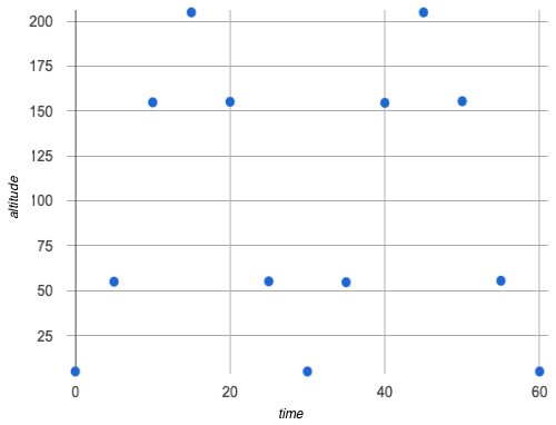
 Your physics teacher comes back from a trip to the state fair, and keeps raving about some amazing ride they took. The class keeps asking them for details: was it a Roller coaster? Bumper cars? Merry-Go-Round?
Being a teacher, of course they decide to turn your casual curiosity into a learning experience, and share some data they recorded from their smart watch.
time (minutes) |
altitude (feet) |
|---|---|
0 |
5.0 |
5 |
55.0 |
10 |
154.9 |
15 |
205.0 |
20 |
155.2 |
25 |
55.2 |
30 |
5.0 |
35 |
54.7 |
40 |
154.6 |
45 |
205.0 |
50 |
155.5 |
55 |
55.5 |
60 |
5.0 |
Investigate
Working in pairs or groups, complete questions 1-4 on Exploring Periodic Data.
-
What are some of your Noticings, and what did they make you Wonder?
-
(Solicit a range of student responses)
-
-
What kind of ride do you think they were on?
-
Answers will vary. Write them all down on the board!
-
-
What about this data supports your theory?
Complete the remaining questions on Exploring Periodic Data.
Synthesize
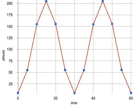
This worksheet had you create a new type of data display, called a line graph.
Line graphs are often used instead of scatter plots when the explanatory variable is time. Time changes continuously, so it makes sense to connect the dots!
|
|
In this example, we know the Ferris wheel keeps turning, generating data "in between" the times represented in our scatter plot. Connecting those dots with the line gives us an approximation of what data is missing between those times, and helps us see the shape of the relationship.
-
Was it helpful to connect the dots to form a line graph?
-
Yes - it was difficult to see the pattern until we added the line!
-
We don’t know for sure what the data looks like between those points, and we certainly don’t know if it’s linear!
-
-
Do
timeandaltitudeappear to be related?-
(Solicit a range of student responses, guiding the class to there being a relationship)
-
-
What kind of ride do you think this teacher was on, and why?
-
A Ferris wheel, because the ride keeps going up and down over and over, and it takes the same amount of time to go up as it does to go down.
-
-
But what kind of relationship is it? Is it Linear? Quadratic? Something else?
-
(Let students discuss)
-
-
Why might using straight lines to connect these dots be a problem?
🔗Periodic Functions
Overview
Students are introduced to periodic functions, and they become familiar with the terminology to describe them.
Launch
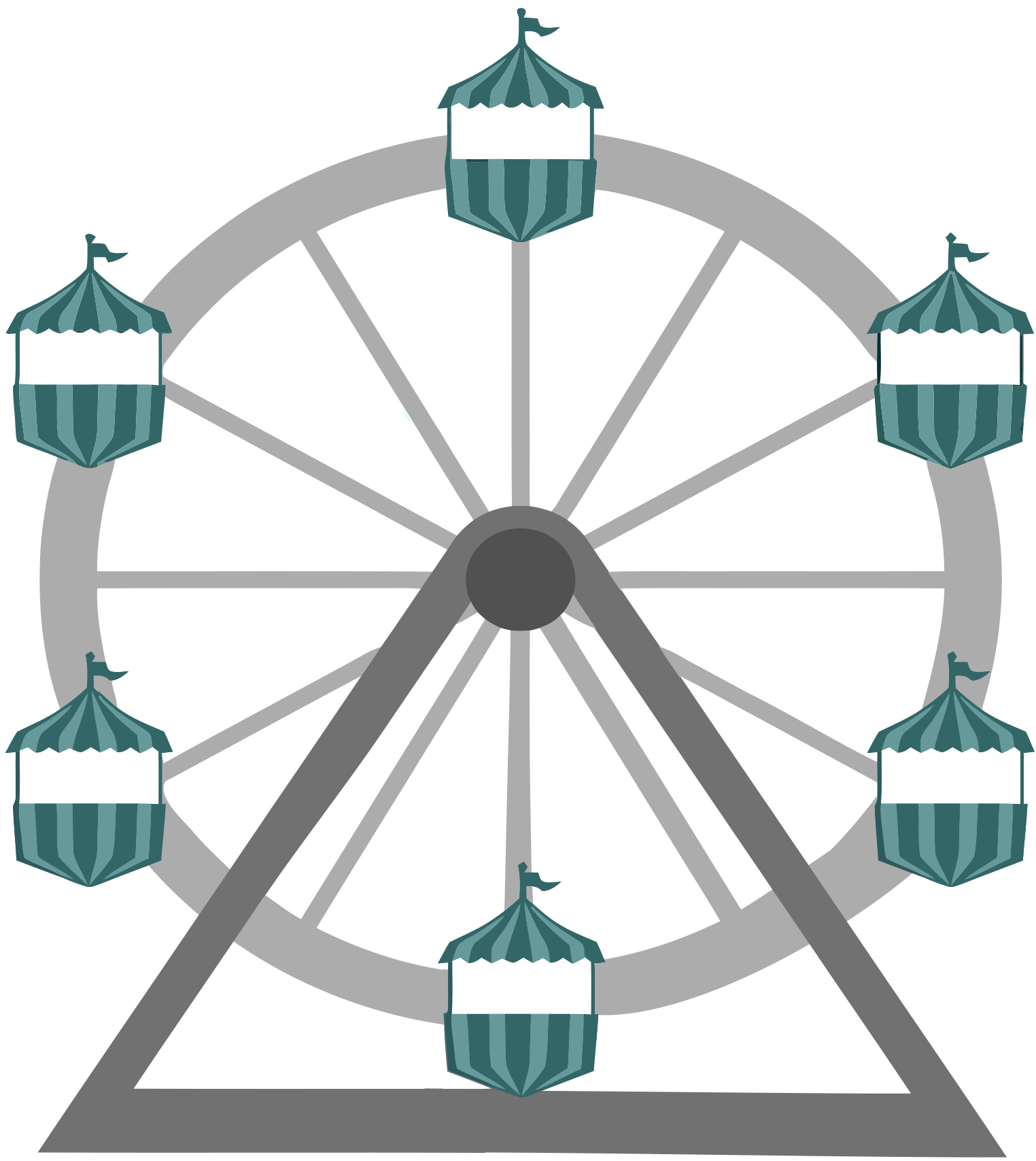 Your teacher’s seat on the Ferris Wheel can be thought of as a point on the circumference of a rotating circle.
-
The y-value (
altitude) goes from 5ft to 205ft then back down to 5, then up again, then down again… -
This pattern of y-values repeats at regular intervals (every 30m)
How do we figure out how far off the ground (y-coordinate) the seat is after some length of time?
Let’s consider the models we’ve studied:
-
linear, exponential and logarithmic models either keep increasing forever or keep decreasing forever.
-
quadratic relationships grow one way until they reach a maxima or minima once, before growing in the other direction.
None of the tools in our modeling toolkit work for functions that keep repeating, going up and down over time!
This is a problem, because modeling cyclical relationships is incredibly important, for everyone from farmers to fishermen to healthcare providers! So many things in nature come in cycles:
-
The sun rises and sets every day: sun-height(time) is periodic
-
The moon waxes and wanes: moon(date) is periodic
-
the tides come in and out each day: tide(time) is periodic
-
Tulips tend to bloom in the Spring: tulips(date) is periodic
-
People tend to get sick in the winter: flu-cases(date) is periodic
In this lesson we’ll explore a new class of functions - periodic functions - that we can use to model cyclical relationships like these.
A note on Vocabulary
You’ve probably heard of related terms sinusoidal functions or trigonometric functions. We’ve chosen periodic functions because the term shows up often in both K-12 math and science and engineering classes, in an attempt to balance the two. Note that "periodic" is also a broader term, as there are periodic functions that are not sinusoidal/trigonometric. Science teachers may be quick to point out that periodic functions can be used to model relationships that cycle (smooth ups-and-downs) and those that oscillate (any kind of up-and-down!).
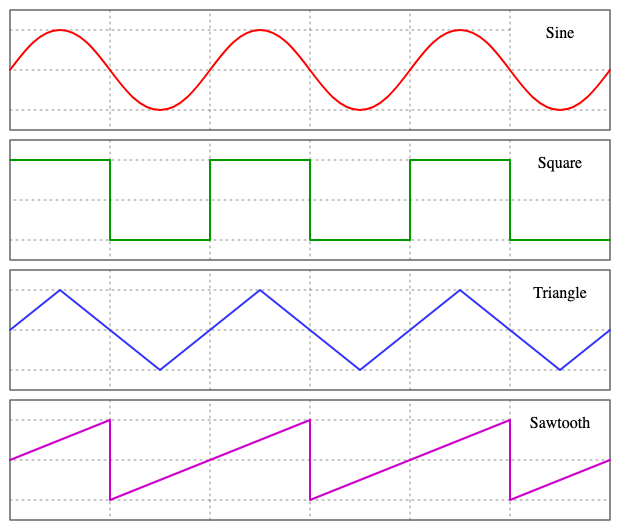
As always, we advise you to use the term that works best for your classroom context!
Unit Clocks
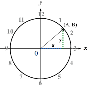 Let’s think about a simpler case, of a clock with a radius 1 that is centered around the origin.
We can draw a radius at any "time", on the clock hitting the circumference at some point (A, B).
For example, when it’s 12 o’clock, the radius lands at (A = 0, B = 1).
That radius also forms the hypotenuse of a right triangle with sides x and y, shown here in green and blue.
-
With a partner, complete questions 1-6 of Reasoning about Unit Clocks.
A and B both vary as a function of time, giving us functions A(time) and B(time).
-
At what time does the radius land on the point (0,-1)?
-
6pm?
-
-
When does B(time) = 0, where the radius sits along the x-axis?
-
3pm lands on (1,0)
-
9pm lands on (-1,0)
-
-
At which time(s) does A(time) = B(time), where the legs x and y are equal?
-
1:30 and 7:30
-
-
When A(time) = B(time), how could we calculate the length of x and y from this right triangle?
-
We could use the Pythagorean Theorem: x2 + x2 = 12
-
Make sure you have created a link or code for your class to Exploring Periodic Functions (Desmos) and paced the class so they only have access to Slide 1: Unit Clocks. Students will be using this slide to check their work on Reasoning about Unit Clocks
-
With a partner, finish Reasoning about Unit Clocks.
-
The end of the page will direct you to use the the link I shared to the Desmos File Exploring Periodic Functions.
 As the point (A, B) travels around the circumference of a circle, it reflects a changing angle θ. It can be helpful to think of this as a pizza slice, with θ as the angle at the tip of the slice, and the edge of the crust as the amount of the circumference the point has traveled.
In our clock example, we divide the circle into twelve "slices", each representing one hour. How many slices would represent 15 minutes? An hour and a half? slice?
Of course, there are other ways besides 12 slices of "hours" to measure this angle!
-
Can you think of another measure that divides a circle up differently?
-
Minutes, which divide our circle up into 720 slices instead of 12. We could imagine one-and-a-half of these slices representing 90 seconds, or 2 slices for 120 seconds.
-
Degrees, divide a circle up into 360 slices instead of 12. How many minutes are represented by 1 degree? 2.5 degrees?
-
Compass Directions like North, South, East, and West, which divide our circle up into 4 slices instead of 12. How many slices represent the angle between North and South? West and Southwest?
-
-
On our graph, would the shape of the curve change if we labeled the x-axis with 360 degrees instead of 12 hours?
-
No — all the intervals remain constant, so the only change is the labels on the x-axis.
-
Radians
Degrees aren’t always the best way to divide up a circle. We often want to use the radius of the circle in our calculations, just as we used the radius of the Ferris wheel to talk about altitude. In these cases, it would be nice to have a measurement of circumference that’s expressed in terms of radius, to make the math cleaner…
 What if we wanted a pizza slice where the length of the crust is exactly the same as the length of the radius? How many slices would there be in the pie?
-
We can start by imagining each slice as an equilateral triangle, where all three sides are exactly one radius.
-
This would give us exactly six slices, with the tip of each slice having a 60° angle…
-
If each of our six slices were an equilateral triangle, our pizza wouldn’t be round anymore.
-
What shape would we get instead?
-
A hexagon!
-
In order to bend the outer edge of the triangle into a curve that lands on the edge of the circle, while keeping the length of the curve equal to the radius, we’d have to make the angle just slightly less than 60°.
Radian: the measure of the angle formed by carving out a radius’s worth of the circumference
If θ of each "radian" slice is less than 60°, we can fit just slightly more than 6 of these slices in our pie. In fact, we can fit exactly 2pi of these "radius slices"!
360° = 2pi
-
If there are 2pi radians in the whole circle, how many radians are in the semi-circle between 3pm and 9pm on our clock?
-
1π
-
-
How many radians are there in the quarter-circle between 12pm and 3pm?
-
$$\displaystyle \pi \over\displaystyle 2$$
-
-
How many radians are there in a single "hour" of the clock?
-
$$\displaystyle \pi \over\displaystyle 6$$
-
Pyret knows about π, too!
-
Open code.pyret.org (CPO)
-
In the Interactions Area, try evaluating
PI(all caps!). What do you get back? -
Try computing the value of 3π.
-
Try computing the value of π / 2.
-
Why do we need spaces around the multiplication and division signs?
Be prepared to remind students to read the error messages when they type 3PI instead of 3 * PI and PI/2 instead of PI / 2
As with degrees, switching our unit-clock graph from hours to radians doesn’t change the curve of our graph at all. It just changes the tick marks on the x-axis.
Note: The conventions for labeling a clock are different from the conventions for labeling circles with Radians or Degrees.
| hours on a clock | vs | radians and degrees on a circle |
|---|---|---|
start from the top |
start from zero on the right |
|
increase clockwise |
increase counter-clockwise |
These are conventions that people have agreed upon over time to make it easy to collaborate. If somebody wanted to make a clock with the numbers written backwards and have the hands move the other way, it would be possible to learn how to tell time using their clock… but it likely would be more confusing than helpful for most people if we hung a clock like that in our school.
Complete the table on Converting Between Angles with your partner, following the prompts in #1 and #2.
We began by graphing the relationship between the legs of a right triangle and the angle formed based on the time on a clock using the functions A(time) and B(time).
To plot these relationships when the input is radians, instead of hours, we’ll use the sine and cosine functions. In Pyret (and most calculators) these function names are abbreviated as sin and cos.
-
One of these functions computes the "x values" from our unit circle (A on the unit clock). The other computes the y-values (B on the clock).
-
Complete Converting Between Angles to determine which is which!
-
The contracts for these functions are:
# sin :: Number -> Number
# cos :: Number -> Number
Note: the numbers that these functions expect aren’t hours, minutes, pizza slices or degrees. They consume radians!
Investigate
Periodic models for sin and cos relationships have the basic form:
f(x) = a sin(b(x - h)) + k OR g(x) = a cos(b(x - h)) + k
Both sin and cos are closely related to one another, and each one can be expressed in terms of the other. We’re going to investigate sin for now, but everything you learn will also apply to cos.
-
Many of the models we’ve studied had a coefficient added at the end of the definition. Thinking back to what you learned, what effect do you think k has on a periodic model?
-
It’s the vertical shift - it moves the midline of the graph up and down the y-axis.
-
-
What effect do you think each of the other coefficients has on the model?
-
Some may recognize h as the horizontal shift, or a as some kind of multiplier that makes the peaks higher and the troughs lower
-
Sync or pace students to Slide 2: Modeling the Ferris Wheel Dataset (sin) of Exploring Periodic Functions (Desmos).
-
Let’s return to the Exploring Periodic Models Desmos file to experiment with the coefficients of periodic models!
-
You should now be on Slide 2: Modeling the Ferris Wheel Dataset (sin).
-
Adjust the sliders to fit this data. How close can you get?
-
With your partner or group, complete Graphing Periodic Models: Amplitude (𝑎), Graphing Periodic Models: Frequency (𝑏), and Graphing Periodic Models: Horizontal/Phase Shift (𝘩).
-
Then turn to Words for Describing Periodic Functions and see if you can come up with explanations for what each of the terms on this diagram refer to.
As you debrief, give ample time for students to hear each other’s thinking. Concepts like amplitude and frequency can be difficult to describe, and having students reach a consensus on their definition in their own words will help deepen their understanding.
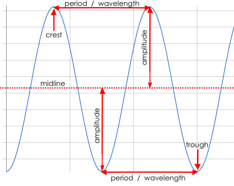
Peaks, Troughs and Midline
When graphed from 0 to 2π, periodic functions rise to a certain height above a Midline, then drop the same distance below it, then rise and fall again to complete the cycle. This cycle then repeats over and over.
-
Peaks - the highest points on the wave (also called Crests)
-
Since periodic functions rise and fall repeatedly, there isn’t a maxima, but math books sometimes refer to each peak as a local maxima
-
-
Troughs - the lowest points on the wave
-
Since periodic functions rise and fall repeatedly, there isn’t a minima, but math books sometimes refer to each trough as a local minima
-
-
Midline - a horizontal line that falls halfway between the peaks and the troughs
Amplitude a
The distance from a peak or trough to the midline.
$$\displaystyle \text{Period} = 2\pi \over\displaystyle \text{frequency}$$
The period is the horizontal distance over which the curve travels before it begins to repeat itself (one complete wave). - It can be measured from peak to peak or from trough to trough. - The frequency (b) is how many cycles occur over a 2π interval.
| Period | Frequency | |
|---|---|---|
When b = 1 |
2π |
1 |
When the period is cut in half, the frequency doubles |
π |
2 |
When the period doubles, the frequency is cut in half |
4π |
1/2 |
Horizontal Shift (h)
The Horizontal Shift is also called the Phase Shift.
-
When h < 0, it shifts the graph to the left.
-
When h > 0, it shifts the graph to the right.
Note: In the function definition f(x) = a sin(b(x - h)) + k, when h is positive it looks like it’s being subtracted.
Vertical shift (k)
The vertical shift is the amount the function is shifted up or down - When k < 0, the graph is shifted down. - When k > 0, the graph is shifted up.
-
Now that you have a sense for what terms like amplitude, frequency, and midline mean, complete Matching Periodic Descriptions by matching the graphs of periodic functions to their written descriptions.
-
What strategies did you use to match the graphs to the descriptions?
Sync or pace students to Slides 2 through 4 of Exploring Periodic Functions (Desmos).
-
Let’s return to the Exploring Periodic Models Desmos file.
-
You should still be on Slide 2: Modeling the Ferris Wheel Dataset (sin).
-
With your partner, complete Modeling the Ferris Wheel Data, advancing to Slide 3: Translating from sin to cos and Slide 4: Modeling the Ferris Wheel Dataset (cos).
-
Open the Ferris Wheel Starter File, and change the definitions of
fandgto match the models defined on Modeling the Ferris Wheel Data. How well do they fit?
NOTE: The altitude column of the Ferris wheel dataset has been rounded to make it easier for students to use. This rounding will result in some error in the model.
Suppose you needed to compute the model for a different Ferris Wheel. Would you know how to use the radius and speed of the wheel to compute the model?
-
Complete Make Your Own Ferris Wheel! with your partner.
Synthesize
Periodic relationships involve repeating cycles. Like our Ferris wheel, they rise and fall along regular intervals. Can you come up with some examples of periodic relationships?
This can be a terrific out-of-seats activity:
-
Have groups of students go to whiteboards/flipcharts, and write down their periodic relationship (e.g. - phases of the moon, tides, etc).
-
Ask them what the period is, then the x-axis, then the y-axis. For example, phases of the moon has a period of roughly 1 month, so the x-axis might be days. For the y-axis, we could use "Percent of visible moon" or "number of lumens".
-
Under that description, have them draw axes and their wave!
For each one:
-
Can you estimate the period of the relationship?
-
Can you estimate the amplitude?
-
Can you estimate the midline and vertical shift?
You’ll likely need to support students in thinking through what these terms mean in the context of their first example, to get the class started. Suppose a student volunteers "the temperature, because it gets cold in the winter and warm in the summer":
-
The seasons change over the course of one year, so the period would be 365 days.
-
The temperature in your area might fluctuate between 95° in the summer and 25° F in the winter. That’s a range of 70° F, for an amplitude of 35° F.
-
The midline and the vertical shift are at 60° F (25 + 35 = 60).
🔗Modeling Periodic Relationships
Overview
Students explore the CO2 dataset, which tracks the recorded quantity of carbon dioxide in the atmosphere from an observatory in Hawaii.
Launch
Of course, the Ferris wheel dataset has almost no variability! The wheel doesn’t change size or speed, and there aren’t any other variables influencing the data. As a result, our scatter plot lines up perfectly with a periodic model.
Now that we’ve had some practice, let’s take a look at a dataset that has more variability!
Carbon Dioxide (CO2) is the gas inside the bubbles in a can of soda. It’s what we breathe out when we exhale. In solid form, it’s known as dry ice. It’s also known as a "greenhouse gas", because it traps heat. When enough of it is in the atmosphere, it can make the planet warmer and warmer.
Scientists are concerned about how much CO2 is in the atmosphere, so they take frequent measurements from multiple locations around the globe. The amount of CO2 in the atmosphere is measured in parts-per-million, abbreviated "ppm". Of course, there are many things that can influence the amount of CO2 in any one location!
-
Temperature and air pressure
-
Proximity to CO2 -producing or CO2 -consuming sources
-
Global trends like the burning of fossil fuels
Because of these and other factors, the amount of CO2 at any one location goes up and down throughout the year. But is there a pattern?
-
Open the Carbon Dioxide Starter File, save a copy, and click "Run".
-
What is the name of the table here?
-
What are the names of the columns?
-
Type
co2-tableinto the Interactions Area, and look at the table. -
What do the
year,month, andco2columns mean? -
What do you think the
datecolumn could mean?
The date column is the decimal year, in which the nth day of the year is divided by 365:
The first date is 1974.375, meaning the sample was taken 0.375 of the way through 1974.
-
How could we compute which day of the year that is?
-
There are 365 days in the year, so we could multiply 365 by
0.375to see the number of days into the calendar.
-
-
What is 365 × 0.375?
-
136.875, or roughly day 137
-
-
What month does that fall in, and what "month-number" is that?
-
May, the 5th month
-
-
What is written in the
monthcolumn for the first row?-
5, which is May
-
-
What do you Notice about this dataset?
-
What do you Wonder?
Look farther down in the Definitions Area, until you find the function is-recent.
-
What does it do?
-
It takes in a row, and checks to see if the decimal date is between 2022.083 and 2023.7917.
-
-
What is defined on the following line of code?
-
A table, which contains only the rows for which the filter function produces
true: just the rows between those dates.
-
The recent-table includes just the rows from trough-to-trough for the years 2022-2023.
-
How many periods are represented here?
-
One
-
-
Why?
-
Because the distance between any adjacent troughs or peaks define one period.
-
Investigate
-
Open the Carbon Dioxide Starter File, and complete Questions 1-6 of Modeling Recent Carbon Dioxide Levels.
-
Be ready to share your answers!
-
What was the highest CO2 value in the table? The lowest?
-
424 and 415.74 parts per million.
-
-
What did you get for amplitude a?
-
4.13, because the distance between the high and low readings is 8.26.
-
-
What did you get for the vertical shift k?
-
Adding the amplitude (4.13) to the lowest value (415.74) gives us 419.87.
-
-
What did you estimate for the phase shift d?
-
Answers will vary, but should be close to 2023.1
-
-
How many years make up one period?
-
One year (this makes sense, since the seasonal cycle repeats every year!)
-
-
What did you get for frequency b?
-
2π, because the period is 1 year and $$\displaystyle {2\pi \over\displaystyle 1} = 2\pi$$.
-
-
With your partner, complete Modeling Recent Carbon Dioxide Levels, and enter your
periodicmodel into Pyret. How well does it fit the data?
Optional Activity: Guess the Model!
-
Divide students into teams of 2-4, and have each team come up with a periodic, real-world scenario, then have them write down a periodic function that fits this scenario on a sticky note. Make sure no one else can see the function!
-
On the board or some flip-chart paper, have each team draw a scatter plot for which their periodic function is best fit. They should only draw the point cloud - not the function itself! Finally, students title display to describe their real-world scenario (e.g. - "Water depth at a beach vs. Time of Day").
-
Have teams switch places or rotate, so that each team is in front of another team’s scatter plot. Have them figure out the original function, write their best guess on a sticky note, and stick it next to the plot.
-
Have teams return to their original scatter plot, and look at the model their colleagues guessed. How close were they? What strategies did the class use to figure out the model?
-
The coefficients can be constrained to make the activity easier or harder. For example, limiting these coefficients to whole numbers, positive numbers, etc.
-
To extend the activity, have the teams continue rotating so that each group adds their sticky note for the best-guess model. Then do a gallery walk so that students can reflect: were the models all pretty close? All over the place? Were the guesses for one coefficient grouped more tightly than the guesses for another?
-
Synthesize
-
Could you rewrite this model to use cosine instead of sine?
-
If so, how?
-
What are some problems you see with this model?
-
Where does it fit the data best? Where does it fit the worst?
🔗Hybrid Models
Overview
Students discover that their periodic model for recent-table data doesn’t fit the historical data very well. They explore the historical data, discovering that there’s a stronger pattern at work than the seasonal periodicity: a linear pattern of rising CO2 over time. They try fitting a linear model first, then combine it with their periodic model to find a better fit.
Launch
The resulting model fits the recent-table data pretty well, with an S-value of about 1.2ppm. But how well does it fit, if we try it with data from more than just the one year?
The starter file includes another table, called modern-table, which is all the data from 2010 and beyond.
-
Fit your model with the
modern-table. -
What S value do you get?
-
What do you think is going on?
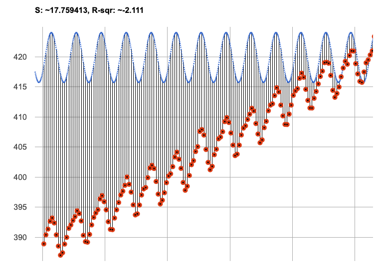
We can still see our model running along the top of the graph, but the data doesn’t line up with the model at all until about the end of 2022.
What do you think will happen if we try to fit this model to all of our data? Try it out!
It gets even worse!
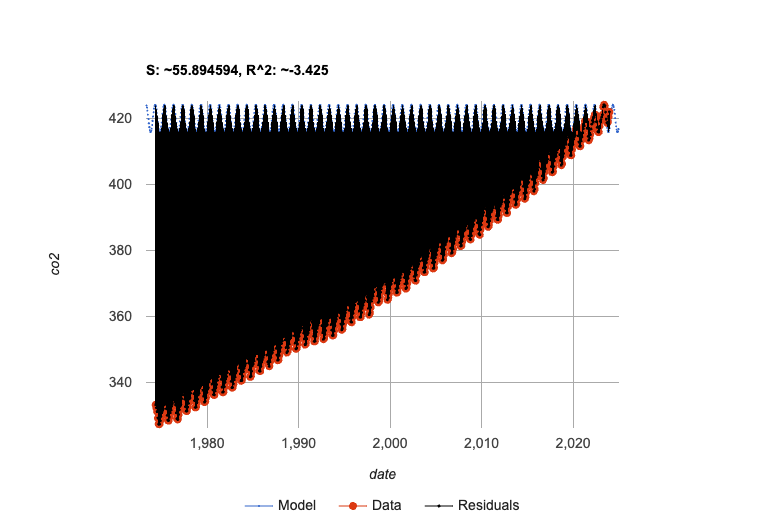
-
If our model is so bad at fitting historical data, why was it so good at fitting just the one year?
-
Models are only reliable within the span of the data they fit. The fact that the model fit
recent-tablewell means it’s a good model for that year, but we can’t make any assumptions about dates outside of the range of the training data.
-
Investigate
Let’s just look at the historical data by itself, without worrying about models.
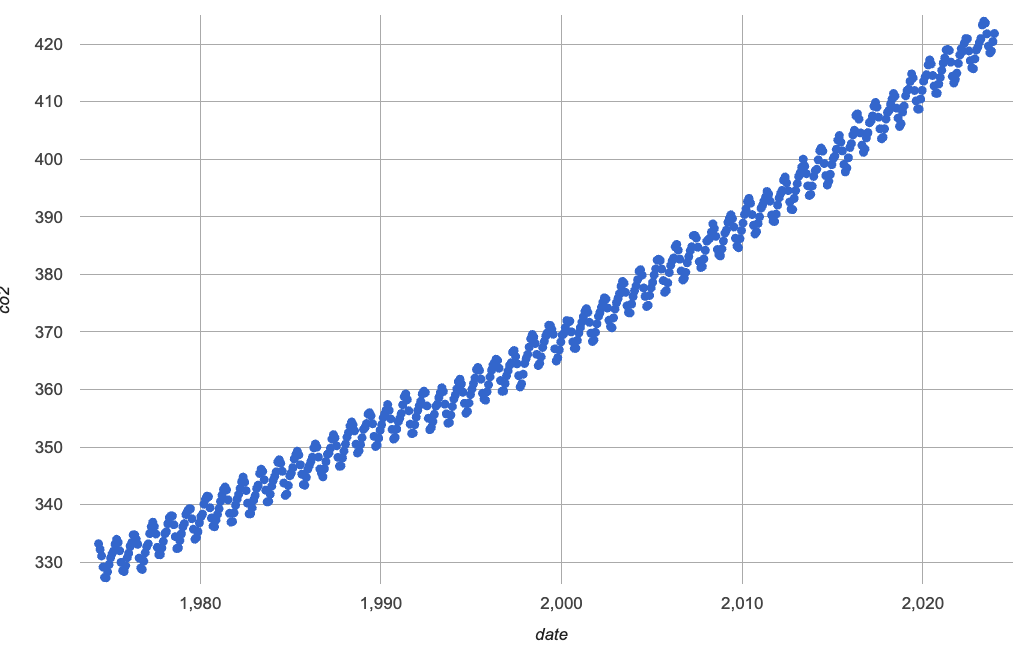
-
In small groups, discuss what you Notice and Wonder about this plot.
-
Be prepared to share back with the class!
-
Complete questions 1 and 2 on Modeling Historical Carbon Dioxide Levels
It looks like there are two different things going on here:
-
The amount of CO2 in the air generally rises linearly over time, for a positive, linear relationship with the year.
-
But at the same time, there are seasonal, periodic variations that cause it to fluctuate up and down across that line.
-
Do you think it’s possible for a model to be both linear and periodic?
-
In small groups, see if you can come up with an idea for a function that combined the best of both models.
Have students share their models and/or discuss their thinking.
-
Complete as much of Modeling Historical Carbon Dioxide Levels as you can.
Our periodic model had two terms:
-
The periodic term 4.13 × sin(2π(x - 2023.1)), which described the wave that wrapped around the horizontal midline
-
The vertical shift 419.87, which described the (fixed) y-coordinate of the midline
But when we zoomed out to see the historical CO2 data, we saw that the midline isn’t horizontal at all!
The midline is our linear model!
By replacing the vertical shift term in our periodic model with the linear model, we get the best of both worlds! Linear behavior for the midline over the years, and periodic behavior for the seasonal variation in CO2.
f(x) = 4.13 × sin(2π(x - 2023.1)) + 1.8345x + - 3296
We can visualize the body of the function using the Circles of Evaluation:
-
If you haven’t already defined your hybrid model, define it in the Definitions Area and finish Modeling Historical Carbon Dioxide Levels.
-
How much better is the S value of the hybrid model, compared to the purely-linear one?
Synthesize
-
Why did our hybrid model fit better than the periodic or linear models alone?
-
Look closely at where the hybrid model fits the data. When does the data under or over predict? What could this mean?
-
What would a model look like for a disease like Covid, but with seasonal variations that cause minor peaks and troughs?
Going Deeper
Have your students refer back to Exploring Exponential Models. As with the recent-table table in Carbon Dioxide Starter File, the starter file there constrains the dataset to show only recent data. This is done for the same reason: to introduce students to a more perfectly-exponential model. Now that students know how to combine terms from different models, they can go back and build a model that fits the entire Covid dataset!
These materials were developed partly through support of the National Science Foundation, (awards 1042210, 1535276, 1648684, 1738598, 2031479, and 1501927).  Bootstrap by the Bootstrap Community is licensed under a Creative Commons 4.0 Unported License. This license does not grant permission to run training or professional development. Offering training or professional development with materials substantially derived from Bootstrap must be approved in writing by a Bootstrap Director. Permissions beyond the scope of this license, such as to run training, may be available by contacting contact@BootstrapWorld.org.

