Students investigate logarithmic relationships in demographic data about countries of the world, using an inquiry-based model, involving hypothesizing, experimental and computational modeling, and sense-making.
Lesson Goals |
Students will be able to…
|
Student-facing Lesson Goals |
|
Materials |
|
Supplemental Materials |
|
Preparation |
|
Key Points For The Facilitator |
|
🔗Looking for Patterns 30 minutes
Overview
Students explore the Countries of the World Starter File, and find a relationship between wealth and median life expectancy. They also learn how to build a new column for a table in Pyret.
Launch
-
 Do you think people living in wealthier countries generally live longer?
 -
Open the Countries of the World Starter File
-
From the File menu, select "Save a Copy", and click "Run".
-
Working in pairs or small groups, complete Exploring the Countries Dataset.
Discuss students' findings. Pay special attention to the form that students use to describe the pattern in the scatter plot. Is it linear, or something else? Is it strong or weak? If there’s some disagreement among the students, that’s a good thing!
Be attentive to sense-making: If a wealthy country is suffering heavy casualties in a war, where would we expect to see that country’s datapoint? Why? What other conditions would cause a point to shift up, down, left or right?
Investigate
Make sure you have created a link or code for your class to Fitting Wealth-v-Health and Exploring Logarithmic Models (Desmos) and paced the class so they have access to the first 2 slides.
-
Open the Desmos link I’ve shared with you. (The file should be called Fitting Wealth-v-Health and Exploring Logarithmic Models.)
-
Working in pairs or small groups, complete Fitting Models for the Countries Dataset.
This activity involves lots of trial and error, as students try to come up with a good linear, quadratic, or exponential model.
The goal is to discover that a new kind of model is necessary, not to find a perfect fit with linear, quadratic, or exponential models!
Synthesize
Direct students to look at the scatter plot they created in Pyret of median-lifespan versus pc-gdp.
-
What’s the best model you came up with?
-
What kinds of lines or curves did you draw?
-
How would you describe the shape of the scatter plot for
median-lifespanversuspc-gdp?-
It starts out rising fast on the left, before tapering off as
pc-gdpincreases to the right.
-
-
How well did our linear, quadratic, and exponential models fit this data?
-
None of the kinds of functions we’ve seen so far exhibit the behavior we see here! In some ways, this behavior is the exact opposite of exponentials: instead of starting slow and taking off like a rocket, this curve explodes up the y-axis right away, before leveling off.
-
🔗Logarithmic Functions
Overview
Having identified that the wealth-v-lifespan scatter plot is neither linear, nor quadratic, nor exponential, students learn about characteristics of logarithmic functions in graphical, tabular, and function notation form.
Launch
All of the models we just found for our dataset made predictions with too much error. Even though this shape looks familiar, it’s just not any kind of growth we’ve seen before.
Exponential growth started really slowly, and then suddenly shot up like a rocket to numbers so large we can’t even reason about them. This kind of growth feels like the exact opposite, growing really quickly but then leveling off to something very slow.
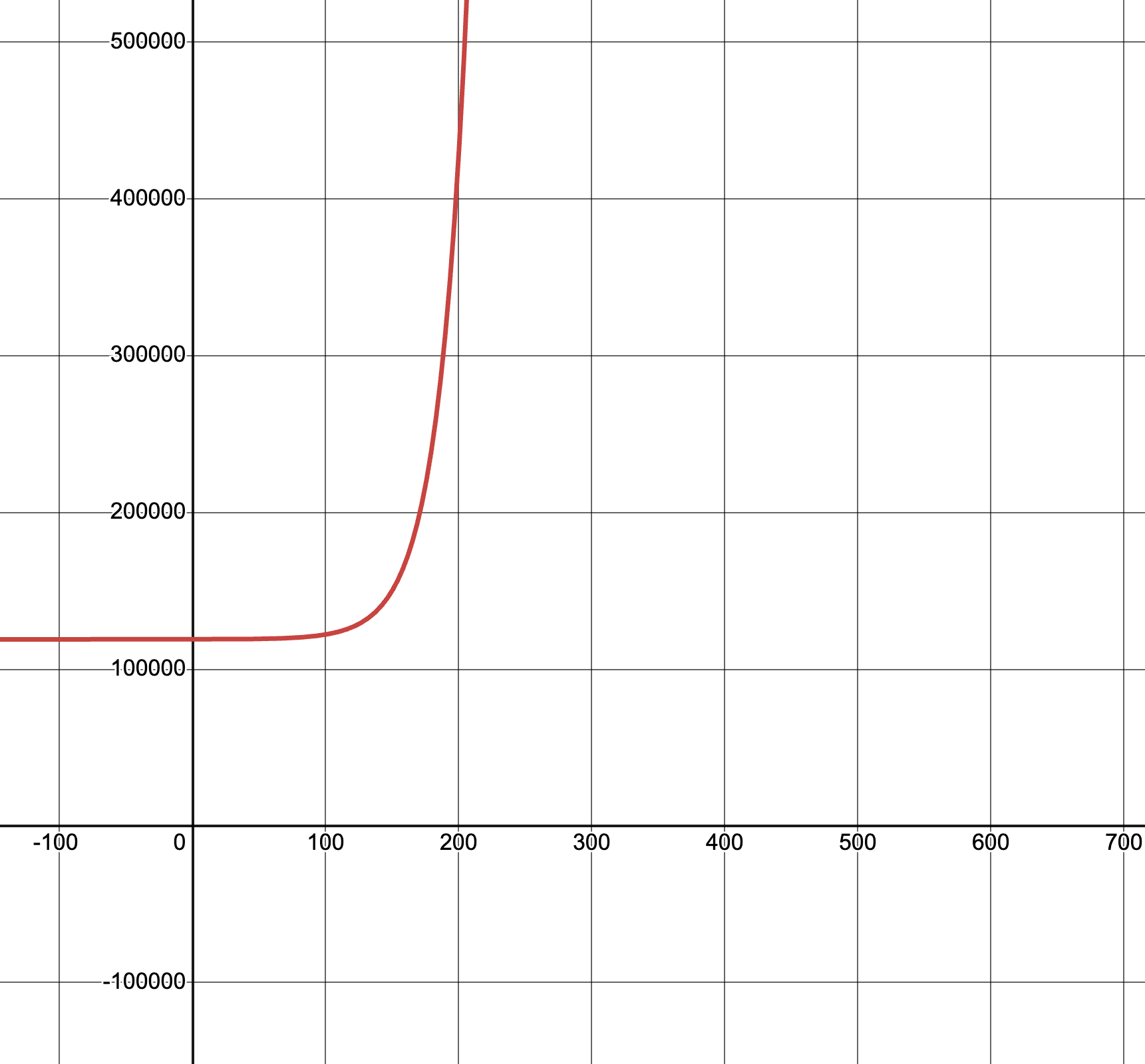 Let’s think back to the graph of our model for Covid spread, from Exploring Exponential Models.
-
Our model answers the question "how many positive cases do we predict after x days?"
-
The graph is showing us the relationship from
days → cases, x → y, or Domain → Range.
But what if we want to answer the opposite question: "how many days will it take to reach y cases?"
-
Now we want to flip the relationship around, asking for
cases → days, y → x, or Range → Domain. -
What would this graph look like?
Swapping the x’s and y’s is like reflecting the graph across the diagonal, making the axes trade places and swapping the x- and y-values for point on the line. Let’s do that with our Covid model…
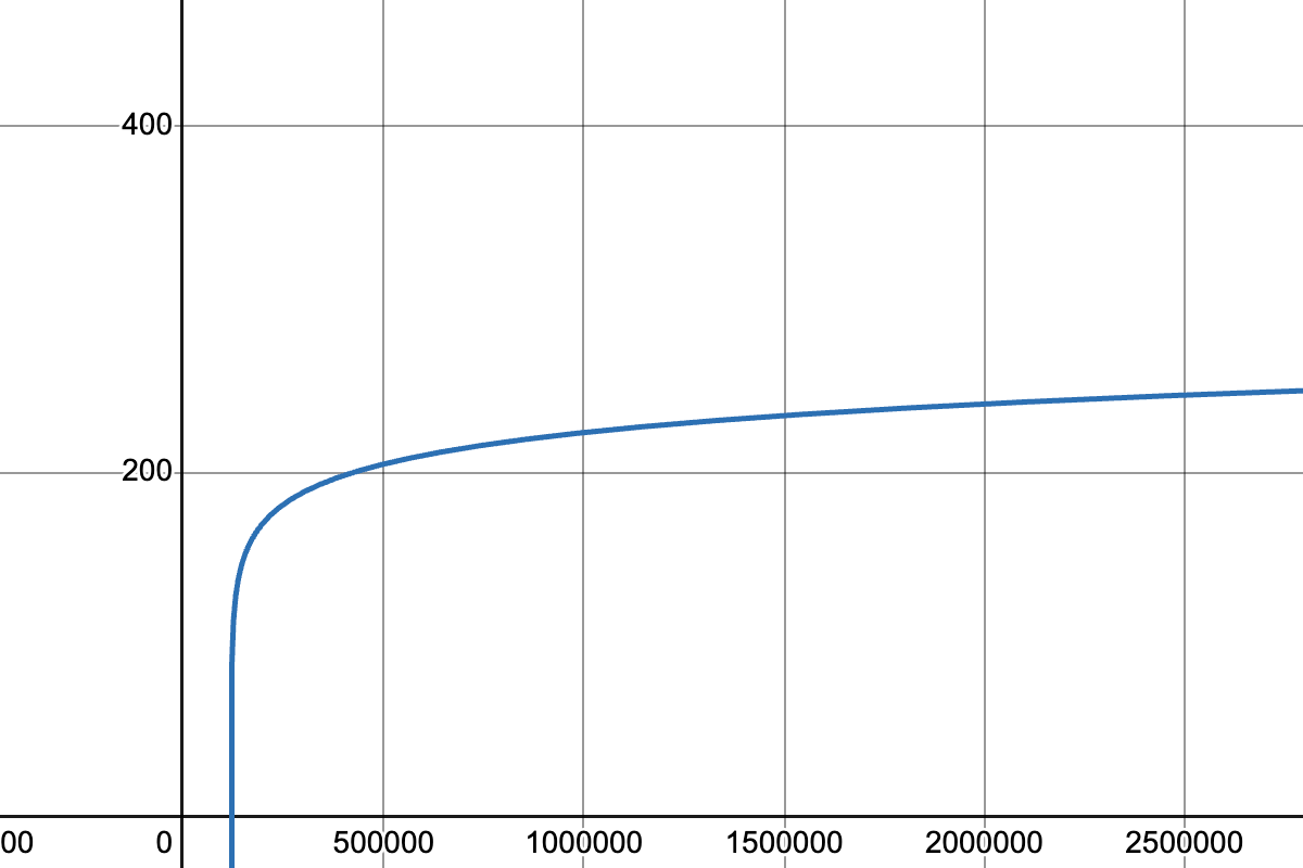 Swapping the x- and y-axes makes the graph start with rapid growth, and then flatten out. Now we can answer those inverted questions!
-
During the pandemic, our initial value was roughly 120,000 cases.
-
By 150,000 cases, it was 75 days later.
-
By 300,000 cases, it was 112 days later.
-
By 400,000 cases, it was 122 days after.
This kind of growth is much easier to understand, and much more alarming! By switching the axes, we’ve given our brains a much better chance of understanding what was really happening.
But our inverted model isn’t exponential at all. In fact, it looks a lot more like our Wealth-v-Lifespan data!
What kind of growth is this?
This kind of growth is called logarithmic growth. Logarithmic functions are closely related to exponential functions!
| Exponential | Logarithmic |
|---|---|
f(x) = 3x |
g(x) = log3(x) |
Tells us "what 3 to the power of 'the input' is" |
Tells us "what power 3 needs to be raised to reach 'the input'" |
f(2) = 32 = 9 |
g(9) = log3(9) = 2 |
-
What will f(4) evaluate to?
-
f(4) = 33 = 27
-
-
What will g(27) evaluate to?
-
g(27) = log3(27) = 3
-
"A logarithmic relationship looks exponential, if your x's and y's trade places!"
By "reversing the question", logarithmic functions and exponential functions serve as inverses of one another:
-
The inputs and outputs are reversed
-
The Domain and Range are swapped
-
The curve is reflected over y = x
To practice spotting logarithmic curves and their connection to exponentials, complete What Kind of Model? (Graphs & Plots).
| Exponential Function | Logarithmic Function |
|---|---|
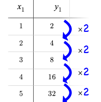
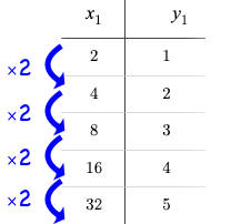
We know that exponential functions grow by equal factors over the same interval. We can describe their growth by calculating the growth factor: "what y is multiplied by" in order to produce the next value over a constant interval. |
Instead of multiplying y by a constant to find the next value, we need to multiply the size of our x-interval by a constant (called the base) in order to get a constant growth in y! |
|
|
Just as swapping the Domain and Range makes a logarithmic curve look exponential, swapping the (x,y) columns of a table makes a logarithmic sequence look exponential.
-
Turn to What Kind of Model? (Tables) and decide whether you think each table is best modeled by a quadratic, exponential or logarithmic function.
-
If the table shows an exponential or logarithmic relationship, identify the base.
-
What strategies did you use to decide if a table represented a quadratic, exponential, or logarithmic function?
-
Was it especially difficult (or simple) to recognize any these function types? Why?
-
For practice translating logarithmic expressions into words and evaluating them turn to Evaluating Logarithmic Expressions.
The "Evaluating Logarithmic Expressions" page uses a phrasing that helps students read a logarithmic expression from left-to-right, emphasizing readability. Many teachers prefer a different phrasing, which emphasizes the connection to exponential expressions. An identical version of this worksheet is available, which uses the exponential phrasing.
Logarithmic relationships allow us to compare things of very different sizes!
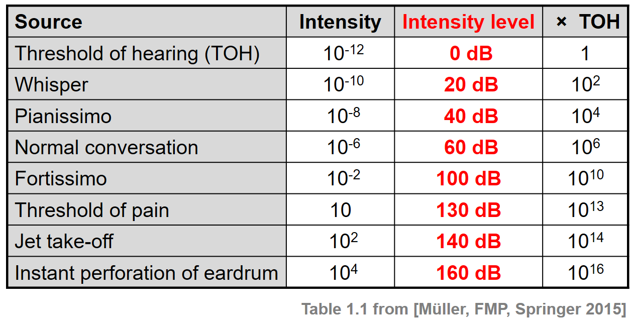
We don’t hear the world as it really is. We hear a logarithmically compressed version of it!
-
A fire alarm is thousands of times louder than a dog barking, but our brains don’t process that difference.
-
When we hear a sound that is ten times as loud as another, our brains perceive it to only be twice as loud.
-
Exponentially increasing sound-strength is perceived as constantly increasing loudness, so perception(sound-strength) is a logarithmic function.
We don’t see the world as it really is. We see a logarithmically compressed version of it!
-
 A fraction of our field of view shows us just a few feet of an airplane wing, but that same fraction shows us hundreds of miles when looking at the ground far away.
 -
Railroad tracks stretching off towards the horizon, they appear to grow closer and closer until it looks like those parallel lines might touch.
-
Exponentially increasing distance is perceived as constantly decreasing distance, so perception(distance) is a logarithmic function.
Students can check out this wonderful visualization from XKCD, which uses a logarithmic scale to draw the entire known universe. The constantly-increasing vertical distance in the picture represents an exponentially-increasing distance, which is why the Eiffel Tower and Great Pyramid at the bottom appear "stretched out" at the bottom and "compressed" at the top!

We don’t taste spiciness as it really is. We taste a logarithmically compressed version of it!
-
The Scoville Scale measures how spicy we perceive a pepper to be, based on the amount of capsaicin in the pepper.
-
Each unit on the scale means there is an exponentially greater amount of capsaicin, so a pepper that measures a 4.0 actually contains ten times the capsaicin of a 3.0.
-
In other words, an exponentially-increasing amount of capsaicin is perceived as a constantly increasing spiciness, so spicyness(capsaicin) is a logarithmic function.
Investigate
Logarithmic Functions can be written in the form: f(x) = a logb(x - h) + k
Most textbooks only present logarithmic functions with a horizontal shift of zero. When h=0, we can safely remove it and use this simplified form of the equation:
f(x) = a logb(x) + k
Advance your teacher dashboard of Fitting Wealth-v-Health and Exploring Logarithmic Models (Desmos) to Slide 3: How does h transform logarithmic functions? and give your students a chance to reinforce their understanding of h - values from other models by connecting it to logarithmic functions.
Logarithmic models have the form f(x) = a logb(x) + k
Sync or pace students to Slide 4: Exploring Logarithmic Functions of Fitting Wealth-v-Health and Exploring Logarithmic Models (Desmos).
Decide whether you want to debrief this activity with your students after they complete each section or wait until they have finished completing Graphing Logarithmic Models: f(x) = a logb x + k.
-
Let’s return to the Desmos file and explore how the constants in a logarithmic function definition impact the shape of its graph.
-
You should now be on Slide 4: Exploring Logarithmic Functions
-
Use it to complete Graphing Logarithmic Models: f(x) = a logb x + k
Review students answers, and then debrief via class discussion. Invite students to consider what new information they have gained by looking at graphical representations rather than tables.
Base b
The base of the logarithm is similar to the base (or growth factor) in an exponential expression…it just answers the opposite question!
| Exponential Expression | Logarithmic Expression |
|---|---|
32 |
log3(9) |
"calculate 3 to the power of 2" |
"calculate what power 3 is raised to in order to reach 9" |
Evaluates to 9 |
Evaluates to 2 |
The expression log2(1) is asking "to what power must 2 be raised to reach 1?
-
What power of 2 will evaluate to 1?
-
Zero
-
-
What question is log5(1) asking?
-
"To what power must 5 be raised, to reach 1?"
-
-
What power of 5 will evaluate to 1?
-
Zero
-
-
What can we conclude about logs that evaluate to 1?
-
They will always be zero, regardless of base!
-
No matter the base, log(1) will always be zero!
-
Turn to What Kind of Model? (Descriptions) and practice identifying whether the scenarios are best modeled by linear quadratic, exponential, or logarithmic functions.
-
What clues did you use to help you identify which relationships were which?
Have students share their answers. Be especially attentive to students who mis-label logarithmic relationships as "exponential" — the relationship between the two is extremely subtle!
Most math books, Desmos, calculators, and programming languages offer a simple "log" function that doesn’t specify a base. By convention, if the base isn’t specified, it’s assumed to be base-10. Pyret’s log function works the same way:
log(1000) # returns 3, because 10^3 = 1000
If you want to work with a different base, you can look up Pyret’s log-base function in the contracts pages.
Vertical Shift k
The term k is the vertical shift of the function, which moves the curve up or down.
Since loganything(1) = 0, the value of a standard log model at x = 1 will always be 0 + k.
(We’ve seen vertical shifts in other kinds of functions given different names, like b for linear functions.)
Logarithmic Coefficient a
The term a is called the logarithmic coefficient, which - like b - helps determine how quickly the function grows.
-
What do you remember about the asymptote of a function with exponential growth?
-
It’s horizontal at k, where y grows or shrinks by smaller and smaller amounts approaching zero
-
Functions with logarithmic growth have a vertical asymptote where the function gets closer and closer, but never crosses the line.
In this data exploration, the asymptote will always be located on the y-axis (x = 0).
Extremely observant students may notice that there’s a relationship between a and b, where the value of 2 log10(10) = log10(102)!
Synthesize
-
What similarities do you see between exponential and logarithmic functions?
-
What differences do you see between exponential and logarithmic functions?
🔗Fitting by Changing Scale 30 minutes
Overview
Students discover that when a logarithmic relationship is graphed on an exponential scale, the point cloud appears linear. When trying to use linear regression with those points, however, they are reminded that merely changing the scale of a graph does not actually change the data.
This section builds the foundation for linearization, transforming the points themselves, which students will do in the following section. (Note: this also opens the door for teaching inverse functions!)
Launch
Sync or pace students to Slide 5: Wealth-v-Health (Logarithmic) of Fitting Wealth-v-Health and Exploring Logarithmic Models (Desmos).
-
Let’s return to the Fitting Wealth-v-Health and Exploring Logarithmic Models Desmos file.
-
You should now be on the Slide 5: "Wealth-v-Health (Logarithmic)".
-
Use it to complete the first section of Changing the Scale.
-
What values did you come up with for a and c in your best-guess logarithmic model?
-
Record different students' responses for a and c on the board.
-
-
How do your a and c values compare with those of other students'? Are they very similar or very different?
-
What were the S values for these models?
Trial-and-error only gets us so far, and it’s not clear that we would ever stumble upon the optimal model.
We need something like Pyret’s lr-plot, which uses computational methods to find the optimal model.
Unfortunately, lr-plot only finds linear models in data with linear relationships.
Data Scientists often use transformations to stretch their data into shapes that are easier to work with, and then reverse the transformation when they are done. If only we could transform this data to make it appear linear. Then we could use lr-plot to fit the optimal model, and then reverse the transformation to get the optimal logarithmic model!
Investigate
-
Imagine that the scatter plot is printed on a sheet of rubber, and can be stretched or squashed in any way we want…
-
With that image in mind, follow the directions on the last section of Changing the Scale.
Students will be switching the x-axis of their graph from linear to logarithmic in this section. Make sure they are toggling back and forth between the two views as they look for the best-fitting model.
-
A person running on a treadmill doesn’t change location. Why not?
-
Their forward movement is balanced by the backwards movement of the treadmill.
-
-
If they run faster and faster, what needs to happen to the treadmill to keep them in the same place?
-
The treadmill needs to go faster as well. As long as the treadmill speed increases at the same rate as the runner, they will balance one another’s growth.
-
-
How is the treadmill example comparable to what we’ve done with our x-axis transformation?
-
We are speeding up the growth intervals on the x-axis to "keep up with" the speed of growth in the data so that we can see the pattern better.
-
When we changed Desmos’s view from "Linear" to "Logarithmic", we made the x-axis grow faster and "squish" the dots so they appear linear. By transforming the x-axis to grow exponentially, we are squashing the coordinate plane so that each interval on the x-axis represents 10x the growth in pc-gdp as the one before it. This balances out the logarithmic growth in median-lifespan, and warps our logarithmic model so the curved looks linear.
Undoing a Log by taking the…Log?
Relationships in our scatter plot represent a ratio of growth between two quantities. Consider a simple ratio like 1:3. This means the first quantity grows by one third with respect to the other. It can by turned into 1:1 in two ways:
-
Transform the first quantity (multiply by 3)
-
Transform the second quantity (divide by 3)
In our scatter plot, the ratio is the growth in median-lifespan v. the growth in pc-gdp. The growth of one is logarithmic with respect to the growth of the other. This means there are two ways to linearize the data:
-
Transform the x-axis to match the y (take the log)
-
Transform the y-axis to match the x (raise to an exponent)
We’ve chosen the first option because Desmos doesn’t offer an exponential transformation of the axes. There’s no way to even let kids experiment, without jumping straight to Pyret! Another reason is that the range of the median-lifespan data is so small (52-85 years) relative to the range of pc-gdp (600-144,000 dollars) that the transformation has less of an effect on the y-axis than it does on the x-axis!
While the treadmill/ratio analogy doesn’t cover inverses in any real depth, the treadmill analogy opens the door to discussing how one kind of change can "cancel out" or "undo" another. We are working to add additional material on inverse functions to our Algebra 2 materials, and hope to release them in the coming year!
Synthesize
-
How does seeing the point cloud as linear help us think about logarithmic growth?
-
Transforming the axes only makes things look linear - the actual points haven’t changed at all, and we still can’t use linear regression to find the best logarithmic model… Can you think of a way we could transform the data, instead of the axes?
🔗Fitting by Transforming Data 45 minutes
Overview
Having discovered that changing the scale of a graph allows us to see logarithmic growth as linear, but still doesn’t allow us to treat it as linear, students learn to transform the data by applying a function to each row and building a new column that can be fit with a linear model. By applying the inverse of this transformation to their computed linear model, students can derive the optimal logarithmic model.
Launch
We tried changing the scale on the x-axis from linear to logarithmic, which cancels out the logarithmic behavior by shrinking the x-axis to make intervals that grow exponentially. Exponentially-bigger intervals on the x-axis cancel out the logarithmic growth on the y-axis, by squishing the points to appear linear.
Unfortunately, this transformation is only skin-deep: the underlying data is still logarithmic, which makes it impossible for us to use linear regression to obtain an optimal model.
Another strategy is to shrink the data, by transforming the x-coordinates themselves. Instead of plotting pc-gdp on a logarithmic x-axis, we could plot log(pc-gdp) on a linear one.
Sync or pace students to Slide 6: Wealth-v-Health (Transformed) of Fitting Wealth-v-Health and Exploring Logarithmic Models (Desmos).
-
Let’s return to the Fitting Wealth-v-Health and Exploring Logarithmic Models Desmos file.
-
You should now be on Slide 6: "Wealth-v-Health (Transformed)".
-
Use it to complete Transforming the Data.
-
What values did you come up with for our coefficients m and b in your best-guess linear model?
-
Record different students' responses for m and b on the board.
-
These numbers should be somewhat close to their earlier responses for a and k!
-
-
Were those values very similar or very different?
-
How close were the values from our best-guess logarithmic model?
-
How was transforming the data similar to changing the scale on the x-axis?
-
Transforming the data and changing the scale both made the logarithmic relationship look linear.
-
-
How was it different?
-
Changing the scale just made things look linear, but the data wasn’t any different so we still couldn’t use linear regression on it.
-
Transforming the points instead of the axis has the same visual effect: the dots appear to fall in a straight line. But now we can plot them on a linear-scale axis, and use linear regression to find the best-possible model!
This transformation changed the kind of growth from logarithmic to linear: instead of increasing logarithmically by a, our new function increases linearly by a.
The term went from a log10(x) to ax, turning our logarithmic coefficient into…*slope*.
Investigate
We transformed the pc-gdp column in three steps:
-
We defined a transformation function, g(x), which produces the log of whatever it’s given (the
pc-gdpcolumn). -
We defined a new column to use as our x-values, populating it by applying the transformation to each of our original x-values.
-
We displayed these transformed datapoints as a scatter plot.
If we can do this in Pyret, we could run linear regression on the transformed data, and then use what we know about the coefficients to turn our optimal linear model into an optimal logarithmic one!
-
Turn to Logarithmic Models.
-
Complete the first part ("Transforming: From Logarithmic Plots to Linear Ones"), then pause for class discussion.
Address any student questions about build-column, the Pyret function they’ve just discovered. Verify that students have recorded the slope and vertical shift for their regression line. Then, emphasize the key ideas below.
-
At each point in our linear model, y is the predicted median lifespan, and x is the log of per-capita gdp in thousands.
-
We want x to represent the original, un-transformed value, simply using per-capita gdp in thousands as-is…
We’ve learned that:
-
the slope in the transformed, linear model is the same as the log coefficient in the un-transformed logarithmic model
-
the vertical shift in the transformed, linear model is the same as the vertical shift in the un-transformed logarithmic model
Use this knowledge to complete the second part ("Inverting: From Linear Models to Logarithmic Ones") of Logarithmic Models.
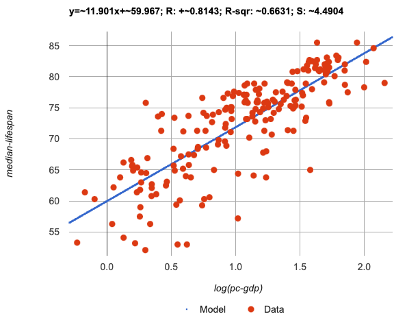 Just like in Desmos, transforming the
 pc-gdp column with a log function produces a scatter plot showing a linear pattern in the data!
Pyret’s lr-plot tool computes the best possible linear model for our transformed data:
y = 11.9011x + ~59.967
Our S has dropped to 4.49, showing a much better correlation than before.
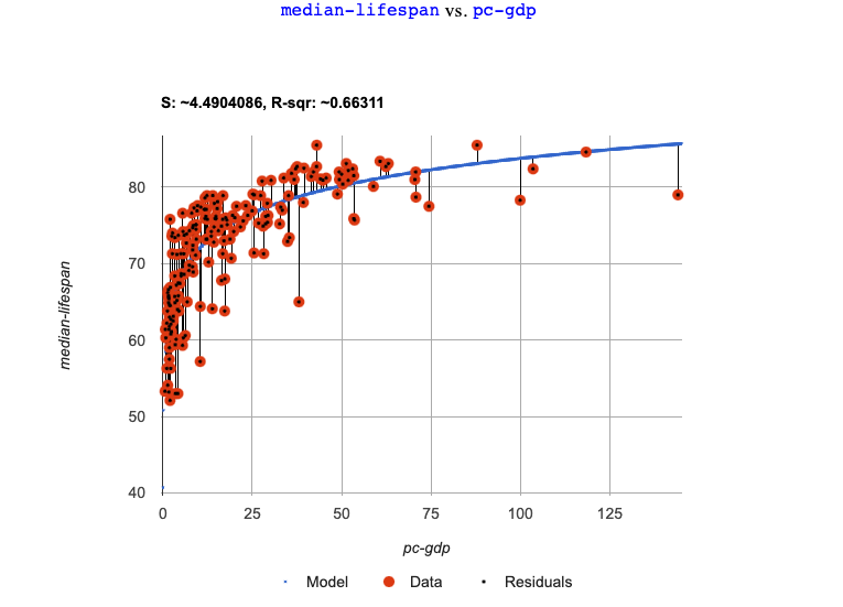 From Transforming the Data, we know that the coefficients used in the transformed, linear model are the same ones used in the logarithmic, un-transformed model:
logarithmic3(x) = 11.9011 log10(x) + 59.967
fun logarithmic3(x): (11.9011 * log(x)) + 59.967 end
The resulting logarithmic model can be fit to our original scatter plot, showing a much better fit than our 2-point-derived estimates.
-
How do you interpret this model?
Optional Activity: Guess the Model!
-
Divide students into teams of 2-4, and have each team come up with a logarithmic, real-world scenario, then have them write down a logarithmic function that fits this scenario on a sticky note. Make sure no one else can see the function!
-
On the board or some flip-chart paper, have each team draw a scatter plot for which their logarithmic function is best fit. They should only draw the point cloud - not the function itself! Finally, students title display to describe their real-world scenario (e.g. - "Age of a Person from Birth to 16 vs. Number of Cells in their Body").
-
Have teams switch places or rotate, so that each team is in front of another team’s scatter plot. Have them figure out the original function, write their best guess on a sticky note, and stick it next to the plot.
-
Have teams return to their original scatter plot, and look at the model their colleagues guessed. How close were they? What strategies did the class use to figure out the model?
-
The coefficients can be constrained to make the activity easier or harder. For example, limiting these coefficients to whole numbers, positive numbers, etc.
-
To extend the activity, have the teams continue rotating so that each group adds their sticky note for the best-guess model. Then do a gallery walk so that students can reflect: were the models all pretty close? All over the place? Were the guesses for one coefficient grouped more tightly than the guesses for another?
-
Synthesize
-
Why is the S-value for our logarithmic model the same as the S-value for our linear model after transforming?
-
Why were our coefficients for linear and logarithmic models the same, even though they were for different terms?
-
Why do you think the relationship between wealth and median lifespan is logarithmic?
-
Suppose all the tech companies in the Bay Area (Google, Apple, Facebook, etc.) decided to secede and form their own country with a
pc-gdpfar, far beyond the range of the rest of the data. Would it be appropriate to use our model to predict themedian-lifespanfor their employees? Why or why not?
-
Is it possible for someone to live to their 6000th birthday?
-
According to our model, is there a
pc-gdpthat would allow someone to live to 6000 years old?-
YES! It’s logarithmic so we’re talking an unimaginable
pc-gdp, but logarithms will keep rising forever.
-
-
If so, should we throw away the model?
-
NO! When building a model from data, a Data Scientist’s job is to find the model that best fits the data. In this case, the best-fit modal happens to be logarithmic - even if it’s biologically impossible!
-
🔗Additional Exercises
For more practice transforming data and programming with filters:
Does Wealth impact lifespan equally if there’s Universal Healthcare? is a guided activity that repeats the Data Science and Linearization techniques used here, but with the idea of exploring the relationship of universal healthcare with respect to wealth and median lifespan.
We are working on collecting more datasets that can be modeled with logarithmic functions so that we can offer students more practice with using linear regression to build logarithmic models.
These materials were developed partly through support of the National Science Foundation, (awards 1042210, 1535276, 1648684, 1738598, 2031479, and 1501927).  Bootstrap by the Bootstrap Community is licensed under a Creative Commons 4.0 Unported License. This license does not grant permission to run training or professional development. Offering training or professional development with materials substantially derived from Bootstrap must be approved in writing by a Bootstrap Director. Permissions beyond the scope of this license, such as to run training, may be available by contacting contact@BootstrapWorld.org.

