Students investigate exponential relationships in data about Covid spread, using an inquiry-based model involving hypothesizing, experimental and computational modeling, and sense-making. They are introduced to table transformations and inverse functions, which are used to fit exponential models onto nonlinear data.
Lesson Goals |
Students will be able to…
|
Student-facing Lesson Goals |
|
Materials |
|
Preparation |
|
🔗Looking for Patterns 45 minutes
Overview
Students explore the covid dataset, focusing on the growth in positive test cases for the state of Massachusetts. They try to fit different kinds of models to it, ultimately discovering the need for models beyond linear and quadratic functions. This section makes heavy use of interactive slider activities we’ve built in Desmos to support open-ended experimentation.
Launch
Starting in 2019, COVID-19 spread across the globe. Most of us heard terms like "flatten the curve" and "infection rate" in videos and on the news.
Even in 2020, very few people could have predicted the impact Covid would have on the world. But Data Scientists who were looking at the data knew differently. Let’s take a look at some of that data!
-
We’re going to look at the daily total of confirmed, positive cases for Rhode Island, Maine, Vermont, New Hampshire, Massachusetts, and Connecticut - all the states formed out of what the English called "New England".
-
Open the Covid Spread Starter File, which imports data from a spreadsheet that looks at the Covid infection rates for New England states from summer 2020 until the end of the year.
-
From the File menu, select "Save a Copy", and click "Run."
-
Working in pairs or small groups, complete Exploring the Covid Dataset.
Why just New England, starting from June 9th?!?
This dataset is available for all 50 states (and Washington, D.C!), but for pedagogical purposes we’ve written the starter file to pull only data from New England.
And even within New England, we’ve artificially constrained this dataset, showing only the data from June 9th to December 26th, 2020. We’ve made this choice in order to showcase the most purely-exponential behavior of the infection curve, for the sake of this lessons' math learning goals.
For students who are farther along in mathematics, we recommend showing them all the data through 2020, starting in January rather than June. The first portion of the infection curve shows a gradual, linear growth pattern before exploding in the Fall of 2020. A purely exponential function will under-predict the growth during this time period by that it adds enormous friction to the modeling goal of this unit!
(The functions necessary to model this kind of growth have multiple terms showing different kinds of growth, and are just out of reach for students right now. Students can return to this unit once they’ve learned about hybrid models in later lessons.)
Based on the strength of your students, we encourage you to choose the data that best fits your learning goals.
To use all available data, open the Covid Spread Starter File and change the source sheet on line 7 from "New England" to "All"
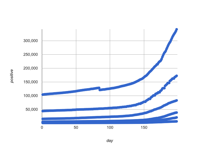
Discuss in groups or pairs, and prepare to share out to the class: - Based on the look of the scatter plot you just made, do you think there’s a strong relationship here? - If we fit a curve or straight line to this data, do you think it would fit the scatter plot well?
Review student answers to confirm that students have made a number of observations:
-
There appears to be more than one relationship in this dataset
-
Every relationship appears to be extremely strong
-
Most/all of these relationships appear nonlinear
Investigate
Let’s start out by looking at just one state. We’ll use Massachusetts for this investigation, but you can do your own investigation about any state you like after finishing this one!
The definition MA-table = filter(covid-table, is-MA) filters our dataset, keeping only the rows for which state = "MA".
Complete Linear Models for MA-table.
-
Did you see a correlation between date and the total number of confirmed, positive cases in this dataset?
-
Yes
-
-
Describe its form, direction, and strength.
-
Sample response: It’s definitely strong and appears to be non-linear. Non-linear functions don’t usually have direction, so not sure about that one.
-
Linear models capture straight-line relationships, where one quantity varies proportionally based on another. In linear models, we expect the response variable to grow by equal amounts over equal intervals in the explanatory variable.
-
Are linear models a good fit for this data?
-
Why or why not?
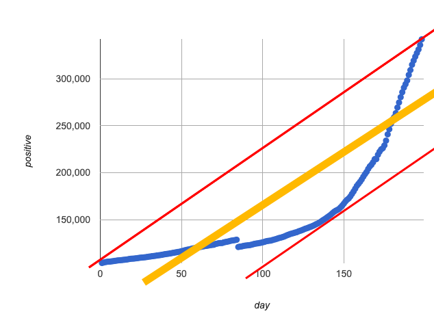 If we make the line go from the start to the peak of the curve (top line), almost all of the points bulge out below our line of best fit. If we make the line hit the bottom of the curve, all the points fall above it (bottom line). Splitting the difference (orange line) is better than both of those options, and we might even get a halfway decent S! But ultimately, straight-line, linear models just don’t behave like this curve, and we’ll never get the best-possible fit with them. The number of positive cases is growing too fast to be fit with a linear model that grows at a constant rate!
Maybe linear isn’t the way to go, here!
Make sure you’ve:
-
Clicked on "pacing" and set your teacher dashboard of Modeling Covid Spread (Desmos) to the first slide so that students are looking at the "Quadratic Models" screen
-
Generated your own link in Desmos for sharing the file with your students
-
Open the Desmos link I shared with you to the Modeling Covid Spread file.
-
You should be on Slide 1 (Quadratic Models).
-
Using the file, complete Quadratic Models for MA-table
Have students share their resulting models. Which one fits best?
Quadratic models capture parabolic relationships, where one quantity varies based on the square of another. In quadratic models, we expect the response variable to grow by differing amounts over equal intervals in the explanatory variable.
-
Are quadratic models a good fit for this data?
-
Why or why not?
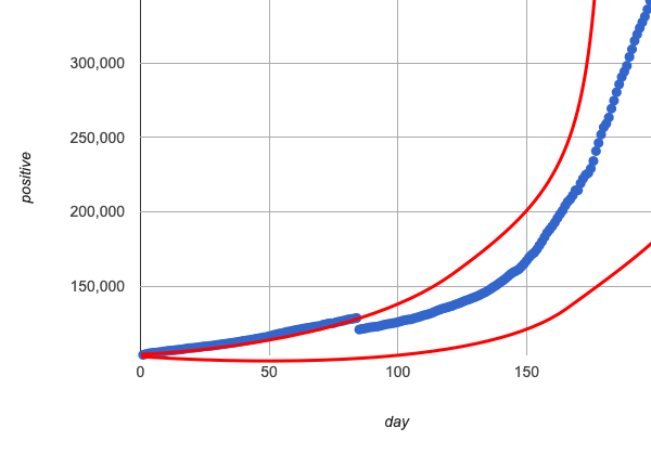 Quadratic models change their rate of growth over time, which definitely makes them a better fit for this data than linear ones. It’s very likely we could find a quadratic model with a lower S-value than our linear model! But this data starts out almost flat and then suddenly takes off like a rocket - quadratic models just don’t have that kind of explosive growth, so our model will never be as good as it could be.
Synthesize
-
This data grows very slowly in the beginning and then grows very quickly. Can you think of any other situations in real life that act like this?
-
Can you think of any math that acts like this?
🔗Exponential Functions 55 minutes
Overview
Having identified that the Covid scatter plot appears neither linear nor quadratic, students learn about characteristics of exponential functions in tabular, graphical, and function notation form.
Launch
Let’s review what we know about the behavior of the models we’ve seen so far:
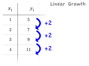 Remember that linear functions grow by fixed intervals, so the rate of change is constant. In the table shown here, each time the x-value increases by 1, we see that the y-value increases by 2. This is true for any set of equal-sized intervals: a line needs to slope up or down at a constant rate in order to be a straight line!
If the "growth" is constant, the relationship is linear.
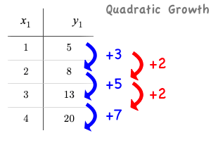 Quadratic functions grow by intervals that increase by fixed amounts! In the table to the right, the blue arrows show a differently-sized jump between identical intervals, meaning the function is definitely not linear! However, if we take a look at the difference between those differences(shown in red), we’re back to constant growth!
If the "growth of the growth" is constant, the relationship is quadratic.
Exponential functions grow even faster than quadratics.
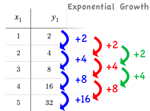 When we calculate the growth between the y-values, we can immediately tell it’s not linear. When we try to calculate the "growth of the growth", we see that it’s not quadratic either.
If we calculate the "growth of the growth of the growth" (shown in green)… we still haven’t found a constant… but we should notice that each of these "growths" just repeats the original pattern of y-values! We could calculate the third difference, fourth difference, and so on - and never reach a stopping point.
Exponential functions grow so rapidly that looking for "what is added to y?" isn’t helpful at all.
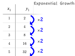
In order to talk about the growth of an exponential function we need to identify the growth factor by asking ourselves "what is y being multiplied by?"
In this case, we can see that the y-values are doubling each time, so the growth factor is 2!
-
Turn to What Kind of Model? (Tables), and decide what kind of pattern is represented in each table.
-
For each table that is growing exponentially, identify the growth factor.
-
Turn to What Kind of Model? (Graphs & Plots), and whether the shape of the scatter plot suggests a linear, quadratic, or exponential relationship.
Investigate
Exponential Functions can be written in the form: f(x) = ab(x - h) + k
Most textbooks only present exponential functions with a horizontal shift of zero. When h=0, we can safely remove it and use this simplified form of the equation: f(x) = abx + k.
Advance your teacher dashboard of Modeling Covid Spread (Desmos) to the second slide ("How does horizontal shift transform exponential functions?") and give students a chance to reinforce their understanding of h-values from other models by connecting it to exponential functions.
Let’s explore what each coefficient of f(x) = abx + k means!
Make sure you’ve advanced your teacher dashboard of Modeling Covid Spread (Desmos) to the third slide ("Exploring Exponential Functions") so that students are looking at the correct screen.
Decide whether you want to debrief this activity with your class after each section or at the end.
-
Let’s return to the Modeling Covid Spread Desmos file.
-
You should now be on the third slide ("Exploring Exponential Functions").
-
Use it to complete Graphing Exponential Models: f(x) = abx + k.
Invite students to consider what new information they have gained by looking at graphical representations rather than tables.
Base b
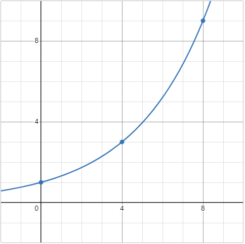
The base of an exponential function (b) must always be positive, because exponential functions grow and decay uniformly.
A negative b would bounce from one side of the y-axis to another.
And, when raised to a fractional power, negative values of b might also lead to things like √!
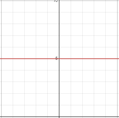
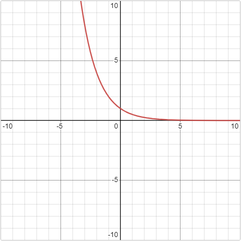
| Exponential Growth | Flat | Exponential Decay |
|---|---|---|
|
|
|
b > 1
|
b = 1
|
0 < b < 1
|
Vertical Shift…and Horizontal Asymptote k
The equation of the horizontal line that an exponential function approaches will always be y = k. This horizontal line is called an asymptote.
Adjusting k shifts the asymptote up and down, along with the rest of the exponential curve that approaches it.
Initial Value a
In exponential function definitions the y-intercept is not represented by a single value (as it would be for linear and quadratic functions).
Since any value raised to the power of zero is 1, when x = 0 in exponential equations, part of the exponential term remains, so we can’t just cross out the other terms and look at the constant term.
For example, the y-intercept for the function below will not be 3 (as you might have expected it to be).
- f(x) = 4(2x) + 3
- f(0) = 4(20) + 3
= 4(1) + 3
= 7
-
So what is the y-intercept of an exponential function?
-
Give students time to discuss…
-
The y-intercept of an exponential function is a + k!
-
If k is "missing", the coefficient a is the initial value where x = 0.
-
If a is "missing", the value of the coefficient is 1.
-
If we don’t see a or k in an exponential equation, the y-intercept of the function is 1.
Exponential growth and exponential decay show up all the time!
Suppose you deposit $100 in a savings account, earning 3% interest each year.
-
How much money would be there after 1 year?
-
$103, because 3% of $100 is $3
-
-
How much is there after 2 years?
-
$106.90, because 3% of $103 is $3.90
-
-
After 3 years?
-
$109.27
-
Every year there’s a little more money to grow, and the total grows faster than the year before. If you start saving early, that $100 will grow into a lot more money down the road!
-
Most cells (e.g. bacteria, the cells in a growing fetus, etc.) divide every few hours, doubling the number of cells each time. A single cell will split into 2, those 2 cells will split to become 4, then 8, then 16, etc: the function cells(hours) grows exponentially.
-
Unstable atomic nucleus decay into stable nuclei over time, emitting ionizing radiation as a byproduct. We use the term half-life to refer to the length of time it takes for 50% of the atomic nuclei in a radioactive sample to decay: the function unstable-atoms(half-lives) decays exponentially.
If you’ve ever heard of something called "interest rate", then you know that sometimes we want to think in terms of percentages instead of factors. When your savings account has a 3% interest rate, it means your money is growing by 3% - a growth factor of 1.03.
Converting between growth rate and growth factor is easy:
b = 1 + r
If a $50,000 car loses 20% of its value each year, the growth rate is - 20%. Modeling this with an exponential function would mean a growth rate b of 1 - .20 = .80, for a function value(years) = $50,000 * (1 + - .20)years = $50,000(.80)years.
In the following activities, students will:
-
identify whether various plots, scenarios, and definitions represent linear, quadratic, or exponential functions
-
think about and apply their knowledge of growth, decay, initial value, and growth factor
Decide whether you’d like to pull your class back together to discuss after each activity or once they’ve completed all three.
-
Let’s practice identifying linear, quadratic, and exponential growth. With your partner, complete:
-
For more practice, complete What Kind of Model? (Descriptions 2)
-
What strategies did you use to decide if a function was linear, quadratic, or exponential?
-
When a function was exponential, how did you recognize whether it was growing or decaying?
-
What new insights did you gain about exponential functions by thinking about them in real-world scenarios?
Have students share their answers, asking them to notice and wonder about the sequences for the exponential examples. How are these sequences growing or decaying? How is that growth or decay different from what they’ve seen before?
Synthesize
-
You looked at several different representations of exponential functions: tables, graphs, descriptions, and equations.
-
Which representation was the most useful for you? Why?
-
Which representation was the least useful for you? Why?
🔗Fitting Exponential Models 30 minutes
Overview
Students extend their sampling techniques to exponential relationships. Students continue experimenting in Desmos, but eventually switch back to Pyret to formalize their understanding.
Launch
Now that you’re familiar with exponential functions, let’s use them to model this Covid data!
-
Make a scatter plot showing the change in positive Covid cases for
MA-table. -
What can you tell about the base b from this plot?
-
What about the initial value a?
-
What about k?
Have students respond to the discussion questions below in pairs or small groups.
-
Does your scatter plot show exponential growth or exponential decay?
-
The scatter plot shows growth. The "hockey stick" is pointing up, meaning that positive cases are increasing.
-
-
Can we make any conclusions about the value of b? Explain.
-
Because we see exponential growth, we know that b must be greater than one.
-
-
Can we make any conclusions about the value of k?
-
Can we make any conclusions about the value of a? Explain.
-
a must be positive, because the curve is consistently above k.
-
Investigate
Make sure you’ve advanced your teacher dashboard of Modeling Covid Spread (Desmos) to the fourth slide ("Exponential Model for MA") so that students are looking at the correct screen. In the next activity, students use Desmos to find promising exponential models, and then fit the model programmatically in Pyret!
-
Let’s return to the Modeling Covid Spread Desmos file.
-
You should now be on the fourth slide ("Exponential Model for MA").
-
Use it to complete the first section of Exponential Models: f(x) = abx + k.
-
Then use Covid Spread Starter File to complete the rest of the page.
-
Is an exponential model a good fit for this data? Why or why not?
On Exponential Models: f(x) = abx + k you’ll see a note about the use of ~1 to tell Pyret to prioritize speed over precision. Unlike most calculators, Pyret usually prioritizes precision.
In a math classroom, this is the difference between 2/3 rendering as 0. or being rounded to 0.666666667.
In data processing, choosing speed over precision can have ethical or technical consequences!
For example:
1) When calculating a path over an extremely long distance, being off by just a billionth of a degree could result in a Mars-bound rocket missing its destination.
2) For an extremely large population like China, rounding to 10 decimal places might result in discounting an entire group of people!
Optional Activity: Guess the Model!
-
Divide students into teams of 2-4, and have each team come up with an exponential, real-world scenario, then have them write down an exponential function that fits this scenario on a sticky note. Make sure no one else can see the function!
-
On the board or some flip-chart paper, have each team draw a scatter plot for which their exponential function is best fit. They should only draw the point cloud - not the function itself! Finally, students title display to describe their real-world scenario (e.g. - "money in a savings account vs. years").
-
Have teams switch places or rotate, so that each team is in front of another team’s scatter plot. Have them figure out the original function, write their best guess on a sticky note, and stick it next to the plot.
-
Have teams return to their original scatter plot, and look at the model their colleagues guessed. How close were they? What strategies did the class use to figure out the model?
-
The coefficients can be constrained to make the activity easier or harder. For example, limiting these coefficients to whole numbers, positive numbers, etc.
-
To extend the activity, have the teams continue rotating so that each group adds their sticky note for the best-guess model. Then do a gallery walk so that students can reflect: were the models all pretty close? All over the place? Were the guesses for one coefficient grouped more tightly than the guesses for another?
-
Synthesize
-
What makes exponential models different from the linear and quadratic models you’ve seen before?
-
Is it always okay for Data Scientists to round off their numbers to speed up computation? Why or why not?
Have students share their predictions for each of the time-spans in question 5.
-
How accurate were your "guesstimates" for your models' predictions after 50 days? (Very accurate? Not accurate at all?)
-
How accurate were your "guesstimates" after 250 days?
-
How accurate were your "guesstimates" after 450 days?
-
How accurate were your "guesstimates" after 550 days?
Chances are, your guesses got less accurate as the number of days increased!
Why was it so much guesstimate the farther out we got, when the number of days was always increasing by a fixed amount?
We are creatures of nature, so our brains are designed to be really good at working with things we see all the time. It’s normal to see groups of 2, 5, or even 10 or 100, and we have a pretty good intuition for comparing group sizes as long as they’re small.
But when numbers grow really, really, really fast…we get lost! Our brains lose track of differences when two numbers get really enormous.
Mathematically, the number line is composed of equal intervals forever. But we don’t actually process it that way at all.
Exponential growth poses a problem for those of us with human brains, because the numbers get so big, so fast that it can be difficult to wrap our heads around it!
This may have played a role in the sluggish response of many countries, and the tragic loss of life and decrease in public health that followed.
Fortunately, there’s another mathematical tool that can help us get control of these wildly gigantic numbers. (Stay tuned!)
🔗(Optional) Why Just One State at a Time?
Overview
Students discuss an example of Simpson’s Paradox, which motivates splitting a dataset into grouped samples using filters. They then discover another motivation for filtering: scatter plots like our covid dataset show multiple correlations, instead of just one. Finally, they learn how to filter a dataset and apply that knowledge to filtering the Covid dataset into samples grouped by state.
Launch
A college is looking at housing data for a sample of students and comparing choices among those students who’ve decided what their major will be to choices made by students who are undecided about their major:
| # On Campus | # Off Campus | % On Campus | |
|---|---|---|---|
Undecided |
120 |
80 |
120/200 = 60% |
Decided |
80 |
100 |
80/180 = 44% |
-
According to the table, how many Undecided Majors live off-campus?
-
80
-
-
How many Decided Majors live on-campus?
-
80
-
-
Who is more likely to live on campus: Decided or Undecided Majors?
-
(Give students time to talk about this, and explain their thinking! )
-
If you’d like to distribute printed copies of this table and the accompanying questions, they are available here.
It looks like the two variables are significantly related: undecided majors are more likely to live on campus than decided ones!
But there’s a third variable hiding in the background: freshmen college students are far less likely to have picked a major than seniors, and they are much more likely to live on campus.
When we filter by this important third variable, it turns out that for both Freshmen and Non-Freshmen, there is no correlation between between deciding on a major and living on- or off-campus.
|
|
What looks like a correlation between having-a-major and living-on-campus is actually a correlation between age and living-on-campus.
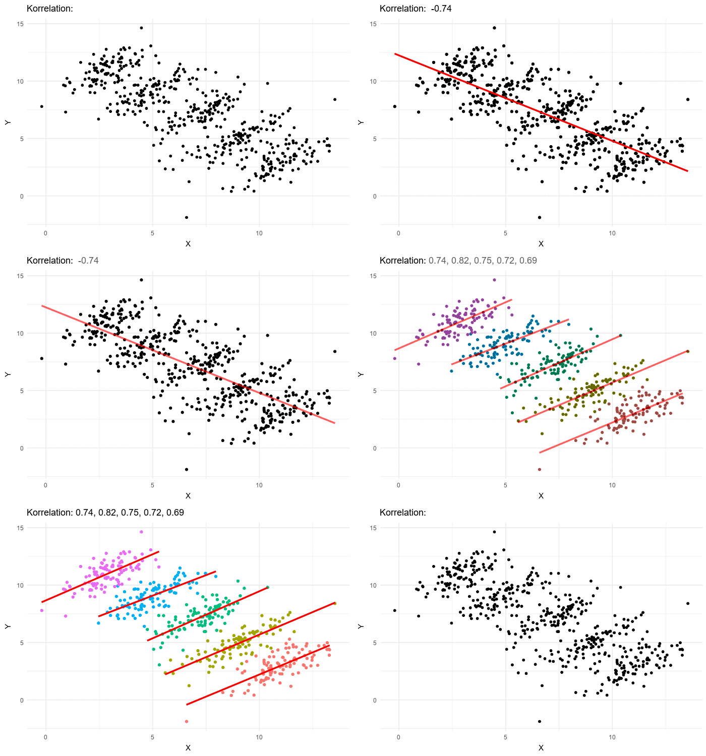 A third variable lurking in the data can play tricks by obscuring relationships between two other variables - or by creating the appearance of a relationship where none exists! Normally we think that the more data we include in our sample the more clearly we’ll see any potential relationships. But in certain circumstances the correlations in our sub-groups cancel each other out when we put the groups together. This is called Simpson’s Paradox.
Simpson’s Paradox: visible trends in sub-groups disappear or even reverse when the groups are combined.
Sometimes filtering the data into subsets is the only way to see what’s really going on. That’s exactly what this starter file does, by filtering the data for Massachusetts only.
Investigate
Datasets like the one used in our Covid Spread Starter File are very difficult to model all at once, because there will always be lots of points that are far from any single function. But it’s not that there’s no relationship between the x- and y-variables. Instead, we have several sub-groups each with their own very strong relationships, and another variable lurking in the background.
In fact, the scatter plot for all our New England states didn’t look much like a scatter plot all! It looks like someone took a marker and drew in five different curvy lines.
-
What do you think might be the variable lurking in the background, which accounts for these separate lines?
-
Give students time to discuss!
-
Diseases spread more rapidly in densely-populated areas, since it’s easier for the infection to jump from one person to another. Unfortunately, we can’t see the density data in our table, so that dimension is missing from our dataset! This is exactly what happened in our college example: we couldn’t see the age of the students, which skewed our interpretation of the scatter plot.
These patterns are so distinct from one another that we’re going to need to make more than one model.
-
We needed to break the Covid data up into grouped samples, so that all of the data for Massachusetts is in one table. We would then do the same for Maine, Rhode Island, etc.
-
How is a grouped sample different from a random sample?
-
A grouped sample is a non-random subset chosen from a larger set. Grouped samples are non-random by design!
-
Make sure you’ve advanced your teacher dashboard of Modeling Covid Spread (Desmos) to the fifth slide ("Exponential Model for VT") so that students will be looking at the correct screen when they are directed to return to Desmos part way through Modeling Other States
-
Working in pairs or small groups, complete Modeling Other States.
-
You will be working with both Covid Spread Starter File and the fifth slide of Modeling Covid Spread Desmos file.
The filter function consumes a Table and a helper function! The helper function is used on every Row of the Table, producing true or false. The filter function takes all the Rows for which the helper produced true, and combines them all into a new table.
While filtering is introduced in this lesson, the primary goal is for students to explore exponential functions. If your students need more practice with filtering - or wish to filter their own datasets - we recommend checking out the Filtering and Building lesson.
Common Misconceptions
It’s extremely common for students to think that filtering a table changes the original table. This is NOT how it works in Pyret! Instead, the filter function always produces a new table, containing only the Rows for which the supplied function evaluates to true.
Synthesize
-
In what other situations would it be useful to filter a dataset?
-
Can you think of other examples where Simpson’s Paradox might arise?
-
When comparing one country’s schools to another’s, a researcher finds that students living in poverty in country A outperform students living in poverty in country B. They also find that the wealthy students in A outperform their wealthy peers in B. In fact, for every income level, country A outperforms country B! But if country B has less child poverty overall, it will still outperform A.
-
Another, thoroughly-explained example involving soft drinks can be found on this web page.
-
These materials were developed partly through support of the National Science Foundation, (awards 1042210, 1535276, 1648684, 1738598, 2031479, and 1501927).  Bootstrap by the Bootstrap Community is licensed under a Creative Commons 4.0 Unported License. This license does not grant permission to run training or professional development. Offering training or professional development with materials substantially derived from Bootstrap must be approved in writing by a Bootstrap Director. Permissions beyond the scope of this license, such as to run training, may be available by contacting contact@BootstrapWorld.org.

