(Also available in CODAP)
Students are introduced to box plots, learn to evaluate the spread of a quantitative column, and deepen their perspective on shape by matching box plots to histogram.
Lesson Goals |
Students will be able to…
|
Student-facing Lesson Goals |
|
Materials |
|
Supplemental Materials |
|
Preparation |
|
Assessments |
@assessments |
🔗How Typical is the Average? 30 minutes
Overview
Students are introduced to the notion of spread in a dataset. They learn about how to use range, quartiles, and interquartile range to talk about variation.
Launch
When we explored measures of center, we determined that the average pet weighs almost 40 pounds.
Once we’ve calculated our summary value, it’s important to ask: How typical is the average?
We’d expect points to deviate from the mean in any sample!
-
Does the average tell us the "typical" weight of animals at the shelter?
-
Maybe!
-
Perhaps all of the pets weigh between 35 and 45 pounds, with every pet close to the mean.
-
But perhaps all of the pets are super small or huge, and none are anywhere near the mean!
-
-
To learn about how evenly distributed the data is we can start by ordering the data from least to greatest. From there we can identify and compute a number of values that will give us more information.
Range
The Range of a Dataset, is the simplest measure of variation we can compute. It is the distance between the Minimum (lowest value) and Maximum (highest value). (Note: the term “Range” means something different in statistics than it does in algebra and programming!)
Range = Maximum - Minimum
It is important that we consider the Range of a Dataset in context.
-
10 years would be a huge age range in an elementary school classroom where all of the students are typically born within the same calendar year and less than 13 years old.
-
But 10 years would be a narrow age range for Cypress trees growing in Louisiana swamps, some of which are 1500 years old.
Quartiles
As we know from our work with Measures of Center, the median is the value that splits the data in half. If it diverges significantly from the mean, the data is skewed.
We can learn more about the distribution by splitting each of the halves of data in half so that we have four equal-sized quarters of data. The boundary points between the equal quarters of data are called quartiles.
If the first quartile does not fall in the middle between the minimum and the median, we know that the data is not evenly distributed. The same is true if the third quartile does not fall in the middle between the maximum and the median.
Interquartile Range (IQR)
Our quartiles allow us to calculate the Interquartile Range(IQR) - the distance spanned by the middle half of the data. It is a more robust measure of variation than the range because it is less susceptible to outliers. Seeing the relative size of the middle quartiles can be more useful than looking at data "on the edge".
IQR = Q3 - Q1
Five-Number Summary
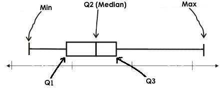
The 5-number Summary combines the quartiles with the minimum and the maximum:
-
Minimum: the smallest value in a dataset - it starts the first quarter
-
Q1 (lower quartile): the number that separates the first quarter of the data from the second quarter of the data
-
Q2 (Median): the middle value (median) in a dataset
-
Q3 (upper quartile): the value that separates the third quarter of the data from the last
-
Maximum: the largest value in a dataset - it ends the fourth quarter of the data
If the data is evenly distributed these 5 numbers will be spaced at consistent intervals, but if the data is clustered, we will see some of these numbers be closer together than others.
Investigate
-
We are going to be looking at the data from 2 family gatherings.
-
The average age at the Watson Family gathering was 70.4 year old.
-
The average age at the Ledet Family gathering was 44.3 years old.
-
-
What images do these statistics conjure in your mind? What do you imagine to be true about the ages of the people in attendance at each of the gatherings?
-
Answers will vary.
-
Some students will likely imagine that all of the people at both of the gatherings are adults.
-
Some students will likely expect that all of the people at the Watson Family Gathering were much older.
-
We are going to find the 5-number summary, range and IQR for 2 datasets. Future reflection will rely upon students having worked through both datasets. If your students tend to need more support, you may want to work with the first dataset as a class and then have students work with the second dataset independently.
Instead of giving the directions below, you can distribute printed copies of Distribution of a Dataset and have students complete the first two sections now. The remaining sections of the page will be completed in another section of this lesson and include number lines for making box plots.
-
Let’s see what we can learn about how typical those averages were by looking at the datasets.
-
Ledet Family Reunion Age Data: 1, 44, 3, 42, 46, 74, 75, 21, 74, 70, 40, 41, 45
-
Rewrite the data in order from least to greatest.
-
Record your five-number summary (Minimum, Q1, Median, Q3, Maximum).
-
Then calculate the IQR and Range.
-
-
Watson Family Gathering Age Data:
70, 68, 69, 72, 65, 75, 65, 78, 70, 72, 71, 70-
Compute the 5-number summary, IQR, and Range.
-
-
What do you notice and wonder about these datasets and the summary values you’ve just computed?
-
Students may notice that the maximum values are pretty close to each other, but the minimum values are very different from each other!
-
Students may notice that Q3 for both datasets is 72.
-
Students may notice that the median value for the Watson family data is a number that isn’t in the dataset, whereas the median value for the Ledet family data is a number that’s in the dataset.
-
Students may have questions about how to calculate the median and/or quartiles.
-
Synthesize
-
What is a quartile?
-
One of the three boundary points that splits our dataset into four equal quarters.
-
-
Why is the IQR a more robust measure of variation than the range?
-
Because it focuses on the middle half of the data, so is less susceptible to outliers.
-
Want to check student mastery of the content you’ve just taught? Administer Box Plots Checkpoint 1 (Desmos) to get a snapshot of your students' current level of mastery. Make sure you have created a link or code for your class to the assessment.
If you’d prefer to wait until your students have completed the entire lesson to check mastery, we also offer a cumulative assessment at the end of Connecting Box Plots and Histograms, the last section of the lesson.
🔗Box Plots - Displaying our Five-Number Summary
Overview
Students plot five-number summaries as box plots before learning to make box plots in pyret.
Launch
To visualize the 5-number summary, the Range, and the Interquartile Range we can plot the five numbers on a number line and connect them to make a box plot.
-
First, make a vertical line on the number line for each of the 5 points.
-
Then make a box connecting Q1 to Q3. This box contains the middle half of the data (IQR).
-
Make sure the line you drew for the median is tall enough to split the box into 2 parts (not necessarily equal!)
-
Make a horizontal line (called a "whisker") connecting each end of the box to the minimum / maximum value. This helps us to visualize the full range of the data.
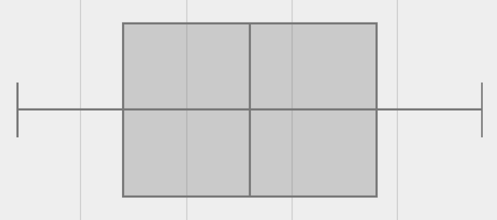
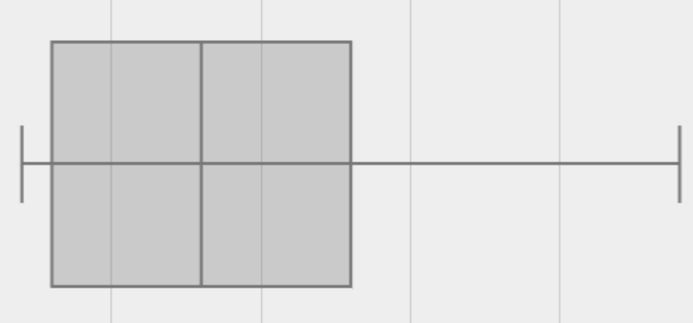
Box plots display how the four equal quarters of data are spread out along the number line.
No matter what shape the box plot has, all four sections contain exactly the same number of points.
When the points are evenly distributed, the four sections of the box plot will be equal in size, but we will rarely see a box plot with four equal sections!
When we see that some of the sections are narrow and others are wider, we know that the narrow sections are packed more densely.
-
Which quarter of data is packed the densest in this box plot?
-
The third one
-
-
Which quarter of the data is the most dispersed in this box plot?
-
The fourth one
-
Investigate
If you printed and distributed copies of Distribution of a Dataset, direct students to complete the page now.
-
Let’s practice making box plots with the data from the family gatherings.
-
Find the page where you recorded the 5-number summaries.
-
Make a number line from 0 to 80, with labeled intervals every 10 years.
-
Plot each of the values from the Ledet Family 5-number summary on the number line.
-
Draw a box around the IQR (connecting Q1 to Q3 with a line for Q2 splitting the box into 2 sections)
-
Draw whiskers connecting the box to the minimum and the maximum.
-
-
Make a second number line from 0 to 80, with labeled intervals every 10 years.
-
Use the Watson Family 5-number summary to make a box plot.
-
The box plots should look like this:
Ledet: 
Watson: 
-
The average age at the Watson Family gathering was 70.4 year old.
-
The average age at the Ledet Family gathering was 44.3 years old.
-
For which family was the average age more typical?
-
For the Watson family gathering because the data is more closely clustered, the Range and IQR are significantly smaller, and the mean and median are much more similar.
-
-
How did making the box plots help you to understand the data?
-
What else do you notice and wonder?
Synthesize
-
Box plots have four sections. What has to be true about all of those sections?
-
They each have to contain exactly one quarter of the data, no matter how different the sections look on the number line.
-
-
Why isn’t the median always in the middle of the box?
-
Because the median has to split the data itself in half and the quarter of the data to the left of the median isn’t necessarily clustered as tightly as the quarter of the data to the right of the median.
-
-
What part of the box plot represents the Range?
-
The full width from the end of the left whisker to the end of the right whisker
-
Want to check student mastery of the content you’ve just taught? Administer Box Plots Checkpoint 2 (Desmos) to get a snapshot of your students' current level of mastery. Make sure you have created a link or code for your class to the assessment.
If you’d prefer to wait until your students have completed the entire lesson to check mastery, we also offer a cumulative assessment at the end of Connecting Box Plots and Histograms, the last section of the lesson.
🔗Interpreting Box Plots - Pyret
Overview
Students learn to identify skewed and symmetric data from a box plot before exploring the spread of the "pounds" column in Pyret.
Launch
We know that when the points are evenly distributed across the range, the four sections of the box plot will be equal in size. But, it’s very rare for the distribution of real world datasets to be uniform like this! (And, even when we see a box plot with four equally wide quarters, we cannot assume that the points are evenly distributed within each of the quarters.)
What shapes are box plots likely to come in and how do we describe them?
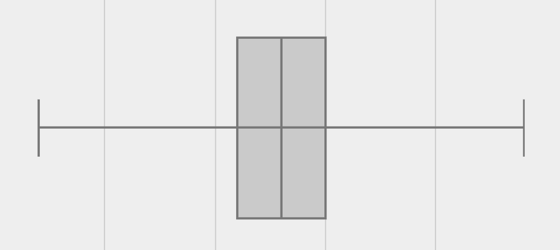
Symmetric
The spread of any dataset with roughly the same amount of variation on the low end as on the high end can be described as symmetric.
|
|
|
An example of symmetric variation might be the weights of newborn babies: the distribution for those who are smaller than average might mirror those who are bigger than average.
Skew
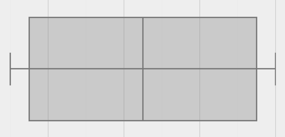
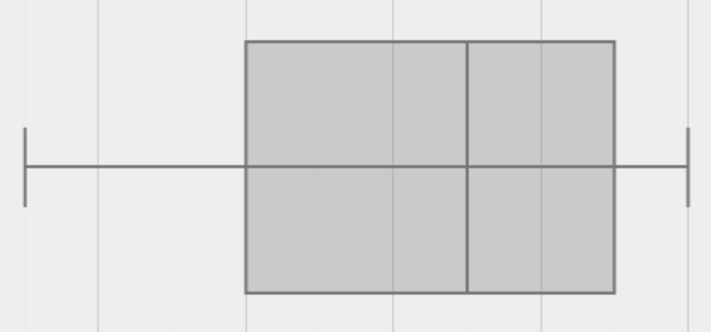
Left and right skew are easy to identify from a quick glance at a box plot, by their longer whiskers trailing off toward the left or right, respectively. Longer whiskers indicate the potential of outliers.
|
|
An example of left skew could be:
-
the weights of the cousins in a family, with the newborn as an outlier.
(Did you know that babies are supposed to triple their weight in the first year of their lives?!)
Examples of right skew could include:
-
the distribution of maximum heights reached during gymnastics floor routines, with Simone Biles as an outlier, reaching over 9 feet in the air!
-
the distribution of time it takes to get from the subway to the street, with people using strollers and wheelchairs as outliers, because they have to wait for elevators while everyone else can use the stairs and escalators.
-
Let’s practice identifying the shape of data from box plots!
-
Turn to Identifying Shape - Box Plots.
Investigate
Let’s see what we can learn about the spread of the data in the pounds column by making a box-plot!
Below is the Contract for box-plot.
# box-plot :: (Tabletable-name, Stringcolumn) -> Image
-
Log into code.pyret.org (CPO), open your saved "Animals Starter File" and click "Run". If you don’t have the file, you can open a new one.
-
Turn to Summarizing Columns with Measures of Spread and follow the directions to complete the Summarizing the Pounds Column section.
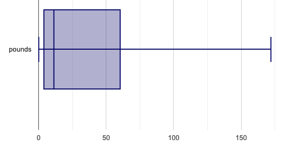
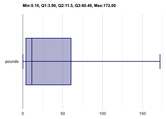
Students will type box-plot(animals-table, "pounds") into the Interactions Area and use the resulting box plot to fill in the five-number summary for the pounds column, and sketch the box plot.
-
What conclusions can you draw about the distribution of values in this column?
-
While the animals' weights range from 0.1 pounds to 172 pounds, 50% of the animals weigh 11.3 pounds or less. The animal that weighs 172 pounds may be an outlier.
-
-
Now that we’ve explored the spread of the dataset, do you think the mean is the best measure of center for the animals' weights?
-
No. Most of the animals weigh far less than the average weight (of nearly 40 pounds)!
-
-
If Q1 is the value for which 25% of the animals weighed that amount or less, what does Q3 represent?
-
The third quartile is the value for which 75% of the animals weighed that amount or less. Another way of saying that would be that it is the value for which 25% of the animals weigh that amount or more.
-
-
Why do you think this display is sometimes called a "box and whisker plot"?
-
The distance between Min/Q1 and Q3/Max is drawn like whiskers!
-
-
Could we make a box plot for every column in the data set?
-
No. We can only make box plots for quantitative columns.
-
If students are struggling to write conclusions, go over the following five number summary from the box plot they made.
-
Minimum (the left “whisker”) - the smallest value in the dataset . In our dataset, that’s just 0.1 pounds.
-
Q1 (the left edge of the box) - computed by taking the median of the lower half of the values. In the pounds column, that’s 3.9 pounds.
-
Q2 / Median value (the line in the middle), which is the middle Quartile of the whole dataset. We already computed this to be 11.3 pounds.
-
Q3 (the right edge of the box), which is computed by taking the median of the upper half of the values. That’s 60.4 pounds in our dataset.
-
Maximum (the right “whisker”) - the largest value in the dataset . In our dataset, that’s 172 pounds.
Choose another quantitative column to summarize and complete the second half of Summarizing Columns with Measures of Spread
Other Box Plots
If you’re trying to compare two box plots, you might like them both to appear on number lines using the same scale. Pyret has a function for the that:
# box-plot-scaled :: (Tabletable-name, Stringcolumn, Numberlow-end, Numberhigh-end) -> Image
More Statistics-based or Math-oriented classes will also be familiar with modified box plots (video explanation), which remove outliers from the box-and-whisker and draw them as asterisks outside of the plot. In Pyret, we can make them using the following contracts:
# modified-box-plot :: (Tabletable-name, Stringcolumn) -> Image
# modified-box-plot-scaled :: (Tabletable-name, Stringcolumn, Numberlow-end, Numberhigh-end) -> Image
Finally, if you’d prefer to use vertical box plots, Pyret as the following contracts:
# vert-box-plot :: (Tabletable-name, Stringcolumn) -> Image
# modified-vert-box-plot :: (Tabletable-name, Stringcolumn) -> Image
# modified-vert-box-plot-scaled :: (Tabletable-name, Stringcolumn, Numberlow-end, Numberhigh-end) -> Image
Common Misconceptions
It is extremely common for students to forget that the quartiles divide the data into quarters, each of which includes 25% of the dataset. This will need to be heavily reinforced.
Synthesize
-
Is it safe to assume that the average typical?
-
No. It is sometimes typical. But sometimes there’s a lot of variation or skew in the data.
-
-
What percentage of points fall in the first quarter?
-
25%
-
-
What percentage of points fall in the second quarter?
-
25%
-
-
What percentage of points fall in the third quarter?
-
25%
-
-
What percentage of points fall in the fourth quarter?
-
25%
-
-
What percentage of points fall in the Interquartile Range (IQR)?
-
50%
-
-
What percentage of points fall within the Range?
-
100%
-
Want to check student mastery of the content you’ve just taught? Administer Box Plots Checkpoint 3 (Desmos) to get a snapshot of your students' current level of mastery. Make sure you have created a link or code for your class to the assessment.
If you’d prefer to wait until your students have completed the entire lesson to check mastery, we also offer a cumulative assessment at the end of Connecting Box Plots and Histograms, below.
🔗Connecting Box Plots and Histograms 30 minutes
Overview
Students learn how to connect this visualization of spread to what they know about histograms.
Launch
Box plots and histograms give us two different views of the shape of quantitative data.
|
|
-
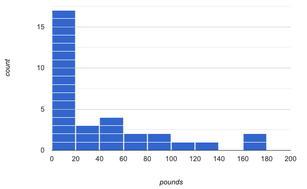
Take a minute to look at these two visualizations we’ve made for the "pounds" column and try to connect them in your mind.
-
How would you explain the differences in how the data gets displayed?
| Intervals | Data points per Interval | Skew presents as | |
|---|---|---|---|
Box Plots |
Variable |
Fixed - 25% of the data in each Interval |
A longer "whisker" or |
Histograms |
Fixed Bins |
Variable - Points “pile up in bins”, |
A long tail of |
Kinesthetic Activity
Divide the class into groups, and give each group a ruler and a ball of play-dough. Have them draw a number line from 0-6 with the ruler, marking off the points at 0, 3, 4, 4.5 and 6 inches. Have the groups roll the dough into a thick cylinder, divide that cylinder in half, and then split each half to form four equally-sized cylinders. The play-dough represents a sample, with values divided into four quarters.
Box plots stretch and squeeze these equal quarters of the data across a number line, so that they fit into their respective intervals. On their number line, students have intervals from 0-3, 3-4, 4-4.5, and 4.5-6. Have students shape their cylinders into rectangles that fill each of these intervals, and are all about 1 inch thick.
Students should notice that the play-dough is taller for shorter intervals and thinner for longer intervals. Even though a box plot doesn’t show us the thickness of the data points, we know that a small interval has the same amount of data "squeezed" into it as a large interval has spread across it.
Investigate
-
Use what you’ve learned about how box plots and histograms display data differently to complete Matching Box Plots to Histograms.
-
With a partner, complete the Box Plot Vocab Concept Map and see if you can draw connections between these concepts!
-
Complete Reading Box Plots to practice matching box plots to a written description of a distribution.
-
Complete Matching Box Plots to Histograms 2 and/or the Matching Box Plots to Histograms slide of Box plot practice (Desmos)
Now that you have the skills to interpret box plots, complete Data Cycle: Shape of the Animals Dataset.
Synthesize
-
How are histograms and box plots similar?
-
How are they different?
-
What can we learn from box plots that we can’t learn from a histogram?
Want to check student mastery of the content you’ve just taught? Administer Box Plots Checkpoint 4 (Desmos) to get a snapshot of your students' current level of mastery. Make sure you have created a link or code for your class to the assessment.
Alternatively, we offer a compilation of all four Checkpoints in Box Plots Cumulative Assessment (Desmos).
🔗Data Exploration Project (Box Plots) flexible
Overview
Students apply what they have learned about box plots to their chosen dataset. They will add three items to their Data Exploration Project Slide Template: (1) at least two box plots, (2) the corresponding five-number summaries, and (3) any interesting questions they develop.
To learn more about the sequence and scope of the Exploration Project, visit Project: Dataset Exploration. For teachers with time and interest, Project: Research Capstone is an extension of the Dataset Exploration, where students select a single question to investigate via data analysis.
Launch
Let’s review what we have learned about making and interpreting box plots.
-
Does a box plot display categorical or quantitative data? How many columns of data does a box plot display?
-
Box plots display a single column of quantitative data.
-
-
How are box plots similar to histograms? How are they different?
-
Box plots and histograms give us two different views on the concept of shape. Histograms have fixed intervals ("bins") with variable numbers of data points in each one. Box plots have variable intervals ("quartiles") with a fixed number of data points in each one.
-
-
A box plot lets us visualize the five-number summary. What does the five-number summary tell us about the column of data?
-
The five-number summary includes the minimum, medium, and maximum. It also includes the median of the lower half of the values, and the median of the upper half of the data points.
-
Investigate
Let’s connect what we know about box plots to your chosen dataset.
Students have the opportunity to choose a dataset that interests them from our List of Datasets in the Choosing Your Dataset lesson.
-
Open your chosen dataset starter file in Pyret.
-
Remind yourself which two columns you investigated in the Measures of Center lesson and make a box plot for one of them.
-
What question does your display answer?
-
Possible responses: How is the data for a certain column distributed? Are the values close together or really spread out? Are there any outliers?
-
-
Now, write down that question in the top section of Data Cycle: Shape of My Dataset
-
Then, complete the rest of the data cycle, recording how you considered, analyzed and interpreted the question.
-
Repeat this process for the other column you explored before (and any others you are curious about).
If students want to investigate new columns from their dataset, they will need to copy/paste additional Measures of Center and Spread slides into their Exploration Project and calculate the mean, median and modes for the new columns.
Confirm that all students have created and understand how to interpret their box plots. Once you are confident that all students have made adequate progress, invite them to access their Data Exploration Project Slide Template from Google Drive.
-
It’s time to add to your Data Exploration Project Slide Template.
-
Find the box plot slide in the "Making Displays" section and copy/paste your first box plot here. Duplicate the slide to add your other box plots.
-
Add the five-number summaries from these plots to the corresponding "Measures of Center and Spread" slides.
-
Be sure to also add any interesting questions that you developed while making and thinking about box plots to the "My Questions" slide at the end of the deck.
Synthesize
-
What shape did you notice in your box plots?
-
Did you discover anything surprising or interesting about your dataset?
-
What, if any, outliers did you discover when making box plots?
-
When you compared your findings with others, did you make any interesting discoveries? (For instance: Did everyone find outliers? Was there more or less similarity than expected?)
These materials were developed partly through support of the National Science Foundation, (awards 1042210, 1535276, 1648684, 1738598, 2031479, and 1501927).  Bootstrap by the Bootstrap Community is licensed under a Creative Commons 4.0 Unported License. This license does not grant permission to run training or professional development. Offering training or professional development with materials substantially derived from Bootstrap must be approved in writing by a Bootstrap Director. Permissions beyond the scope of this license, such as to run training, may be available by contacting contact@BootstrapWorld.org.

