Students define row-consuming functions and combine them with advanced display contracts to create compelling data displays. This project supports the learning goals of Advanced Displays.
Lesson Goals |
Students will be able to…
|
Student-facing Lesson Goals |
|
Materials |
|
Supplemental Materials |
|
Key Points for the Facilitator |
|
🔗Beautiful Data Project flexible
Students advance their programming skills by using code to add their own flair and style to data that matters to them.
Launch
Data visualization is where data science and creativity mix. Data displays are meant to tell a story, and storytelling is an art form!
Take a moment to explore the resources below, and choose one display that really interests you:
Allow students ample time to check out the provided resources. You might consider inviting a few students to share their reflections on the varying displays.
We recommend printing and distributing the student-facing Rubric: Beautiful Data to help students understand the scope of the project and your expectations at the outset. Teachers are welcome and encouraged to edit and adapt the rubric for their unique classroom context.
On Beautiful Data: Reflect and Plan, respond to the first two questions.
Today, you’re going to get a chance to create your own customized data visualization - one that connects artistic expression to data in ways that are relevant and meaningful.
The first step is to find your data!
-
Choose a dataset that interests you - or one that you’re already working with - and use
bar-chart,pie-chart,histogram, orscatter-plotto create a display. -
Write down a title for the display you created on Beautiful Data: Reflect and Plan, Q3.
-
Respond to Q4: What does this display show? Why would it be interesting to someone else?
Investigate
 Once students have created a basic display, things start to get interesting!
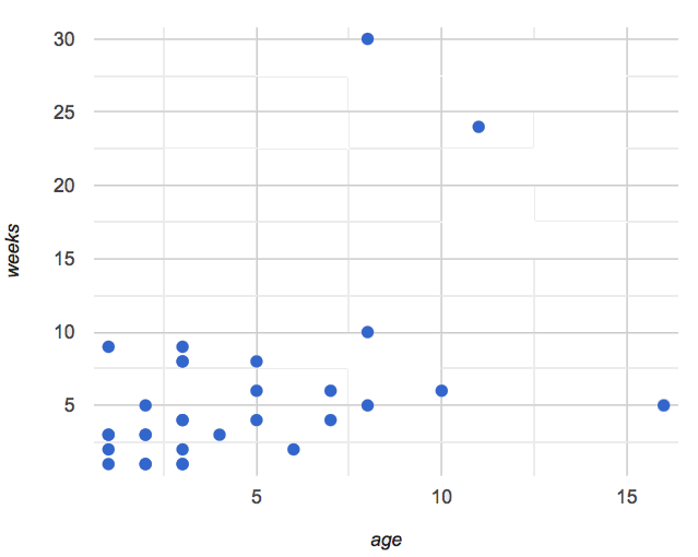
The scatter plot on the right suggests a moderate correlation between age and weeks: older animals take longer to be adopted, but it’s not as direct a connection as others might think! It’s time to get curious, and ask ourselves: What data is missing?
In the above scatter plot, we might wonder whether the species matters, how big the animal is, or whether or not it’s fixed. This gives us both an observation and a more advanced question to ask about our data: Different species of animals have very different lifespans. Is the correlation between age and adoption time different for each species?
-
Think about at least two columns that might give you more insight into your data, and why those other columns matter in the display(s) you’ve chosen.
-
Write the observations and questions in Beautiful Data: Reflect and Plan for Q5.
 Age v. Weeks Scatter Plot, labeled by species
Once we wrote code to add the species column to our data display by customizing the dots, we saw some interesting results!
Age v. Weeks Scatter Plot, labeled by species
Once we wrote code to add the species column to our data display by customizing the dots, we saw some interesting results!
Right away, we could see that cats and dogs take longer to be adopted based on their age, but the impact of each extra year is much smaller for cats than for dogs. It’s almost like we have two stronger correlations in the same display: the line for dogs slopes up more steeply, and the line for cats is more gentle. When all the dots looked the same, these lines blurred each other out to create one weak-to-moderate correlation.
-
In your Pryet file, define a row-consuming function that produces custom images for each Row in your dataset using your new column(s).
-
Use that row-consuming function to create a data display that makes the data pop and really shows the deeper patterns at work.
-
Write a paragraph about how your custom display uses visual cues to enhance the display. As in our animals example, write about what new insights you gained and why you couldn’t see them in the original display.
Finally, students publish and submit their completed worksheets and program links. Specify how you would like students to submit Pyret files. Email, a form, or any SMS that allows students to share links (ie, Google Classroom or Schoolology) will work.
Synthesize
-
Encourage students to self-assess and revise their work. Peer review is a powerful tool if time allows! The rubric is a useful resource for facilitating both self and peer review.
-
Finally, celebrate students' work! In many instances, students will want to share their project, given how much time they have invested. Class or public presentations can instill a sense of pride.
These materials were developed partly through support of the National Science Foundation, (awards 1042210, 1535276, 1648684, 1738598, 2031479, and 1501927).  Bootstrap by the Bootstrap Community is licensed under a Creative Commons 4.0 Unported License. This license does not grant permission to run training or professional development. Offering training or professional development with materials substantially derived from Bootstrap must be approved in writing by a Bootstrap Director. Permissions beyond the scope of this license, such as to run training, may be available by contacting contact@BootstrapWorld.org.