Defining functions allows data scientists to create advanced data displays, which expose deeper insight into a dataset. This motivates students to define their own functions and deepen their analysis.
Lesson Goals |
Students will be able to…
|
Student-facing Lesson Goals |
|
Materials |
|
Supplemental Materials |
|
Relevant Resources |
|
- conditional
-
a code expression made of questions and answers
- piecewise function
-
a function that computes different expressions based on its input
- scatter plot
-
a display of the relationship between two quantitative variables, graphing each explanatory value on the x axis and the accompanying response on the y axis
🔗Processing Rows with Functions 20 minutes
Overview
This section motivates the combination of function definition and column lookups, applying algebraic thinking to Data Science. Students review the concepts of column lookups and function definition by writing functions that consume rows and use the value of one column to create an image.
Launch
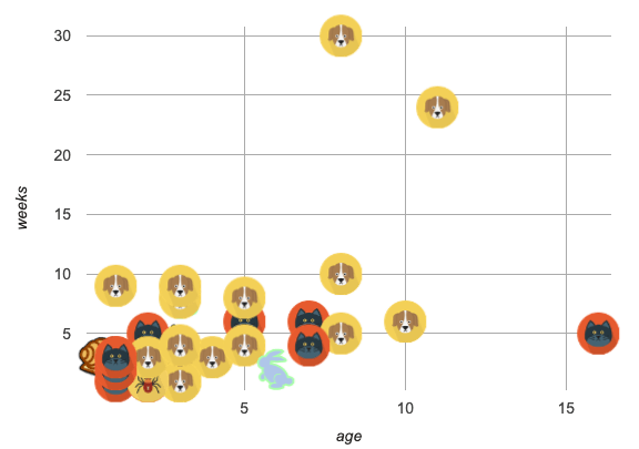
This is a scatter plot of the animals dataset, showing the age on the x-axis and the weeks spent at the shelter on the y-axis.
-
What is different about this plot, from ones you’ve seen before?
-
Sample responses: More colorful, prettier, pictures of animals, etc.
-
This scatter plot isn’t just prettier - it’s also more useful! Scatter plots typically only show two variables from each Row in the Table (the x and y), but this plot is showing us three.
-
What is the third column being visualized here?
-
species
-
To dig deeper into your data, sometimes you need to see more than 2 variables at once! By processing each Row separately, we can make use of all the columns we want to draw beautiful, creative, and insightful data displays. In this lesson, you’ll learn how to do just that.
But how do we process each Row separately? You’ve learned how to take a complex value like a Row, and lookup a column. We could write a line of code that does that for every Row in the table… but that would take a long time and would result in a LOT of code! You’ve also seen how to define functions that consume simple values, and do all the repetitive work for us. Let’s put those two concepts together, and define functions that consume Rows!
Investigate
-
Turn to age-dot, and complete the top half of the page (questions 1 and 2).
-
Compare your answers to some other students'. If you each wrote down different answers, talk about what’s different and what’s the same.
Review student answers. Every student should have the same code for this part!
-
You could imagine doing this for every animal in the shelter, but that would be a lot of very repetitive work. This is exactly what functions are made for!
-
Open your saved Animals Starter File (or start a new one), and type the Contract, Examples, and Definition for
age-dotinto the Definitions Area. -
Click "Run", and make sure your examples pass. Then try using your new function on some of the other Rows defined there, like
lizard-rowandcat-row.
Review the Contract, Examples and Definition with students, making sure to point out the connections between each representation!
-
Turn to species-tag, and complete the top half of the page (questions 1 and 2).
-
When you are confident with the code you have written - check with your teacher or a partner - complete the rest of the page to define a function
species-tag. -
In your Animals Starter File, type the Contract, Examples, and Definition for
species-taginto the Definitions Area. -
Click "Run", and make sure your examples pass. Then try using your new function on some of the other Rows defined there, like
lizard-rowandcat-row.
Synthesize
-
One of the functions we wrote used the
agecolumn, and the other used thespeciescolumn. One is a Number and the other is a String, so why did both functions consume Rows?-
What a function consumes is not the same as the work the function does. Both functions consumed Rows, but one function looked up the
agecolumn - a Number - and the other looked up thespeciescolumn - a String.
-
-
How is this similar to the other functions you’ve defined, like
gtandbc? How is it different?-
It’s similar in that it makes images based on numeric data, from the one argument in its Domain. But instead of that argument being a Number, it’s a Row that contains a Number. So instead of using that input verbatim, the function needs to use a lookup to get that Number out of the Row.
-
🔗Image Scatter Plots 15 minutes
Overview
Students are introduced to image-scatter-plot, which consumes a function and uses it to draw custom images in place of dots. Image scatter plots offer deeper insight into subgroups within a population, motivating students to define their own functions and deepen their analysis.
CS or Programming teachers take note: image-scatter-plot is an example of a higher order function, or a function that consumes another function as its input. Curiosity and creativity combine to motivate more advanced programming.
Launch
Do you think an animal’s weight affects how long it stays at the shelter? Why or why not?
Many apartment buildings have limits on how heavy a pet can be, which could make bigger animals harder to adopt. If we’re looking for a relationship between two variables, we know that we need a scatter plot! Let’s start out by making a scatter plot to look for a relationship between Pounds and Weeks.

There seems to be a positive relationship, but it’s not very strong.
-
What other factors might influence how quickly an animal is adopted?
-
Invite students to share their ideas and explain their rationale. Possible responses: Maybe fixed animals are adopted more quickly. Maybe some species are adopted more quickly. Maybe age plays a role…
-
Let’s say we want to consider the influence of age on how how quickly an animal is adopted - while simultaneously considering the relationship between pounds and weeks to adoption. Fortunately, there’s a way to do this… custom scatter plots!
Investigate
-
Open the Custom Scatter Plot Starter File.
-
With a partner or in small groups, complete Numbers 1-7 on Exploring Image Scatter Plots.
-
Based on the work that you just completed, what is the Contract for
image-scatter-plot?
Discuss as a class, or in small groups. See explanation, below, of the image-scatter-plot Contract.
The Contract for image-scatter-plot looks pretty different from other Contracts we’ve seen.
# image-scatter-plot :: (Tabletable-name, Stringxs, Stringys, (Row -> Image)f) -> Image
This Domain is interesting: Table, String, String and…a Function that consumes a Row and produces an Image!
-
What do you think the resulting custom scatter plot will look like? You may want to refer back to age-dot.
-
Students should make predictions based on their work on age-dot.
-
-
Now complete questions 8, 9, and 10 on Exploring Image Scatter Plots to see the scatter plot that will be generated and then experiment with modifying its code.
-
The scatter plot that will be generated is below.
-
 Pounds v. Weeks, showing the age of each animal
-
Do the bottom portion of the worksheet, which invites you to consider what new insights you can glean from your custom displays.
-
How did having the dots labeled with the species change your understanding of the data?
-
The
species-tagscatter plot (below) makes it clear that we may want to analyze each species separately, rather than grouping them all together. (In the Grouped Samples lesson, students will learn how to do just that!)
-

Custom Colors! We’ve created a special function called
For example, By using row accessors to extract these values from their dataset, students can make custom scatterplots where each data point is represented by a shape whose color indicates something about the data! We could, for example, represent the Animals using the following code:
|
Synthesize
-
What other ways could we use the columns in each row of the Animals Table to pack more information into our scatter plots?
-
Use legs and age to determine width and height of a rectangle
-
Use different colors or shapes based on species, sex, or fixed-status
-
-
How are the charts produced by
image-scatter-plotdifferent from those produced byscatter-plot? Why do these differences exist? (Think about their Contracts!)-
image-scatter-plotconsumes a function that can draw different dots depending on each Row in the dataset, along with information about which columns contain the x- and y-coordinates. In contrast,scatter-plotbecause it only consumes information about where the dots are drawn, and not how they are drawn.
-
-
How might image-scatter-plot be useful to your own analysis?
🔗Piecewise/Conditional Functions 15 minutes
Overview
Students discover how to use conditionals - piecewise functions in math - to create more complex scatter plots, and also custom bar charts, pie charts, and histograms. Experimentation becomes the motivation for more practice with Row-consuming functons.
NOTE: Math teachers may want their students to confront piecewise functions more deeply, and CS teachers may want to spend more time on conditionals. While not a part of the Data Science pathway, the Piecewise Functions and Conditionals lesson includes a lot of supporting material and practice pages for these topics, with greater emphasis on the math connections.
Launch
So far, we’ve seen that…
-
the
scatter-plotfunction makes uniform blue dots -
the
image-scatter-plotfunction can label each point with a custom image, computed by a helper function that consumes a Row and produces an Image
How could we use different color dots for each species? Or perhaps draw different shapes depending on whether an animal was fixed or not?
This requires a more powerful kind of function, known in math as a piecewise function because it has more than one "piece". In programming, these are often called "conditional" functions, because each piece is used depending on which condition is met.
Investigate
-
Can you come up with another piecewise function?
-
What did the function produce for a dog Row?
-
A black square
-
-
What did the function produce for a cat Row?
-
An orange square
-
-
What happened when you took away the condition for snails?
-
An error
-
Piecewise functions are extremely powerful, allowing us to specify different rules for different inputs. But with great power comes great responsibility: if an input has no rule, the function will be undefined for that input! You’ve seen undefined behavior before, where division fails if the second input is zero. Removing the condition for snails, for example, created undefined behavior for all rows where the species is "snail".
else:, which is a catch-all rule for "any input that we don’t already have a condition for". But beware! Teaching kids to use else: without considering the input is a really bad programming habit!
Error messages tell us when something goes wrong. In the case of the animals starter file, we have a fixed, predefined number of species. Adding an else clause will prevent us from seeing any errors if there’s a typo in one of the conditions, if an unexpected animal gets added to the dataset, etc. In situations like this, good programming practice demands a condition for each species, and no else clause.
Optional: When your conditional is already a Boolean
If you have time or students who are ready for a challenge, you can also have them make a scatter plot with dots distinguishing whether the animal is fixed or not using Word Problem: fixed-dot. Students will discover that this is a little different from the other two functions they’ve seen because The following two functions do the same thing. Notice how much cleaner the second example is!
For students who are really into graphics: To take their data displays to the next level, have them check out Animal Images Starter File and Animal Image - Explore. For students who are really ready for a programming challenge: have them open Dots for Value Ranges Starter File and complete Dots for Value Ranges - Explore. |
Pyret allows us to create advanced displays for several types of charts!
# image-scatter-plot :: Table, String, String, (Row -> Image) -> Image
# image-histogram :: Table, String, Number, (Row -> Image) -> Image
# image-bar-chart :: Table, String, (Row -> Image) -> Image
# image-pie-chart :: Table, String, (Row -> Image) -> Image
Optional Project: Beautiful Data Data Visualization is a growing and fascinating field. It’s about more than making charts look cool - it’s about connecting artistic expression to data in ways that are relevant and meaningful. Project: Beautiful Data gives students a chance to advance their programming skills by using code to add their own flair and style to data that matters to them. |
Synthesize
-
How do piecewise functions expand what is possible for displaying data?
-
How could you see this power being used to help express complex relationships?
These materials were developed partly through support of the National Science Foundation, (awards 1042210, 1535276, 1648684, 1738598, 2031479, and 1501927).  Bootstrap by the Bootstrap Community is licensed under a Creative Commons 4.0 Unported License. This license does not grant permission to run training or professional development. Offering training or professional development with materials substantially derived from Bootstrap must be approved in writing by a Bootstrap Director. Permissions beyond the scope of this license, such as to run training, may be available by contacting contact@BootstrapWorld.org.