Students investigate logarithmic relationships in demographic data about countries of the world, using an inquiry-based model, involving hypothesizing, experimental and computational modeling, and sense-making.
Lesson Goals |
Students will be able to…
|
Student-facing Lesson Goals |
|
Materials |
|
Supplemental Materials |
|
Key Points For The Facilitator |
|
- asymptote
-
A straight line to which a curve gets closer and closer - but never touches - as one of the variables approaches infinity.
- form
-
the shape of a relationship between two quantitative variables: whether the two variables together vary linearly or in some other way
- logarithmic relationship
-
A mathematical relation between two variables, x and y, in which a base must be raised to the power of y in order to equal the value of x. When graphed, a logarithmic relationship appears as a reflection of an exponential function across the diagonal line y = x.
🔗Looking for Patterns 30 minutes
Overview
Students explore the Countries of the World Starter File, and find a relationship between wealth and median life expectancy. They also learn how to build a new column for a table in Pyret.
Launch

-
Do you think people living in wealthier countries generally live longer?
-
Open the Countries of the World Starter File
-
From the File menu, select "Save a Copy", and click "Run".
-
Working in pairs or small groups, complete questions 1-6 on Exploring the Countries Dataset.
Be attentive to sense-making: If a wealthy country is suffering heavy casualties in a war, where would we expect to see that country’s datapoint? Why? What other conditions would cause a point to shift up, down, left or right?
Investigate
Working in pairs or small groups, complete the rest of Exploring the Countries Dataset using Fitting Wealth-v-Health (Desmos).
Synthesize
-
What’s the best model you came up with?
-
What kinds of lines or curves did you draw?
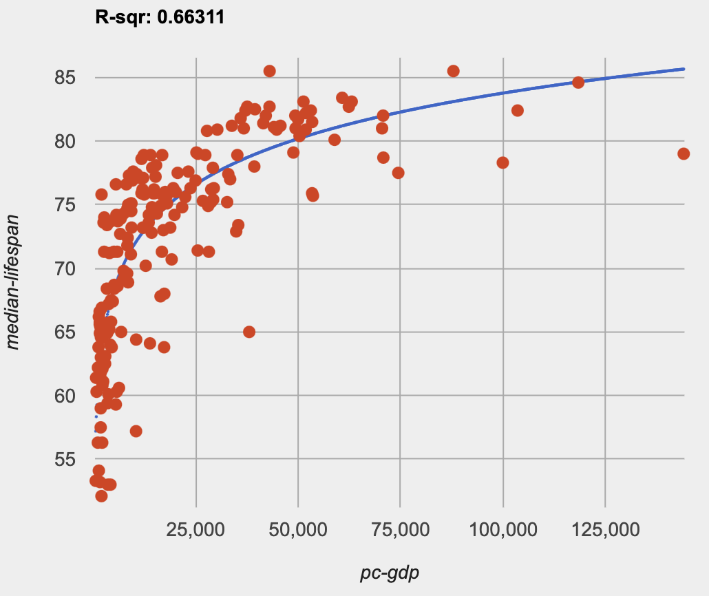
Direct students to look at the scatter plot they created in Pyret of median-lifespan versus pc-gdp.
-
How would you describe the shape of the scatter plot for
median-lifespanversuspc-gdp?-
It starts out rising fast on the left, before tapering off as
pc-gdpincreases to the right.
-
-
How well did our linear, quadratic, and exponential models fit this data?
-
None of the kinds of functions we’ve seen so far exhibit the behavior we see here! In some ways, this behavior is the exact opposite of exponentials: instead of starting slow and taking off like a rocket, this curve explodes up the y-axis right away, before leveling off.
-
🔗Logarithmic Functions 45 minutes
Overview
Having identified that the wealth-v-lifespan scatter plot is neither linear, nor quadratic, nor exponential, students learn about characteristics of logarithmic functions in graphical, tabular, and function notation form.
Launch
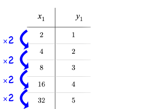
We know that exponential functions grow by equal factors over the same interval, so instead of calculating "what is added to 𝑦", we calculate "what 𝑦 is multiplied by" to produce the next value over a constant interval. |
|
The behavior in this relationship is the reverse of exponential growth: instead of multiplying 𝑦 by a constant factor to find the next value, we need to multiply the size of our x-interval by a constant factor just to get a constant growth in 𝑦! This relationship can be modeled using a logarithmic function. |
|
-
Complete What Kind of Model? (Tables).
-
What strategies did you use to decide if a table represented a quadratic, exponential, or logarithmic function?
-
Was it especially difficult (or simple) to recognize any these function types? Why?
Have students share their answers. For logarithmic functions, it’s especially important to have students talk about how much 𝑥 needs to increase just to get a fixed increase in 𝑦. This foreshadows the idea of base for logarithmic relationships.
Logarithmic relationships - like the ones you identified on tables 1, 4, and 6 - grow or decay very quickly at first, but then level out as 𝑥 increases. Our intervals need to grow longer and longer just to reach a small change in 𝑦. For example, it might take 10 steps to go from 1 to 2, but then a hundred more to get to 3 and a thousand more to get to 4.
Investigate
Logarithmic models have the form 𝑓(𝑥) = 𝑎 log𝑏(𝑥) + 𝑐
Use Exploring Logarithmic Functions (Desmos) to complete the first section ("base") of Graphing Logarithmic Models
Review students answers, and then debrief via class discussion. Invite students to consider what new information they have gained by looking at graphical representations rather than tables.
The base 𝑏 of the logarithm is similar to the base in exponential functions.
-
32 means "calculate 3 to the power of 2", which is 9.
-
log3(9) means "calculate what power 3 should be raised to in order to reach 9", which is 2.
Look back to your answers on What Kind of Model? (Tables). For tables that represent logarithmic functions, by what factor does 𝑥 need to grow in order to get a constant increase in 𝑦?
| logarithm | Translation | Solution |
|---|---|---|
log2(8) |
2 raised to what power is 8? |
3 |
log2(1) |
2 raised to what power is 1? |
0 |
log5(25) |
5 raised to what power is 25? |
2 |
log5(1) |
5 raised to what power is 1? |
0 |
log3(81) |
3 raised to what power is 81? |
4 |
log3(1) |
3 raised to what power is 1? |
0 |
, (Don’t forget — anything to the power of zero is always 1, so the log of 1 will always be zero - for any base!)
Use Exploring Logarithmic Functions (Desmos) to complete the second section ("vertical shift") of Graphing Logarithmic Models
The term 𝑐 is the vertical shift of the function, which moves the curve up or down.
(We’ve seen vertical shifts in other kinds of functions given different names, like 𝑘 for quadratics and 𝑏 for linear function.)
Because loganything(1) = 0
-
the logarithmic term will always be zero at 𝑥=1
-
𝑦 will always be the value of 𝑐 at 𝑥=1
Use Exploring Logarithmic Functions (Desmos) to complete the last section ("logarithmic coefficient") of Graphing Logarithmic Models
The term 𝑎 is called the logarithmic coefficient, which - like 𝑏 - determines how quickly the function grows. Extremely observant students may notice that there’s a relationship between 𝑎 and 𝑏, where the value of 2 log10(10) = log10(102)!
Logarithmic models have a vertical asymptote where the function increases or decreases boundlessly. In this data exploration, the asymptote will always be located on the y-axis (𝑥 = 0).
-
We observed a logarithmic relationship between wealth and lifespan in our Countries of the World dataset.
-
There are lots of relationships like this, where the function grows or decays very quickly at first, but then moves at a glacial pace the farther out it goes.
-
Can you think of any other real-world relationships that logarithmic functions might do a good job modeling?
-
Logarithms are primarily applied in science and technology. It may be a challenge for students to think of relevant examples. We’ve provided one for class discussion, below.
-
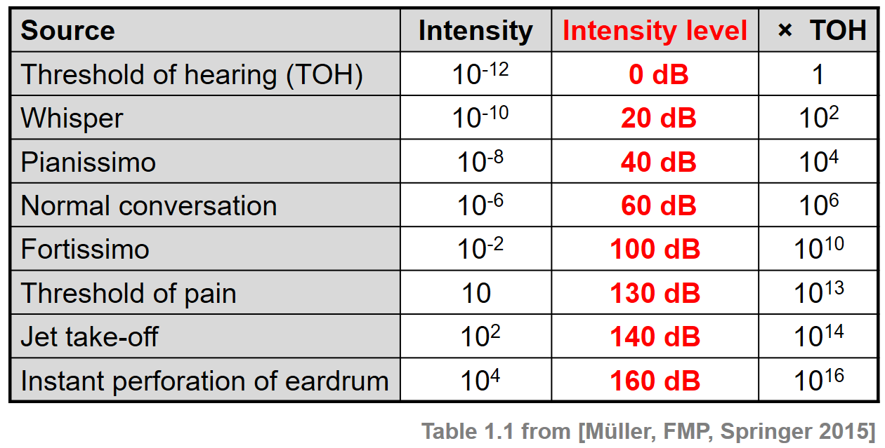
 We measure sound intensity on a logarithmic scale, which proceeds in multiples of 10. The table to the right gives some intensity levels in watts per square meter and in decibels. Our ears can hear incredibly quiet sounds (like a pin dropping), but also process incredibly loud sounds (like a fog horn). A fire alarm, for example, is thousands of times louder than a dog barking, but it’s difficult for our brains to process that much more "loudness". As a result, we also perceive loudness on a logarithmic scale: for us to perceive a sound as being twice as loud as another, it actually has to be a hundred times as loud.
-
Turn to What Kind of Model? (Descriptions) and practice identifying whether the scenarios are best modeled by linear quadratic, exponential, or logarithmic functions.
-
What clues did you use to help you identify which relationships were which?
Have students share their answers. Be especially attentive to students who mis-label logarithmic relationships as "exponential" — the relationship between the two is extremely subtle!
Synthesize
-
What similarities do you see between exponential and logarithmic functions?
-
What differences do you see between exponential and logarithmic functions?
🔗Changing the Scale 30 minutes
Overview
Students discover that when a logarithmic relationship is graphed on an exponential scale, the point cloud appears linear. When trying to use linear regression with those points, however, they are reminded that merely changing the scale of a graph does not actually change the data.
This section builds the foundation for linearization, transforming the points themselves, which students will do in the following section. (Note: this also opens the door for teaching inverse functions!)
Launch
Remember that logarithmic models have the form 𝑓(𝑥) = 𝑎 log𝑏(𝑥) + 𝑐
To fit our logarithmic model, we need to find 𝑎 and 𝑐, such that the model fits the data as closely as possible.
-
Complete the first section of Changing the Scale, using Fitting Wealth-v-Health, Part 2 (Desmos).
-
What values did you come up with for 𝑎 and 𝑐 in your best-guess logarithmic model.
-
Crowdsource and record students' responses on the board.
-
-
Were those values very similar or very different? What were the 𝑅2 values?
Trial-and-error only gets us so far, and it’s not clear that we would ever stumble upon the optimal model. We need something like Pyret’s lr-plot function, which uses computational methods to find the best possible model. Unfortunately, lr-plot only finds linear models!
If only we could transform this data to make it appear linear. Then we could use lr-plot to fit the optimal model, and then reverse the transformation to get the optimal logarithmic model!
Investigate
Imagine that the scatter plot is printed on a sheet of rubber, and can be stretched or squashed in any way we want. Data Scientists often use transformations to stretch their data into shapes that are easier to use, and then reverse the transformation when they are done.
Complete the last section of Changing the Scale, using Fitting Wealth-v-Health, Part 2 (Desmos).
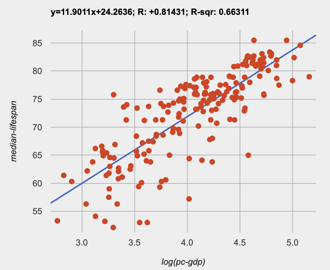
By transforming the x-axis to grow exponentially, we are "squashing" the coordinate plane so that each interval on the x-axis represents 10x the growth in pc-gdp as the one before it. This balances out the logarithmic growth in median-lifespan, makes the curved relationship appear linear, and warps our logarithmic model so it looks like a straight line-of-best-fit.
The following metaphor might help students make sense of this.
-
A person running on a treadmill doesn’t change location. Why not?
-
Their forward movement is balanced by the backwards movement of the treadmill.
-
-
If they run faster and faster, what needs to happen to the treadmill to keep them in the same place?
-
The treadmill needs to go faster as well. As long as the treadmill speed increases at the same rate as the runner, they will balance one another’s growth.
-
-
How is the treadmill example comparable to what we’ve done with our x-axis transformation?
Going Deeper: Connecting to Inverse Functions While this metaphor doesn’t cover inverses in any real depth, the treadmill analogy opens the door to discussing how one kind of change can "cancel out" or "undo" another. We are working to add additional material on inverse functions to our Algebra 2 materials, and hope to release them by Fall 2024! |
Synthesize
-
How does seeing the point cloud as linear help us think about logarithmic growth?
-
Transforming the axes only makes things look linear - the actual points haven’t changed at all, and we still can’t use linear regression to find the best logarithmic model… Can you think of a way we could we transform the data, instead of the axes?
🔗Transforming the Data 45 minutes
Overview
Having discovered that changing the scale of a graph does not allow them to use linear regression, students learn to transform the data into a linear shape, building a new column by applying a function to each row. This new data can be fit with a linear model. By then applying the inverse of this transformation to their computed linear model, they retrieve the logarithmic model.
Launch
We tried changing the scale on the x-axis from linear to exponential, which cancels out the logarithmic behavior by "shrinking the axis". Another strategy is to "shrink the data", by transforming the x-coordinates themselves. Instead of plotting pc-gdp on a logarithmic x-axis, we could plot log(gdp) on a linear x-axis.
-
Complete Transforming the Data, using Fitting Wealth-v-Health, Part 2 (Desmos).
-
What values did you come up with for our coefficients 𝑚 and 𝑏 in your best-guess linear model.
-
Crowdsource and record students' responses on the board.
-
-
Were those values very similar or very different?
-
How close were the values from our best-guess logarithmic model?
-
Students should discover that the values match the coefficients of the logarithmic model as well.
-
Transforming the points instead of the axis has the same visual effect: the dots appear to fall in a straight line. But now we can plot them on a linear-scale axis, and use linear regression to find the best-possible model!
This transformation changed the kind of growth from logarithmic to linear: the term went from 𝑎 log10(𝑥) to 𝑎𝑥. Instead of increasing logarithmically by 𝑎, our new function increases linearly by 𝑎.
Investigate
We transformed the pc-gdp column in three steps:
-
We defined a transformation function, 𝑔(𝑥), which produces the log of whatever it’s given (the
pc-gdpcolumn). -
We defined a new column to use as our x-values, populating it by applying the transformation to each of our original x-values.
-
We displayed these transformed datapoints as a scatterplot.
It’s easy to do the same thing in Pyret!
-
Turn to Logarithmic Models.
-
Complete Part 1, then pause for class discussion.
Address any student questions about the Pyret function they’ve just discovered, build-column. Verify that students have recorded the slope and vertical shift for their regression line. Then, emphasize the key ideas below.
-
At each point in our linear model, 𝑦 is the predicted median lifespan, and 𝑥 is the log of per-capita gdp.
-
We want 𝑥 to represent the original, un-transformed value, simply using per-capita gdp as-is…
-
We’ve learned that:
-
the slope in the transformed, linear model is the same as the log coefficient in the un-transformed logarithmic model
-
the vertical shift in the transformed, linear model is the same as the vertical shift in the un-transformed logarithmic model
-
Now complete Part 2 of Logarithmic Models.
 Just like in Desmos, transforming the
 pc-gdp column with a log function produces a scatter plot showing a linear pattern in the data! Pyret’s lr-plot tool computes the best possible linear model for our transformed data, determining it to have a slope of 11.9011 and a y-intercept of 24.2636. Our 𝑅2 has jumped to 0.66311, showing a vastly better correlation than before.
With the transformation applied, our linear model (in both function and Pyret notation) is:
𝑓(𝑥) = 11.9011𝑥 + 24.2636
fun f(x): (11.9011 * x) + 24.2636 end
 From Transforming the Data, we know that the coefficients used in the transformed, linear model are the same ones used in the logarithmic, un-transformed model:
ℎ(𝑥) = 11.9011 log10(𝑥) + 24.2636
fun h(x): (11.9011 * log(x)) + 24.2636 end
The resulting logarithmic model can be fit to our original scatter plot, showing a much better fit than our 2-point-derived estimates.
Synthesize
-
Why is the 𝑅2 value for our logarithmic model the same as the value for our linear model after transforming?
-
Why were our coefficients for linear and logarithmic models the same, even though they were for different terms?
-
How do you interpret this model?
-
Why do you think the relationship between wealth and median lifespan is logarithmic?
🔗Additional Exercises
For more practice transforming data and programming with filters:
Does Wealth impact lifespan equally if there’s Universal Healthcare? is a guided activity that repeats the Data Science and Linearization techniques used here, but with the idea of exploring the relationship of universal healthcare with respect to wealth and median lifespan.
Coming Soon! We are working on collecting more datasets that can be modeled with logarithmic functions so that we can offer students more practice with using linear regression to build logarithmic models. |
These materials were developed partly through support of the National Science Foundation, (awards 1042210, 1535276, 1648684, 1738598, 2031479, and 1501927).  Bootstrap by the Bootstrap Community is licensed under a Creative Commons 4.0 Unported License. This license does not grant permission to run training or professional development. Offering training or professional development with materials substantially derived from Bootstrap must be approved in writing by a Bootstrap Director. Permissions beyond the scope of this license, such as to run training, may be available by contacting contact@BootstrapWorld.org.


