Students compute the “line of best fit” using linear regression, and summarize linear relationships in a dataset.
Prerequisites |
None |
||||||||||||||||||
Relevant Standards |
Select one or more standards from the menu on the left (⌘-click on Mac, Ctrl-click elsewhere). Common Core Math Standards
CSTA Standards
K-12CS Standards
Next-Gen Science Standards
Oklahoma Standards
|
||||||||||||||||||
Lesson Goals |
Students will be able to…
|
||||||||||||||||||
Student-facing Lesson Goals |
|
||||||||||||||||||
Materials |
|||||||||||||||||||
Preparation |
|
||||||||||||||||||
Supplemental Resources |
Summative Assessment / Capstone: |
||||||||||||||||||
Language Table |
|
- explanatory variable
-
the variable in a relationship that is presumed to impact the other variable
- line of best fit
-
summarizes the relationship (if linear) between two quantitative variables
- linear regression
-
modeling the relationship between two quantitative variables using a straight line
- predictor function
-
a function which, given a value from one data set, makes an educated guess at a related value in a different data set
- response variable
-
the variable in a relationship that is presumed to be affected by the other variable
🔗Intro to Linear Regression 10 minutes
Overview
Students are introduced to the concept of linear regression, and learn how to interpret the slope and intercept. For teachers who have the need and the bandwidth to go deeper, this is a good opportunity to teach the algorithm behind linear regression.
Launch
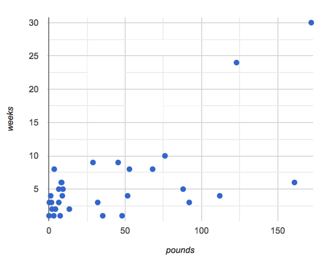
Make two scatterplots from the animals-table, using age as the explanatory variable in one plot and pounds as the explanatory variable in the other. In both plots, use weeks as your response variable and name for the labels. We will refer to the explanatory column as “xs” and the response column as “ys.”
“Can we predict an animal’s adoption time based on its size? Its age?”
Have students write down what they think on What’s on your mind? (Page 81), then quickly survey the class.
weeks-v-pounds scatterplot
 🖼Show image
We are asking if we can use an animal’s size or age to predict how long it will take to be adopted. A scatter plot of adoption time versus size does suggest that smaller animals get adopted in a shorter period of time and larger animals take longer. Similarly, younger animals tend to be adopted faster than older ones. Can we be more precise about this, and actually predict how long it will take an animal to be adopted, based on these factors? And which one would give us a better prediction?
🖼Show image
We are asking if we can use an animal’s size or age to predict how long it will take to be adopted. A scatter plot of adoption time versus size does suggest that smaller animals get adopted in a shorter period of time and larger animals take longer. Similarly, younger animals tend to be adopted faster than older ones. Can we be more precise about this, and actually predict how long it will take an animal to be adopted, based on these factors? And which one would give us a better prediction?
The mean, median, and mode are three different ways to measure the “center” of a dataset in one dimension. Each represents a different way to collapse a bunch of points on a number line into a single, summary value. If the “center” of points on a one dimensional number line is a single point, what is the “center” of points in a two-dimensional cloud, which cluster around a line?
What we need to do is find a line — called a line of best fit, or a regression line — that is at the center of this cloud. Each point in our scatter plot “pulls” on the line, with points above the line yanking it up and points below the line dragging it down. Points that are really far away — especially influential observations that are far out in the x direction —- pull on the line with more force. This line can be graphed on top of the scatter plot as a function, called the predictor function.
Given a value on the x-axis, this line allows us to predict what the corresponding value on the y-axis might be. This allows us to make predictions based on our data.
Is there only one “best line”? Based on methods of calculus, data scientists know the answer to this question is yes! That justifies us talking about a single “line of best fit.”
Data scientists use a statistical method called linear regression to pinpoint linear relationships in a dataset. When we draw our regression line on a scatter plot, we can imagine a rubber bands stretching vertically between the line itself and each point in the plot — every point pulls the line a little “up” or “down”. Linear regression is the math behind the line of best fit.
Going Deeper If you want to teach students the algorithm for linear regression, now is the time! However, this algorithm is not a required portion of Bootstrap:Data Science. |
Investigate
Have students open this Interactive LR Plot.
-
Try moving the blue point “P”, and see what effect it has on the red line.
-
Find the number called r. In your own words, explain what this number tells us.
-
What’s the largest r-value you can get? What do you think that number means?
-
Where can you move it so that it is most aligned with the other points?
-
Where can you move it so that it is least aligned with the other points?
-
Could the regression line ever be above or below all the points? Why or why not?
Let’s explore scatter plots for weeks-v-pounds and weeks-v-age:
weeks-v-pounds scatterplot
🖼Show image
weeks-v-age scatterplot
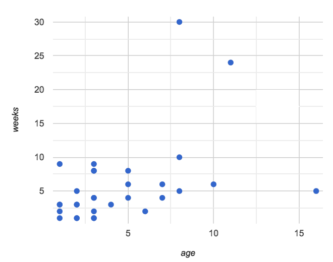 🖼Show image
After looking at the point clouds, we are left with a few questions:
-
Do the relationships appear to be linear for one? Both?
-
If a relationship is linear, what line in particular are the scatter plot points clustering around?
-
What is the r-value for each relationship?
-
Turn to Drawing Predictors (Page 77).
-
In the first column, draw a line of best fit through each of the scatter plots.
-
In the second column, circle whether the slope of the line (which is the same as the direction of the correlation) is positive or negative.
Synthesize
Give students some time to experiment, then share back observations. Can they come up with rules or suggestions for how to minimize error?
-
Would it be possible to have a line that is below all the points? (no)
-
Would it be possible to have a line that is above all the points? (no)
-
Would it be possible to have a line with more points on one side than the other? (yes)
🔗Linear Regression in Pyret 20 minutes
Overview
Students are introduced to the lr-plot function in Pyret, which performs a linear regression and plots the result.
Launch
Pyret includes a powerful display, which (1) draws a scatterplot, (2) draws the line of best fit, and (3) even displays the equation for that line:
# use linear regression to extract a predictor function
# lr-plot :: (t :: Table, ls :: String, xs :: String, ys :: String) -> Image
lr-plot(animals-table, "name", "age", "weeks")
 🖼Show image
lr-plot is a function that takes a Table and the names of 3 columns:
-
ls— the name of the column to use for labels (e.g. “names of pets”) -
xs— the name of the column to use for x-coordinates (e.g. “age of each pet”) -
ys— the name of the column to use for y-coordinates (e.g. “weeks for each pet to be adopted”)
Our goal is to use values of the variable on our x-axis to predict values of the variable on our y-axis.
Pedagogical Note We prefer the words “explanatory” and “response” in our curriculum, because in other contexts the words “dependent” and “independent” refer to whether or not the variables are related at all, as opposed to what role each plays in the relationship. |
Have students create an lr-plot for our animals-table, using "names" for the labels, "age" for the x-axis and "weeks" for the y-axis.
The resulting scatterplot looks like those we’ve seen before, but it has a few important additions. First, we can see the line of best fit drawn onto the plot. We can also see the equation for that line (in red), in the form y = mx + b. In this plot, we can see that the slope of the line is 0.792, which means that on average, each extra year of age results in an extra 0.792 weeks of waiting to be adopted (about 5 or 6 extra days). By plugging in an animal’s age for x, we can make a prediction about how many weeks it will take to be adopted. For example, we predict a 5-year-old animal to be adopted in 0.7925 + 2.285 = 6.245 weeks. That’s the y-value exactly on the line at x=5.
The intercept is 2.285. This is where the best-fitting line crosses the y-axis. We want to be careful not to interpret this too literally, and say that a newborn animal would be adopted in 2.285 weeks, because none of the animals in our data set was that young. Still, the regression line (or line of best fit) suggests that a baby animal, whose age is close to 0, would take only about 3 weeks to be adopted.
We also see the r-value is +0.442. The sign is positive, consistent with the fact that the scatter plot point cloud, along with the line of best fit, slopes upward. The fact that the r-value is close to 0.5 tells us that the strength is moderate. This is consistent with the fact that the scatter plot points are somewhere between being really tightly clustered and really loosely scattered.
Going Deeper Students may notice another value in the lr-plot, called R^2. This value describes the percentage of the variation in the y-variable that is explained by least-squares regression on the x variable. In other words, an R^2 value of 0.20 could mean that “20% of the variation in adoption time is explained by regressing adoption time on the age of the animal”. Discussion of R^2 may be appropriate for older students, or in an AP Statistics class. |
Investigate
-
Make another lr-plot, but this time use the animals' weight as our explanatory variable instead of their age.
-
If an animal is 5 years old, how long would our line of best fit predict they would wait to be adopted? What if they were a newborn, just 0 years old?
-
If an animal weighs 21 pounds, how long would our line of best fit predict they would wait to be adopted? What if they weighed 0.1 pounds?
-
Make another lr-plot, comparing the
agev.weekscolumns for only the cats.
Synthesize
A predictor only makes sense within the range of the data that was used to generate it. Statistical models are just proxies for the real world, drawn from a limited sample of data: they might make a useful prediction in the range of that data, but once we try to extrapolate beyond that data we may quickly get into trouble!
Does the linear regression for our sample of the Animals Dataset allow us to make inferences about the behavior of the larger dataset? Why or why not?
🔗Interpreting LR Plots in Pyret 20 minutes
Overview
Students learn how to write about the results of a linear regression, using proper statistical terminology and thinking through the many ways this language can be misused.
Launch
How well can you interpret the results of a linear regression analysis? Can you write your own?
-
What does it mean when a data point is above the line of best fit?
-
What does it mean when a data point is below the line of best fit?
Investigate
-
Turn to Interpreting Regression Lines & r-Values (Page 78), and match the write-up on the left with the line of best fit and r-value on the right.
-
Turn to Regression Analysis in the Animals Dataset (Page 79) to see how Data Scientists would write up the finding involving cats’ age and adoption time. Write up two other findings from the linear regressions you performed on this dataset.
When looking at a regression for adoption time v. age for just the cats, we saw that the slope of the predictor function was +0.23, meaning that for every year older a cat is, we expect a +0.23-week increase in the time taken to adopt the cat. The r-value was +0.566, confirming that the correlation is positive and indicating moderate strength.
Common Misconceptions
Students often think it doesn’t matter which variable is assigned to be x and which is y in a regression. It’s true that you’ll get the same correlation either way---for example, r=+0.442 whether your scatter plot shows weeks v. pounds or pounds v. weeks. However, the regression line is different, due to the math involved in minimizing vertical distances from the line, not horizontal.
Synthesize
Have students read their text aloud, to get comfortable with the phrasing.
🔗Your Analysis flexible
Overview
Students repeat the previous activity, this time applying it to their own dataset and interpreting their own results. Note: this activity can be done briefly as a homework assignment, but we recommend giving students an additional class period to work on this.
Launch
Now that you’ve gotten some practice performing linear regression on the Animals Dataset, it’s time to apply that knowledge to your own data!
Investigate
-
Write up your findings by filling out Regression Analysis in Your Dataset (Page 80).
-
Students should fill in the Correlations portion of their Research Paper, using the scatter plots and linear regression plots they’ve constructed for their dataset and explaining what they show.
Synthesize
Have students share their findings with the class. Get excited about the connections they are making and the conclusions they are drawing! Encourage students to make suggestions to one another about further analysis.

You’ve learned how linear regression can be used to fit a line to a linear cloud, and how to determine the direction and strength of that relationship. The word “linear” is important here. In the image on the right, there’s clearly a pattern, but it doesn’t look like a straight line! There are many other kinds of statistical models out there, but all of them work the same way: use a particular kind of mathematical function (linear or otherwise), to figure out how to get the “best fit” for a cloud of data.
Project Options: Olympic Records In both this project, students gather data about olympic records over time in running, swimming, or speed skating. They use what they’ve learned in the class so far to analyze the change over time, using scatter plots and linear regression. This project can be used as a mid-term or formative assessment, or as a capstone for a limited implementation of Bootstrap:Data Science. See the project description is available here. (Project designed by Joy Straub) |
🔗Additional Exercises:
These materials were developed partly through support of the National Science Foundation,
(awards 1042210, 1535276, 1648684, and 1738598).  Bootstrap:Data Science by Emmanuel Schanzer, Nancy Pfenning, Emma Youndtsmith, Jennifer Poole, Shriram Krishnamurthi, Joe Politz, Ben Lerner, Flannery Denny, and Dorai Sitaram with help from Eric Allatta and Joy Straub
is licensed under a
Creative Commons 4.0 Unported License.
Based on a work at www.BootstrapWorld.org.
Permissions beyond the scope of this license may be available by contacting
schanzer@BootstrapWorld.org.
Bootstrap:Data Science by Emmanuel Schanzer, Nancy Pfenning, Emma Youndtsmith, Jennifer Poole, Shriram Krishnamurthi, Joe Politz, Ben Lerner, Flannery Denny, and Dorai Sitaram with help from Eric Allatta and Joy Straub
is licensed under a
Creative Commons 4.0 Unported License.
Based on a work at www.BootstrapWorld.org.
Permissions beyond the scope of this license may be available by contacting
schanzer@BootstrapWorld.org.