Students are introduced to box plots, learn to evaluate the spread of a quantitative column, and deepen their perspective on shape by matching box plots to histogram.
Lesson Goals |
Students will be able to…
|
Student-facing Lesson Goals |
|
Materials |
|
Preparation |
|
Supplemental Resources |
Summative Assessments / Capstone: Stress Project (You will also need the Personality True Colors assessment) |
- box plot
-
the box plot (a.k.a. box-and whisker-plot) is a way of displaying a distribution of data based on the five-number summary: minimum, first quartile, median, third quartile, and maximum
- histogram
-
a display of quantitative data that uses vertical bars positioned over bins (sub-intervals); each bar’s height reflects the count or percentage of data values in that bin.
- interquartile range
-
(IQR) is one possible measure of spread, based on dividing a dataset into four parts. The values that divide each part are called the first quartile (Q1), the median, and third quartile (Q3). IQR is calculated as Q3 minus Q1.
- median
-
the middle element of a quantitative dataset
- quartiles
-
three values that divide a dataset into four equal-sized groups
- range of a dataset
-
the distance between minimum and maximum values
- sample
-
a set of individuals or objects collected or selected from a statistical population by a defined procedure
- shape
-
The aspect of a dataset - visible in a histogram or box plot - that describes which values are more or less common.
- spread
-
the extent to which values in a dataset vary, either from one another or from the center
🔗Measures of Spread 30 minutes
Overview
Students are introduced to the notion of spread in a dataset. They learn about quartiles, box plots, and how to use them to talk about spread.
Launch
When you read that the average temperature in Singapore is 80 degrees, it’s important to know whether it’s about 80 degrees year-round or whether there are months when the temperature is over 100 degrees and months when it’s in the 50s. When Data Scientists use the mean of a sample to estimate the mean of a whole population, it’s important to know the spread in order to report how good or bad a job that estimate does.
Suppose we lined up all of the values in the pounds column of the animals dataset from smallest to largest, and then split the line up into two equal groups by taking the median. We can learn something about the spread of the dataset by taking things further: The middle of the lighter half of animals is called the first quartile - or "Q1" - and the middle of the heavier half of animals is the third quartile (also called "Q3"). Once we find these numbers, we can say that the middle half of the animals’ weights are spread between Q1 and Q3.
The first quartile (Q1) is the value for which 25% of the animals weighed that amount or less. What does the third quartile represent?
Besides looking at the median as center, and the spread between Q1 and Q3, we also gain valuable information from the spread of the entire dataset—that is, the distance between minimum and maximum. This is called the range of a dataset. (Note: the term “Range” means something different in statistics than it does in algebra and programming!)
We can use box plots to visualize all of this information. These plots are constructed using just five numbers, which makes them convenient ways to display both center and spread of a dataset in a clear and simple way. Below is the contract for box-plot, along with an example that will make a box plot for the pounds column in the animals-table.
# box-plot :: Table, (unquote String) -> Image
# Consumes a table and the name of the column to plot, and produces a box plotbox-plot(animals-table, "pounds")
Box plots divide our sample into equally-sized groups, and show where those groups are spread thin or clumped together.
Type in this expression in the Interactions Area, and see the resulting plot.
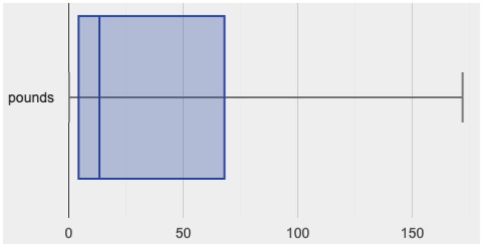
This plot shows us the center and spread in our dataset according to those five numbers.
-
The minimum value in the dataset (at the left of “whisker”). In our dataset, that’s just 0.1 pounds.
-
The First Quartile (Q1) (the left edge of the box), is computed by taking the median of the lower half of the values. In the pounds column, that’s 3.9 pounds.
-
The Median value (the line in the middle), which is the middle Quartile of the whole dataset. We already computed this to be 11.3 pounds.
-
The Third Quartile (Q3) (the right edge of the box), which is computed by taking the median of the upper half of the values. That’s 60.4 pounds in our dataset.
-
The maximum value in the dataset (at the right of the “whisker”). In our dataset, that’s 172 pounds.
Investigate
-
Fill in the five-number summary for the
poundscolumn, and sketch the box plot. -
What conclusions can you draw about the distribution of values in this column?
Data Scientists subtract the 1st quartile from the 3rd quartile to compute the range of the “middle half” of the dataset, also called the interquartile range.
Kinesthetic Activity Divide the class into groups, and give each group a ruler and a ball of playdough. Have them draw a number line from 0-6 with the ruler, marking off the points at 0, 3, 4, 4.5 and 6 inches. Have the groups roll the dough into a thick cylinder, divide that cylinder in half, and then split each half to form four equally-sized cylinders. The playdough represents a sample, with values divided into four quartiles. Box plots stretch and squeeze these equal quartiles across a number line, so that each quartile fills up an interval in that quartile. On their number line, students have intervals from 0-3, 3-4, 4-4.5, and 4.5-6. Have students roll their cylinders so that they fill each of these intervals, retaining a uniform thickness. They should notice that shorter intervals have thicker cylinders, and longer ones have skinny ones. Even though a box plot doesn’t show us the thickness of the datapoints, we can tell that a small intervals has the same amount of data "squeezed" into it as a large interval. |
-
Find the interquartile range of this dataset.
-
What percentage of animals fall within the interquartile range?
-
What percentage of animals fall below the First Quartile? Above the Third Quartile? What percentage fall anywhere between the minimum and the maximum?
Now that you’re comfortable creating box plots and looking at measures of spread on the computer, it’s time to put your skills to the test!
Turn to Interpreting Spread and complete the questions you see there.
Just as pie and bar charts are ways of visualizing categorical data, box plots and histograms are both ways of visualizing the shape of quantitative data. Box plots make it easy to see the 5-number summary, and compare the Range and Interquartile Range. Histograms make it easier to see skewness and more details of the shape, and offer more granularity when using smaller bins.
Left-skewness is seen as a long tail in a histogram. In a box plot, it’s seen as a longer left "whisker" or more spread in the left part of the box. Likewise, right skewness is shown as a longer right "whisker" or more spread in the right part of the box.
Box plots and Histograms can both tell us a lot about the shape of a dataset, but they do so by grouping data quite differently. A box plot is always divided into four parts, which may fall on differently-sized intervals but all contain the same number of points. A histogram, on the other hand, has identically-sized intervals which can contain very different numbers of points.
Turn to Identifying Shape - Box Plots and see if you can describe box plots using what you know about skewness.
Challenge Questions:
- Compare the histograms for the pounds column of both cats and dogs in the dataset. Are their shapes different? How much overlap is there?
- Compare the histograms for the age column of both cats and dogs in the dataset. Are their shapes different? How much overlap is there?
- Can you explain why the amount of overlap between these two distributions is different?
Common Misconceptions
It is extremely common for students to forget that every quartile always includes 25% of the dataset. This will need to be heavily reinforced.
Synthesize
Histograms, box plots, and measures of center and spread are all different ways to get at the shape of our data. It’s important to get comfortable using every tool in the toolbox when discussing shape!
Modified Box Plots More Statistics- or Math-oriented classes will also be familiar with modified box plots (video explanation), which remove outliers from the box-and-whisker and draw them as asterisks outside of the plot. Modified box plots are also available in Bootstrap:Data Science, using the following contract:
|
🔗Comparing Box Plots 15 minutes
Overview
Students assess the degree of visual overlap of two numerical distributions.
Launch
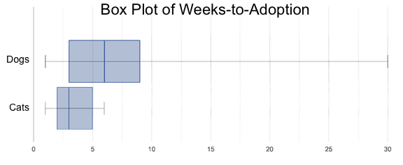
"Do dogs take longer to get adopted than cats?"
This is asking us about the interaction between a categorical variable (species) and a quantitative one (weeks). Instead of creating a whole new display, all we have to do is make separate box plots for the distribution of weeks for both cats and dogs. Note: this works fine as long as we’re sure to use a common scale! Both box plots (see below) share the same axis for adoption times, which ranges from about 1 to 10 weeks.
Box plots make it easy to decide if values of a quantitative variable seem to be mostly similar or mostly different, depending on which group an individual is in. The trick is to train your eyes to look for whether there’s a lot of overlap in the two box plots, or if one is noticeably higher than the other.
Investigate
Have students break into groups of 3-4, and compare the box plot of weeks-to-adoption for cats with the one for dogs. Note: they can generate the pair of box plots themselves, but we recommend simply giving them this image: cats v. dogs
 🖼Show image
-
Do the two box plots mostly overlap, or does one have a noticeably different range than the other?
-
How do the medians compare?
Next, each group examines the pair of box plots that compare weeks to adoption for fixed versus unfixed animals: fixed v. unfixed
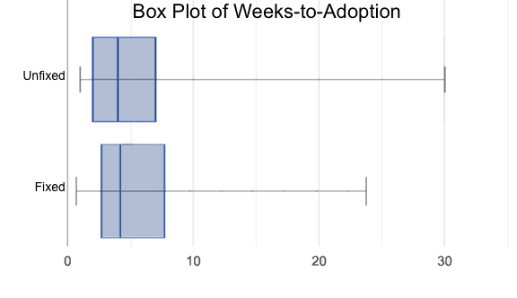 🖼Show image. Once again, consider how similar or different the two plots seem.
-
Do the two box plots mostly overlap, or does one have a noticeably different range than the other?
-
How do the medians compare?
Students should confirm that the box plots for adoption times of unfixed versus fixed animals have more overlap than the box plots for adoption times of cats versus dogs.
Box plots create varying-size bins, which contain a fixed number of datapoints.
This is in contrast to histograms, which have fixed-size bins with varying numbers of datapoints. We can imagine the data as being a pile of pizza dough, divided into four equally-sized quartiles. When the data is tightly packed, the bin is narrow. When it’s spread out, the bin is wide. Histograms show data clusters as tall bars, whereas box plots show clusters as narrow quartiles.
Box plots and histograms give us two different views on the concept of shape.
Histograms: fixed intervals (“bins”) with variable numbers of data points in each one. Points “pile up in bins”, so we can see how many are in each. Larger bars show where the clusters are.
Box plots: variable intervals (“quartiles”) with a fixed number of data points in each one. Treats data more like “pizza dough”, dividing it into four equal quarters showing where the data is tightly clumped or spread thin. Smaller intervals show where the clusters are.
To make connections between histograms and box plots, complete Matching Box-Plots to Histograms, Matching Box-Plots to Histograms and/or Matching Boxplots to Histograms (Desmos)
Synthesize
Referring to our Dogs v. Cats box plots, the dogs’ adoption times were much higher than the cats’; the top half of the dogs’ box plot doesn’t overlap at all with the cats’ box plot. Does this suggest that species does or does not play a role in how long it takes for an animal to be adopted?
Referring to our Fixed v. Unfixed box plots, we saw that adoption times for unfixed and fixed animals overlapped a lot, and the medians were pretty close. Does this suggest that being fixed does or does not play a role in how long it takes for an animal to be adopted?
Which variable seems to have more of an effect on adoption time: species (cat or dog) or whether an animal is fixed or not? Have students share back their findings.
Project Option: Stress or Chill? Students can gather data about their own lives, and use what they’ve learned in the class so far to analyze it. This project can be used as a mid-term or formative assessment, or as a capstone for a limited implementation of Bootstrap:Data Science. The project description is available here (You will also need the Personality True Colors assessment) (Based on the What Stresses Us? project from IDS at UCLA) |
🔗Your Analysis flexible
Overview
Students repeat the previous activity, this time applying it to their own dataset and interpreting their own results. Note: this activity can be done briefly as a homework assignment, but we recommend giving students an additional class period to work on this.
Investigate
-
Take 15 minutes to fill out Shape of My Dataset in your Student Workbook. Choose a column to investigate, and write up your findings.
-
Students should fill in Measures of Center and Spread portion of their Research Paper, using the means, medians, modes, box plots and five-number summaries they’ve constructed for their dataset and explaining what they show.
Synthesize
Have students share their findings with one another.
🔗Additional Exercises:
These materials were developed partly through support of the National Science Foundation,
(awards 1042210, 1535276, 1648684, and 1738598).  Bootstrap by the Bootstrap Community is licensed under a Creative Commons 4.0 Unported License. This license does not grant permission to run training or professional development. Offering training or professional development with materials substantially derived from Bootstrap must be approved in writing by a Bootstrap Director. Permissions beyond the scope of this license, such as to run training, may be available by contacting contact@BootstrapWorld.org.