Image-scatter-plots expose deeper insight into subgroups within a population, motivating the need for more advanced analysis and adding if-expressions to students' programming toolkit.
Lesson Goals |
Students will be able to…
|
Student-facing Lesson Goals |
|
Materials |
|
Preparation |
|
🔗Warmup
Age v. Weeks Scatterplot
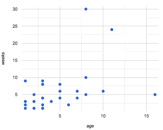 🖼Show image
-
Show students this code, which uses
image-urlandscaleto generate icons of animals. -
What do they Notice? What do they Wonder? How might this scatterplot change our analysis?
-
Have students make a scatter plot of animals, using
ageas the x-axis values andweeksas the y-axis.
(For now, the scatter plot is purely to give students practice with contracts and displays. They are not expected to know much about scatter plots at this point.)
🔗If-Expressions 20 minutes
Overview
Students explore a program that makes use of an if-expression, develop their own understanding, and modify it.
Launch
So far, all of the functions we know how to write have had a single rule. The rule for gt was to take a number and make a solid, green triangle of that size. The rule for bc was to take a number and make a solid, blue circle of that size. The rule for nametag was to take a row and make an image of the animal’s name in purple letters.
What if we want to write functions that apply different rules, depending on the input? For example, what if we want to change the color of the nametag depending on the species of the animal?
Investigate
-
Open the Mood Generator starter file.
-
Complete Mood Generator in your student workbooks.
Synthesize
Have the class share their own explanations for how if-expressions work.
Pyret allows us to write if-expressions, which contain:
-
the keyword
if, followed by a condition. -
a colon (
:), followed by a rule for what the function should do if the condition istrue -
an
else:, followed by a rule for what to do if the condition isfalse
We can chain them together to create multiple rules, with the last else: being our fallback in case every other condition is false.
🔗Better Image Scatter Plots 20 minutes
Overview
Students discover how "dot appearance" can be used to show more data in a scatterplot, and why that would be valuable.
Launch
Suppose we want to make a scatter plot for the Animals Dataset, but with dots taking different colors depending on the species. This would make it possible to see if certain species are "clustered" in different parts of the plot.
Investigate
Have students open Word Problem: species-color. Make sure they all write the Contract and Purpose Statement first , and check in with their partner and the teacher before proceeding.
Once they’ve got the Contract and Purpose Statement, have them come up with examples: for each species. Once again, have them check with a partner and the teacher before finishing the page.
Once another student and the teacher has checked their work, have them type this function into their animals starter files, and use it to make an image-scatter-plot using age as the x-axis and weeks as the y-axis.
Synthesize
Age v. Weeks Scatterplot
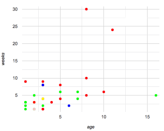 🖼Show image
-
What do you Notice about this scatter plot?
-
What do you Wonder?
What does this new visualization tell us about the relationship between age and weeks? What other analysis would be helpful here?
🔗Closing
Make sure to direct the conversation back to Data Science! Does this scatter plot make us think we should be analyzing animals separately? What other scatter plots might this be useful for?
This scatterplot makes it clear that we may want to analyze each species separately, rather than grouping them all together! In the next lesson, students will learn how to do just that.
These materials were developed partly through support of the National Science Foundation,
(awards 1042210, 1535276, 1648684, and 1738598).  Bootstrap by the Bootstrap Community is licensed under a Creative Commons 4.0 Unported License. This license does not grant permission to run training or professional development. Offering training or professional development with materials substantially derived from Bootstrap must be approved in writing by a Bootstrap Director. Permissions beyond the scope of this license, such as to run training, may be available by contacting contact@BootstrapWorld.org.