Students explore the concept of "shape", using histograms to determine whether a dataset has skewness, and what the direction of the skewness means. They apply this knowledge to the Animals Dataset, and then to their own.
Lesson Goals |
Students will be able to…
|
Student-facing Lesson Goals |
|
Materials |
|
Preparation |
|
- shape
-
The aspect of a dataset - visible in a histogram or box plot - that describes which values are more or less common.
- skewed left
-
A distribution is skewed left if there are a few values that are fairly low compared to the others. A histogram of data that is skewed left will have a clump of taller bars on the right, with smaller ones trailing off to the left, like the shape of the toes on a left foot.
- skewed right
-
A distribution is skewed right if there are a few values that are fairly high compared to the bulk of data values. A histogram of data that is skewed right will have a clump of taller bars on the left, with smaller ones trailing off to the right, like the shape of the toes on a right foot.
- symmetric
-
A symmetric distribution has a balanced shape, showing that it’s just as likely for the variable to take lower values as higher values.
🔗Review 15 minutes
Have students turn to Reading Histograms, and complete the matching activity there.
🔗Describing Shape 20 minutes
Overview
This activity focuses on describing shape based on a histogram. Students learn about "left skewed", "right skewed", and "symmetric" data, and what those descriptions tell us about a dataset.
Launch
Shape is one way to summarize information in a dataset, to quickly describe what values are more or less common. Data Scientists spend a lot of time looking at data displays to examine their shape! There are lots of insights that can only be found by looking at a display, which we lose by focusing only on numbers (this page from Autodesk is a wonderful example!).
Histograms create fixed-size bins, which contain varying numbers of datapoints.
We can think of the data being "squeezed" into these fixed bins, like globs of pizza dough being pushed into tubes. When there isn’t much data that fits into a bin, the tube is mostly empty. But when lots of datapoints fall within a bin, the dough stacks up in the tube. This is why the height of a histogram bar tells us how much data is "squeezed" into that bin!
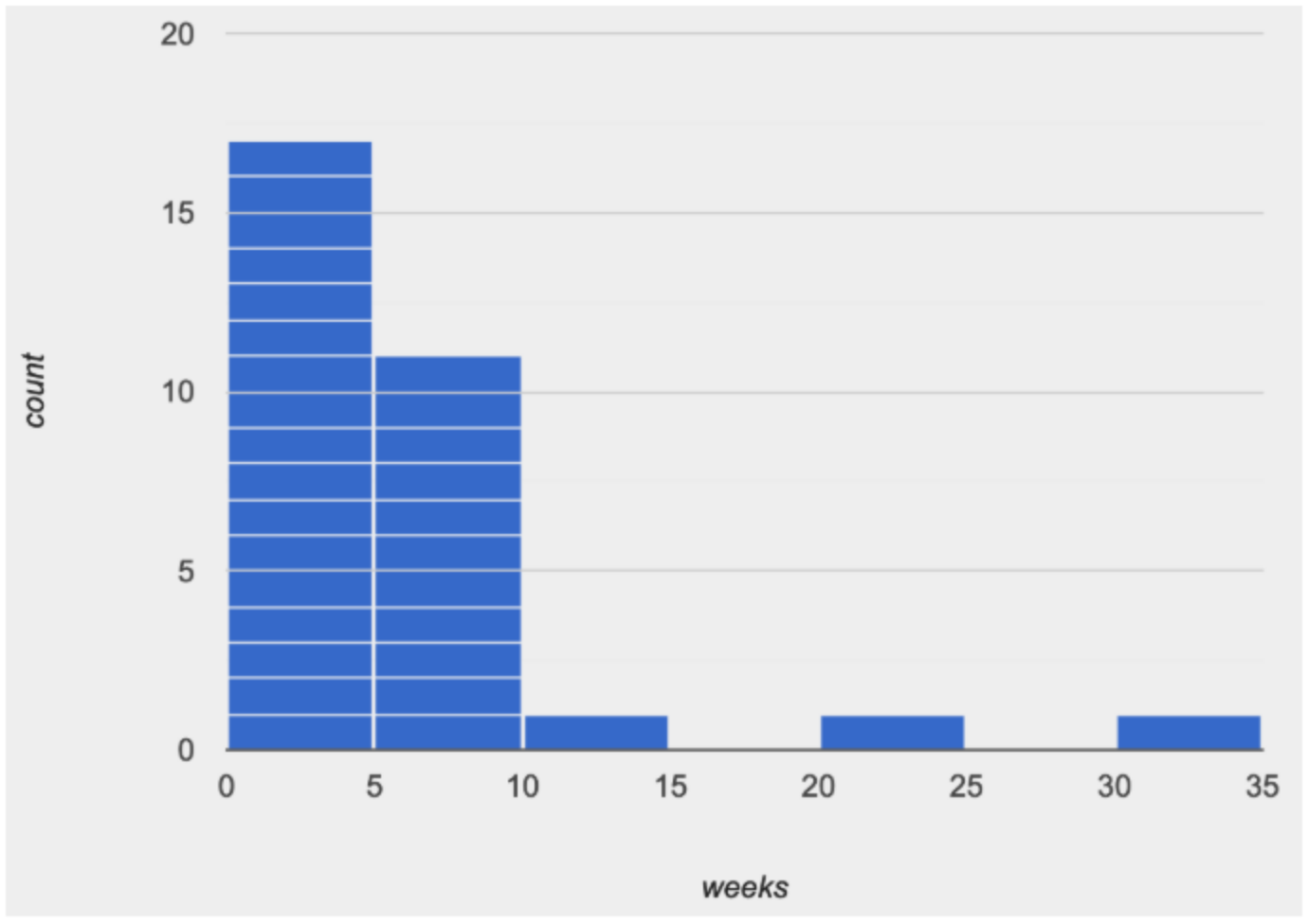
Consider the image on the right: most of the data points are clustered on the left side, and it contains a few unusually high values way off to the right. We might describe this histogram by saying that it is “skewed right, or has high outliers.”
Here are the most common shapes that we see for real-world datasets:
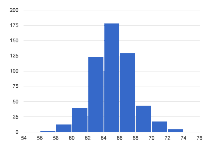
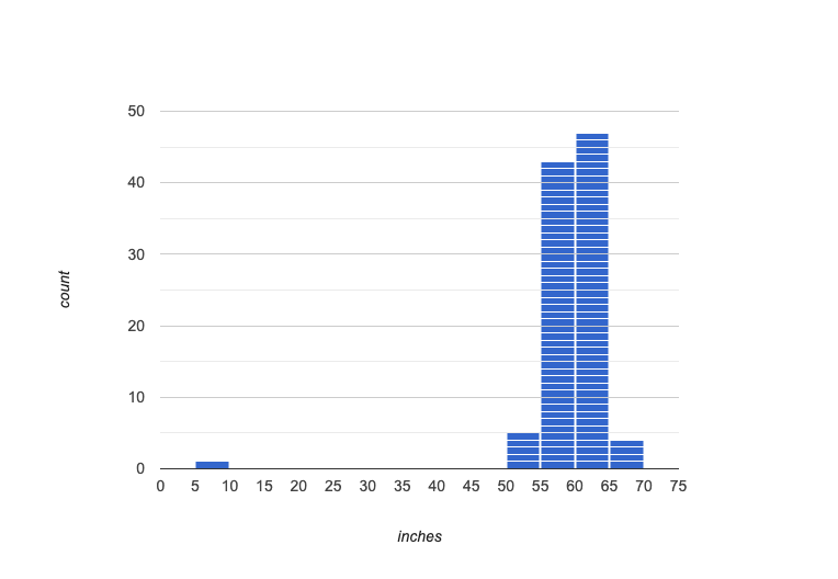
Symmetric: values are balanced on either side of the middle.
 🖼Show image
In a symmetric distribution, it’s just as likely for the variable to take a value a certain distance below the middle as it is to take a value that same distance above the middle. Examples:
🖼Show image
In a symmetric distribution, it’s just as likely for the variable to take a value a certain distance below the middle as it is to take a value that same distance above the middle. Examples:
-
Heights of 12-year-olds would have a symmetric shape. It’s just as likely for a 12-year-old to be a certain number of inches below average height as it is to be that number of inches above average height.
-
In a standardized test, most students score fairly close to what’s average. Also, we see just as many students scoring a certain number of points above average as we see scoring that same number of points below average. The shape is symmetric (and bulges in the middle because most students score fairly close to what’s average).
Skewed left, or low outliers.
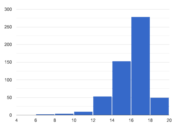
In a distribution that is skewed left, values are clumped around what’s typical, but they trail off to the left with a few unusually low values. Examples:
-
Number of teeth that adults have in their mouths would be skewed left or have low outliers. Most adults will have close to a full set of 32 teeth, but a few of them with serious dental problems would have a very small number of teeth. We won’t get anyone in our dataset who has 10 or 20 extra teeth in their mouths!
-
If the school cafeteria mostly buys canned goods in large commercial sizes, but buys a few items in household sizes, then if we looked at the ounces per can we’d see a shape that has left skewness and/or low outliers.
Skewed right, or high outliers.
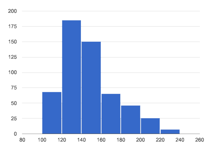
In a distribution that is skewed right, values are clumped around what’s typical, but they trail off to the right with a few unusually high values. We see this shape often in the real world, because there are many variables — like “income” or “time spent on the phone” — for which a few individuals have unusually high values, which aren’t balanced out by unusually low values (things like “income” and “phone time” can’t be less than zero). Examples:
-
Age when a woman in the U.S. gives birth would be skewed right or have high outliers. A few women would be unusually old (40+ years), above the average age of 26 (check the tabloids!), but none of them could be even close to 40 years below average to balance things out!
-
A dataset of earnings almost always shows right skewness or high outliers, because there are usually a few values that are so far above average, they can’t be balanced out by any values that are so far below average. (Earnings can’t be negative.)
Outliers: Do they stay or do they go? Histogram with a low outlier
Histogram with a high outlier
An outlier can be "junk" data that you need to throw away as part of your analysis, or it could be a really important part of your analysis! As a data scientist, an outlier is a reason to look closer. And whether you decide to keep or remove it from your dataset, make sure you explain your reasons in your writeup! |

Investigate
-
Make a histogram for the pounds column in the animals table, sorting the animals into 20-pound bins:
-
Would you describe the shape of your histogram as being skewed left, skewed right, or symmetric?
-
Which one of these statements is justified by the histogram’s shape?
-
A few of the animals were unusually light.
-
A few of the animals were unusually heavy.
-
It was just as likely for an animal to be a certain amount below or above average weight.
-
-
Try bins of 1-pound intervals, then 100-pound intervals. Which of these three histograms best satisfies our rule of thumb?
-
On Identifying Shape - Histograms, describe the shape of the histograms you see there.
-
On The Shape of the Animals Dataset, describe the pounds histogram and another one you make yourself. When writing down what you notice, try to use the language Data Scientists use, discussing both skew and outliers.
Challenge Questions:
- Compare histograms for the pounds column of both cats and dogs in the dataset. Are their shapes different? How much overlap is there?
- Compare histograms for the age column of both cats and dogs in the dataset. Are their shapes different? How much overlap is there?
- Can you explain why the amount of overlap between these two distributions is different?
Synthesize
Discuss as a class, making sure students agree on the description of the shape.
🔗Your Analysis flexible
Overview
Students repeat the previous activity, this time applying it to their own dataset and interpreting their own results. Note: this activity can be done briefly as a homework assignment, but we recommend giving students an additional class period to work on this.
Launch
Now it’s time to try looking at the shape of your own dataset! Pick one quantitative column in your dataset, and hypothesize whether you think it will be skewed right, skewed left, or symmetric. What do you think?
Investigate
-
How is your dataset distributed? Choose two quantitative variables and display them with histograms. Explain what you learn by looking at these displays. If you’re looking at a particular subset of the data, make sure you write that up in your findings on The Spread of My Dataset.
-
Students should fill in the Quantitative Visualizations portion of their Research Paper, using histograms they’ve constructed for their dataset and explaining what they show.
Synthesize
Have students share their findings.
Histograms are a powerful way to display a dataset and see its shape. But shape is just one of three key aspects that tell us what’s going on with a quantitative dataset. In the next unit, we’ll explore the other two: center and spread.
These materials were developed partly through support of the National Science Foundation,
(awards 1042210, 1535276, 1648684, and 1738598).  Bootstrap by the Bootstrap Community is licensed under a Creative Commons 4.0 Unported License. This license does not grant permission to run training or professional development. Offering training or professional development with materials substantially derived from Bootstrap must be approved in writing by a Bootstrap Director. Permissions beyond the scope of this license, such as to run training, may be available by contacting contact@BootstrapWorld.org.