(Also available in CODAP)
Students learn to generate and compare bar graphs, explore other plotting & display functions in CODAP, and (optionally) design an infographic.
Lesson Goals |
Students will be able to:
|
Student-facing Lesson Goals |
|
Materials |
|
Preparation |
|
Supplemental Resources |
🔗Welcome to CODAP! 10 minutes
Overview
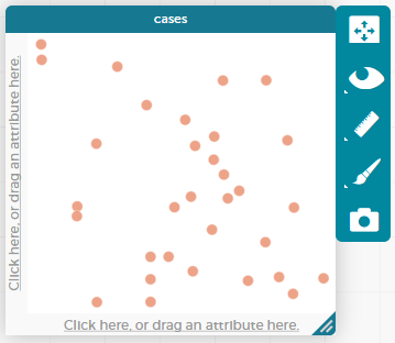
Students use the options on CODAP’s Configuration menu to produce displays and plots of the Animals Dataset.
Launch
Where have you seen infographics and graphs used to display data in the real world?
Open the Animals Dataset in CODAP.
-
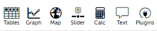
Click the
graphicon from the horizontal toolbar in the upper left. (See toolbar, below.) What appears?
-
Select a dot with your mouse. What happens?
-
Try generating the graph again. Does it look the same or different? Why might this be relevant?
-
What happens when you select a table row? How about multiple table rows?
-
What happens when you click the "eye" icon (to the right of the graph or the table, depending on which is selected)?
If students report that a blank graph appears (rather than a scatterplot), prompt them to whitelist CODAP on their ad-blocker. Ad-blockers do seem to inhibit some of the functionality of CODAP (which will fortunately never advertise to users!).
Initially, the data points are randomly distributed on the graph. Selecting an orange dot reveals the name of that particular animal. Selecting a particular dot causes the table row for that animal to be highlighted in blue. Holding the shift button allows students to select multiple dots in the graphical display, or multiple rows in the table.
Students should observe that when they select a table row (or multiple table rows), the corresponding dots change from orange to turquoise. When they set aside selected and / or unselected cases (by using the "eye" icon), they can temporarily alter the amount of pets in the dataset (with the option to restore to the original dataset).
Students can also resize the window by dragging its borders.
Investigate
Once we have a graph of randomly distributed data points, we can organize the data by selecting attributes from our table that we want to appear on the axes of our graph.
Experiment with creating some bar charts in CODAP by following the steps below.
-
Select the y-axis on your graph (where it says "Click here"). On the drop-down menu that appears, select
fixed. What do you notice? -
Now select the x-axis on your graph and select
fixed. How does the graph change? -
Select the
configurationicon (which looks like a bar graph) to the right of the data display. Selectfuse dots into bars. -
Click the
rulericon; test out each of the two options available (count and percentage). What happens? -
Now, make a bar chart showing how many animals there are of each species by changing the variable on the x-axis to
species. -
Experiment with bar charts, either by clicking on the axis title to display a menu of attributes or dragging column title from the table to the axes.
-
Which types of attributes can be displayed with the dots fused into bars? For which types of attributes does CODAP instead offer to create a bar for each point?
To dig deeper into bar charts, have students turn to Bar Chart - Notice and Wonder.
People aren’t Hermaphrodite?
When students make a display of the |
Common Misconceptions
Bar charts look a lot like another kind of chart - called a "histogram" - which are actually quite different because they display quantitative data, not categorical. Making a histogram in CODAP, however, begins quite similarly to making a bar chart in CODAP - by creating a dot plot that will be modified.
Synthesize
Bar charts display how much of the sample belongs to each category. If they are based on sample data from a larger population, we use them to infer the proportion of a whole population that might belong to each category.
Bar charts are mostly used to display categorical columns.
While bars in some bar charts should follow some logical order (alphabetical, small-medium-large, etc), they can technically be placed in any order, without changing the meaning of the chart.
Mini Project: Making Infographics Infographics are a powerful tool for communicating information, especially when made by people who actually understand how to connect visuals to data in meaningful ways. Making Infographics is an opportunity for students to become more flexible math thinkers while tapping into their creativity. This project can be made on the computer or with pencil and paper. There’s also an Infographics Rubric to highlight for you and your students what an excellent infographic includes. |
🔗Exploring other Displays 30 minutes
Overview
Students freely explore the CODAP data display options available to them when they select the bar graph icon (also known as the Configuration menu). In doing so, they experiment with new charts and get comfortable with CODAP as a platform for doing data science.
Launch
There are lots of different kinds of charts and plots. Even if you don’t know what these plots are for yet, see if you can figure out how to use them.
-
Open a scatterplot of randomly positioned points derived from the Animals Dataset by clicking on the
graphicon again. -
Now, drag or select the
Weightattribute/column to the X-axis. -
Select the little icon that looks like a ruler; it is the
Measureicon. Try producing a box plot by selecting the appropriate option from this menu. -
With
Weightstill on the X-axis, drag or selectTime to Adoptionto the Y-axis. -
Take another look at the
Measuremenu, now that your data display is two-dimensional. Which options do you see that did not appear before? -
Try producing a least squares line (also known as a regression line) by using the
Measuremenu.
Investigate
Complete Exploring Displays and (More) Exploring Displays.
Common Misconceptions
There are many possible misconceptions about displays that students may encounter here. But that’s ok! Understanding all those other plots is not a learning goal for this lesson. Rather, the goal is to have them develop some loose familiarity.
Synthesize
Today you’ve added more data displays to your toolbox. You can create bar charts to visually display data, and even transform entire tables!
You will have many opportunities to use these concepts in this course, by applying what you’ve learned to answer data science questions.
🔗Additional Exercises:
These materials were developed partly through support of the National Science Foundation,
(awards 1042210, 1535276, 1648684, and 1738598).  Bootstrap by the Bootstrap Community is licensed under a Creative Commons 4.0 Unported License. This license does not grant permission to run training or professional development. Offering training or professional development with materials substantially derived from Bootstrap must be approved in writing by a Bootstrap Director. Permissions beyond the scope of this license, such as to run training, may be available by contacting contact@BootstrapWorld.org.