(Also available in CODAP)
Students compute the “line of best fit” using the function for linear regression, and summarize linear relationships in a dataset.
Lesson Goals |
Students will be able to…
|
Student-facing Lesson Goals |
|
Materials |
|
Supplemental Materials |
|
Preparation |
|
Assessments |
@assessments |
🔗Intro to Linear Regression 10 minutes
Overview
Students are introduced to the concept of linear regression, and learn how to interpret the slope and y-intercept of predictor functions.
For teachers who have the need and the bandwidth to go deeper, this is a good opportunity to teach the algorithm behind linear regression. This algorithm is not part of Bootstrap:Data Science.
Launch
Vocabulary Note
We prefer the words “explanatory” and “response” in our curriculum, because in other contexts the words “dependent” and “independent” refer to whether or not the variables are related at all, as opposed to what role each plays in the relationship.
The straight line that best fits the points on a scatter plot has several names, depending on the context, subject, or grade level. All of the following terms refer to the same concept:
-
Regression Line
-
Line of Best Fit
-
Least Squares Line
-
Predictor
-
Trendline
The line itself is computed through a process called linear regression, which also goes by the name least squares regression.
-
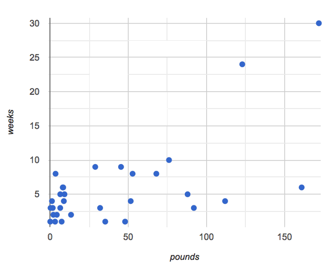
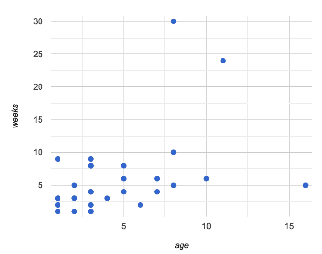
Make two scatter plots from the
animals-table, usingageas the explanatory variable in one plot andpoundsas the explanatory variable in the other. -
In both plots, use
weeksas your response variable andnamefor thelabels. -
We will refer to the explanatory column as “xs” and the response column as “ys.”
|
|
Quickly survey the class about whether they think we can use an animal’s size or age to predict how long it will take to be adopted.
-
A scatter plot of adoption time versus size does suggest that smaller animals get adopted faster than larger animals.
-
Similarly, younger animals tend to be adopted faster than older ones.
Can we be more precise about this, and actually predict how long it will take an animal to be adopted, based on these factors? And which one would give us a better prediction?
Just as the mean, median, and mode can summarize data from a single quantitative variable, the “center” of points in a two-dimensional cloud can be described by a line of best fit. Given a value for the explanatory variable, this line allows us to predict what the corresponding value for the response variable might be.
Open the Interactive Regression Line (Geogebra), and use it to complete Introduction to Linear Regression.
Have students talk about their answers to the first section.
-
Why do x-values that are far to the left or right of the point cloud have a larger impact on R?
-
Think of their distance from the "anchor" of the data as the length of a wrench. The longer the handle, the more "force" P applies on the regression line.
-
-
Why can’t we have a regression line with all points above or below the line?
-
Because the points exert a balanced force on the line. If all the points were on one side, there would be nothing to balance them out on the other side.
-
Data scientists use a statistical method called linear regression to pinpoint linear relationships in a dataset. Linear regression is the math behind the line of best fit, which allows us to make predictions based on our data.
Each point in our scatter plot “pulls” on the line, with points above the line yanking it up and points below the line dragging it down. Points that are really far away — especially influential observations that are far to the left or right of the point cloud — pull on the line with more force.
This line can be graphed on top of the scatter plot as a function, called the predictor function.
Investigate
-
Turn to Drawing Predictors.
-
Draw a line of best fit through each of the scatter plots.
-
Decide whether the direction of the correlation (which could also be referred to as the slope of the line) is positive or negative.
-
Then assess the strength of the correlation.
Common Misconceptions
-
Don’t forget to look at sample size! A linear regression plot with an r-value of 0.999 is strong…but that’s useless if it’s a sample of just three data points!
Synthesize
What did you observe as you experimented?
Want to check student mastery of the content you’ve just taught? Administer Linear Regression Checkpoint 1 (Desmos) to get a snapshot of your students' current level of mastery. Make sure you have created a link or code for your class to the assessment.
If you’d prefer to wait until your students have completed the entire lesson to check mastery, we also offer a cumulative assessment at the end of Interpreting Linear Regression Lines, the last section of the lesson.
🔗Performing Linear Regression 20 minutes
Overview
Students are introduced to the lr-plot function in Pyret, which performs a linear regression and plots the result.
Launch
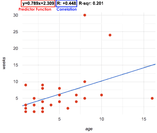
Pyret includes a powerful display called lr-plot, which (1) draws a scatter plot, (2) draws the line of best fit, and (3) even displays the equation for that line.
Just like the scatter-plot function, lr-plot takes in a Table and the names of 3 Columns, the first of which will be used to label the points.
-
Open your saved Animals Starter File, or make a new copy.
-
Create an
lr-plotfor the Animals Table.-
Use
"name"for the labels. -
Use
"age"for the x-axis. -
Use
"weeks"for the y-axis.
-

(1) The resulting scatter plot looks like those we’ve seen before!
(2) The line of best fit is now drawn onto the plot.
(3) Above the display, we see the predictor function for that line.
-
The predictor function is written in slope-intercept form. (y = mx + b, where m describes the slope or rate of change and b identifies the y-intercept.)
-
In this plot, we can see that the slope of the line is
0.789, which means that on average, each extra year of age results in an extra 0.789 weeks of waiting to be adopted (about 5 or 6 extra days).
-
The y-intercept is roughly
2.3. This is where the best-fitting line crosses the y-axis. We want to be careful not to interpret this too literally, and say that a newborn animal would be adopted in~2.3weeks, because none of the animals in our dataset was that young. Still, the regression line (or line of best fit) suggests that a baby animal, whose age is close to 0, would take only about 3 weeks to be adopted.
-
By substituting an animal’s age for x in the predictor function, we can make a prediction about how many weeks it will take to be adopted.
-
For example, we predict a 5-year-old animal to be adopted in 0.789(5) + 2.309 = 6.254 weeks. That’s the y-value when x = 5 for a point that falls exactly on the regression line.
(4) We also see the r-value is +0.448.
-
The sign is positive, because the scatter plot point cloud and line of best fit both slope upward.
-
The fact that the r-value is close to 0.5 tells us that the strength is moderate.
-
This makes sense: the scatter plot points are somewhere between being really tightly clustered and really loosely scattered.
Going Deeper
Students may notice another value in the lr-plot, called R2. R2 describes the percentage of the variation in the y-variable that is explained by least-squares regression on the x variable. In other words, an R2 value of 0.20 could mean that “20% of the variation in adoption time is explained by regressing adoption time on the age of the animal”. Discussion of R2 may be appropriate for older students, or in an AP Statistics class.
Investigate
-
Complete Exploring lr-plot.
Have students share their answers and discuss.
A predictor only makes sense within the range of the data that was used to generate it.
Toddlers grow a lot faster than adults. A regression line predicting the height of toddlers based on age would predict that a 60-year-old is 10 feet tall!
Statistical models are just proxies for the real world, drawn from a limited sample of data: they might make a useful prediction in the range of that data, but once we try to extrapolate beyond that data we may quickly get into trouble!
-
Complete Making Predictions.
-
Open Age vs. Height Starter File to explore the same student dataset broken down by gender identity using Age vs. Height Explore.
Synthesize
-
Why does it only make sense to use predictor functions for values that fall within the range of the dataset?
Simpson’s Paradox
A common misconception is that "more data is always better", and the age-v-height worksheet challenges that assumption. Two sub-groups (girls and boys) can each have a strong correlation between age and height, but when they are combined the correlation is weaker. This phenomenon is called Simpson’s Paradox. Statistics (especially AP!) teachers will want to dive deeper on this topic.
Want to check student mastery of the content you’ve just taught? Administer Linear Regression Checkpoint 2 (Desmos) to get a snapshot of your students' current level of mastery. Make sure you have created a link or code for your class to the assessment.
If you’d prefer to wait until your students have completed the entire lesson to check mastery, we also offer a cumulative assessment at the end of Interpreting Linear Regression Lines, below.
🔗Interpreting Linear Regression Lines 20 minutes
Overview
Students learn how to write about the results of a linear regression, using proper statistical terminology and thinking through the many ways this language can be misused.
Launch
How well can you interpret the results of a linear regression analysis? How would you explain it to someone else?
-
What does it mean when a data point is above the line of best fit?
-
It means the y-value is higher than the sample would have predicted for that x-value.
-
-
What does it mean when a data point is below the line of best fit?
-
It means the y-value is lower than the sample would have predicted for that x-value.
-
Turn to Interpreting Regression Lines & r-Values, and fill in the blanks for each scenario on the left using information from the predictor function and r-value on the right.
Let’s take a look at how the Data Cycle can be used with Linear Regression, and how the result can be used to form our Data Story.
-
Read Data Cycle: Animals Regression Analysis, including the Data Story in the Interpret Data section.
-
What do you Notice? What do you Wonder?
-
Do the
Ask QuestionsandConsider Datasteps match each other? Why or why not?-
Yes. We’re thinking about how age of cats impact time to adoption by looking a the cat rows and comparing
ageandweeks.
-
-
Do you think the results of the analysis and the accompanying Data Story are written responsibly? Why or why not?
-
Responses will vary, but in general, there is a high level of detail and the story feels unbiased.
-
-
Using the Animals Dataset, complete the second Data Cycle on Data Cycle: Animals Regression Analysis.
Investigate
-
Turn to Describing Relationships.
-
Using the language you saw on Data Cycle: Animals Regression Analysis, how would you write up the findings on this page?
-
For more practice, you can complete Describing Relationships (2).
Common Misconceptions
-
Don’t call it "accuracy"! One of the most common misconceptions about Linear Regression is that the r or R2 value is a measure of accuracy. For example, a student who sees a very high r-value when plotting age vs. weeks might say "this prediction is 95% accurate." But these values only speak to how much variation in the y-axis can be explained by variation in the x-axis, so the statement should be "95% of the variation in weeks can be explained by variation in the age."
-
X and Y matter! The correlation coefficient will be the same, even if you swap the x- and y-axes. However, the interpretation of the display is different! The column used for the x-axis will always be interpreted as "the explanation" for the "result" seen in the y-axis. It’s fine to say that being older tends to make an animal take longer to be adopted, but it is not true that taking longer to be adopted makes an animal older!
Synthesize
Have students read their data stories aloud, to get comfortable with the phrasing.

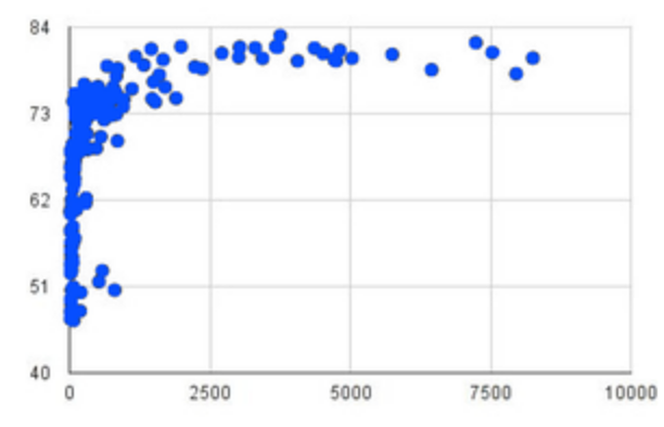
The word “linear” in “linear regression” is important here. In the image on the right, there’s clearly a pattern, but it doesn’t look like a straight line!
There are many other kinds of statistical models out there, but all of them work the same way: use a particular kind of mathematical function (linear or otherwise), to figure out how to get the “best fit” for a cloud of data.
Want to check student mastery of the content you’ve just taught? Administer Linear Regression Checkpoint 3 (Desmos) to get a snapshot of your students' current level of mastery. Make sure you have created a link or code for your class to the assessment.
Alternatively, we offer a compilation of all four Checkpoints in Linear Regression Cumulative Assessment (Desmos).
🔗Data Exploration Project (Linear Regression) flexible
Overview
Students apply what they have learned about linear regression to their chosen dataset. They will add at least one linear regression display to their Data Exploration Project Slide Template, along with their interpretation of what this display tells them.
Visit Project: Dataset Exploration to learn more about the sequence and scope. Teachers with time and interest can build on the exploration by inviting students to take a deep dive into the questions they develop with our Project: Research Capstone.
Launch
Let’s review what we have learned about linear regression.
Linear Regression is a way to calculate the line-of-best-fit (or "predictor function") for the relationship between two quantitative columns.
-
Will
lr-plotstill find a line of best fit, even if there’s no correlation?-
Yes! Linear regression will always find a line of best fit — it just might not fit very well!
-
-
What does the slope of the line-of-best-fit tell us about a correlation?
-
If the slope is positive, the correlation is positive. If it’s negative, so is the correlation.
-
-
If the r-value is close to 1, does this mean the predictor function will always give us a good prediction of the y-value, based on any x-value? Why or why not?
-
No! Even with an extremely high r-value, the predictor function should not be used to make predictions far outside the range of the dataset.
-
Investigate
Let’s connect what we know about linear regression to your chosen dataset.
Students have the opportunity to choose a dataset that interests them in List of Datasets in the Choosing Your Dataset lesson.
-
Open your chosen dataset starter file in Pyret.
-
Choose one correlation you were investigating, and use the Data Cycle to ask the question about the relationship between those two columns. Tell the story on Data Cycle: Regression Analysis.
-
Complete the second regression analysis on the page with another correlation.
Confirm that all students have created and understand how to interpret their LR plots. Once you are confident that all students have made adequate progress, invite them to access their Data Exploration Project Slide Template from Google Drive.
It’s time to add to your Data Exploration Project Slide Template.
-
Find the "Correlations I want to look into" section of the slide deck.
-
Choose one correlation you explored, and duplicate the slide.
-
On the new slide, replace your scatter plot with the linear regression plot and add your interpretation of that plot.
Synthesize
Have students share their findings.
-
Did you discover anything surprising or interesting about your dataset?
-
Did the results from
lr-plotconfirm your suspicions about the correlation? Were any of them surprising?
🔗Additional Exercises
-
An extra, blank regression analysis pages is available
These materials were developed partly through support of the National Science Foundation, (awards 1042210, 1535276, 1648684, 1738598, 2031479, and 1501927).  Bootstrap by the Bootstrap Community is licensed under a Creative Commons 4.0 Unported License. This license does not grant permission to run training or professional development. Offering training or professional development with materials substantially derived from Bootstrap must be approved in writing by a Bootstrap Director. Permissions beyond the scope of this license, such as to run training, may be available by contacting contact@BootstrapWorld.org.


