Students investigate quadratic relationships in data about Fuel Efficiency, using an inquiry-based model, involving hypothesizing, experimental and computational modeling, and sense-making.
Lesson Goals |
Students will be able to…
|
Student-facing Lesson Goals |
|
Materials |
|
Supplemental Materials |
|
Preparation |
|
Key Points For The Facilitator |
|
🔗Looking for Patterns 45 minutes
Overview
Students explore the Fuel Efficiency Starter File, and create scatter plots to search for relationships between columns. They share and discuss their findings with the class, discovering the limitations of linear models.
Launch
These questions are intended to spark student interest in fuel efficiency, which students will explore in this lesson.
Since 1992, there have been laws about what information must be printed onto the labels of cars for sale. What do you think consumers should know about cars they are considering buying?
-
Have you heard the term "fuel efficiency" before? What do you know about fuel efficiency?
-
Fuel efficiency is the number of miles that a car can travel per gallon. Since 2013, labels on cars for sale must include: fuel efficiency, energy use, fuel cost, and environmental impact.
-
-
What factors influence fuel efficiency?
-
Possible responses:
-
Efficient driving (e.g., gradual acceleration and braking, using cruise control)
-
car maintenance
-
planning / combining trips
-
choosing a more fuel efficient vehicle
-
avoiding carrying excess weight in a vehicle
-
-
Do you think the speed at which you drive influences fuel efficiency? Why or why not?
-
At what speeds do you predict that fuel efficiency is the best? The worst?
-
"Zero" is a clever attempt (no gas used!), but remember that miles-per-gallon also includes the distance traveled (0 / 0)!
-
Make sure that student guesses make sense, as well: a car rolling downhill in neutral shouldn’t be counted, cars can’t travel 10,000mph, etc
-
In this lesson, we’ll learn more about the relationship between fuel efficiency and the speed a car is traveling.
First, we’ll explore a dataset and see if this relationship appears linear.
NOTE: While this dataset is based on real data obtained from the Transportation Energy Book, it has been augmented with fictional data in order to provide a sufficiently-rich dataset for student modeling. You can find out more about this augmentation in the README tab of the dataset.
-
Open the Fuel Efficiency Starter File
-
From the File menu, select "Save a Copy", and click "Run".
-
Working in pairs or small groups, complete the first section of Exploring the Fuel Efficiency Dataset.
Investigate
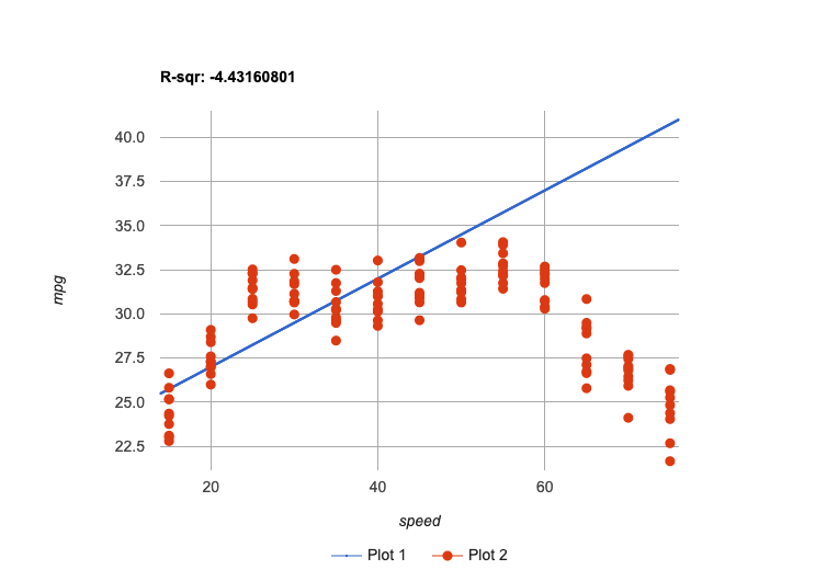
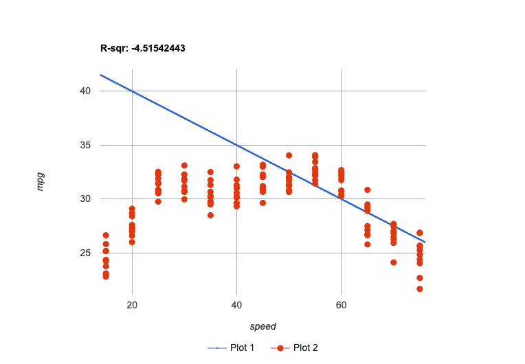
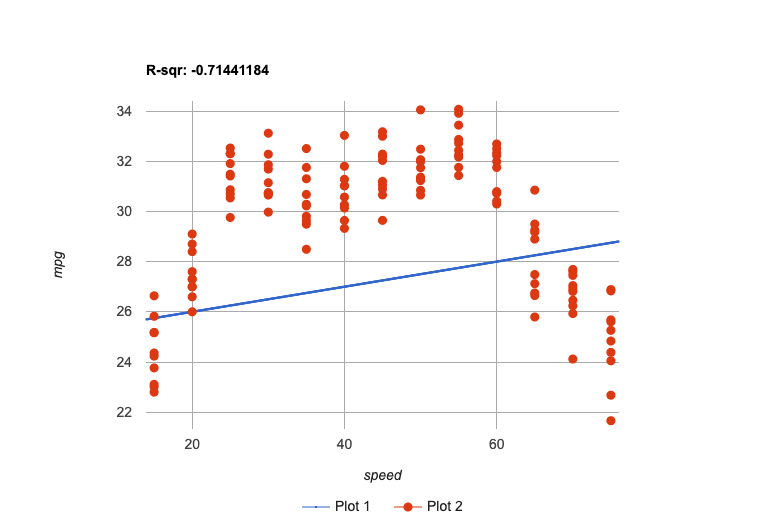
There definitely appears to be a relationship here…
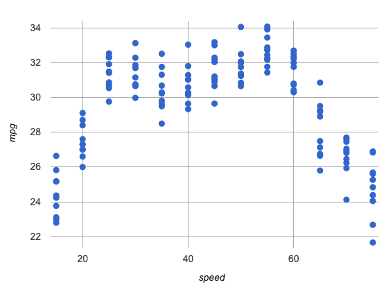
But linear models don’t seem to fit very well!
We could build linear models that fit the increasing half of the data… |
We could build linear models that fit the decreasing half of the data… |
We could build linear models that try to split the difference… |
|
|
|
All of them are far away from so many points, and will make poor predictions for a large subset of x-values.
-
Complete the rest of Exploring the Fuel Efficiency Dataset. Be ready to share back and describe the curve you drew.
-
Is there a function mpg(speed), that describes the pattern you see here?
Even though some cars are more efficient than others, fuel efficiency generally increases from 15mph to around 40-55mph. After that, fuel efficiency generally decreases!
Review student answers to confirm that students see a nonlinear relationship in the dataset that is fairly strong. Students should generally agree that the relationship is better fit by a curve, with efficiency peaking roughly at 45mpg. Make sure students have agreed on this vertex, as its location is important for the next activity!
Have students share their curves, encouraging them to identify where they "peak" and where they cross the x-axis. These locations will be important anchor concepts on which to build in the next section. (One option for facilitating sharing is to project the scatter plot on a whiteboard and have students come up and draw all of their curves on it).
Synthesize
-
Why don’t linear models work to model the relationship between fuel efficiency and speed?
-
What kinds of curves did you draw that fit better?
-
Are there any mathematical functions that look like those curves?
🔗Quadratic Functions 45 minutes
Overview
Students are introduced to quadratic functions. They become familiar with scenarios involving quadratics and terminology to describe parabolas. They also learn how to identify quadratic sequences, and then explore each of the coefficients in Vertex Form.
Launch
Linear models work well for fitting simple relationships, but many relationships in the real world are more complex! Linear models are often too primitive.
The relationship we observe between speed and fuel efficiency appears to best be described by a curve, where fuel-efficiency increases up to a certain speed, and then decreases again.
Today, we will learn about one kind of curved model called a quadratic relationship. Graphs of quadratic relationships are often described as "u-shaped" or "looking like an arch". More formally, mathematicians and data scientists call these kinds of curves parabolas.
There are lots of relationships that change direction like this! For example, when an athlete is young, they improve as they get stronger and more skilled. But as they age, they begin to lose their speed and strength.
In some quadratic relationships, the curve goes the other way - decreasing, bottoming out, and then rising again. For example, the graph of an accelerating car’s position over time will look like the right-half of a downward-facing parabola, with the car covering more distance each second than last.
-
Can you think of any other real-world relationships that appear to be quadratic?
-
A ball dropped from a tall building will get faster and faster as it falls, so a graph of distance(time) will be quadratic.
-
Many nutrients are good for you, and the more you take the healthier you are…up to a point. After that, too much of a mineral or vitamin can cause problems. A graph of health(dose) will be quadratic.
-
A ball thrown in the air will rise quickly, slow down, peak, and then begin to fall. A graph of height(time) will be quadratic.
-
The temperature of a puddle will warm and then cool over the course of the day. A graph of temp(time) will be quadratic.
-
The length of a shadow is long in the morning and shortens til the sun is overhead, after which it slowly lengthens til the sun sets. A graph of length(time) will be quadratic.
-
Turn to What Kind of Model? (Descriptions) and practice identifying whether the scenarios are best modeled by linear or quadratic relationships.
Investigate
Although the examples we just discussed include the characteristic rising and falling or falling and rising of the parabola, we might encounter datasets that include only the rising part of the parabola or only the falling part.
But what if our list of x-y pairs, doesn’t show a rise-and-fall. How do we know if we’re looking at just the rise or a parabola, or just the fall, or something that isn’t a parabola at all? In other words:+ How can we identify quadratic relationships from a sequence of numbers?
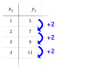 Remember that linear functions grow by fixed intervals, so the rate of change is constant. In the table shown here, each time the x-value increases by 1, we see that the y-value increases by 2. This is true for any set of equal-sized intervals: a line needs to slope up or down at a constant rate in order to be a straight line!
If the rate of growth is constant, the relationship is linear.
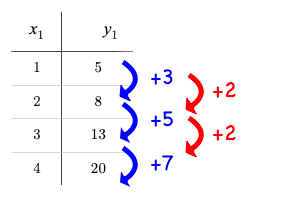 Quadratic functions grow by intervals that increase by fixed amounts! In the table to the right, the blue arrows show a differently-sized jump between identical intervals time, meaning the function is definitely not linear! However, if we take a look at the difference between those differences(shown in red), we’re back to constant growth!
If the "growth of the growth" is constant, the relationship is quadratic.
Turn to What Kind of Model? (Tables), and look at the first two tables on the page (shown below). One of them shows a linear progression, while the other shows a quadratic progression.
1 |
|
||||||||||||||||
2 |
|
-
What do you Notice? What do you Wonder?
-
Which one is linear, and how do you know?
-
The second table is linear, because the y values growth is constant relative to x.
-
-
Which one is quadratic, and how do you know?
-
The first table is quadratic, because the y values "growth of the growth" is constant relative to x.
-
-
Identify whether each of the remaining tables on What Kind of Model? (Tables) is quadratic, linear or neither.
-
Use the space to the right of the table to show your work.
Debrief with students and allow them to share the different strategies that they used. Note: When looking at real-world datasets that can be modeled by linear or quadratic functions, these patterns will not be evident in the tables, because the points won’t fit the function perfectly!
When we graph these points on a plane, they draw our parabola. As we work with parabolas - and eventually fit them to our Fuel Efficiency dataset - we need to know how to talk about and describe them.
Let’s define the parts of a parabola together.
-
Linear relationships can be described with terms like "slope" and "y-intercept". But what about quadratic relationships? Do parabolas have slope?
-
No. They curve because they do not have a constant rate of change.
-
-
Do all parabolas have x-intercepts?
-
No. Some do and some don’t!
-
-
Can you point out or describe other important parts of a parabola?
-
Even without knowing the names for these things, students might point to the vertex, the axis of symmetry, etc.
-
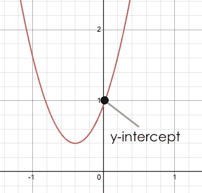
| vertex | y-intercept | x-intercept |
|---|---|---|
|
|
|
The point at which a parabola "changes direction" and goes from climbing to sinking (or vice versa). |
Like linear models, parabolas always cross the y-axis once when x = 0. |
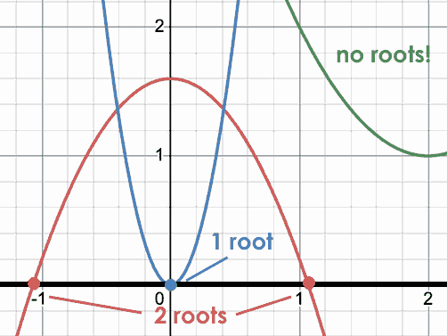
Also known as roots or zeros. A quadratic function can cross the x-axis once, twice, or not at all. |
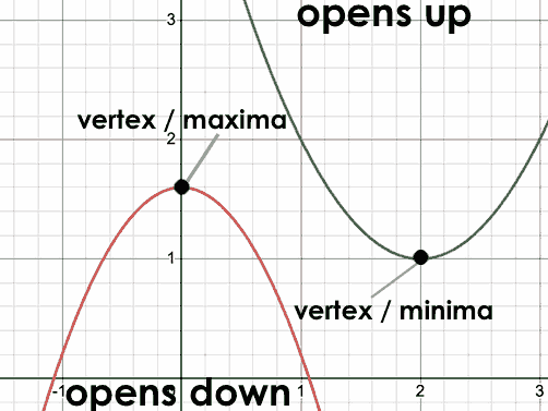
There are two more specific terms that we can use to describe a parabola’s vertex:
-
The maximum is the vertex of a parabola that "opens down."
-
The minimum is the vertex of a parabola that "opens up."
For parabolas representing y as a quadratic function of x, we can imagine a vertical line through the vertex that splits the curve into two congruent parts that mirror each other. This line is the axis of symmetry, which for quadratics always passes through the vertex (these axes exist in other shapes and functions, as well!).
Turn to Parabolas to apply our new terminology by sketching and labeling some graphs.
Synthesize
-
What key characteristics of a scatter plot would provide the clue that we should look for a quadratic model rather than a linear model?
-
Why do some parabolas have roots and others don’t?
-
If the minimum is negative, it will fall below the x-axis and the parabola will cross the x-axis twice as it opens up so there will be two roots. Similarly, there will be two roots if the maximum is positive.
-
If the minimum or maximum is zero it will fall directly on the x-axis and there will be one root
-
If the minimum is greater than zero or the maximum is less than zero, the parabola won’t cross the x-axis and there won’t be any roots.
-
-
What is the difference between a minimum and a maximum?
-
A minimum is the vertex of a parabola that opens up, while a maximum is the vertex of a parabola that opens down.
-
🔗Fitting Quadratic Models 45 minutes
Overview
Students work with the vertex form to fit a quadratic model for the Fuel Efficiency dataset. They extend the model-fitting techniques from the Exploring Linear Models lesson into quadratic relationships and explore the f(x) = a(x − h)2 + k form of quadratic models using a custom Desmos slider activity.
Launch
We just examined a series of quadratic and linear functions that looked a lot like the ones you might find in an Algebra 2 textbook: clean and predictable. Real-world data, however, is messy! Let’s return to our Fuel Efficiency Starter File to dig into that messiness.
-
A scatter plot of the fuel efficiency data has the familiar "rise and fall" pattern of a parabola… but there appears to be a "dip" around 40mph.
-
Does that mean we shouldn’t use a quadratic model for the relationship between speed and fuel efficiency? Why or why not?
-
Have students discuss and share back with the class.
-
If necessary, remind students that models are - by definition - approximations of the real world.
-
The existence of a "dip" like this is normal in real data, but it doesn’t mean that the overall shape of this relationship isn’t quadratic. There’s no such thing as a perfect model!
Investigate
Let’s try to build the best possible quadratic model we can for our Fuel Efficiency dataset.
One form of a quadratic model looks like this: f(x) = a(x − h)2 + k
Let’s find out what each of these coefficients mean for our model.
Make sure you have created a link or code for your class to Exploring Quadratic Functions (Desmos).
-
Open Exploring Quadratic Functions (Desmos).
-
Use Slide 1: Transforming Parabolas to complete Graphing Quadratic Models
-
When you’re done, continue your exploration with Slide 2: Do horizontal shifts correspond to vertical shifts for quadratic functions?
Quadratic Coefficient (a)
-
How do you make a parabola "narrower"?
-
Increase the value of a
-
-
How do you make a parabola "wider"?
-
Decrease the value of a
-
-
How do you know whether to parabola opens up or down?
-
If a is negative, it will open down. If a is positive, it will open up.
-
-
What value of a will result in a linear model?
-
Zero
-
The quadratic coefficient a tells us whether the parabola opens up or down, and how tightly it hugs the axis of symmetry.
Horizontal Shift (h)
-
How do you translate a parabola to the left?
-
Increase the value of h.
-
-
How do you translate a parabola to the right?
-
Decrease the value of h.
-
-
What does an h of zero tell us about the axis of symmetry?
-
It’s the y-axis.
-
The horizontal shift h tells us where the axis of symmetry hits the x-axis, which means it also tells us the x-coordinate of the vertex.
Vertical Shift (k)
-
How do you translate a parabola up and down?
-
Change the value of k
-
-
How can you find the coordinates of the parabola’s vertex, just by looking at the equation?
-
h tells us the x-coordinate, and k tells us the y-coordinate.
-
-
We know that for linear functions it’s possible to achieve any transformation that we can do with a horizontal shift with a vertical shift. Is this also true for quadratic functions? Why or Why not?
-
No. That phenomenon worked for linear functions because they extend indefinitely without changing direction. Because quadratic functions curve, horizontal shifts and vertical shifts don’t translate to each other.
-
Like the y-intercept of a linear model, the vertical shift translates the parabola up and down.
Now that we know how a, h, and k shape a parabola, let’s work on modelling our data!
Return to the Fuel Efficiency Starter File and work through Modeling Fuel Efficiency v. Speed.
Students may wonder why fuel efficiency is a function of the square of the speed, rather than the speed itself!
Physicists have determined that the biggest factor affecting fuel efficiency is drag: the effect of air slowing it down. Physicists have calculated that drag increases based on squared velocity. Additionally, a car’s transmission uses more efficient gears for higher speeds (the engine can turn more slowly at higher gears), but rarely does a car have a gear optimized for speeds above 65mph. As a result efficiency falls sharply once the "highest" gear is reached, as higher speeds require the engine to run faster.
Optional Activity: Guess the Model!
-
Divide students into teams of 2-4, and have each team come up with a secret, quadratic, real-world scenario, then have them write down a quadratic function that fits this scenario on a sticky note. Make sure these functions are key private within each team! (Note: students may be tempted to just make up a scenario where something rises and falls, or vice versa. Challenge them to think through why the change in the output is quadratic with respect to the change of the change in the input!)
-
On the board or some flip-chart paper, have each team draw a scatter plot for which their quadratic function is best fit. They should only draw the point cloud - not the function itself! Finally, have students title display to describe their real-world scenario (e.g., "percentage of people wearing diapers vs. age").
-
Have teams switch places or rotate, so that each team is in front of another team’s scatter plot. Have them figure out the original function, write their best guess on a sticky note, and stick it next to the plot.
-
Have teams return to their original scatter plot, and look at the model their colleagues guessed. How close were they? What strategies did the class use to figure out the model?
-
The coefficients can be constrained to make the activity easier or harder. For example, limiting these coefficients to whole numbers, positive numbers, etc.
-
To extend the activity, have the teams continue rotating so that each group adds their sticky note for the best-guess model. Then do a gallery walk so that students can reflect: were the models all pretty close? All over the place? Were the guesses for one coefficient grouped more tightly than the guesses for another?
-
Synthesize
-
What did you figure out about how adjusting a changed the shape of the parabola?
-
The sign of a determines whether the parabola:
-
opens up (a > 0)
-
opens down (a < 0)
-
or exists as a straight line (a = 0)
-
-
The magnitude of a determines how "tight" or "steep" the parabola is, with larger magnitudes creating tighter parabolas and values closer to zero creating wider ones.
-
Our model is built from data about these 6 vehicles, evaluated at 15-75mph. What does your best model predict for the fuel efficiency of a vehicle that is turned off, moving at 0mph? What about a racecar moving at 200mph?
It’s impossible for a car that’s turned off to burn gas. A racecar with a negative mpg rating would generate fuel as it drives, which is also nonsense! If our model’s prediction for these two extreme values is so bad, does that mean we shouldn’t use the model at all?
No - a model is only as good as the data it was based on. With lots of data between 15-75mph, the model could be very reliable between these speeds and totally unreliable for speeds outside that range!
🔗Other Forms of Quadratic Models
Overview
Students are introduce to Factored Form and Standard Form, and why they each have a role to play in modeling.
Launch
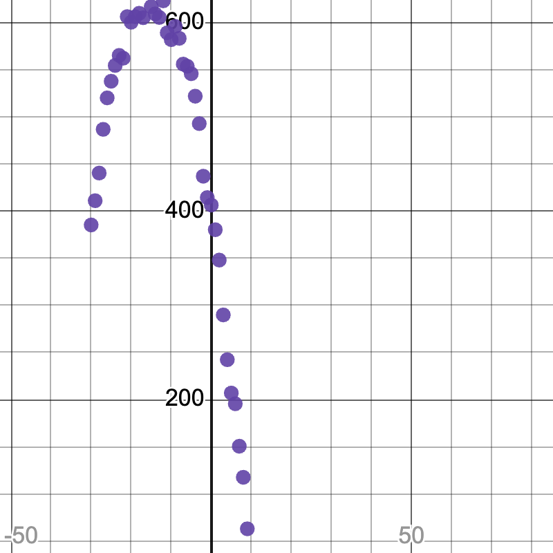 We used Vertex Form to fit this data, because the scatter plot made it easy for us to pick out the vertex of the quadratic relationship between
 speed and mpg. But when looking at a scatter plot of quadratic data, it’s not always easy to see that vertex!
As with Linear Models, mathematicians and data scientists use different forms of Quadratic Models to make model-fitting and calculations easier.
Investigate
The Factored Form for quadratic functions looks like this: f(x) = a(x - r1)(x - r2)
Factored form makes it really easy to see where the roots of the function, where the parabola crosses the x-axis. If x = r1 or x = r2, one of the parenthetical terms will be zero and make the whole equation zero.
In our fuel efficiency dataset, we can see the vertex but not the roots. Factored form is especially useful in the opposite situation, where a scatter plot shows the roots but not the vertex!
The Standard Form for quadratic functions looks like this: f(x) = Ax2 + Bx + C
Standard form requires that any polynomial be written with their terms from highest to lowest degree. The standard form for quadratics puts the quadratic (squared) term first, followed by the linear term, followed by the constant term for vertical shift. Knowing that an equation is in standard form makes it easy for someone to know exactly what kind of equation it is just by looking at the first term.
This is a great time to include your textbook’s traditional content on standard form!
The coefficients in standard form can also be computed by the quadratic formula, which is useful when simple factoring isn’t enough.
-
Complete What Kind of Model? (Definitions) to get comfortable identifying the different forms of quadratic functions.
-
For practice connecting these forms to graphs, complete Matching Vertex Form to Graphs, Matching Factored Form to Graphs, and Matching Standard Form to Parabolas.
Let’s try to use standard form to build a model from samples.
-
With your partner, complete Build a Model from Samples
Synthesize
-
How close did your sampled model get to the one you created visually in Desmos?
-
Which method did you like better?
🔗Additional Exercises
Coming Soon!
We are working on collecting more datasets that can be modeled with quadratic functions so that we can offer students more practice with building quadratic models and engage them in thinking about which form is most efficient to start with depending on the available data.
These materials were developed partly through support of the National Science Foundation, (awards 1042210, 1535276, 1648684, 1738598, 2031479, and 1501927).  Bootstrap by the Bootstrap Community is licensed under a Creative Commons 4.0 Unported License. This license does not grant permission to run training or professional development. Offering training or professional development with materials substantially derived from Bootstrap must be approved in writing by a Bootstrap Director. Permissions beyond the scope of this license, such as to run training, may be available by contacting contact@BootstrapWorld.org.

