(Also available in Pyret)
Infographics are a powerful tool for communicating information, especially when made by people who understand how to connect visuals to data in meaningful ways. This project is an opportunity for students to become more flexible math thinkers while tapping into their creativity. This project supports the learning goals of Dot Plots and Bar Charts.
Lesson Goals |
Students will be able to…
|
Student-facing Lesson Goals |
|
Materials |
|
Preparation |
|
🔗Make an Infographic flexible
Overview
Students get curious about a variety of provided infographics, then complete research and plan to create their own - either electronically, or with paper and art supplies.
Launch
Infographics are graphic visual representations of data, information, or knowledge that present information quickly and clearly. You probably see infographics all around you - in advertisements, political campaigns, your textbooks, on the news… they’re everywhere, because they are so impactful.
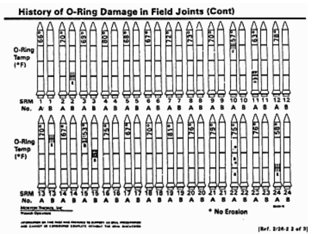
A day before the 1986 launch of the Challenger, a team of engineers urged NASA to postpone, arguing that launching in cold weather would be extremely dangerous. Parts called "O-rings", they said, were likely to crack in cold weather. A cracked O-ring could lead to a catastrophic explosion – and the death of every astronaut onboard.
Mission control asked the engineers to explain this risk with data. To make their case, the engineers created an infographic that displayed outlines of 48 rockets, each representing a previous launch. Each rocket was labeled with the temperature at launch, with marks showing O-ring damage. These marks were explained in a legend, to help mission control understand what the damage was.
Unfortunately, their infographic was very hard to read:
-
Instead of sorting the rockets by temperature or amount-of-damage (the two variables the engineers claimed were related!), they were sorted by…the date they launched.
-
The temperature at launch, which was the most important thing the engineers wanted mission control to see, was written sideways, in a tiny font that was difficult to read.
-
The marks showing O-ring damage were hard to understand, and the legend that explained them was on a separate page!
The engineers created an infographic that failed to clearly explain the risk, and mission control made the decision to go ahead with the launch. 73 seconds into the flight, the rocket exploded over the coast of Florida, killing everyone onboard. The tragedy crippled NASA, which did not launch another rocket for nearly three years. The Challenger’s explosion was, in the end, attributed to O-ring failure.
A good infographic is worth a thousand words. And sometimes it even saves lives.
For this project, you are going to create your own infographic! We’ll start by studying a variety of infographics. What message does each convey? Is each infographic communicating its message in the most effective way? As a class, we’ll view several infographics in the Sample Infographics (Google) slide deck and consider the answers to these questions.
Teacher Note: Distributing the student-facing Making Infographics Rubric will help students understand the work that a good infographic does. Teachers are welcome and encouraged to edit and adapt the rubric for their unique classroom context.
While viewing the Sample Infographics (Google), we’ll pause on each image to discuss.
-
Look at the first slide of the Sample Infographics (Google) slide deck. What do you Notice? What do you Wonder?
-
Are the words on the infographic clear and impactful - or does the meaning get lost? Why or why not?
-
Are the images in the infographic impactful - or does the meaning get lost? Why or why not?
-
Is the infographic accurate (e.g., every element is in the same proportion)?
-
Why do you think each author chose to use a certain strategy to represent their ratio statement (e.g., illustrate ratios using repeated images)?
Use the questions above to foster discussion of each infographic in the slide deck.
Investigate
For the remainder of the project, students will (1) do some brainstorming and research, (2) write a ratio statement or create a display, and (3) make their infographic in a medium of their choice (or one that you have selected).
There are a number of options for the data that might be the basis of your students' infographics.
-
Option 1: Students can build bar charts or dot plots in in CODAP from the the Global Food Supply and Production dataset or any of the data sets in our library. This option is appropriate for students who are comfortable independently building and interpreting displays.
-
Option 2: Students may find a dot plot or bar chart on the internet about a topic of interest to use as a starting point. This option works best for students who can confidently conduct an internet search and discern which internet sources are reliable, but may struggle with independently building displays.
-
Option 3: Students build a pie or bar chart in google sheets based on a summary statistic that they find about an issue that is of interest. For this option, students need to be able to recognize reliable internet sources. Option 3 is valuable if there is a school-wide (or interdiscplinary) interest in students developing comfort with google sheets.
-
Option 4: This option is the most appropriate for younger students, who need more teacher support. As a class, agree on a topic of interest, and then generate as many quantitative questions as possible about that topic. (E.g., if the topic is veterans, students might ask: What’s the gender breakdown? Do veterans have higher suicide rates? What percentage of veterans struggle with mental health?) Then, spend some time locating data that answers each question to develop a list of ratio statements for students to choose from. Students will use their chosen statement to make a dot plot or bar chart and a corresponding infographic.
Some teachers prefer that all students work from the same dataset while others encourage students to pursue their own unique interests. It is up to you how much freedom or structure you offer your students during this phase.
Once students have conducted their research, it is time to write a ratio statement (for options 1-3) or create a bar/pie chart or dot plot (for option 4). Urge students to refer to their rubrics for guidance on doing this well!
Some teachers have students submit their work up to this point to monitor progress and ensure that all students have a solid foundation for the remainder of the project. Others opt to conduct a peer review using the Making Infographics Rubric.
As students write their ratio statements and work on their infographics, one important point to emphasize is that all percentages are ratios! 40% is equivalent to 40 out of 100. If 40% of students wear baseball hats we can show 100 people, of which 40 are wearing hats. Or we could scale 40/100 down to 2/5 and show 5 people of which 2 are wearing hats.
Students should be now ready to independently complete their infographics.
A tricky thing about making infographics with images of people is that not all images accurately represent the diversity of the communities described by the statistics. We encourage the use of silhouetted images in infographics.
You may choose to allot class time (when students could use computers or art supplies), or you can direct students to complete the remainder of their infographics at home.
Synthesize
-
Once finished, encourage students to self-assess and revise their work. The Making Infographics Rubric is a useful tool to facilitate self and peer review.
-
Finally, celebrate students' work! In many instances, students will want to share their project, given how much time they have invested. Class or public presentations can instill a sense of pride.
-
If all students' infographics are on the same topic (e.g., if you used Option 4), a display featuring each student’s project will provide a fascinating and comprehensive view of that topic!
These materials were developed partly through support of the National Science Foundation, (awards 1042210, 1535276, 1648684, 1738598, 2031479, and 1501927).  Bootstrap by the Bootstrap Community is licensed under a Creative Commons 4.0 Unported License. This license does not grant permission to run training or professional development. Offering training or professional development with materials substantially derived from Bootstrap must be approved in writing by a Bootstrap Director. Permissions beyond the scope of this license, such as to run training, may be available by contacting contact@BootstrapWorld.org.