Students use linear models to investigate relationships in demographic data about US states using an inquiry-based approach, involving hypothesizing, experimental and computational modeling, and sense-making.
Lesson Goals |
Students will be able to…
|
Student-facing Lesson Goals |
|
Materials |
|
Supplemental Materials |
|
Key Points For The Facilitator |
This lesson focuses on linear relationships, and the math content of the lesson is primarily a review of those concepts from Algebra 1 (the third section includes topics that may be new to some students). That being said, the bulk of the new learning serves two objectives:
|
- correlation
-
the degree to which knowing the value of an explanatory variable helps us predict the value of another, response, variable
- direction
-
the aspect of a linear relationship that tells if the line relating the two variables is sloping up or down
- explanatory variable
-
When modeling a possible relationship between an input and an output (e.g. - height and age), we are curious about how a change in the input (typically graphed on the x-axis of a scatter plot) might "explain" the output (y). When the behavior of the output may be explained by the input, we refer to the input as the "explanatory variable".
- form
-
the shape of a relationship between two quantitative variables: whether the two variables together vary linearly or in some other way
- line of best fit
-
summarizes the relationship (if linear) between two quantitative variables in such a way as to minimize the errors overall when using explanatory values to predict responses
- linear relationship
-
a mathematical relation between two quantitative variables x and y such that y changes by a constant amount (the slope) for every unit increase in x. When graphed, a linear relationship appears as a straight line (sloping up or down).
- R²
-
a number between 0 and 1, indicating what percentage of the variation in the response values can be explained by a prediction based on the explanatory values in the data set. (For example, "25% of the variation in heights can be explained by a linear model based on shoe sizes")
- response variable
-
the variable in a relationship, generally plotted on the y-axis of a scatter plot, that is presumed to be affected by the explanatory variable; in some contexts the response variable is referred to as the "dependent variable" or the "output"
- scatter plot
-
a display of the relationship between two quantitative variables, graphing each explanatory value on the x axis and the accompanying response on the y axis
- slope
-
the steepness of a straight line on a graph reported as a number which tells how much y changes for every unit increase in x
- strength
-
of a relationship between two quantitative variables: how much do the values of one variable tells us about the values of the other
- x-intercept
-
the point where a line or curve crosses the x-axis of a graph (also called the 'root' or 'zero' because this is the x-value for which y=0)
- y-intercept
-
the point where a line or curve crosses the y-axis of a graph
🔗Looking for Patterns 45 minutes
Overview
Students explore the State Demographics dataset and, building on a discussion of the displays they previously made using the animals dataset, recognize the unique opportunity scatter plots offer for exploring relationships between columns.
Launch
We’re going to search for relationships within a dataset about all the states in the US. But first, let’s take a moment to (1) develop confidence in our ability to use functions for working with tables and making displays, and (2) build familiarity with a new dataset that we are going to spend a lot of time with.
-
Open the State Demographics Starter File.
-
From the File menu, select "Save a Copy", and click "Run".
-
Working in pairs or small groups, complete Exploring the States Dataset.
-
What did you Notice and Wonder?
-
What did you learn about defining rows in Pyret?
-
Example:
x = row-n(states-table, 3)will make the namexhave the value of the fourth row in the table (the index starts at zero!).
-
In math, x = 4 will define a variable x to be the value 4. Any time we use x after that, we can substitute in the value of 4. This works in Pyret, too. But in Pyret, values can be more than just numbers! In this file, the variables alabama and alaska are defined as rows from the table.
Debrief the rest of the page with students. Then, initiate a conversation about the various column names, ensuring that students understand all of the terminology. Later in the lesson, students will examine relationships between income and education. We recommend posing the questions below to ensure that they are ready to do so.
-
What columns in this dataset have to do with wealth?
-
pct-in-poverty,poverty-rate,median-income,per-capita-income
-
-
What columns are about education levels?
-
college-or-higher,hs-or-higher
-
Investigate
Before we dig deeper into State Demographics Starter File, let’s think back to the animals at the shelter in order to introduce some new data science concepts.
-
Think back to the dataset we explored about animals at the shelter.
-
Would you imagine that younger animals get adopted faster than older animals? Why or why not?
-
The goal here is to have an open discussion and draw students in. Allow students to share their opinions freely. (For example: Yes, baby animals get adopted quickly because they’re so cute! No, animals require too much work when they are young.)
-
-
What kind of data does the
agevariable represent? What aboutweeks?-
Both
ageandweeksare quantitative variables.
-
-
What kind of display would help us analyze the relationship between age and adoption time?
-
Again, solicit student’s ideas and discuss why each display type would or would not work.
-
Pie and bar charts help us see the frequency of values in a single categorical column. There are other displays, like histograms and box plots, that help us explore the distribution of values in a single quantitative column.
But what we really want is a display that will help us search for a relationship between two quantitative columns, and that’s exactly what scatter plots do!
Scatter plots reveal the relationship between two columns by plotting one on the x-axis and the other on the y-axis.
Before we can draw a scatter plot, we have to make an important decision: which variable do we think of as the cause - called the explanatory variable - and which is the effect (response variable)?
In this case, which do we suspect is the cause and which is the effect: age or time-to-adoption?
We suspect that age affects the adoption time, so we’ll use age as our explanatory variable and weeks as our response variable.
Why not Independent/Dependent? Data Science relies on concepts in Probability. When discussing events in Probability, we may say two events are dependent or they are independent. For instance, we might say having a job and having a college education are dependent because one affects the probability of the other occurring. When discussing relationships in Data Science, we want to go further than just saying two things are connected: We want to consider if they are causally connected: one of them affects the other, but not vice versa. Therefore, we think of one variable as being explanatory and the other as the response variable. For instance, having a college education would be our explanatory variable, and having a job would be the response. |
It’s customary to use the horizontal axis for our explanatory variable and the vertical axis for the response variable. Each row in the dataset will be represented by a point on the scatter plot with age for 𝑥 and weeks for 𝑦.
-
It’s time to return to the State Demographics Starter File!
-
We are going to be focusing some of our thinking on our state and its neighbors. Which states should we focus on?
-
Come to a consensus about which states your students will explore to produce richer full-class dialogue.
-
-
Working in pairs or small groups, complete Part 1 of Looking for Patterns.
-
Do not go on to Part 2! We’ll return to that later in the lesson.
Encourage students to first think about which columns might be related, and then create the scatter plot to search for this relationship, rather than making scatter plots for random pairs of columns. The dataset is designed so that students will quickly begin searching for relationships between varying levels of education and income, and there are linear relationships in each of these.
Exploring the States Dataset The State Demographics Starter File has a lot of interesting data, and endless possible combinations of columns to explore. But randomly smashing columns together in a scatter plot is not the habit we want students to cultivate! Instead, make sure students are actually talking with their partners about why two columns may or may not be related. Making sense: can students predict these relationships, and explain their thinking? (If so, probably not worth having them spend time on more than one of them!)
Surprises in the District of Columbia: DC often shows up as an outlier or extreme value. But why? Here are a few relationships to spark students' interest.
|
Synthesize
-
Share your scatter plots with one another (copying and pasting
scatter-plotdisplays into a shared document, for example, and then labeling those displays). -
What possible relationships did you find?
-
Did you and your classmates commonly use any words to describe the relationships you observed?
Note: Students will acquire the formal vocabulary that data scientists use to assess relationships in the next section of this lesson, which is all about identifying form, direction, and strength.
🔗Describing Patterns 45 minutes
Overview
Students identify and make use of correlations in scatter plots. They learn to characterize their form as being linear, curved, or showing no clear pattern. They learn that linear patterns have direction, and they learn how to report strength (as well as direction) with a number called the "correlation."
Launch
Scatter plots let us visualize the relationship between two quantitative columns. If no relationship exists, the points in the scatter plot just appear as a shapeless cloud. But if there is a relationship, the points will form some kind of pattern. When we build scatter plots, we are searching for patterns between two quantitative variables.
These patterns can be described by three terms: form, direction, and strength.
|
|
|
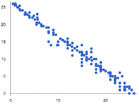
Some patterns are linear, and cluster around a straight line sloping up or down. |
Some patterns are nonlinear, and may look like some kind of curve. |
And sometimes there is no relationship or pattern at all! |
 relationships")

Form indicates whether a relationship is linear, nonlinear or undefined.
Optional: Have students turn to Linear, Non-linear, or Bust? and decide whether each of the scatter plots could be modeled by a linear relationship, a nonlinear relationship, or that there doesn’t appear to be a pattern.
If the relationship clusters around a straight line, we can talk about direction.
 Positive: The line slopes up as we look from left-to-right. Positive relationships are by far the most common because of natural tendencies for variables to increase in tandem. For example, “the older the animal, the more it tends to weigh”.
 Negative: The line slopes down as we look from left-to-right. For example, “the older a child gets, the fewer new words he or she learns each day.”
Only linear relationships have direction.
Not every shape has a direction! For example, a curve can start out sloping upwards, but then peak and slope downwards.
How well does knowing the x-value allow us to predict what the y-value will be?
A relationship is strong if knowing the x-value of a data point gives us a very good idea of what its y-value will be (knowing a student’s age gives us a very good idea of what grade they’re in). A strong linear relationship means that the points in the scatter plot are all clustered tightly around an invisible line.
 A relationship is weak if x tells us little about y (a student’s age doesn’t tell us much about their number of siblings). A weak linear relationship means that the cloud of points is scattered very loosely around the line.
Strength indicates how closely the two variables are related.
If a relationship is linear, we can report both its direction and its strength with a single number between -1 and +1 called the correlation. The way correlation reports direction is simple: it’s greater than zero if the relationship is positive, and less than zero if it’s negative. As for strength, correlation is closer to 1 in absolute value for strong relationships and closer to 0 for weak relationships; moderate relationships would have a correlation closer to 0.5 in absolute value.
Investigate
Now that you’ve dug into the role that form, direction and strength play in assessing a relationship between two quantitative variables, it’s time to put those concepts to work!
-
We are going to learn how to compute correlations using Pyret, but before we can trust the computer, we need to train our eyes to look for form so that we know whether we’re justified in fitting a line to the scatter plot and reporting a correlation, neither of which would be appropriate if the form is non-linear. (Alternatives are addressed in units on quadratic, exponential, and logarithmic models.) Also, sometimes there’s a bug in a program, so we want to be able to recognize whether the results we get from Pyret for form, direction, and strength make sense!
-
Let’s start by practicing matching the scatterplots to their descriptions on Identifying Form, Direction and Strength (Matching).
Review student answers, and have students explain their thinking for this activity. For students who are struggling, hearing what their peers are looking for is especially helpful at this stage.
In pairs or small groups, complete Identifying Form, Direction and Strength
Review student answers. Some of the answers are not so clear-cut, and students may disagree about what constitutes a "strong" vs. "weak" correlation. We’ve tried to choose scatter plots that clearly fall into one category or the other, but without diving into the algorithm for linear regression students may find this exercise somewhat subjective… and that’s ok!
Return to Looking for Patterns, and complete Part 2.
Common Misconceptions
-
Students often conflate strength and direction, thinking that a strong correlation must be positive and a weak one must be negative.
-
Students may also falsely believe that there is ALWAYS a correlation between any two variables in their dataset.
-
Students often believe that strength and sample size are interchangeable, leading to mistaken assumptions like "any correlation found in a million data points must be strong!" Or "there are only a few data points, so the relationship must be weak!" (Sample size only plays a role if we’re trying to generalize to what’s true for a larger population.)
Synthesize
-
What relationships did you explore in the states dataset?
-
Which appeared to have strong correlations? Were they positive or negative?
-
Were any of these relationships a surprise? Why or why not?
🔗Fitting Linear Models 45 minutes
Overview
Building on prior knowledge of linear functions, students learn to find the line of best fit to model the relationship in a scatter plot that looks linear. This yields a predictor function that tells what y-value to expect for a given x-value. Students also learn to use R-squared as a measure of how well their linear models fit the data.
Launch
Before we learn to fit linear models to scatter plots, let’s review. What do you remember about linear functions?
We’d expect students to be able to surface much of the following:
-
Linear functions look like straight lines.
-
Vertical lines are not functions, because their slope is undefined as a result of their horizontal change being zero.
-
The steepness of a line can be described by its slope (or constant rate of change).
-
The slope can be calculated from any two points.
-
Students may remember the slope as $$\displaystyle \frac{change \; in \; y}{change \; in \; x}$$ or 𝑟𝑖𝑠𝑒/𝑟u𝑛 or $$\displaystyle \frac{y_2 - y_1}{x_2 - x_1}$$.
-
The point where the line crosses the y-axis is called the y-intercept.
-
The x-coordinate of the y-intercept always starts with zero, e.g. (0, 𝑦).
-
Diagonal lines have both a y-intercept and an x-intercept.
-
Horizontal lines have a constant rate of change of zero.
 and y (5,7,9,11), and arrows showing what is added between the y-values (2,2,2,2).") Linear relationships grow by fixed amounts, meaning that the difference between two y-values will always be the same over identical horizontal intervals. In the table shown to the right, you can see arrows pointing out the "jumps" between y-values for intervals of 1. Each jump is the same size.
If the rate of change is constant, the relationship is linear.
Linear relationships grow by fixed amounts, meaning that the difference between two y-values will always be the same over identical horizontal intervals. In the table shown to the right, you can see arrows pointing out the "jumps" between y-values for intervals of 1. Each jump is the same size.
If the rate of change is constant, the relationship is linear.
-
Try comparing intervals of 2, instead of intervals of 1. Is the difference between y-values from x=1 to x=3 the same as the difference between y-values from x=2 to x=4?
-
Yes.
-
Optional: Students are about to be asked to write the Slope-Intercept form of the line, given two points in our states dataset. If your students haven’t done much work with calculating slope and y-intercept from pairs of points recently, we recommend prepping them for success by having them complete Defining a Linear Function from Two Points.
Investigate
Return to Pyret and the State Demographics Starter File.
Make a scatter plot showing the relationship between pct-college-or-higher and median-income, using state for the labels.

This scatter plot appears to show a positive, linear relationship: states with higher percentages of college graduates tend to have higher median household incomes.
Suppose the United States were to add a new state.
Based on the data for the existing 50 states (plus DC!)…
-
What median household income would you predict, if exactly 30% of the new state’s citizens had attended college?
-
What would you predict if 20% had attended college?
-
If 40% had attended college?
 Let students discuss, and explain their thinking. If possible, mark off a single point for each of the hypothetical percentages, then connect those points to show a straight line. Note that some of these new points would require changing the x-min, x-max, y-min and/or y-max of our display, which we can do by typing in the cells on the right side of the scatterplot and clicking "Redraw".
When we see patterns in data, we can use those patterns to make predictions based on that data. We can even draw a line to show all the possible predictions at once! These predictions represent our "best guess" at the underlying relationship in the data, as we try to model that relationship using math.
These models are just functions being graphed on top of the scatter plot, with the goal of minimizing the squared distances between the line and all the points on the plot. For relationships that are apparently linear, the "predictor function" is a linear model of the form y=mx+b. For historical reasons, this line of best fit is sometimes called the regression line.
When we make a model, we want it to be the closest possible approximation of all the points. If we used another line instead of the "line of best fit," it wouldn’t be as close to all the points as a group, and wouldn’t do as good a job at predicting y-values from x-values.
Let’s find the best fit we can make for this dataset!
Optional: If your students could use more support for finding the equation of the line between two points, direct them to the scaffolded version of Build a Model from Samples: College Degrees v. Income (Scaffolded) instead.
-
How well did your model work for Alabama and Alaska? Why didn’t it work as well for other states?
-
How can we measure "how well a model fits"?
Confirm that students were able to successfully compute slope and y-intercept, define and test f(x) in Pyret, and evaluate the predictive value of f(x).
Pyret includes a function called fit-model. Find its Contract on the Contracts Page. _If you’re working with a printed workbook, the contracts pages are included in the back. Like scatter-plot, it consumes columns for our labels, our 𝑥s and our 𝑦s. However, it also consumes a function! It produces a scatter plot, with the function graphed on top of it.
-
Complete Fit a Model: College Degrees v. Income.
-
Based on the R² values of the plots you created on this page, what do you think R² means?
R² describes the percentage of the variation in the y-variable that is explained by the x-variable in our model. In other words, an R² value of 0.20 could mean that “20% of the variation in median household income is explained by the percentage of college degrees in a state, according to our linear model”. Better models will explain a higher percentage of that variation.
If the model is perfectly linear, the R² value will be 1.00, meaning the 𝑦-values can be perfectly predicted by the 𝑥-values. Of course in the real world, the only "perfect" relationships are things like "height in inches v. height in centimeters". That relationship is perfectly linear…but we don’t need to use modeling to figure that out! The R² value for no correlation at all is zero. If we just drew a horizontal predictor line in the middle of the data, it would mean that we expect a median income to equal whatever the average is but with no connection whatsoever to the percentage of people who finish college.
But sometimes models make predictions that are even worse than useless - they trend in the wrong direction altogether. Did you see any models with a negative R² value?
-
Complete the first section ("Build a Model through Trial and Error") on Better Modeling: College Degrees v. Income.
-
What was the best model you could come up with?
But how do we find the best model? In Statistics, an algorithm called linear regression is used to derive the slope and y-intercept of the best possible model by taking every datapoint into account. Pyret has a function that will do just that, called lr-plot.
-
Complete the last section ("Build a Model Computationally") in Better Modeling: College Degrees v. Income.
-
How close did you come to the optimal model? Did anything about the model surprise you?
-
Optional: Turn to Graphing Linear Models and sketch graphs for three of the models you wrote on Build a Model from Samples: College Degrees v. Income and Fit a Model: College Degrees v. Income.
Sometimes the slope or y-intercept of a linear model have too many digits to be displayed clearly. When this happens, Pyret will convert them to scientific notation. While students have encountered scientific notation before, they may not recognize 8.23𝑒5 as 8.23 × 10⁵. You should make sure they understand how to translate this notation into numbers before proceeding.
More If you’d like to have students dig deeper into linear regression, there’s an entire lesson you can use that spends more time interpreting results and writing about findings. Deeper discussion of 𝑅2 and least-squares regression may be appropriate for older students, or in a dedicated statistics class. |
When we interpret a model, we try to make sense of the slope, the axes, the 𝑅2 value, and the real data behind them. In this example, a model built from Alaska and Alabama predicts that a 1 percent increase in college degrees is associated with a $5613 increase in median household income. Based on the 𝑅2 value of -15.63, this is a pretty terrible model and shouldn’t be trusted.
These models are useless if we can’t make sense of them!
-
For practice building other relationships in the data, complete Interpreting Linear Models.
-
Optional: For more practice, build linear models for other relationships in the data. You can use Building More Linear Models, and write up your findings in the extra space on Interpreting Linear Models.
Synthesize
-
How could we use scatter plots and linear models to find out if taller NBA players tend to make more three-pointers?
-
How could we use scatter plots and linear models to find out if wealthier people live longer?
-
How could we use scatter plots and linear models to find answers to other questions?
🔗(Optional) Other Forms of Linear Models 45 minutes
Overview
Students are reminded of the three forms of linear models available to us, discuss when and why we might choose one form over another, and practice translating between them.
Launch
When trying to fit a piece into a puzzle, sometimes we rotate the piece to see it from a different angle. When fitting a model to a dataset, we might prefer to look at the linear relationship from different angles as well!
So far, we’ve focused on models using the Slope-Intercept form of the line. That’s because it’s the form that is defined in terms of the response variable, making it most compatible with the programming environment. Depending on who we’re communicating with and what information we have available to us, we might opt to use other forms of linear models, but we can always translate any model into another!
You may already be familiar with the different forms of linear models available to us:
| Slope-Intercept | Point-Slope | Standard |
|---|---|---|
𝑦 = 𝑚𝑥+𝑏 |
𝑦−𝑦1 = 𝑚(𝑥−𝑥1) |
𝐴𝑥+𝐵𝑦 = 𝐶 |
|
|
|
Why we might choose to use one form over another?
-
Slope-Intercept Form makes it really easy to read the slope and y-intercept.
-
Point-Slope Form makes it easy to find the equation of the line given a single point and slope.
-
Standard Form makes it easy to find the x- and y-intercepts of the line.
Pose the questions below to assess student understanding of when and why we might choose one form over another.
-
Suppose our scatterplot has data for a state with 0% college enrollment, and another with 0% median income. Which linear model form would be easiest to build?
-
Standard Form
-
-
Suppose we only know the slope of a model, but we know the college graduation rate and median income for Rhode Island. Which form would make it easy to figure out the rest of the model?
-
Point-Slope Form
-
-
Suppose we want to define our model in Pyret. Which form makes it easiest to do that?
-
Slope-Intercept Form
-
Investigate
While it’s easier to write one linear form or the other based on the information available to us, and might be easier for someone else to extract the information they’re looking for based on the model we supply them with, we can easily translate back and forth between linear forms!
-
Let’s practice writing linear functions in each of the forms and translating them into Pyret function definitions.
-
Turn to Which Form is Best?
-
When you’re done, add your function definitions to your State Demographics Starter File and test them out with
fit-model.
Synthesize
If you needed to draw the graph of a linear model, which form would you like to start from? Why?
🔗Additional Exercises
To practice reading linear models and connecting them to graphs:
For practice translating the models we’ve written today into other forms:
These materials were developed partly through support of the National Science Foundation, (awards 1042210, 1535276, 1648684, 1738598, 2031479, and 1501927).  Bootstrap by the Bootstrap Community is licensed under a Creative Commons 4.0 Unported License. This license does not grant permission to run training or professional development. Offering training or professional development with materials substantially derived from Bootstrap must be approved in writing by a Bootstrap Director. Permissions beyond the scope of this license, such as to run training, may be available by contacting contact@BootstrapWorld.org.