(Also available in CODAP)
Students are introduced to box plots, learn to evaluate the spread of a quantitative column, and deepen their perspective on shape by matching box plots to histogram.
Lesson Goals |
Students will be able to…
|
Student-facing Lesson Goals |
|
Materials |
|
Supplemental Materials |
|
Preparation |
|
- box plot
-
the box plot (a.k.a. box-and whisker-plot) is a way of displaying a distribution of data based on the five-number summary: minimum, first quartile, median, third quartile, and maximum
- interquartile range
-
(IQR) is one possible measure of spread, based on dividing a dataset into four parts. The values that divide each part are called the first quartile (Q1), the median, and third quartile (Q3). IQR is calculated as Q3 minus Q1.
- maximum
-
the largest value in a dataset
- median
-
the middle element of a quantitative dataset
- minimum
-
the smallest value in a dataset
- quartile
-
each of four equal groups into which a population can be divided according to the distribution of values of a particular variable.
- range
-
the type or set of outputs that a function produces, i.e., the dependent variable(s)
- range of a dataset
-
the distance between minimum and maximum values
- sample
-
a set of individuals or objects collected or selected from a statistical population by a defined procedure
- shape
-
The aspect of a dataset - visible in a histogram or box plot - that describes which values are more or less common.
- spread
-
the extent to which values in a dataset vary, either from one another or from the center
🔗Making Box Plots 30 minutes
Overview
Students are introduced to the notion of spread in a dataset. They learn about quartiles, box plots, and how to use them to talk about spread.
Launch
When we explored measures of center, we tried to answer a question about "typical" values. We considered a fact - that the Animal Shelter Bureau says the average pet weighs almost 40 pounds.
How useful is this fact, really? Maybe all the pets weigh between 35 and 45 pounds, with every pet close to the mean. But maybe all the pets are super small or huge, and no one is even near to the mean!
So once we have our summary for a "normal value", it’s likely we’ll ask another question: If the average pet is 40 pounds, just how typical is that?
There are differences in every class of students. Not everyone likes the same music, not everyone dresses the same, etc. So we’d expect some deviation - or spread - in any class of students! Some classes are more different than others. How do we measure the spread of a population?
Suppose we lined up all animals' weights from smallest to largest, and then split them in half by taking the median. We can learn something about the spread of the dataset by taking the median of each half, splitting the population into four equal-sized quarters. The boundary points between these quarters are called quartiles.
-
The first quartile (Q1) is the value for which 25% of the animals weighed that amount or less.
-
What animals does the third quartile represent?
-
The third quartile is the value for which 75% of the animals weighed that amount or less.Another way of saying that would be that it is the value for which 25% of the animals weigh that amount or more.
-
Besides looking at the median as center, and the spread between Q1 and Q3, we also gain valuable information from the spread of the entire dataset — that is, the distance between minimum and maximum. This is called the range of a dataset. (Note: the term “Range” means something different in statistics than it does in algebra and programming!)
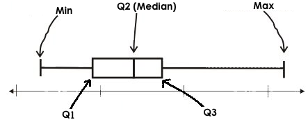
Splitting a dataset into quarters gives us five numbers that we can use to measure spread: the minimum, the maximum and the three quartiles that split the dataset into quarters.
-
Minimum: the smallest value in a dataset - it starts the first quarter
-
Q1 (lower quartile): the number that separates the first quarter of the data from the second quarter of the data
-
Q2: Median: the middle value (median) in a dataset
-
Q3 (upper quartile): the value that separates the third quarter of the data from the last
-
Maximum: the largest value in a dataset - it ends the fourth quarter of the data
Taken together these are called the 5 Number Summary of a dataset, and this summary is one tool for calculating spread. We can use these numbers to calculate two new values:
-
Range : the distance spanned by the extreme values in the dataset
-
Maximum - Minimum
-
-
IQR: the Interquartile Range, or the distance spanned by the middle half of the data
-
Q3 - Q1
-
Investigate
We can use box plots to visualize the 5 number summary, the Range, and the Interquartile Range.
Below is the Contract for box-plot, along with an example that will make a box plot for the pounds column in the animals-table.
box-plot :: (t::Table, col::String) -> Image
# Consumes a table and the name of the column
# to plot, and produces a box plot
box-plot(animals-table, "pounds")
Box plots divide our sample into four equally populated groups, and show which of those groups are spread wide or are tightly packed.
Type box-plot(animals-table, "pounds") into the Interactions Area, and see the resulting plot.

-
Then turn to Summarizing Columns in the Animals Dataset
-
Fill in the five-number summary for the
poundscolumn, and sketch the box plot. -
What conclusions can you draw about the distribution of values in this column?
-
While the animals' weights range from 0.1 pounds to 172 pounds, 50% of the animals weigh 11.3 pounds or less. The animal that weighs 172 pounds may be an outlier.
-
If students are struggling to write conclusions, go over the following five number summary from the box plot they made.
-
Minimum (the left “whisker”) - the smallest value in the dataset . In our dataset, that’s just 0.1 pounds.
-
Q1 (the left edge of the box) - computed by taking the median of the lower half of the values. In the pounds column, that’s 3.9 pounds.
-
Q2 / Median value (the line in the middle), which is the middle Quartile of the whole dataset. We already computed this to be 11.3 pounds.
-
Q3 (the right edge of the box), which is computed by taking the median of the upper half of the values. That’s 60.4 pounds in our dataset.
-
Maximum (the right “whisker”) - the largest value in the dataset . In our dataset, that’s 172 pounds.
-
Fill in the five-number summary for the
poundscolumn, and sketch the box plot.
-
What conclusions can you draw about the distribution of values in this column?
-
While the animals' weights range from 0.1 pounds to 172 pounds, 50% of the animals weigh 11.3 pounds or less. The animal that weighs 172 pounds may be an outlier.
-
Common Misconceptions
It is extremely common for students to forget that every quartile always includes 25% of the dataset. This will need to be heavily reinforced.
Synthesize
-
What percentage of points fall in the first quartile?
-
25%
-
-
What percentage of points fall in the second quartile?
-
25%
-
What percentage of points fall in the third quartile?
-
25%
-
-
What percentage of points fall in the fourth quartile?
-
25%
-
-
What percentage of points fall in the Interquartile Range (IQR)?
-
50%
-
-
What percentage of points fall within the Range?
-
100%
-
🔗Interpreting Box Plots 30 minutes
Overview
Students learn how to read a box plot, and consider spread and variability. They connect this visualization of spread to what they learned about histograms.
Launch
Just as pieand bar charts are ways of visualizing categorical data, box plots and histograms are both ways of visualizing the shape of quantitative data.
Box plots make it easy to see the 5-number summary, and compare the Range and Interquartile Range. Histograms make it easier to see skewness and more details of the shape, offering more granularity when using smaller bins.
Left-skewness is seen as a long tail in a histogram. In a box plot, it’s seen as a longer left "whisker" or more spread in the left part of the box. Likewise, right skewness is shown as a longer right "whisker" or more spread in the right part of the box.
Box plots and histograms give us two different views on the concept of shape.
| Intervals | Points-per-Interval | |
|---|---|---|
Box Plots |
Variable |
Fixed |
Histograms |
Fixed |
Variable |
Histograms: fixed intervals (“bins”) with variable numbers of data points in each one. Points “pile up in bins”, so we can see how many are in each. Larger bars show where the clusters are.
Box plots: variable intervals (“quartiles”) with a fixed number of data points in each one. Treats data more like “pizza dough”, dividing it into four equal quarters showing where the data is tightly clumped or spread thin. Smaller intervals show where the clusters are.
Kinesthetic Activity Divide the class into groups, and give each group a ruler and a ball of playdough. Have them draw a number line from 0-6 with the ruler, marking off the points at 0, 3, 4, 4.5 and 6 inches. Have the groups roll the dough into a thick cylinder, divide that cylinder in half, and then split each half to form four equally-sized cylinders. The playdough represents a sample, with values divided into four quarters. Box plots stretch and squeeze these equal quarters of the data across a number line, so that they fit into their respective intervals. On their number line, students have intervals from 0-3, 3-4, 4-4.5, and 4.5-6. Have students shape their cylinders into rectangles that fill each of these intervals, and are all about 1 inch thick. Students should notice that the playdough is taller for shorter intervals and thinner for longer intervals. Even though a box plot doesn’t show us the thickness of the data points, we know that a small interval has the same amount of data "squeezed" into it as a large interval has spread across it. |
Investigate
-
Complete Identifying Shape - Box Plots and see if you can describe box plots using what you know about skewness.
-
To make connections between histograms and box plots, complete Matching Box Plots to Histograms
-
Optional: Complete Matching Box Plots to Histograms and/or Matching Box Plots to Histograms (Desmos)
Modified Box Plots More Statistics- or Math-oriented classes will also be familiar with modified box plots (video explanation), which remove outliers from the box-and-whisker and draw them as asterisks outside of the plot. Modified box plots are also available in Bootstrap:Data Science, using the following Contract:
|
You’ve learned about quartiles, max and min, interquartile range, and more. With a partner, complete the Box Plot Vocab Concept Map and see if you can draw connections between these concepts!
Synthesize
Histograms, box plots, and measures of center and spread are all different ways to get at the shape of our data. It’s important to get comfortable using every tool in the toolbox when discussing shape!
We started talking about measures of center with a single question: is "average" the right measure to use when talking about animals' weights? Now that we’ve explored the spread of the dataset, do you agree or disagree that average is the right summary?
Project Option: Stress or Chill? Students can gather data about their own lives, and use what they’ve learned in the class so far to analyze it. Optional Project: Stress or Chill? [rubric] can be used as a mid-term or formative assessment, or as a capstone for a limited implementation of Bootstrap:Data Science. |
🔗Data Exploration Project (Box Plots) flexible
Overview
Students apply what they have learned about box plots to their chosen dataset. They will add three items to their Data Exploration Project Slide Template: (1) at least two box plots, (2) the corresponding five-number summaries, and (3) any interesting questions they develop. To learn more about the sequence and scope of the Exploration Project, visit Project: Dataset Exploration. For teachers with time and interest, Project: Create a Research Project is an extension of the Dataset Exploration, where students select a single question to investigate via data analysis.
Launch
Let’s review what we have learned about making and interpreting box plots.
-
Does a box plot display categorical or quantitative data? How many columns of data does a box plot display?
-
Box plots display a single column of quantitative data.
-
-
How are box plots similar to histograms? How are they different?
-
Box plots and histograms give us two different views on the concept of shape. Histograms have fixed intervals ("bins") with variables numbers of data points in each one. Boxplots have variable intervals ("quartiles") with a fixed number of data points in each one.
-
-
Building a box plot creates a five-number summary. What does the five-number summary tell us about the column?
-
The five-number summary includes the minimum, medium, and maximum. It also includes the median of the lower half of the values, and the median of the upper half of the data points.
-
Investigate
Let’s connect what we know about box plots to your chosen dataset.
-
Open your chosen dataset starter file in Pyret.
-
Teachers: Students have the opportunity to choose a dataset that interests them from our List of Datasets in the Choosing Your Dataset lesson.
-
-
Remind yourself which two columns you investigated in the Measures of Center lesson and make a box plot for one of them.
-
What question does your display answer?
-
Possible responses: How is the data for a certain column distributed? Are the values close together or really spread out? Are their any outliers?
-
-
Now, write down that question in the top section of Data Cycle: Shape of My Dataset
-
Then, complete the rest of the data cycle, recording how you considered, analyzed and interpreted the question.
-
Repeat this process for the other column you explored before (and any others you are curious about).
-
Note: If students want to investigate new columns from their dataset, they will need to copy/paste additional Measures of Center and Spread slides into their Explorartion Project and calculate the mean, median and modes for the new columns.
-
Confirm that all students have created and understand how to interpret their box plots. Once you are confident that all students have made adequate progress, invite them to access their Data Exploration Project Slide Template from Google Drive.
-
It’s time to add to your Data Exploration Project Slide Template.
-
Find the box plot slide in the "Making Displays" section and copy/paste your first box plot here. Duplicate the slide to add your other box plots.
-
Add the five-number summaries from these plots to the corresponding "Measures of Center and Spread" slides.
-
Be sure to also add any interesting questions that you developed while making and thinking about box plots to the "My Questions" slide at the end of the deck.
Synthesize
Share your findings!
What shape did you notice in your box plots?
Did you discover anything surprising or interesting about your dataset?
What, if any, outliers did you discover when making box plots?
When your compared your findings with others, did they make any interesting discoveries? (For instance: Did everyone find outliers? Was there more or less similarity than expected?)
🔗Additional Exercises
These materials were developed partly through support of the National Science Foundation, (awards 1042210, 1535276, 1648684, 1738598, 2031479, and 1501927).  Bootstrap by the Bootstrap Community is licensed under a Creative Commons 4.0 Unported License. This license does not grant permission to run training or professional development. Offering training or professional development with materials substantially derived from Bootstrap must be approved in writing by a Bootstrap Director. Permissions beyond the scope of this license, such as to run training, may be available by contacting contact@BootstrapWorld.org.