Students use data displays like bar and pie charts to create 1- and 2-level groupings to visualize the distribution of categorical data.
Lesson Goals |
Students will be able to:
|
Student-facing Lesson Goals |
|
Materials |
|
Supplemental Materials |
- bar chart
-
a display of categorical data that uses bars positioned over category values; each bar’s height reflects the count or percentage of data values in that category
- categorical data
-
data whose values are qualities that are not subject to the laws of arithmetic
- frequency
-
how often a particular value appears in a dataset
- percentage
-
a ratio showing the parts per hundred
- pie chart
-
a display that uses areas of a circular pie’s slices to show percentages in each category
- quantitative data
-
number values for which arithmetic makes sense
🔗Grouping by Value 25 minutes
Overview
Students learn one way of grouping data, showing the frequency of values in a dataset using bar and pie charts.
Launch
Open the Animals Starter File, click "Run" and test the expressions count(animals-table, "species") and bar-chart(animals-table, "species") in the Interactions Area.
Investigate
For the questions and prompts below, you can guide students verbally and via class discussion.
Optional: If you’d prefer, another option is to print and distribute Count, Bar Charts and Pie Charts. Part A of this page includes the same questions and prompts along with space for students to record their responses.
-
How do the count table and bar chart you just made compare?
-
The height of each bar matches the count of each species.
-
-
Which do you like better: the bar chart or the table? Why?
-
Now test out the expression
pie-chart(animals-table, "species") -
How does this pie chart compare to the bar chart you just made?
-
The wedges show percentages, whereas the bar chart was labeled with the count. We could figure out how many animals were in the sample from the bar chart. With the pie chart we see how the categories compare to each other, but we have no way of knowing how many animals each wedge represents.
-
-
When you first build a bar chart or pie chart in pyret, they are interactive displays. That means that you can mouse over them for more information.
-
Hit the up arrow in the Interactions Area to reload your last expression and test it out!
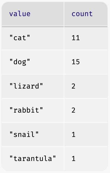

Both bar-chart and count group the data in one column by value, creating "buckets" for each unique value and counting the number of rows in each bucket, one uses a picture and one uses a table.
Hovering over a bar reveals the label, as well as the number of animals in that species. We can also resize the window by dragging its borders. This allows us to experiment with the data before closing the window and generating the final, non-interactive image.
Bar charts group data by value to show frequency as a count.
") Pie charts show us the percentage of the data points that fall in each category. Hovering over a pie slice reveals the label, as well as the count and the percentage of the whole. In this example we see that there is 1 animal that is a snail, representing 3.1% of the population.
Pie charts show us the percentage of the data points that fall in each category. Hovering over a pie slice reveals the label, as well as the count and the percentage of the whole. In this example we see that there is 1 animal that is a snail, representing 3.1% of the population.
Pie charts group data by value to show frequency as a percentage.
If our data is based on sample data from a larger population, we can use these charts to infer the proportion of a whole population that might belong to each category. For example, the distribution of species in our shelter might help us make guesses about the distribution of species in other shelters.
While bars in some bar charts should follow some logical order (alphabetical, small-medium-large, etc), the pie slices and bars can really be placed in any order, without changing the meaning of the chart.
-
Make a
pie-chartandbar-chartfor thepoundscolumn. -
What happened?
-
Why isn’t it useful to group the
poundscolumn using these functions?-
Grouping by value works well for categorical data, when lots of different data points can be sorted into a smaller number of buckets. But for quantitative data - which can have lots of different values - the number of buckets is too large to be useful.
-
-
Look at the list of columns in the Definitions Area. For which columns do you expect pie charts to be most useful?
-
Species, Sex, Fixed, and Legs
-
-
Turn to Bar & Pie Chart - Notice and Wonder and take two minutes to notice and wonder about the displays.
-
Then complete Matching Bar and Pie Charts.
Grouping by value works well when lots of different data points can be sorted into a smaller number of buckets.
Common Misconceptions
-
Pie charts and bar charts can show counts or percentages of categorical data. If there are more people with brown hair than blond hair, for example, a pie chart of hair color will have a larger slice or longer bar for "brown" than for "blond". In Pyret, pie charts show percentages, and bar charts show counts.
-
Pie charts have a wedge for each represented category. Unlike in bar charts, empty categories will not be included in a pie chart. When comparing bar charts, it is important to read the scales on the y-axes. If the scales do not match, a taller bar may not represent a larger value.
-
Bar charts look a lot like another kind of chart - called a "histogram" - which are actually quite different because they display quantitative data, not categorical. This lesson focuses entirely on pie- and bar charts.
Synthesize
Confirm that students have correctly matched the displays on Matching Bar and Pie Charts.
-
What did you Notice? What did you Wonder?
Answers will vary, but here are some important points:-
One of the pie charts has more categories for race than the other and the bar charts have more categories for race than we see on either of the pie charts.
-
In a pie chart, when there isn’t any data in a category it goes unrepresented, but in a bar chart its absence is made visible.
-
The scale is different for each bar chart, whereas for pie charts the percentages will always add to 100%.
-
-
How is
pie-chartsimilar tobar-chart? How is it different? -
When would you want to use one chart instead of another?
-
What strategies did you use to match the bar charts to the pie charts?
-
Which displays do you find it easier to interpret? Why?
-
What information is provided in bar charts that is hidden in pie charts?
-
In a bar chart, every category is visible and those with no values are missing a bar. Categories containing 0% of the data aren’t represented on a pie chart.
-
-
Why might this sometimes be problematic?
-
Sample Answer: If a service isn’t reaching a sector of the population, it’s easier to ignore the issue if that population doesn’t get represented in the display.
-
Optional Extension Sometimes we want to visualize data that is already summarized:
In this situation, we want to use the values in the first column for the labels of our pie slices or bars, and the values in the second column for the size. We have contracts for those, too:
Open the Hair Color Starter File to try them out! |
🔗Groups and Subgroups 20 minutes
Overview
Students learn how to create groups within groups, showing the relative frequency of one variable across values of another variable using stacked and multi bar charts.
Launch
For the questions and prompts below, you can guide students verbally and via class discussion.
Optional: If you’d prefer, another option is to print and distribute Introducing Displays for Subgroups and direct students to complete Part A now.
-
Take a moment to answer the following questions: How many cats are male? How many cats are female?
-
5 are male, 6 are female
-
-
Do you think there are about as many male dogs as female dogs?
-
Do you think this distribution is similar for every species at the shelter?
Comparing groups is great, but sometimes we want to compare sub-groups across groups. In this example, we want to compare the distribution of sexes across each species.
-
Let’s step away from the Animals Dataset for a moment to learn about some new kinds of displays that would make answering questions like these easier to answer by revealing the subgroups in a column. Turn to Stacked & Multi Bar Charts - Notice and Wonder.
-
What do you Notice? What do you Wonder?
Investigate
Pyret has two functions that let us specify both a group and a subgroup:
# stacked-bar-chart :: (Tabletable-name, Stringgroup, Stringsubgroup) -> Image
# multi-bar-chart :: (Tabletable-name, Stringgroup, Stringsubgroup) -> Image
-
Try using both of these functions to show the distribution of sexes across species in our shelter.
-
Which display do you think is easier to read?
| Stacked Bar Chart | Multi Bar Chart |
|---|---|
|
|
, cats (6 female, 5 male), and rabbits (1 female, 1 male)")
, cats (6 female, 5 male), rabbits (1 female, 1 male), lizards (1 female, 1 male), snails (1 hermaphrodite), and tarantulas (1 female)")
Stacked Bar Charts (left) put the totals side by side, so it’s easy to answer whether there are more dogs than cats in the shelter. But it’s a little more difficult to see whether there are more male dogs than female dogs, because the bars are on top of one another.
Multi Bar Charts (right) put the subgroups side by side, so it’s easy to answer whether there are more male dogs than female dogs in the shelter. But it’s a little more difficult to see whether there are more dogs than cats, because there aren’t any bars showing the totals.
Stacked bar charts make it easy to compare groups. Multi bar charts make it easy to compare subgroups.
Synthesize
All of the charts we’ve looked at in this lesson work with categorical data, showing us the frequency of values in one or two groups.
-
What kinds of questions need stacked or multi bar charts, rather than pie or bar charts?
-
What kinds of questions are better answered by stacked bar charts?
-
What kinds of questions are better answered by multi bar charts?
Optional Project: Making Infographics Infographics are a powerful tool for communicating information, especially when made by people who actually understand how to connect visuals to data in meaningful ways. Project: Make an Infographic is an opportunity for students to become more flexible math thinkers while tapping into their creativity. This project can be made on the computer or with pencil and paper. |
🔗Additional Exercises
-
If you are looking to offer your students more practice making and interpreting these chart types in Pyret, we have a second teaching dataset on Global Food Supply & Production Starter File for you to work with!
These materials were developed partly through support of the National Science Foundation, (awards 1042210, 1535276, 1648684, 1738598, 2031479, and 1501927).  Bootstrap by the Bootstrap Community is licensed under a Creative Commons 4.0 Unported License. This license does not grant permission to run training or professional development. Offering training or professional development with materials substantially derived from Bootstrap must be approved in writing by a Bootstrap Director. Permissions beyond the scope of this license, such as to run training, may be available by contacting contact@BootstrapWorld.org.