Introduction to Computational Data Science
Simple Data Types
Contracts
Displaying Categorical Data
Data Displays and Lookups
Table Methods
Defining Functions
Defining Table Functions
Method Chaining
If-Expressions
Randomness and Sample Size
Grouped Samples
Choosing Your Dataset
Histograms
Visualizing the “Shape” of Data
Measures of Center
Spread of a Data Set
Checking Your Work
Scatter Plots
Correlations
Linear Regression
Ethics and Privacy
Threats to Validity
Introduction to Computational Data Science
Introduction to Computational Data Science
Students are introduced to the Animals Dataset, learn about Tables, Categorical and Quantitative data, and consider the kinds of questions that can be asked about a dataset.
Prerequisites |
None |
Relevant Standards |
Select one or more standards from the menu on the left (⌘-click on Mac, Ctrl-click elsewhere). Common Core ELA Standards
Common Core Math Standards
K-12CS Standards
Oklahoma Standards
|
Lesson Goals |
Students will be able to…
|
Student-facing Lesson Goals |
|
Materials |
|
Preparation |
|
Supplemental Resources |
- categorical data
-
data whose values are qualities that are not subject to the laws of arithmetic.
- data row
-
a structured piece of data in a dataset that typically reports all the information gathered about a given individual
- data science
-
the science of collecting, organizing, and drawing general conclusions from data, with the help of computers
- header
-
the titles of each column of a table, usually shown at the top
- identifier column
-
a column of unique values which identify all the individual rows (e.g. - student IDs, SSNs, etc)
- programming language
-
a set of rules for writing code that a computer can evaluate
- quantitative data
-
number values for which arithmetic makes sense
Introduction 20 minutes
Overview
Students look at opening questions, either at their desks or in a walk around the room. They select a question they are personally interested in, and think about the data required to answer that question. This process draws a direct line between answering questions they care about and the basics of data science.
Launch
-
Give students 2 minutes to choose a question that grabs their attention, and group themselves by question. Ideally, no student will be the only one interested in that question.
-
Have students spend 2 minutes coming up with a hypothesis about what the answer is, and explaining why. Does every student in a single question-grouping have the same answer?
Investigate
-
What information would you collect to answer this question? Give students 5 minutes to think about what information they would need to collect, to find the answer.
Common Misconceptions
Students may lean towards questions about individuals, instead of questions about what’s true for a group of individuals who vary from one to another. For example, instead of wondering what movie gets the highest rating, they should ask what’s the typical rating for movies in a list, or how much those ratings tend to vary.
Synthesize
Have students share back the different data they would gather to answer their questions. For each question, students would likely have to gather many different kinds of data. If we wanted to find out if small schools are better than big schools, for example, we might want to gather data on SAT scores, college acceptance, etc. Each of these is a variable in our dataset: any two schools we look at could vary by each of them.
What is the most popular movie of all time? Is Climate Change real? How long do quarterbacks tend to stay in the league? Is Stop-and-Frisk racially biased? We can’t survey every school in the world, get data on every movie ever made, or every police action - but we can do an analysis for a sample of them, and try to infer something about all of them as a whole. These questions quickly turn into a discussion about data — how you assess it, how you interpret the results, and what you can infer from those results. The process of learning from data is called Data Science. Data science techniques are used by scientists, business people, politicians, sports analysts, and hundreds of other different fields to ask and answer questions about data.
We’ll use a programming language to investigate these questions. Just like any human language, programming languages have their own vocabulary and grammar that you will need to learn. The language you’ll be learning for data science is called Pyret.
Meet the Animals! 25 minutes
Overview
Students explore the Animals Dataset, sharing observations and familiarizing themselves with the idiosyncrasies and patterns in the data. In the process, they learn about Categorical and Quantitative data.
Notice and Wonder Pedagogy This pedagogy has a rich grounding in literature, and is used throughout this course. In the "Notice" phase, students are asked to crowd-source their observations. No observation is too small or too silly! Students may notice that the animals table has corners, or that it’s printed in black ink. But by listening to other students' observations, students may find themselves taking a closer look at the dataset to begin with. The "Wonder" phase involves students raising questions, but they must also explain the context for those questions. Sharon Hessney (moderator for the NYTimes excellent What’s going on in this Graph? activity) sometimes calls this "what do you wonder…and why?". Both of these phases should be done in groups or as a whole class, with time given to each. |
Launch
Have students open the Animals Spreadsheet in a browser tab, or turn to The Animals Dataset (Page 2) in their Student Workbooks.
Investigate
This table contains data from an animal shelter, listing animals that have been adopted. We’ll be analyzing this table as an example throughout the course, but you’ll be applying what you learn to a dataset you choose as well.
-
Turn to Questions and Column Descriptions (Page 4) in your Student Workbook. What do you Notice about this dataset? Write down your observations in the first column.
-
Sometimes, looking at data sparks questions. What do you Wonder about this dataset, and why? Write down your questions in the second column.
-
There’s a third column, called “Question Type” — we’re going to return to that later, so you can ignore it for now.
-
If you look at the bottom of the spreadsheet file, you’ll see that this document contains multiple sheets. One is called
"pets"and the other is called"README". Which sheet are we looking at? -
Each sheet contains a table. For our purposes, we only care about the animals table on the
"pets"sheet.
Any two animals in our dataset may have different ages, weights, etc. Each of these is called a variable in the dataset.
Data Scientists work with two broad kinds of data: Categorical Data and Quantitative Data. Categorical Data is used to classify, not measure. Categories aren’t subject to the laws of arithmetic. For example, we couldn’t ask if “cat is more than lizard”, and it doesn’t make sense to "find the average ZIP code” in a list of addresses. “Species” is a categorical variable, because we can ask questions like “which species does Mittens belong to?"
What are some other categorical variables you see in this table?
Quantitative Data is used to measure an amount of something, or to compare two pieces of data to see which is less or more. If we want to ask “how much” or “which is most”, we’re talking about Quantitative Data. "Pounds" is a quantitative variable, because we can talk about whether one animal weighs more than another or ask what the average weight of animals in the shelter is.
We use Categorical Data to answer “what kind?”, and Quantitative Data to answer "how much?".
-
Turn to page Categorical or Quantitative? (Page 3), and answer questions 1-7.
-
Sometimes it can be tricky to figure out if data is categorical or quantitative, because it depends on how that data is being used!
-
On Categorical or Quantitative? (Page 3) in your Student Workbook, fill in the blanks for questions 8-13.
Synthesize
Have students share back their noticings (statements) and wonderings (questions), and write them on the board.
Data Science is all about using a smaller sample of data to make educated guesses about a larger population. It’s important to remember that tables are only a sample of a larger population: this table describes some animals, but obviously it isn’t every animal in the world! Still, if we took the average age of the animals from this particular shelter, it might tell us something about the average age of animals from other shelters.
Meet Pyret! 10 minutes
Overview
Students open up the Pyret environment (code.pyret.org, or "CPO") and see the Animals Dataset reflected there.
Launch
Let’s take a look at our programming environment, and see what the Animals Dataset looks like there.
Open the Animals Starter File in a new tab. Click “Connect to Google Drive” to sign into your Google account. This will allow you to save Pyret files into your Google Drive.
Next, click the "File" menu and select "Save a Copy". This will save a copy of the file into your own account, so that you can make changes and retrieve them later.
Click "Run" to tell Pyret to read the code on the left-hand side. Anytime something on the left changes, we need to click "Run" to give Pyret the hint that something has changed.
Investigate
-
On the right-hand side, type
animals-tableand hit the "Enter" or "Return" key. -
What happens?
-
Look on the left-hand side of the screen. Where is Pyret getting
animals-tablefrom?
The first few lines on the lefthand side of the screen tell Pyret to import files from elsewhere, which contain tools we’ll want to use for this course. We’re importing a file called Bootstrap:Data Science, as well as files for working with Google Sheets, tables, and images:
include shared-gdrive("Bootstrap-DataScience-...")
include gdrive-sheets
include tables
include image
After that, we see a line of code that defines shelter-sheet to be a spreadsheet. This table is loaded from Google Drive, so now Pyret can see the same spreadsheet you do. (Notice the funny scramble of letters and numbers in that line of code? If you open up the Google Sheet, you’ll find that same scramble in the address bar! That scramble is how the Pyret editor knows which spreadsheet to load.) After that, we see the following code:
# load the 'pets' sheet as a table called animals-table
animals-table = load-table: name, species, age, fixed, legs
  source: pets-sheet.sheet-by-name("pets", true)
end
The first line (starting with #) is called a Comment. Comments are notes for humans, which the computer ignores. The next line defines a new table called animals-table, which is loaded from the shelter-sheet defined above. We also create names for the columns: name, species, sex, age, fixed, legs, pounds and weeks. We could use any names we want for these columns, but it’s always a good idea to pick names that make sense!
Even if your spreadsheet already has column headers, Pyret requires that you name them in the program itself.
Every table is made of cells, which are arranged in a grid of rows and columns. The first row and first column are special. The first row is called the header row, which gives a unique name to each variable (or “column”) in the table. The first column in the table is the identifier column, which contains a unique ID for each row. Often, this will be the name of each individual in the table, or sometimes just an ID number.
Below is an example of a table with one header row and two data rows:
| name | species | sex | age | fixed | legs | pounds | weeks |
|---|---|---|---|---|---|---|---|
"Sasha" |
"cat" |
"female" |
1 |
false |
4 |
6.5 |
3 |
"Mittens" |
"cat" |
"female" |
2 |
true |
4 |
7.4 |
1 |
-
How many variables are listed in the header row for the Animals Dataset? What are they called? What is being used for the identifier column in this dataset?
-
Try changing the name of one of the columns, and click "Run". What happens when you try to out the table?
-
What happens if you remove a column from the list? Or add an extra one?
After the header, Pyret tables can have any number of data rows. Each data row has values for every column variable (nothing can be left empty!). A table can have any number of data rows, including zero, as in the table below:
| name | species | sex | age | fixed | legs | pounds | weeks |
|---|
Pyret lets us use many different kinds of data. In the animals table, for example, there are Numbers (the number of legs each animal has), Strings (the species of the animal), and Booleans (whether it is true or false that an animal is fixed).
Synthesize
Once you know how to program, you can do a lot with datasets:
-
Data Scientists display tables as all kinds of charts and graphs. For example, we might want to make a pie chart showing how many animals of each species we have.
-
Sometimes they want to filter a table, showing only a few of the rows. For example we might only want to look at animals where
speciesis equal to"dog". -
Or perhaps we want to build a column! For example, there could be a vaccination for all cats under the age of 3, and we want to add a
vaccinatecolumn that saystrueorfalsefor animal.
In this course, you’ll be learning to do all three in Pyret: Display, Filter, and Build.
What are some other examples each?
These materials were developed partly through support of the National Science Foundation,
(awards 1042210, 1535276, 1648684, and 1738598).  Bootstrap:Data Science by the Bootstrap Community is licensed under a Creative Commons 4.0 Unported License. This license does not grant permission to run training or professional development. Offering training or professional development with materials substantially derived from Bootstrap must be approved in writing by a Bootstrap Director. Permissions beyond the scope of this license, such as to run training, may be available by contacting contact@BootstrapWorld.org.
Simple Data Types
Simple Data Types
Students begin to program in Pyret, learning about basic data types, operations, and value definitions.
Prerequisites |
None |
Lesson Goals |
Students will be able to…
|
Student-facing Lesson Goals |
|
Materials |
|
Preparation |
|
Supplemental Resources |
|
Key Points For The Facilitator |
|
Click here to see the prior unit-based version.
- Boolean
-
a type of data with two values: true and false
- definitions area
-
the left-most text box in the Editor where definitions for values and functions are written
- editor
-
software in which you can write and evaluate code
- error message
-
information from the computer about errors in code
- interactions area
-
the right-most text box in the Editor, where expressions are entered to evaluate
- operator
-
a symbol that manipulates two Numbers and produces a result
- syntax error
-
errors where the computer cannot make sense of the code (e.g. - missing commas, parentheses, unclosed strings)
Numbers & Strings 20 minutes
Overview
Students experiment with the Editor, exploring the different kinds of numbers and strings and how they behave in this programming language.
Launch
Students should open code.pyret.org (CPO) in their browser, and click "Sign In". This will ask them to log in with a valid Google account (Gmail, Google Classroom, YouTube, etc.), and then show them the "Programs" page. This page is empty - they don’t have any programs yet! Have them click "Open Editor".
Our Editing Environment
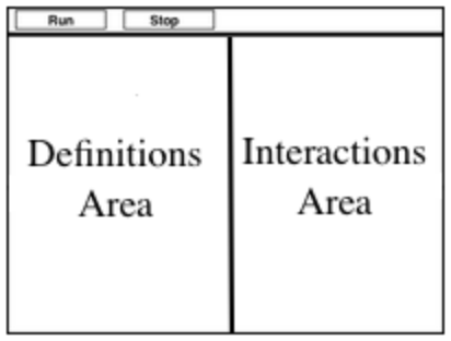 🖼Show image
This screen is called the Editor, and it looks something like the diagram you see here. There are a few buttons at the top, but most of the screen is taken up by two large boxes: the Definitions Area on the left and the Interactions Area on the right.
🖼Show image
This screen is called the Editor, and it looks something like the diagram you see here. There are a few buttons at the top, but most of the screen is taken up by two large boxes: the Definitions Area on the left and the Interactions Area on the right.
The Definitions Area is where programmers define values and functions that they want to keep, while the Interactions Area allows them to experiment with those values and functions. This is like writing function definitions on a blackboard, and having students use those functions to compute answers on scrap paper.
For now, we will only be writing programs in the Interactions Area on the right.
Investigate
Math is a language, just like English, Spanish, or any other language. Languages have nouns (e.g. “ball”, “tomato”, etc.) and verbs, which are actions we can perform on these nouns (e.g. - I can “throw a ball”). Math and programming also have values, like the numbers 1, 2 and 3. And, instead of verbs, they have functions, which are actions we can perform on values (e.g. - “I can square a number”).
Languages also have rules for syntax. In English, for example, words don’t have ! and ? in the middle. In math and programming numbers don’t have & in them.
Languages also have rules for grammar. The cat sat. is a sentence, whereas The sat cat. is nonsense, even though all the words are valid syntax. The order of the words matters!
Keeping the importance of syntax and grammar in mind is helpful when learning to program!.
Have students complete Numbers and Strings (Page 7). Ask them to pay special attention to the error messages!
-
What did you Notice? What do you Wonder?
-
Did you get any error messages? What did you learn from them? Most of the error messages we’ve just seen were drawing our attention to syntax errors: Missing commas, unclosed strings, etc.
Common Misconceptions
In Pyret, writing decimals as .5 (without the leading zero) results in a syntax error. Make sure students understand that Pyret needs decimals to start with a zero!
Synthesize
Our programming language knows about many types of numbers, and they behave pretty much the way they do in math. Discuss what students have learned:
-
Numbers and Strings evaluate to themselves.
-
Our Editor is pretty smart, and can automatically switch between showing a rational number as a fraction or a decimal, just by clicking on it!
-
Anything in quotes is a String, even something like
"42". -
Strings must have quotation marks on both sides.
-
Operators like
+,-,*,and/need spaces around them. -
In pyret, the operators work just like they do in math.
-
Any time there is more than one operator being used, Pyret requires that you use parentheses to define the order of operations.
-
Types matter! We can add two Numbers or two Strings to one another, but we can’t add the Number
4to the String"hello".
Error messages are a way for Pyret to explain what went wrong, and are a really helpful way of finding mistakes. Emphasize how useful they can be, and why students should read those messages out loud before asking for help. Have students see the following errors:
-
6 / 0. In this case, Pyret obeys the same rules as humans, and gives an error. -
(2 + 2. An unclosed quotation mark is a problem, and so is an unmatched parentheses.
Booleans 20 minutes
Overview
This lesson introduces students to Booleans, a unique datatype with only two values: "true" and "false", and why they are useful in both the real world and the programming environment.
Launch
What’s the answer: is 3 greater than 10?
Boolean-producing expressions are yes-or-no questions and will always evaluate to either true (“yes”) or false (“no”). The ability to separate inputs into two categories is unique and quite useful!
For example, some rollercoasters with loops require passengers to be a minimum height to make sure that riders are safely held in place by the one-size-fits all harnesses. The gate keeper doesn’t care exactly how tall you are, they just check whether you are as tall as the mark on the pole. If you are, you can ride, but they don’t let people on the ride who are shorter than the mark because they can’t keep them safe. Similarly, when you log into your email, the computer asks for your password and checks whether it matches what’s on file. If the match is true it takes you to your messages, but, if what you enter doesn’t match, you get an error message instead.
Brainstorm other scenarios where Booleans are useful in and out of the programming environment.
Investigate
In pairs, students complete Booleans (Page 8), making predictions about what a variety of Boolean expressions will return and testing them in the editor.
Synthesize
Debrief student answers as a class.
What sets Booleans apart from other data types?
These materials were developed partly through support of the National Science Foundation,
(awards 1042210, 1535276, 1648684, and 1738598).
Bootstrap:Data Science by the Bootstrap Community is licensed under a Creative Commons 4.0 Unported License. This license does not grant permission to run training or professional development. Offering training or professional development with materials substantially derived from Bootstrap must be approved in writing by a Bootstrap Director. Permissions beyond the scope of this license, such as to run training, may be available by contacting contact@BootstrapWorld.org.
Contracts
Contracts
Students learn how to apply Functions in the programming environment, encounter Image data types, and learn how to interpret the information contained in a Contract: Name, Domain and Range.
Prerequisites |
None |
||||||||||||
Relevant Standards |
Select one or more standards from the menu on the left (⌘-click on Mac, Ctrl-click elsewhere). Common Core Math Standards
Oklahoma Standards
|
||||||||||||
Lesson Goals |
Students will be able to:
|
||||||||||||
Student-facing Lesson Goals |
|
||||||||||||
Materials |
|||||||||||||
Preparation |
|
||||||||||||
Key Points For The Facilitator |
|
||||||||||||
Supplemental Resources |
|||||||||||||
Language Table |
|
Click here to see the prior unit-based version.
- argument
-
the inputs to a function; expressions for arguments follow the name of a function
- contract
-
a statement of the name, domain, and range of a function
- contract error
-
errors where the code makes sense, but uses a function with the wrong number or type of arguments
- data types
-
a way of classifying values, such as: Number, String, Image, Boolean, or any user-defined data structure
- domain
-
the type or set of inputs that a function expects
- error message
-
information from the computer about errors in code
- function
-
a mathematical object that consumes inputs and produces an output
- name
-
how we refer to a function or value defined in a language (examples: +, *, star, circle)
- range
-
the type or set of outputs that a function produces
- syntax error
-
errors where the computer cannot make sense of the code (e.g. - missing commas, parentheses, unclosed strings)
- variable
-
a letter or symbol that stands in for a value or expression
Applying Functions 10 minutes
Overview
Students learn how to apply functions in Pyret , reinforcing concepts from standard Algebra, and practice reading error messages to diagnose errors in code.
Launch
Students know about Numbers, Strings, Booleans and Operators -- all of which behave just like they do in math. But what about functions? Students may remember functions from algebra: fx = x + 4.
-
What is the name of this function? f
-
The expression f2 applies the function f to the number 2. What will it evaluate to? 6
-
What will the expression f3 evaluate to? 7
-
The values to which we apply a function are called its arguments. How many arguments does f expect? 1
Arguments (or "inputs") are the values passed into a function. This is different from variables, which are the placeholders that get replaced with input values! Pyret has lots of built-in functions, which we can use to write more interesting programs.
Have students log into code.pyret.org (CPO) , open the editor, type the words include image on Line 1 of the Definitions area (left side) and press "Run" to load the image library. Then type num-sqrt(16) into the interactions area and hit Enter.
-
What is the name of this function? num-sqrt
-
How many arguments does the function expect? 1
-
What type of argument does the function expect? Number
-
Does the num-sqrt function produce a Number? String? Boolean? Number
-
What did the expression evaluate to? 4
Have students type string-length("rainbow") into the interactions area and hit Enter:
-
What is the name of this function? string-length
-
How many arguments does
string-lengthexpect? 1 -
What type of argument does the function expect? String
-
What does the expression evaluate to? 7
-
Does the
string-lengthfunction produce a Number? String? Boolean? Number
Investigation
Have students complete Applying Functions (Page 9) to investigate the triangle function and a series of error messages. As students finish, have them try changing the expression triangle(50, "solid", "red") to use "outline" for the second argument. Then have them try changing colors and sizes!
Synthesize
Debrief the activity with the class.
-
What are the types of the arguments
trianglewas expecting? A Number and 2 Strings -
How does the output relate to the inputs? The Number determines the size and the Strings determine the style and color.
-
What kind of value was produced by that expression? An Image! New data type!
-
Which error messages did you encounter?
Contracts 15 minutes
Overview
This activity introduces the notion of Contracts, which are a simple notation for keeping track of the set of all possible inputs and outputs for a function. They are also closely related to the concept of a function machine, which is introduced as well. Note: Contracts are based on the same notation found in Algebra!
Launch
When students typed triangle(50, "solid", "red") into the editor, they created an example of a new data type, called an Image.
The triangle function can make lots of different triangles! The size, style and color are all determined by the specific inputs provided in the code, but, if we don’t provide the function with a number and two strings to define those parameters, we will get an error message instead of a triangle.
As you can imagine, there are many other functions for making images, each with a different set of arguments. For each of these functions, we need to keep track of three things:
-
Name — the name of the function, which we type in whenever we want to use it
-
Domain — the type(s) of data we give to the function
-
Range — the type of data the function produces
The Name, Domain and Range are used to write a Contract.
Where else have you heard the word "contract"? How can you connect that meaning to contracts in programming?
An actor signs a contract agreeing to perform in a film in exchange for compensation, a contractor makes an agreement with a homeowner to build or repair something in a set amount of time for compensation, or a parent agrees to pizza for dinner in exchange for the child completing their chores. Similarly, a contract in programming is an agreement between what the function is given and what it produces.
Contracts tell us a lot about how to use a function. In fact, we can figure out how to use functions we’ve never seen before, just by looking at the contract! Most of the time, error messages occur when we’ve accidentally broken a contract.
Contracts don’t tell us specific inputs. They tell us the data type of input a function needs. For example, a Contract wouldn’t say that addition requires "3 and 4". Addition works on more than just those two inputs! Instead, it would tells us that addition requires "two Numbers". When we use a Contract, we plug specific numbers or strings into the expression we are coding.
Contracts are general. Expressions are specific.
Let’s take a look at the Name, Domain, and Range of the functions we’ve seen before:
A Sample Contracts Table
| Name | Domain | Range | ||
|---|---|---|---|---|
|
:: |
|
-> |
|
|
:: |
|
-> |
|
|
:: |
|
-> |
|
|
:: |
|
-> |
|
|
:: |
|
-> |
|
|
:: |
|
-> |
|
When the input matches what the function consumes, the function produces the output we expect.
Optional: Have students make a Domain and Range Frayer model (Page 10) and use the visual organizer to explain the concepts of Domain and Range in their own words.
Here is an example of another function. string-append("sun", "shine")
Type it into the editor. What is its contract? string-append :: String, String -> String
Investigate
Have students complete pages Practicing Contracts: Domain & Range (Page 11) and Matching Expressions and Contracts (Page 12) to get some practice working with Contracts.
Synthesize
-
What is the difference between a value like
17and a type likeNumber? -
For each expression where a function is given inputs, how many outputs are there? For each collection of inputs that we give a function there is exactly one output.
Exploring Image Functions 20 minutes
Overview
This activity digs deeper into Contracts. Students explore image functions to take ownership of the concept and create an artifact they can refer back to. Making images is highly motivating, and encourages students to get better at both reading error messages and persisting in catching bugs.
Launch
Error Messages The error messages in this environment are designed to be as student-friendly as possible. Encourage students to read these messages aloud to one another, and ask them what they think the error message means. By explicitly drawing their attention to errors, you will be setting them up to be more independent in the next activity! |
Suppose we had never seen star before. How could we figure out how to use it, using the helpful error messages?
-
Type
starinto the Interactions Area and hit "Enter". What did you get back? What does that mean? There is something called "star", and the computer knows it’s a function! -
If it’s a function, we know that it will need an open parentheses and at least one input. Have students try star(50)
-
What error did we get? What hint does it give us about how to use this function?
starhas three elements in its Domain -
What happens if I don’t give it those things? We won’t get the star we want, we’ll probably get an error!
-
If I give
starwhat it needs, what do I get in return? An Image of the star that matches the arguments -
What is the contract for star? star : Number String String -> Image
-
The contract for
squarealso hasNumber String Stringas the Domain andImageas the Range. Does that mean the functions are the same? No! The Domain and Range are the same, but the function name is different… and that’s important because thestarandsquarefunctions do something very different with those inputs!
Investigate
-
At the back of your workbook, you’ll find pages with space to write down a contract and example or other notes for every function you see in this course. The first few have been completed for you. You will be adding to these contract pages and referring back to them for the remainder of this Bootstrap class!
-
Take the next 10 minutes to experiment with the image functions listed in the contracts pages.
-
When you’ve got working expressions, record the contracts and the code!
(If needed, you can print a copy of these contracts pages for your students.)
Strategies for English Language Learners MLR 2 - Collect and Display: As students explore, walk the room and record student language relating to functions, domain, range, contracts, or what they perceive from error messages. This output can be used for a concept map, which can be updated and built upon, bridging student language with disciplinary language while increasing sense-making. |
Synthesize
-
squareandstarhave the same Domain (Number, String, String) and Range (Image). Did you find any other shape functions with the same Domain and Range? Yes!triangleandcircle. -
Does having the same Domain and Range mean that the functions do the same things? No! They make very different images!
-
A lot of the Domains for shape functions are the same, but some are different. Why did some shape functions need more inputs than others?
-
Was it harder to find contracts for some of the functions than others? Why?
-
What error messages did you see? Too few / too many arguments given, missing parentheses, etc.
-
How did you figure out what to do after seeing an error message? Read the error message, think about what the computer is trying to tell us, etc.
-
Which input determined the size of the Rhombus? What did the other number determine?
Contracts Help Us Write Code 10minutes
Overview
Students are given contracts for some more interesting image functions and see how much more efficient it is to write code when starting with a contract.
Launch
You just investigated image functions by guessing and checking what the contract might be and responding to error messages until the images built. If you’d started with contracts, it would have been a lot easier!
Investigate
Have students turn to Using Contracts (Page 13), Using Contracts (continued) (Page 14) and use their editors to experiment.
Once they’ve discovered how to build a version of each image function that satisfies them, have them record the example code in their contracts table. See if you can figure out what aspect of the image each of the inputs specifies. It may help you to jot down some notes about your discoveries. We will be sharing our findings later.
-
What kind of triangle did
trianglebuild? Thetrianglefunction draws equilateral triangles -
Only one of the inputs was a number. What did that number tell the computer? the size of the triangle
-
What other numbers did the computer need to already know in order to build the
trianglefunction? all equilateral triangles have three 60 degree angles and 3 equal sides -
If we wanted to build an isosceles triangle or a right triangle, what additional information would the computer need to be given?
Have students turn to Triangle Contracts (Page 15) and use the contracts that are provided to write example expressions. If you are ready to dig into triangle-sas, you can also have students work through Triangle Contracts (SAS & ASA).
Sometimes it’s helpful to have a contract that tells us more information about the arguments, like what the 3 numbers in a contract stand for. This will not be a focal point of our work, but to give students a taste of it, have them turn to Radial Star (Page 16) and use the contract to help them match the images to the corresponding expressions. For more practice with detailed contracts you can have them turn to Star Polygon to work with the detailed contract for a star-polygon. Both of these functions can generate a wide range of interesting shapes!
Synthesize
Make sure that all students have completed the shape functions in their contracts pages with both contracts and example code so they have something to refer back to.
-
How was it different to code expressions for the shape functions when you started with a contract?
-
For some of you, the word
ellipsewas new. How would you describe what an ellipse looks like to someone who’d never seen one before? Why did the contract forellipserequire two numbers? What happened when the two numbers were the same?
How to diagnose and fix errors is a skill we will continue working on developing. Some of the errors are syntax errors: a missing comma, an unclosed string, etc. All the other errors are contract errors. If you see an error and you know the syntax is right, ask yourself these three questions:
-
What is the function that is generating that error?
-
What is the contract for that function?
-
Is the function getting what it needs, according to its Domain?
Common Misconceptions
Students are very likely to randomly experiment, rather than to actually use the Contracts. You should plan to ask lots of direct questions to make sure students are making this connection, such as:
-
How many items are in this function’s Domain?
-
What is the name of the 1st item in this function’s Domain?
-
What is the type of the 1st item in this function’s Domain?
-
What is the type of the Range?
Additional Exercises:
These materials were developed partly through support of the National Science Foundation,
(awards 1042210, 1535276, 1648684, and 1738598).
Bootstrap:Data Science by the Bootstrap Community is licensed under a Creative Commons 4.0 Unported License. This license does not grant permission to run training or professional development. Offering training or professional development with materials substantially derived from Bootstrap must be approved in writing by a Bootstrap Director. Permissions beyond the scope of this license, such as to run training, may be available by contacting contact@BootstrapWorld.org.
Displaying Categorical Data
Displaying Categorical Data
Students learn to apply functions to entire Tables, generating pie charts and bar charts. They then explore other plotting and display functions that are part of the Data Science library.
Prerequisites |
||||||||||||||||
Relevant Standards |
Select one or more standards from the menu on the left (⌘-click on Mac, Ctrl-click elsewhere). CSTA Standards
K-12CS Standards
Oklahoma Standards
|
|||||||||||||||
Lesson Goals |
Students will be able to:
|
|||||||||||||||
Student-facing Lesson Goals |
|
|||||||||||||||
Materials |
||||||||||||||||
Preparation |
|
|||||||||||||||
Supplemental Resources |
||||||||||||||||
Language Table |
|
- bar chart
-
a display of categorical data that uses bars positioned over category values; each bar’s height reflects the count or percentage of data values in that category
- contract
-
a statement of the name, domain, and range of a function
- domain
-
the type or set of inputs that a function expects
- pie chart
-
a display that uses areas of a circular pie’s slices to show percentages in each category
Displaying Categorical Variables 10 minutes
Overview
Students extend their understanding of Contracts and function application, learning new functions that consume Tables and produce displays and plots.
Launch
Have students ever seen any pictures created from tables of data? Can they think of a situation when they’d want to consume a Table, and use that to produce an image? The library included at the top of the file includes some helper functions that are useful for Data Science, which we will use throughout this course. Here is the Contract for a function that makes pie charts, and an example of using it:
pie-chart(animals-table, "legs")
-
What is the Name of this function?
-
How many inputs are in its Domain?
-
In the Interactions Area, type
pie-chart(animals-table, "sex")and hit Enter. What happens?
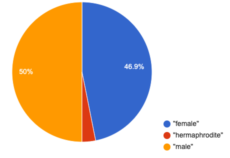
Hovering over a pie slice reveals the label, as well as the count and the percentage of the whole. In this example we see that there are 15 females, representing 46.9% of the population.
We can also resize the window by dragging its borders. This allows us to experiment with the data before closing the window and generating the final, non-interactive image.
The function pie-chart consumes a Table of data, along with the name of a categorical column you want to display. The computer goes through the column, counting the number of times that each value appears. Then it draws a pie slice for each value, with the size of the slice being the percentage of times it appears. In this example, we used our animals-table table as our dataset, and made a pie chart showing the distribution of sex across the shelter.
Investigate
Here is the Contract for another function, which makes bar charts:
-
Which column of the animals table tells us how many legs an animal has?
-
Use
bar-chartto make a display showing how many animals there are of each sex. -
Experiment with pie and bar charts, passing in different column names. If you get an error message, read it carefully!
-
What do you think are the rules for what kinds of columns can be used by bar-chart and pie-chart?
-
When would you want to use one chart instead of another?
Common Misconceptions
Pie charts and bar charts may show counts or percentages (in Pyret, pie charts show percentages and bar charts show counts). Bar charts look a lot like histograms, which are actually quite different because they display quantitative data, not categorical. Also, a pie chart can only display one categorical variable but a bar chart might be used to display two or more categorical variables.
Synthesize
Pie and Bar Charts display what portion of a sample belongs to each category. If they are based on sample data from a larger population, we use them to infer the proportion of a whole population that might belong to each category.
Pie charts and bar charts are mostly used to display categorical columns.
While bars in some bar charts should follow some logical order (alphabetical, small-medium-large, etc), the pie slices and bars can technically be placed in any order, without changing the meaning of the chart.
Exploring other Displays 30 minutes
Overview
Students freely explore the Data Science display library. In doing so, they experiment with new charts, practice reading Contracts and error messages, and develop better intuition for the programming constructs they’ve seen before.
Launch
There are lots of other functions, for all different kinds of charts and plots. Even if you don’t know what these plots are for yet, see if you can use your knowledge of Contracts to figure out how to use them.
Investigate
Common Misconceptions
There are many possible misconceptions about displays that students may encounter here. But that’s ok! Understanding all those other plots is not a learning goal for this lesson. Rather, the goal is to have them develop some loose familiarity, and to get more practice reading Contracts.
Synthesize
Today you’ve added more functions to your toolbox. Functions like pie-chart and bar-chart can be used to visually display data, and even transform entire tables!
You will have many opportunities to use these concepts in this course, by writing programs to answer data science questions.
Extension Activity Sometimes we want to summarize a categorical column in a Table, rather than a pie chart. For example, it might be handy to have a table that has a row for dogs, cats, lizards, and rabbits, and then the count of how many of each type there are. Pyret has a function that does exactly this! Try typing this code into the Interactions Area: What did we get back?
Sometimes the dataset we have is already summarized in a table like this, and we want to make a chart from that. In this situation, we want to base our display on the summary table: the size of the pie slice or bar is taken directly from the count column, and the label is taken directly from the value column. When we want to use summarized data to produce a pie chart, we have the contract for another function: # pie-chart-summarized :: Table, String, String -> Image
And an example of using that function (applying
|
Additional Exercises:
These materials were developed partly through support of the National Science Foundation,
(awards 1042210, 1535276, 1648684, and 1738598).
Bootstrap:Data Science by the Bootstrap Community is licensed under a Creative Commons 4.0 Unported License. This license does not grant permission to run training or professional development. Offering training or professional development with materials substantially derived from Bootstrap must be approved in writing by a Bootstrap Director. Permissions beyond the scope of this license, such as to run training, may be available by contacting contact@BootstrapWorld.org.
Data Displays and Lookups
Data Displays and Lookups
Students continue to practice making different kinds of data displays, this time focusing less on programming and more on using displays to answer questions. They also learn how to extract individual rows from a table, and columns from a row.
Prerequisites |
||||||||||||||||
Relevant Standards |
Select one or more standards from the menu on the left (⌘-click on Mac, Ctrl-click elsewhere). CSTA Standards
K-12CS Standards
Next-Gen Science Standards
Oklahoma Standards
|
|||||||||||||||
Lesson Goals |
Students will be able to…
|
|||||||||||||||
Student-facing Lesson Goals |
|
|||||||||||||||
Materials |
||||||||||||||||
Preparation |
|
|||||||||||||||
Supplemental Resources |
||||||||||||||||
Language Table |
|
- categorical data
-
data whose values are qualities that are not subject to the laws of arithmetic.
- contract
-
a statement of the name, domain, and range of a function
- method
-
a function that is only associated with an instance of a datatype, which consumes inputs and produces an output based on that instance
- quantitative data
-
number values for which arithmetic makes sense
Displaying Data 20 minutes
Overview
Students get some more practice applying the plotting functions and working with Contracts, and begin to shift the focus from programming to data visualization. This activity stresses a hard programming skill (reading Contracts) with formal reading comprehension (identifying key portions of the sentence).
Launch
The Contracts page in the back of students' workbooks contains contracts for many plotting functions.
Suppose we wanted to generate a display showing the ratio of fixed to un-fixed animals from the shelter? How do we go from a simple sentence to working code that makes a data display?
To make a data display, we ask "Which Rows?", "Which Column(s)?", and "What Display?"
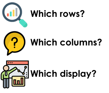
-
We start by asking which rows we’re talking about. In this case, it’s all the animals from the shelter.
-
We also need to know which column(s) - or "which variable(s)" - we are displaying. In this case, it’s the
fixedcolumn. -
Finally, we need to know which display we are using. Is it a histogram? Bar chart? Scatter plots are essential for displaying relationships between columns, but the other displays only deal with one column. Some displays work for categorical data, and others are for quantitative data.
Once we can answer these questions, all we need to do is find the Contract for that display and fill in the Domain!
To display the categorical data, we can choose between pie and bar charts. Which one of these two is best, and why?
Investigate
Do you know what kind of data is used for each display?
Turn to What Display Goes with Which Data? (Page 23), and see if you identify what kind of data each display needs!
Let’s get some practice going from questions to code, making visualizations.
Turn to Data Displays (Page 24), and see if you can fill in these three parts for a number of data display requests. When you’re finished, try to make the display in Pyret using the appropriate function.
Synthesize
Debrief the activity with students.
Optional: As an extension, have students break into teams and come up with additional Data Display challenges, then race to see which team can complete the other team’s challenges first!
Row and Column Lookups 30 minutes
Overview
Students learn how to define values in Pyret, and practice by defining Numbers, Strings, and Images. They also learn how to define an individual row from a table in Pyret, and how to access a particular column from that row.
Launch
Have students open their saved Animals Starter File (or make a new copy), and click “Run”.
Sometimes we have a value that we want to use again and again, and it makes sense to define a name for it. Every definition includes a name and a value. In the code below, we have definitions for a String, a Number and an Image.
name = "Flannery"
age = 16
logo = star(50, "solid", "red")
-
What are the names given in each of these? name, age, and logo
-
What are the values? the String "Flannery", the Number 16, and an Image of a solid red star
Investigate
We can even define Rows from our tables!
Tables have special functions associated with them, called Methods, which allow us to do all sorts of things with those tables. For example, we can get the first data row in a table by using the .row-n method:
animals-table.row-n(0)
Don’t forget: data rows start at index zero!
In the Interactions Area, use the row-n method to get the second and third data rows.
What is the Domain of .row-n? What is the Range? Find the contract for this method in your contracts table. A table method is a special kind of function which always operates on a specific table. In our example, we always use .row-n with the animals table, so the number we pass in is always used to grab a particular row from animals-table.
The code below will define the first row from the animals table:
sasha = animals-table.row-n(0)
Pyret also has a way for us to get at individual columns of a Row, by using a Row Accessor. Row accessors start with a Row value, followed by square brackets and the name of the column where the value can be found. Here are three examples that use row accessors to get at different columns from the first row in the animals-table:
animals-table.row-n(0)["name"]
animals-table.row-n(0)["age"]
animals-table.row-n(0)["fixed"]
And of course, we can use our defined name, substituting it in place of all the redundant code:
sasha["name"]
sasha["age"]
sasha["fixed"]
-
How would you get the
weekscolumn out of the second row? The third? -
Complete the exercises on Lookup Questions (Page 25).
Flip back to page 2 of your workbook and look at The Animals Dataset. Which row is animalA? Label it in the margin next to the dataset. Which row is animalB? Label it in the margin next to the dataset.
Now turn back to your screen.
What happens when you evaluate animalA in the Interactions Area?
-
Define at least two additional values to be animals from the
animals-table,calledanimalCandanimalD.
Synthesize
Have students share their answers, and see if there are any common questions that arise.
Additional Exercises:
These materials were developed partly through support of the National Science Foundation,
(awards 1042210, 1535276, 1648684, and 1738598).
Bootstrap:Data Science by the Bootstrap Community is licensed under a Creative Commons 4.0 Unported License. This license does not grant permission to run training or professional development. Offering training or professional development with materials substantially derived from Bootstrap must be approved in writing by a Bootstrap Director. Permissions beyond the scope of this license, such as to run training, may be available by contacting contact@BootstrapWorld.org.
Table Methods
Table Methods
Students learn about table methods, which allow them to order, filter, and build columns to extend the animals table.
Prerequisites |
||||||||||||||||
Relevant Standards |
Select one or more standards from the menu on the left (⌘-click on Mac, Ctrl-click elsewhere). CSTA Standards
Next-Gen Science Standards
Oklahoma Standards
|
|||||||||||||||
Lesson Goals |
Students will be able to…
|
|||||||||||||||
Student-facing Lesson Goals |
|
|||||||||||||||
Materials |
||||||||||||||||
Preparation |
|
|||||||||||||||
Supplemental Resources |
||||||||||||||||
Language Table |
|
Review Function Definitions 15 minutes
Overview
Students get some practice reading function definitions, and in the process they build knowledge that’s needed later on in the lesson.
Launch
Let’s see how much you remember about function definitions! Load the Table Methods Starter File, go to the File menu, and click "Save a Copy".
Investigate
-
Complete Reading Function Definitions (Page 28) in their student workbooks.
-
Scroll down until you see the
examplessection foris-dog. There are three examples here, all usingcat-row. Each one shows us a different way of thinking about examples:-
The first one lists the answers. For example,
cat-rowis not a dog (producing the answerfalse). We know this because we defined the row to be a cat, and cats are definitely not dogs! -
The second one shows us some of the work involved: we know the species of
cat-rowis"cat",and comparing that to the String"dog"will return false. -
The third one shows all the work: given the Row
cat-row,we look up the"species"column and compare it to the String"dog".
-
Write three similar examples, this time using dog-row.
Synthesize
Can students explain what each function does?
Ordering Tables 10 minutes
Overview
Students learn to sort Rows of a Table in ascending or descending order, according to one column.
Launch
Have students find the contract for .order-by in their contracts pages. The .order-by method consumes a String (the name of the column by which we want to order) and a Boolean (true for ascending, false for descending). But what does it produce?
Investigate
-
Type
animals-table.order-by("name", true)into the Interactions Area. What do you get? -
Type
animals-table.order-by("age", false)into the Interactions Area. What do you get? -
Sort the animals table from heaviest-to-lightest.
-
Sort the animals table alphabetically by species.
-
Sort the animals table by how long it took for each animal to be adopted, in ascending order.
Synthesize
-
What do
.order-byand.row-nhave in common? How are they different? -
Does sorting the
animals-tableproduce a new table, or change the existing one? How could we test this?
Filtering Tables 20 minutes
Overview
Students learn how to filter tables, by removing Rows.
Launch
Explain to students that you have "Function Cards", which describe the purpose statement of a function that consumes a Row from a table of students, and produces a Boolean (e.g. - "this student is wearing glasses"). Select a volunteer to be the "filter method", and have them randomly choose a Function Card, and make sure they read it without showing it to anyone else.
Have 6-8 students line up in front of the classroom, and have the filter method go to each student and say "stay" or "sit" depending on whether their function would return true or false for that student. If they say "sit", the student sits down. If they say true, the student stays standing.
Ask the class: based on who sat and who stayed, what function was on the card?
The .filter method takes a function, and produces a new table containing only rows for which the function returns true.
Suppose we want to get a table of only animals that have been fixed? Have students find the contract for .filter in their contracts pages. The .filter method is taking in a function. What is the contract for that function? Where have we seen functions-taking-functions before?
Investigate
-
In the Interactions Area, type
animals-table.filter(lookup-fixed). What did you get? -
What do you expect
animals-tableto produce, and why? Try it out. What happened? -
In the Interactions Area, type
animals-table.filter(is-old). What did you get? -
In the Interactions Area, type
animals-table.filter(is-dog). What did you get? -
In the Interactions Area, type
animals-table.filter(lookup-name). What did you get?
The .filter method walks through the table, applying whatever function it was given to each row, and producing a new table containing all the rows for which the function returned true. Notice that the Domain for .filter says that test must be a function (that’s the arrow), which consumes a Row and produces a Boolean. If it consumes anything besides a single Row, or if it produces anything else besides a Boolean, we’ll get an error.
Common Misconceptions
Students often think that filtering a table changes the table. In Pyret, all table methods produce a brand new table. If we want to save that table, we need to define it. For example: cats = animals-table.filter(is-cat).
Synthesize
Debrief with students. Some guiding questions on filtering:
-
Suppose we wanted to determine whether cats or dogs get adopted faster. How might using the
.filtermethod help? -
If the shelter is purchasing food for older cats, what filter would we write to determine how many cats to buy for?
-
Can you think of a situation where filtering fixed animals would be helpful?
Building Columns 10 minutes
Overview
Students learn how to build columns, using the .build-column table method.
Launch
Suppose we want to transform our table, converting pounds to kilograms or weeks to days. Or perhaps we want to add a "cute" column that just identifies the puppies and kittens? Have students find the contract for .build-column in their contracts pages. The .build-column method is taking in a function and a string. What is the contract for that function?
Investigate
-
Try typing
animals-table.build-column("old", is-old)into the Interactions Area. -
Try typing
animals-table.build-column("sticker", nametag)into the Interactions Area. -
What do you get? What do you think is going on?
The .build-column method walks through the table, applying whatever function it was given to each row. Whatever the function produces for that row becomes the value of our new column, which is named based on the string it was given. In the first example, we gave it the is-old function, so the new table had an extra Boolean column for every animal, indicating whether or not it was young. Notice that the Domain for .build-column says that the builder must be a function which consumes a Row and produces some other value. If it consumes anything besides a single Row, we’ll get an error.
Synthesize
Debrief with students. Ask them if they think of a situation where they would want to use this. Some ideas:
-
A dataset about school might include columns for how many students are in the school and how many pass the state exam. But when comparing schools of different sizes, what we really want is a column showing what percentage passed the exam. We could use
.build-columnto compute that for every row in the table. -
The animals shelter might want to print nametags for every animal. They could build a column using the
textfunction to have every animal’s name in big, purple letters. -
A dataset from Europe might list everything in metric (centimeters, kilograms, etc), so we could build a column to convert that to imperial units (inches, pounds, etc).
Additional Exercises:
These materials were developed partly through support of the National Science Foundation,
(awards 1042210, 1535276, 1648684, and 1738598).
Bootstrap:Data Science by the Bootstrap Community is licensed under a Creative Commons 4.0 Unported License. This license does not grant permission to run training or professional development. Offering training or professional development with materials substantially derived from Bootstrap must be approved in writing by a Bootstrap Director. Permissions beyond the scope of this license, such as to run training, may be available by contacting contact@BootstrapWorld.org.
Defining Functions
Defining Functions
Students discover functions as an abstraction over a programming pattern, and are introduced to a structured approach to building them called the Design Recipe.
Prerequisites |
||||||||||||||||
Relevant Standards |
Select one or more standards from the menu on the left (⌘-click on Mac, Ctrl-click elsewhere). Common Core Math Standards
CSTA Standards
K-12CS Standards
Next-Gen Science Standards
Oklahoma Standards
|
|||||||||||||||
Lesson Goals |
Students will be able to:
|
|||||||||||||||
Student-Facing Lesson Goals |
|
|||||||||||||||
Materials |
||||||||||||||||
Preparation |
|
|||||||||||||||
Key Points for the Facilitator |
|
|||||||||||||||
Language Table |
|
Click here to see the prior unit-based version
- example
-
shows the use of a function on specific inputs and the computation the function should perform on those inputs
- function
-
a mathematical object that consumes inputs and produces an output
- function definition
-
code that names a function, lists its variables, and states the expression to compute when the function is used
- syntax
-
the set of rules that defines a language, whether it be spoken, written, or programmed.
There’s Got to Be a Better Way! 15 minutes
Overview
In this lesson, students will build their flexibiltiy of thinking by engaging with multiple representations. Students will search for structures that are dynamic, meaning they change in a predictable way. This is the foundation for defining functions.
Launch
Students should have their workbook, pencil, and be logged into code.pyret.org on their computer.
I Love Green Triangles
 🖼Show image
I Love Green Triangles
 🖼Show image
This is a fun lesson to make silly! Dramatically confess to your students, "I LOVE green triangles!" Challenge them to use the Definitions Area to code as many unique, solid, green triangles as they can in 2 minutes.
Walk around the room and give positive feedback on the green triangles. When the time is up, ask for some examples of green triangles that they wrote and copy them to the board. Be specific and attend to precision with the syntax such that students can visually spot the pattern between the different lines of code.
For example:
triangle(30, "solid", "green")
triangle(12, "solid", "green")
triangle(500, "solid", "green")
-
Is there a pattern? Yes, the code mostly stayed the same with one change each time.
-
What stayed the same? The function name
triangle,"solid", "green". -
What changed? The size of the
triangle,or the Number input. -
How many of you typed out the code from scratch each time? How many triangles were you able to code in a minute? Write this down so that you can compare to it later!!!
-
Did you know that there is a keyboard shortcut for making the previous line of code reappear in the interacions area? up-arrow
Investigate
Suppose we want to define a shortcut function called gt. When we give it a number, it makes a solid green triangle of whatever size we give it.
Select a student to act out gt. Make it clear to the class that their Name is "gt", they expect a Number, and they will produce an Image. Act out some examples before having the class add their own and record them on the board:
-
You say: gt 20! The student responds: triangle(20, "solid", "green")!
-
You say: gt 200! The student responds: triangle(200, "solid", "green")!
-
You say: gt 99! The student responds: triangle(99, "solid", "green")!
Synthesize
Thank your volunteer.
Assuming they did a wonderful job, ask them: * How did you get to be so speedy at building green triangles? You seemed so confident! Ideally they’ll tell you that they had good instructions and that it was easy to follow the pattern
Just as we were able to give our volunteer instructions that let them take in gt 20 and give us back triangle(20, "solid", "green"), we can define any function we’d like in the Definitions Area.
Examples and Definitions
Launch
We need to program the computer to be as smart as our volunteer. But how do we do that? We already know how to do this in math!
-
Draw the table on the left below on the board.
-
We recommend starting by showing it without the equation at the bottom and talking students through the process of highlighting the variable & defining the function.
-
Once you have crowd-sourced the equation from the math side, show students how the same process of writing examples and defining the function would work in Pyret syntax.
| Math | Pyret | |
|---|---|---|
400
|
➞ |
400
|
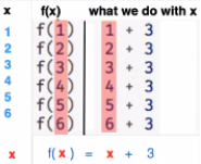

Investigate
Have students turn to Matching Examples and Definitions (Math) (Page 30).
-
Start by looking at each table and highlighting what is changing from the first row to the following rows.
-
Then, match each table to the function that defines it.
You may also want to have students complete Matching Examples & Function Definitions (Desmos)
Now that we’ve seen how this works in math, let’s go back to gt.
400
 🖼Show image
In the case of gt, the domain was a number and that number stood for the size of the triangle we wanted to make. Whatever number we gave gt for the size of the triangle is the number our volunteer inserted into the triangle function. Everything else stayed the same no matter what! We need to define gt in terms of the variable size, instead of in terms of a specific number.
Turn to Matching Examples and Function Definitions (Page 31) and look at the definition of gt in the first row of the table.
400
 🖼Show image
Using gt as a model, match the mystery function examples to their corresponding definitions.
You may also want to have students complete Matching Examples & Function Definitions (Desmos) .
Connecting to Best Practices - Writing the examples is like "showing your work" in math class. - Have students circle what is changing and label it with a proper variable name. The name of the variable should reflect what it represents, such as - Writing examples and identifying the variables lays the groundwork for writing the function, which is especially important as the functions get more complex. Don’t skip this step! |
Synthesize
-
What strategies did you use to match the examples with the function definitions?
-
Why is defining functions useful to us as programmers?
Examples and Contracts
Launch
-
What is the contract for
triangle?
triangle :: Number, String, String -> Image
-
What is the contract for
gt?
gt :: Number -> Image
-
Why might someone think the domain for
gtcontains a Number and two Strings? The functiongtonly needs one Number input because that’s the only part that’s changing. The functiongtmakes use oftriangle,whose Domain is Number String String, butgtalready knows what those strings should be.
Investigate
Have students turn to Matching Examples and Contracts (Page 32).
Confirm that everyone is on the same page before moving on. You may want to have students turn to a partner, compare their findings, and discuss their thinking about anything they didn’t agree on at first.
Have students open the gt starter file (Pyret) .
-
Click Run and evaluate gt(10) in the Interactions Area.
-
What did you get back? a little green triangle!
-
Take one minute and see how many different green triangles you can make using the
gtfunction. -
Try changing one of the examples to be incorrect and click run again. What happens? The editor lets us know that the function doesn’t match the examples so that we can fix our mistake!
Have students turn to Contracts, Examples & Definitions (Page 33)
On the top half of the page you will see the contract, examples, and function defintion for gt. Using gt as a model, complete the contract, examples and function defintion for bc. Then type the Contract, Examples and Definition into the Definitions Area, click “Run”, and make sure all of the examples pass!
If you have time, have students complete
Synthesize
-
Functions can consume values besides Numbers. What other datatypes did you see being consumed by these functions?
-
Thumbs up? Thumbs to the side? or Thumbs down? How confident do you feel that you could write the contract, examples and function definition on your own if you were given a word problem about another shape function?
Additional Exercises:
These materials were developed partly through support of the National Science Foundation,
(awards 1042210, 1535276, 1648684, and 1738598).
Bootstrap:Data Science by the Bootstrap Community is licensed under a Creative Commons 4.0 Unported License. This license does not grant permission to run training or professional development. Offering training or professional development with materials substantially derived from Bootstrap must be approved in writing by a Bootstrap Director. Permissions beyond the scope of this license, such as to run training, may be available by contacting contact@BootstrapWorld.org.
Defining Table Functions
Defining Table Functions
Students explore using multiple representations of functions to solve word problems involving Data Rows, using a process called the Design Recipe.
Prerequisites |
||||||||||||||||
Relevant Standards |
Select one or more standards from the menu on the left (⌘-click on Mac, Ctrl-click elsewhere). Common Core Math Standards
CSTA Standards
K-12CS Standards
Next-Gen Science Standards
Oklahoma Standards
|
|||||||||||||||
Lesson Goals |
Students will be able to…
|
|||||||||||||||
Student-facing Lesson Goals |
|
|||||||||||||||
Materials |
||||||||||||||||
Preparation |
|
|||||||||||||||
Language Table |
|
- contract
-
a statement of the name, domain, and range of a function
- purpose statement
-
a concise, detailed description of what a function does with its inputs
Warmup 5 minutes
Let’s review using .row-n and value definitions…
Open the Row Functions Starter File, save a copy, and click "Run".
Scroll until you see the definition for cat-row. What will you get back if you evaluate cat-row in the Interactions Area?
We’ve defined a few rows for you already: young-row, fixed-row, and of course cat-row. Take a few minutes to define three more rows on the lines below:
-
Define
old-rowto be an animal that is greater than 5 years old -
Define
dog-rowto be an animal that is a dog -
Define
unfixed-rowto be an animal whosefixedcolumn isfalse
Computing Images from Rows 20 minutes
Overview
Primary: Students use different representations of functions to define Row-based functions.
Secondary: Students discover functions that consume other functions, and compose a scatter plot function with a function they’ve defined.
Launch
The shelter wants to print nametags for all the animals, with their names written in red letters. Turn to The Animals Table in your Student Workbook.
Suppose you had a stack of blank nametags, and you needed to fill them out. In careful detail, exactly what would you do for each row?
This would be pretty repetitive! Just like making green triangles in ../defining-functions/, there’s got to be a better way! In this lesson, we’ll learn a step-by-step process that helps us define functions, called the Design Recipe.
The Design Recipe uses multiple representations of functions in a specific order, to help us solve problems. Let’s look at an example to see how this works!
Investigate
Step 1: Contract and Purpose
-
Scroll down in the starter file until you find the Contract for
nametag. -
What is the Domain of this function? The Range?
-
The Purpose Statement is a way of describing the function in detail. What is the Purpose Statement for this function?
Step 2: Write Examples
# nametag :: Row -> Image
# consumes an animal, and draws the name in 15px red letters
examples:
  nametag(cat-row)   is text(        "Miaulis", 20, "red")
  nametag(young-row) is text(           "Nori", 20, "red")

  nametag(cat-row)   is text(  cat-row["name"], 20, "red")
  nametag(young-row) is text(young-row["name"], 20, "red")
end-
Look at the first two examples. Can you explain what these examples do?
-
These examples show us exactly what should be produced for the two Rows representing "Miaulis" and "Nori". But these examples only tell us part of the story! Where does the computer get those names from?
-
Now look at the last two examples. How are they related to the first?
-
The last two examples are the missing part of the puzzle. We get those names by looking up the "name" column in the Row!
-
In the previous lesson, we learned that representations of functions have to match. Look at the Examples carefully - there is one mistake, where the Examples don’t quite match the Contract and Purpose. Can you find the bug?
Make sure students have changed the 20 to 15, matching the Purpose Statement.
Step 3: Define the Function
Those last two examples provide the pattern that allows us to write our definition. Everything stays the same except the Row itself. Just as we did for gt, we can circle and label the the Rows. In this case, r or animal would be a pretty good name for the Row that represents an animal in our table:
fun nametag(r): text(r["name"], 15, "red")
end
Have students try this function on some of the animals they defined, by typing nametag(unfixed-row), nametag(dog-row), etc. Then have them find find the contract for image-scatter-plot in their Contracts pages.
-
How many things are in the Domain of this function? What is the type of the first thing? The second? The third?
-
The fourth argument is something you’ve never seen before! What do you think it means?
-
Type
image-scatter-plot(animals-table, "pounds", "weeks", nametag)into the Interactions Area. -
What did you get? Does this help you explain what the fourth argument is?
-
Try changing the color of the nametag. Remember: all the representations for the same function need to match! How many places do we need to change the color?
Note: the optional lesson If Expressions goes deeper into basic programming constructs, using image-scatter-plot to motivate more complex (and exciting!) plots.
Scatter plots allow us to display two dimensions of data: one on the x-axis and the other on the y-axis. This is useful if we want to explore a relationship between how much an animals weighs and how long it takes to be adopted! But what if we wanted to also see the impact of an animal’s age? We could make a different scatter plot, using age as our x-axis. But maybe we want to combine all three into a single plot, and see three dimensions?
-
Copy and paste the entire Design Recipe (Contract and Purpose, Examples, and Definition) for
nametag,so you have a second copy below the first. -
Now, change this second copy to a function named
age-dot,which consumes a Row and draws a solid blue circle using the age as the radius. -
When you’re done, click "Run" and make sure your examples pass!
-
Then type
image-scatter-plot(animals-table, "pounds", "weeks", age-dot)into the Interactions Area.
Synthesize
Each step in the Design Recipe helps us write the next one.
-
If we can’t write our Contract and Purpose, it means we haven’t thought through the problem enough. Better to find this out before we write the rest of our function!
-
If we’re having trouble writing our Examples, we can check our Contract and Purpose for hints.
-
If we’re having trouble writing the Definition, we can check our Examples for hints.
These steps also help us check our work. If any two representations don’t match, it means there’s likely a bug somewhere.
Computing Booleans from Rows 15 minutes
Overview
Students use different representations of functions to write functions that produce true and false by asking questions of Rows.
Launch
Let’s try solving some other word problems using the Design Recipe, starting from scratch.
Turn to The Animals Dataset. For the first 10 rows in the table, write true next to the animals that are cats and false next to all the ones which aren’t.
Investigate
How could we describe this work to the computer, so that we can define a function and make it do the work for us? Complete the following sentence: For each Row, I…
Step 1: Contract and Purpose
Since we’re asking if an animal is a cat, we’ll call our new function is-cat. What type of data is going in? What type is coming out?
Turn to The Design Recipe - Compute (Page 36) in your Student Workbook, and fill out the Contract and Purpose Statement for this function. Make sure your Purpose Statement includes all the details you need!
Step 2: Write Examples
Using the dog-row and cat-row values defined earlier, write examples for this function. If you’re not sure what work to do, look back at the purpose statement! Ultimately, we want to write examples that show their work. But if you get stuck, you can always start with examples that just show the answer.
examples:
	is-cat(dog-row) is false
	is-cat(cat-row) is true
	is-cat(dog-row) is dog-row["species"] == "cat"
	is-cat(cat-row) is cat-row["species"] == "cat"
end
Step 3: Define the Function
The last two examples are what we want, because we can see the pattern! Just as with nametag, the only thing changing is the Row itself. Once we circle and label the Rows, we’re ready to define the function:
fun is-cat(r): r["species"] == "cat" end
-
Scroll further down in the file, until you find the Contract for
is-cat. -
Add the examples from your workbook. We’ve already provided one to get you started, but it doesn’t show the work being done.
-
Try using this function in the Interactions Area with some of your predefined animals!
-
On The Design Recipe - Compute (Page 36), practice the Design Recipe by completing
is-young. When you’ve finished, type it into Pyret and try it out!
Common Misconceptions
It’s extremely likely that students will struggle with this Boolean expression:
dog-row["species"] == "cat"
That’s because they are confusing false with wrong. It’s absolutely correct that this expression will produce false, because the species of the dog row isn’t "cat". But this doesn’t make the example wrong! Remember, the first example said that false is the answer we expect.
Synthesize
There are lots of Boolean-producing functions that would be handy to write. We might want functions that tell us if an animal is old, if it’s male, or if it was adopted in under a week.
What are some other Boolean-producing functions that would be useful?
Defining Lookup Functions 10 minutes
Overview
Students use different representations of functions to define Lookup functions.
Launch
Turn to The Animals Dataset. For the next 10 rows in the table, and write the value in the fixed column over in the margin.
Investigate
Step 1: Contract and Purpose
Turn to ./lessons/defining-table-functions/pages/design-recipe-2.adoc in your Student Workbook, and write the Contract and Purpose Statement.
Have students share back their Purpose Statements, and discuss.
Since we’re looking up the fixed column, we’ll call our new function lookup-fixed. What type of data was going in? What type was coming out? This gives us the Contract:
- # lookup-fixed
-
Row -> Boolean # consumes an animal, and tells whether it is fixed
Write two examples for this function, using the fixed-row and unfixed-row that you defined earlier.
Have students share back their examples.
examples:
	lookup-fixed(fixed-row)   is fixed-row["fixed"]
	lookup-fixed(unfixed-row) is unfixed-row["fixed"]
end
Looking at the rows that include the lookup, what is changing? Circle and label the changing part, then use that pattern to define the function.
fun lookup-fixed(r): r["fixed"] end
-
Scroll further down in the file, until you find the Contract for
lookup-fixed. -
Add the two examples that show the pattern, and click "Run"
-
Try using this function in the Interactions Area with some of your predefined animals!
-
Optional: On The Design Recipe - Lookup (Page 37), practice the Design Recipe by completing
lookup-name. When you’ve finished, type it into Pyret and try it out!
Common Misconceptions
Ironically, students are likely to struggle with lookup functions that don’t do nothing more than look up a column ("but it doesn’t do any work!"). This may come from a misunderstanding that a column lookup is doing work!
Synthesize
Students may ask "why would I need this, if I can already see all the values in the Row?"
The big idea here is that functions provide a standard way to compose computations. Every wall plug has a standard shape, which allows us to plug all sorts of appliances, lamps, etc into any room in the house. Having a standard like function-name(argument1, argument2, …) allows us to stack functions together and do all kinds of sophisticated analysis.
These materials were developed partly through support of the National Science Foundation,
(awards 1042210, 1535276, 1648684, and 1738598).
Bootstrap:Data Science by the Bootstrap Community is licensed under a Creative Commons 4.0 Unported License. This license does not grant permission to run training or professional development. Offering training or professional development with materials substantially derived from Bootstrap must be approved in writing by a Bootstrap Director. Permissions beyond the scope of this license, such as to run training, may be available by contacting contact@BootstrapWorld.org.
Method Chaining
Method Chaining
Students continue practicing their Design Recipe skills, making lots of simple functions dealing with the Animals Dataset. Then they learn how to chain Methods together, and define more sophisticated subsets.
Prerequisites |
||||||||||||||||
Relevant Standards |
Select one or more standards from the menu on the left (⌘-click on Mac, Ctrl-click elsewhere). CSTA Standards
K-12CS Standards
Next-Gen Science Standards
Oklahoma Standards
|
|||||||||||||||
Lesson Goals |
Students will be able to…
|
|||||||||||||||
Student-facing Lesson Goals |
|
|||||||||||||||
Materials |
||||||||||||||||
Preparation |
|
|||||||||||||||
Supplemental Resources |
||||||||||||||||
Language Table |
|
Design Recipe Practice 25 minutes
Overview
Students practice more of what they learned in the previous lesson, applying the Design Recipe to simple table functions that operate on rows of the Animals Dataset. The functions they create - in addition to the ones they’ve already made - set up the method-chaining activity.
Launch
The Design Recipe is a powerful tool for solving problems by writing functions. It’s important for this to be like second nature, so let’s get some more practice using it!
Investigate
Define the Compute functions on The Design Recipe (Page 40) and The Design Recipe (Page 41).
Optional: Combining Booleans Suppose we want to build a table of Animals that are fixed and old, or a table of animals that are cats or dogs? By using the You can get some practice using For many of the situations where you might use |
Synthesize
Did students find themselves getting faster at using the Design Recipe? Can students share any patterns they noticed, or shortcuts they used?
Chaining Methods 25 minutes
Overview
Students learn how to perform multiple table operations (sorting, filtering, building) in the same line of code.
Launch
Now that we are doing more sophisticated analyses, we might find ourselves writing the following code:
# get a table with the nametags of all the fixed animals, ordered by species
with-labels = animals-table.build-column("labels", nametag)
fixed-with-labels = with-nametags.filter(is-fixed)
result = fixed-with-labels.order-by("species", true)
That’s a lot of code, and it also requires us to come up with names for each intermediate step! Pyret allows table methods to be chained together, so that we can build, filter and order a Table in one shot. For example:
# get a table with the nametags of all the fixed animals, ordered by species
result = animals-table.build-column("labels", nametag).filter(is-fixed).order-by("species", true)
This code takes the animals-table, and builds a new column. According to our Contracts Page, .build-column produces a new Table, and that’s the Table whose .filter method we use. That method produces yet another Table, and we call that Table’s order-by method. The Table that comes back from that is our final result.
Teaching Tip Use different color markers to draw nested boxes around each part of the expression, showing where each Table came from. |
It can be difficult to read code that has lots of method calls chained together, so we can add a line-break before each “.” to make it more readable. Here’s the exact same code, written with each method on its own line:
# get a table with the nametags of all the fixed animals, order by species
animals-table
  .build-column("label", nametag)
  .filter(is-fixed)
  .order-by("species", true)
Order matters: Build, Filter, Order.
Suppose we want to build a column and then use it to filter our table. If we use the methods in the wrong order (trying to filter by a column that doesn’t exist yet), we might wind up crashing the program. Even worse, the program might work, but produce results that are incorrect!
Investigate
When chaining methods, it’s important to build first, then filter, and then order.
How well do you know your table methods? Complete Chaining Methods (Page 42) and Chaining Methods 2: Order Matters! (Page 43) in your Student Workbook to find out.
Synthesize
As our analysis gets more complex, method chaining is a great way to keep the code simple. But complex analysis also has more room for mistakes, so it’s critical to think carefully when we use it!
Additional Exercises
These materials were developed partly through support of the National Science Foundation,
(awards 1042210, 1535276, 1648684, and 1738598).
Bootstrap:Data Science by the Bootstrap Community is licensed under a Creative Commons 4.0 Unported License. This license does not grant permission to run training or professional development. Offering training or professional development with materials substantially derived from Bootstrap must be approved in writing by a Bootstrap Director. Permissions beyond the scope of this license, such as to run training, may be available by contacting contact@BootstrapWorld.org.
If-Expressions
If-Expressions
Students build on their knowledge of the image-scatter-plot function, motivating the need for if-expressions in their programming toolkit. This drives deeper insight into subgroups within a population, and motivates the need for more advanced analysis.
Prerequisites |
||||||||||||||||
Relevant Standards |
Select one or more standards from the menu on the left (⌘-click on Mac, Ctrl-click elsewhere). CSTA Standards
K-12CS Standards
Next-Gen Science Standards
|
|||||||||||||||
Lesson Goals |
Students will be able to…
|
|||||||||||||||
Student-facing Lesson Goals |
|
|||||||||||||||
Materials |
||||||||||||||||
Preparation |
|
|||||||||||||||
Supplemental Resources |
||||||||||||||||
Language Table |
|
Warmup
Age v. Weeks Scatterplot
 🖼Show image
-
Show students this code, which uses
image-urlandscaleto generate icons of animals. -
What do they Notice? What do they Wonder? How might this scatterplot change our analysis?
-
Have students make a scatter plot of animals, using
ageas the x-axis values andweeksas the y-axis.
(For now, the scatter plot is purely to give students practice with contracts and displays. They are not expected to know much about scatter plots at this point.)
If-Expressions 20 minutes
Overview
Students explore a program that makes use of an if-expression, develop their own understanding, and modify it.
Launch
So far, all of the functions we know how to write have had a single rule. The rule for gt was to take a number and make a solid, green triangle of that size. The rule for bc was to take a number and make a solid, blue circle of that size. The rule for nametag was to take a row and make an image of the animal’s name in purple letters.
What if we want to write functions that apply different rules, depending on the input? For example, what if we want to change the color of the nametag depending on the species of the animal?
Investigate
-
Open the Mood Generator starter file.
-
Complete Mood Generator (Page 45) in your student workbooks.
Synthesize
Have the class share their own explanations for how if-expressions work.
Pyret allows us to write if-expressions, which contain:
-
the keyword
if,followed by a condition. -
a colon (
:), followed by a rule for what the function should do if the condition istrue -
an
else:,followed by a rule for what to do if the condition isfalse
We can chain them together to create multiple rules, with the last else: being our fallback in case every other condition is false.
Better Image Scatter Plots 20 minutes
Overview
Students discover how "dot appearance" can be used to show more data in a scatterplot, and why that would be valuable.
Launch
Suppose we want to make a scatter plot for the Animals Dataset, but with dots taking different colors depending on the species. This would make it possible to see if certain species are "clustered" in different parts of the plot.
Investigate
Have students open Word Problem: species-color (Page 46). Make sure they all write the Contract and Purpose Statement first , and check in with their partner and the teacher before proceeding.
Once they’ve got the Contract and Purpose Statement, have them come up with examples: for each species. Once again, have them check with a partner and the teacher before finishing the page.
Once another student and the teacher has checked their work, have them type this function into their animals starter files, and use it to make an image-scatter-plot using age as the x-axis and weeks as the y-axis.
Synthesize
Age v. Weeks Scatterplot
 🖼Show image
-
What do you Notice about this scatter plot?
-
What do you Wonder?
What does this new visualization tell us about the relationship between age and weeks? What other analysis would be helpful here?
Closing
Make sure to direct the conversation back to Data Science! Does this scatter plot make us think we should be analyzing animals separately? What other scatter plots might this be useful for?
This scatterplot makes it clear that we may want to analyze each species separately, rather than grouping them all together! In the next lesson, students will learn how to do just that.
These materials were developed partly through support of the National Science Foundation,
(awards 1042210, 1535276, 1648684, and 1738598).
Bootstrap:Data Science by the Bootstrap Community is licensed under a Creative Commons 4.0 Unported License. This license does not grant permission to run training or professional development. Offering training or professional development with materials substantially derived from Bootstrap must be approved in writing by a Bootstrap Director. Permissions beyond the scope of this license, such as to run training, may be available by contacting contact@BootstrapWorld.org.
Randomness and Sample Size
Randomness and Sample Size
Students learn about random samples and statistical inference, as applied to the Animals Dataset. In the process, students get a light introduction to the role of sample size and the importance of statistical inference.
Prerequisites |
||||||||||||||||
Relevant Standards |
Select one or more standards from the menu on the left (⌘-click on Mac, Ctrl-click elsewhere). Common Core Math Standards
CSTA Standards
Next-Gen Science Standards
Oklahoma Standards
|
|||||||||||||||
Lesson Goals |
Students will be able to…
|
|||||||||||||||
Student-facing Lesson Goals |
|
|||||||||||||||
Materials |
||||||||||||||||
Preparation |
|
|||||||||||||||
Optional Projects |
||||||||||||||||
Language Table |
|
- statistical inference
-
using information from a sample to draw conclusions about the larger population from which the sample was taken
Do Now
Students should log into CPO open the Random Samples Starter File (Pyret), and save a copy.
Flip the Script: Inference v. Probability 30 minutes
Overview
Statistical inference involves looking at a sample and trying to infer something you don’t know about a larger population. This requires a sort of backwards reasoning, kind of like making a guess about a cause, based on the effect that we see. To better understand the process of going from the sample back to the population, it helps to understand the more straightforward process of going from the population to a sample. If the sample is random, we call this process Probability!
In real life we typically don’t know what’s true for an entire population. But this probability thought-experiment will start with a larger population with known properties (such as the fact that nearly half of the entire population are males). Then we’ll see what kind of behavior we tend to see in random samples taken from that population.
Launch
Inference Reasons Backwards; Probability Reasons Forwards
One of the most useful tasks in Data Science is using sample data to infer (guess) what’s true about the larger population from which the sample was taken. This process, called statistical inference, is used to gain information in practically every field of study you can imagine: medicine, business, politics, history; even art! Early on, statisticians discovered that random samples almost always work best.
Suppose we want to estimate what percentage of all Americans plan to vote for a certain candidate. We can’t ask everyone who they’re voting for, so pollsters instead take a sample of Americans, and generalize the opinion of the sample to estimate how Americans as a whole feel. But choosing a sample can be tricky…
-
Would it be problematic to only call voters who are registered Democrats? To only call voters under 25? To only call regular churchgoers? Why or why not?
-
How could we choose a representative subset, or sample of American voters?
-
Would it be problematic to only sample a handful of voters? What do we gain by taking a larger sample?
Before we infer something unknown about a population from a sample, we need to know what makes a "good" sample!
Sampling is a complicated issue. The main reason for doing inference is to guess about something that’s unknown for the whole population. But a useful step along the way is to practice with situations where we happen to know what’s true for the whole population. As an exercise, we can keep taking random samples from that population and see how close they tend to get us to the truth. Another discovery (besides the value of randomness) that statisticians made early on was something that’s perfectly consistent with common sense: Larger samples are better than smaller ones, because they tend to get us closer to the truth about the whole population.
Let’s see what happens if we switch from smaller to larger sample sizes, if we’re taking a random sample of shelter animals to infer what’s true about the larger population…
Investigate
The Animals Dataset we’ve been using is just one sample taken from a very large animal shelter. How much can we infer about the whole population of hundreds of animals, by looking at just this one sample?
-
Divide the class into groups of 3-5 students.
-
Have students open the Random Samples Starter File (Pyret), and click "Run".
-
Have students complete Sampling and Inference (Page 48), sharing their results and discussing with the group.
Common Misconceptions
Many people mistakenly believe that larger populations need to be represented by larger samples. In fact, the formulas that Data Scientists use to assess how good a job the sample does is only based on the sample size, not the population size.
Extension In a statistics-focused class, or if appropriate for your learning goals, this is a great place to include more rigorous statistics content on sample size, sampling bias, etc. |
Synthesize
Have students share how much better their larger samples are at guessing the truth about the whole population.
Project Options: Food Habits / Time Use In both of these projects, students can gather data about their own lives, and use what they’ve learned in the class so far to analyze it. This project can be used as a mid-term or formative assessment, or as a capstone for a limited implementation of Bootstrap:Data Science. See the project descriptions for pages/food-habits-project.html and pages/time-use-project.html. (Based on the projects of the same name from IDS at UCLA) |
These materials were developed partly through support of the National Science Foundation,
(awards 1042210, 1535276, 1648684, and 1738598).
Bootstrap:Data Science by the Bootstrap Community is licensed under a Creative Commons 4.0 Unported License. This license does not grant permission to run training or professional development. Offering training or professional development with materials substantially derived from Bootstrap must be approved in writing by a Bootstrap Director. Permissions beyond the scope of this license, such as to run training, may be available by contacting contact@BootstrapWorld.org.
Grouped Samples
Grouped Samples
Students learn about grouped samples, and practice creating them from the Animals Dataset. In the process, they practice using the Design Recipe to create filter functions, and come up with questions they wish to explore.
Prerequisites |
||||||||||||||||
Relevant Standards |
Select one or more standards from the menu on the left (⌘-click on Mac, Ctrl-click elsewhere). Common Core Math Standards
CSTA Standards
K-12CS Standards
Next-Gen Science Standards
Oklahoma Standards
|
|||||||||||||||
Lesson Goals |
Students will be able to…
|
|||||||||||||||
Student-facing Lesson Goals |
|
|||||||||||||||
Materials |
||||||||||||||||
Preparation |
|
|||||||||||||||
Language Table |
|
- grouped sample
-
a non-random subset of individuals chosen from a larger set, where the individuals belong to a specific group
Problems with a Single Population 10 minutes
Overview
This activity is all about grouped samples: Students make a bunch of subsets from the Animals Dataset, and see how each subset might answer the same question differently.
Launch
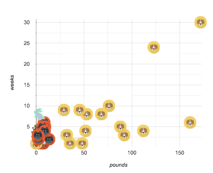 🖼Show image
When looking at a scatter plot of our animals, it looks like the amount an animal weighs may have something to do with how long it takes to be adopted.
🖼Show image
When looking at a scatter plot of our animals, it looks like the amount an animal weighs may have something to do with how long it takes to be adopted.
But if we label the dots by animal (see the image on the right), we notice every data point after 25 pounds belongs to a dog from the shelter! The cats are all clumped together in the lower weight range, making it hard to see how weeks to adoption may relate to a cat’s weight.
Investigate
Divide the class into groups of 3-4, with one student identified as the "reporter".
-
Looking at this scatterplot, does it make sense to analyze all the animals together? Why or why not?
-
Are there some questions where it would be important to break up the population into species-specific populations? What are they?
-
Are there some questions where it would be important to keep the whole population together? What are they?
Synthesize
Have the reporters share their findings with the class.
Imagine that you’ve been handed a dataset from a country where half the people are wealthy and have access to amazing medical care, and the other half are poor and have no healthcare. If we took a random sample of the population as a whole, we might think that they are generally middle-income and have average health. But if we ask the same question about the two groups separately, we would discover inequality hiding in plain sight!
Grouped Samples 20 minutes
Launch
Ultimately, it might make more sense to ask certain questions about "just the cats" or "just the dogs". Averaging every animal together will give us an answer, but it may not be a useful answer.
Sometimes important facts about samples get lost if we mix them with the rest of the population!
Data Scientists define grouped samples of datasets, breaking them up into sub-groups that may be helpful in their analysis.
Earlier, you learned how to define values in Pyret. We can define Numbers, Strings, Images, and even rows:
name = "Flannery"
age  = 16
logo = star(50, "solid", "red")
sasha= animals-table.row-n(0)
Let’s use this skill to define Tables…
Investigate
A “kitten” is an animal who is a cat and who is young. How would you define a table of just kittens?
-
Turn to Grouped Samples from the Animals Dataset (Page 49), and see what code will compute whether or not an animal is a kitten.
-
Can you fill in the code for the other subsets?
-
When you’re done, type these definitions into the Definitions Area.
We already know how to define values, and how to filter a dataset. So let’s put those skills together to define one of our subsets:
dogs = animals-table.filter(is-dog)
-
Define the other subsets, and click "Run".
-
Make a pie chart showing the species in the
youngsubset, by typingpie-chart(young, "species"). -
Make pie charts for every grouped sample. Which one is the most representative of the whole population? Why?
Synthesize
Debrief with students. Thoughtful question: how could we filter and sort a table? How can we combine methods?
Displaying Samples 20 minutes
Overview
Students revisit the data display activity, now using the samples they created.
Launch
Making grouped and random samples is a powerful skill to have, which allows us to dig deeper than just making charts or asking questions about a whole dataset. Now that we know how to make subsets, we can make much more sophisticated displays!
Investigate
Complete Displaying Data (Page 50), using what you’ve learned about samples to make more sophisticated data displays.
Synthesize
Were any of the students' displays interesting or surprising? Given a novel question, can students identify what helper functions they would need to write?
These materials were developed partly through support of the National Science Foundation,
(awards 1042210, 1535276, 1648684, and 1738598).
Bootstrap:Data Science by the Bootstrap Community is licensed under a Creative Commons 4.0 Unported License. This license does not grant permission to run training or professional development. Offering training or professional development with materials substantially derived from Bootstrap must be approved in writing by a Bootstrap Director. Permissions beyond the scope of this license, such as to run training, may be available by contacting contact@BootstrapWorld.org.
Choosing Your Dataset
Choosing Your Dataset
Students summarize their dataset by exploring the data and identifying categorical and quantitative columns, data types, and more. They also define a few sample rows, random subsets, and logical subsets.
Prerequisites |
||||||||||||||||
Relevant Standards |
Select one or more standards from the menu on the left (⌘-click on Mac, Ctrl-click elsewhere). Common Core Math Standards
CSTA Standards
K-12CS Standards
Next-Gen Science Standards
Oklahoma Standards
|
|||||||||||||||
Lesson Goals |
Students will be able to…
|
|||||||||||||||
Student-facing Lesson Goals |
|
|||||||||||||||
Materials |
||||||||||||||||
Preparation |
|
|||||||||||||||
Supplemental Resources |
||||||||||||||||
Language Table |
|
The Data Cycle 20 minutes
Overview
Students learn about the Data Cycle, which helps them get situated in the process of analyzing the datasets they will select in this lesson. They browse through the library of provided datasets, and choose one they want to work with. NOTE: the selection process can also be done as a homework assignment, if all students have internet access at home.
Launch
Zoom out a little and help students reflect on what they’ve done so far. Students began by exploring the Animals Dataset, formulating questions and exploring them with data displays. This led to further questions, making subsets, and asking more questions.
 🖼Show image
The Data Cycle[*] is a roadmap, which helps guide us in the process of data analysis.
🖼Show image
The Data Cycle[*] is a roadmap, which helps guide us in the process of data analysis.
(Step 1) We start by Asking Questions - statistical questions that can be answered with data.
(Step 2) Then we Consider Data. This could be done by conducting a survey, observing and recording data, or finding a dataset that meets our needs.
(Step 3) Then it’s on to Analyzing the Data, in which we produce data displays and new tables of filtered or transformed data in order to identify patterns and relationships.
(Step 4) Finally, we Interpret the Data, in which we answer our questions and summarize the results. As we’ve already seen from the Animals Dataset, these interpretations often lead to new questions….and the cycle begins again.
Explain to students that they will now select a dataset for them to work with for the remainder of the course. Make sure they understand that it genuinely has to be something they are interested in - their engagement with the data is critical to engaging with the class.
Students can also find their own dataset, and use this Blank Starter file. See this tutorial video for help importing your own data into Pyret.
Students must have at least 2 questions that are both interesting and answerable using their dataset.
Investigate
Have students choose a dataset that is interesting to them! They should have at least two questions that the dataset can help them answer, and write them on What’s on your mind? (Page 57).
- World Cities' Proximity to the Ocean
- NYPD Stop, Search & Frisk 2019
- Marijuana Laws & Arrests by State 2018
- College Majors
- US Jobs
- Refugees 2018
- R.I. Schools
- Movies
- Fast Food Nutrition
- Beverages Nutrition
- North American Pipe Organs
- International Exhibition of Modern Art
- Esports Earnings
- MLB Hitting Stats
- NBA Players
- NFL Passing
- NFL Rushing
- U.S. Voter Turnout Rates 1986-2018
- State Demographics
- Countries of the World
- U.S. Income
- U.S. Presidents
- Music
- IGN Video Game Reviews
Open the Research Paper template, and save a copy.
-
Students fill in their first and last name(s), the teacher name on the first page of the Research Paper.
-
Students should also copy the link to the dataset (spreadsheet), and paste it into the first page of the Research Paper.
-
Students should click "Publish" in their Pyret Starter File, then copy/paste the resulting link into the first page of the Research Paper.
We have also compiled some , which we recommend for all teachers before having their students choose a dataset.
Synthesize
Have students share their datasets and their questions.
For the rest of this course, students will be learning new programming and Data Science skills, practicing them with the Animals Dataset and then applying them to their own data.
Exploring Your Dataset flexible
Overview
Students apply what they’ve learned about describing and making subsets from the Animals Dataset to their own dataset. Note: this activity can be done briefly as a homework assignment, but we recommend giving students an additional class period to work on this.
Launch
By now you’ve already learned what to do when you approach a new dataset. With the Animals Dataset, you first read the data itself, and wrote down your Notice and Wonders. You described the columns in the Animals Dataset, identifying which were categorical and which were quantitative, and whether they were Numbers, Strings, Booleans, etc. Finally, you used the Design Recipe and table methods to make random and logical subsets.
Now, you’re doing to do the same thing with your own dataset.
Investigate
-
Have students look at the spreadsheet for their dataset. What do they Notice? What do they Wonder? Have them complete My Dataset (Page 53), making sure to include at least two questions that _can be answered by their dataset and one that cannot.
-
In the Definitions Area, students use
random-rowsto define at least three tables of different sizes:tiny-sample,small-sample,andmedium-sample. -
In the Definitions Area, students use
.row-nto define at least three values, representing different rows in your table. -
Have students think about subsets that might be useful for their dataset. Name these subsets and write the Pyret code to test an individual row from your dataset on Samples from My Dataset (Page 54).
-
Students should fill in My Dataset portion of their Research Paper.
-
Students should fill in Categorical Visualizations portion of their Research Paper, by generating pie and bar charts for their dataset and explaining what they show.
Turn to The Design Recipe (Page 55), and use the Design Recipe to write the filter functions that you planned out on Samples from My Dataset (Page 54). When the teacher has checked your work, type them into the Definitions Area and use the .filter method to define your new sample tables.
Choose one categorical column from your dataset, and try making a bar or pie-chart for the whole table. Now try making the same display for each of your subsets. Which is most representative of the entire column in the table?
Synthesize
Have students share which subsets they created for their datasets.
[*] From the Mobilizing IDS project and GAISE
These materials were developed partly through support of the National Science Foundation,
(awards 1042210, 1535276, 1648684, and 1738598).
Bootstrap:Data Science by the Bootstrap Community is licensed under a Creative Commons 4.0 Unported License. This license does not grant permission to run training or professional development. Offering training or professional development with materials substantially derived from Bootstrap must be approved in writing by a Bootstrap Director. Permissions beyond the scope of this license, such as to run training, may be available by contacting contact@BootstrapWorld.org.
Histograms
Histograms
Students explore new visualizations in Pyret, this time focusing on the distribution in a quantitative dataset. Students are introduced to Histograms by comparing them to bar charts, and learn to construct them by hand and in Pyret.
Prerequisites |
||||||||||||||||
Relevant Standards |
Select one or more standards from the menu on the left (⌘-click on Mac, Ctrl-click elsewhere). Common Core Math Standards
CSTA Standards
K-12CS Standards
Next-Gen Science Standards
|
|||||||||||||||
Lesson Goals |
Students will be able to…
|
|||||||||||||||
Student-facing Lesson Goals |
|
|||||||||||||||
Materials |
||||||||||||||||
Preparation |
|
|||||||||||||||
Supplemental Resources |
||||||||||||||||
Language Table |
|
- bar chart
-
a display of categorical data that uses bars positioned over category values; each bar’s height reflects the count or percentage of data values in that category
- frequency
-
how often a particular value appears in a data set
- histogram
-
a display of quantitative data that uses vertical bars positioned over bins (sub-intervals); each bar’s height reflects the count or percentage of data values in that bin.
- sample
-
a set of individuals or objects collected or selected from a statistical population by a defined procedure
- shape
-
The aspect of a dataset that tells which values are more or less common
Review 20 minutes
Have students open their Animals Starter File, and click “Run”. (If they do not have this file, or if something has happened to it, they can always make a new copy.)
-
Turn to The Design Recipe (Page 59), and write the functions you see there. When you’re ready, type the contracts, purpose statements, examples and definitions into the Definitions Area.
-
Use the
.build-columnmethod to add a new column to the animals table, showing the weight of every animal in kilograms. -
Use the
image-scatter-plotfunction to plot all of the animals, puttingageon the x-axis, number ofweeksin the shelter on the y-axis, andsmart-dotas our function.
Introducing Histograms 20 minutes
Overview
Students look at a bar chart and a histogram, compare/contrast them, and make observations about what they have in common and how they are different. Then they learn a more formal explanation of histograms.
Launch
Have students complete Summarizing Columns (Page 60).
The display on the left side of that page is a Bar chart.
-
The x-axis lists the values of a categorical variable (
species). -
The y-axis shows the frequency of categorical values in the dataset.
-
This chart happens to show the categorical values in alphabetical order from left to right, but it would be fine to re-order them any way we wish. The bar for “dogs” could have been drawn before the one for “cats”, without changing the meaning of the display. It never makes sense to talk about the “shape” of a categorical data set, since that shape holds no meaning.
The display on the right side is called a histogram.
-
Histograms show the distribution of quantitative data.
-
Since quantitative data must follow a natural order, these bars cannot be re-ordered.
-
Histograms allow us to see the shape of a data set.
Investigate
To build a histogram, we start by sorting all of the numbers in our column from smallest to largest, marking our x-axis from the smallest value (or a bit below) to the largest value (or a bit above) and dividing into equally-sized intervals, or “bins”. For example, if our values ranged from 3 to 53 we might mark our x-axis from 0 to 60 and divide it into bins of width 10. If they range from 22 to 41 we might mark our x-axis from 20 to 45 and divide it into bins of width 5. Once we have our bins, we put each value in our dataset into the bin where it belongs, and then count how many values fall in each bin. This count determines the height of the bars on our y-axis.
Kinesthetic Activity Divide the class into groups, and give each group a ball of playdough. Have the groups roll the dough into a thick cylinder, then divide that cylinder in half. Then, have them take one of the halves and cut that in half again, then cut one of the resulting pieces in half once more. This will form four chunks of playdough, with a ratio of 1:1:2:4 The playdough represents a sample, with values falling into four intervals. The largest cylinder represents double the number of "datapoints" (amounts of dough) as the next largest, which in turn has double the datapoints of the two small ones. Histograms pile the datapoints into equally-sized intervals, just as the cylinders of dough are all of the same width. More dough means longer cylinders, since the "interval width" (cylinder thickness) stays fixed. Have students line up the cylinders from smallest-to-largest, laying them on a sheet of graph paper. Have them come up with labels for the x- and y-axis! |
Turn to Making Histograms (Page 61), and try drawing a histogram from a dataset.
Common Misconceptions
Note that intervals on this display include the left endpoint but not the right. If we included the right endpoint and someone had 0 teeth, we’d have to add on a bar from -5 to 0, which would be awfully strange!
Synthesize
Review: How are histograms and bar charts different?
Choosing the Right Bin Size 15 minutes
Overview
Students make histograms from the animals-dataset, and explore different bin sizes.
Launch
The size of the bins matters a lot! Bins that are too small will hide the shape of the data by breaking it into too many short bars. Bins that are too large will hide the shape by squeezing the data into just a few tall bars. In this workbook exercise, the bins were provided for you. But how do you choose a good bin-size?
Investigate
A display of how long it takes animals to get adopted can make it easier to get an idea of what adoption times were most common, and if there were any unusually long or short times that it took for an animal to be adopted.
Suppose we want to know how long it takes for animals from the shelter to be adopted.
-
Find the contract for the
histogramfunction. -
Make a histogram for the
"weeks"column in theanimals-table,using a bin size of 10. -
How many took between 0 and 10 weeks? Between 10 and 20?
-
Try some other bin sizes (be sure to experiment with bigger and smaller bins!) - what shapes emerge? What bin size gives you the best picture of the distribution?
Look at the histogram and count how many animals took between 0 and 5 weeks to be adopted. How many took between 5 and 10 weeks? What else do you Notice? What do you Wonder?
Some observations you can share with the class, to get them started:
-
We see most of the histogram’s area under the two bars between 0 and 10 weeks, so we can say it was most common for an animal to be adopted in 10 weeks or less.
-
We see a small amount of the histogram’s area trailing out to unusually high values, so we can say that a couple of animals took an unusually long time to be adopted: one took even more than 30 weeks.
-
More than half of the animals (17 out of 31) took just 5 weeks or less to be adopted. But the few unusually long adoption times pulled the average up to 5.8 weeks. We’ll talk more about Shape of a histogram in the next lesson, and about its effect on average (the mean) in the lesson after that.
If someone asked what was a typical adoption time, we could say: “Almost all of the animals were adopted in 10 weeks or less, but a couple of animals took an unusually long time to be adopted — even more than 20 or 30 weeks!” Without looking at the histogram’s shape, we could not have drawn this conclusion.
What would the histogram look like if most of the animals took more than 20 weeks to be adopted, but a couple of them were adopted in fewer than 5 weeks?
Synthesize
Have students talk about the bin sizes they tried. Encourage open discussion as much as possible here, so that students can make their own meaning about bin sizes before moving on to the next point.
Rule of thumb: a histogram should have between 5–10 bins.
Histograms are a powerful way to display a data set and assess its shape. Choosing the right bin size for a column has a lot to do with how data is distributed between the smallest and largest values in that column! With the right bin size, we can see the shape of a quantitative column. But how do we talk about or describe that shape, and what does the shape actually tell us? The next lesson addresses all of these.
These materials were developed partly through support of the National Science Foundation,
(awards 1042210, 1535276, 1648684, and 1738598).
Bootstrap:Data Science by the Bootstrap Community is licensed under a Creative Commons 4.0 Unported License. This license does not grant permission to run training or professional development. Offering training or professional development with materials substantially derived from Bootstrap must be approved in writing by a Bootstrap Director. Permissions beyond the scope of this license, such as to run training, may be available by contacting contact@BootstrapWorld.org.
Visualizing the “Shape” of Data
Visualizing the “Shape” of Data
Students explore the concept of "shape", using histograms to determine whether a dataset has skewness, and what the direction of the skewness means. They apply this knowledge to the Animals Dataset, and then to their own.
Prerequisites |
||||||||||||||||
Relevant Standards |
Select one or more standards from the menu on the left (⌘-click on Mac, Ctrl-click elsewhere). Common Core Math Standards
CSTA Standards
K-12CS Standards
Next-Gen Science Standards
Oklahoma Standards
|
|||||||||||||||
Lesson Goals |
Students will be able to…
|
|||||||||||||||
Student-facing Lesson Goals |
|
|||||||||||||||
Materials |
||||||||||||||||
Preparation |
|
|||||||||||||||
Supplemental Resources |
||||||||||||||||
Language Table |
|
- shape
-
The aspect of a dataset that tells which values are more or less common
- skewed left
-
A distribution is skewed left if there are a few values that are fairly low compared to the bulk of data values. A display of the data will show a longer tail to the left.
- skewed right
-
A distribution is skewed right if there are a few values that are fairly high compared to the bulk of data values. A display of the data will show a longer tail to the right.
- symmetric
-
A symmetric distribution has a balanced shape, showing that it’s just as likely for the variable to take lower values as higher values.
Review 15 minutes
Have students turn to Reading Histograms (Page 62), and complete the matching activity there.
Describing Shape 20 minutes
Overview
This activity focuses on describing shape based on a histogram. Students learn about "left skewed", "right skewed", and "symmetric" data, and what those descriptions tell us about a dataset.
Launch
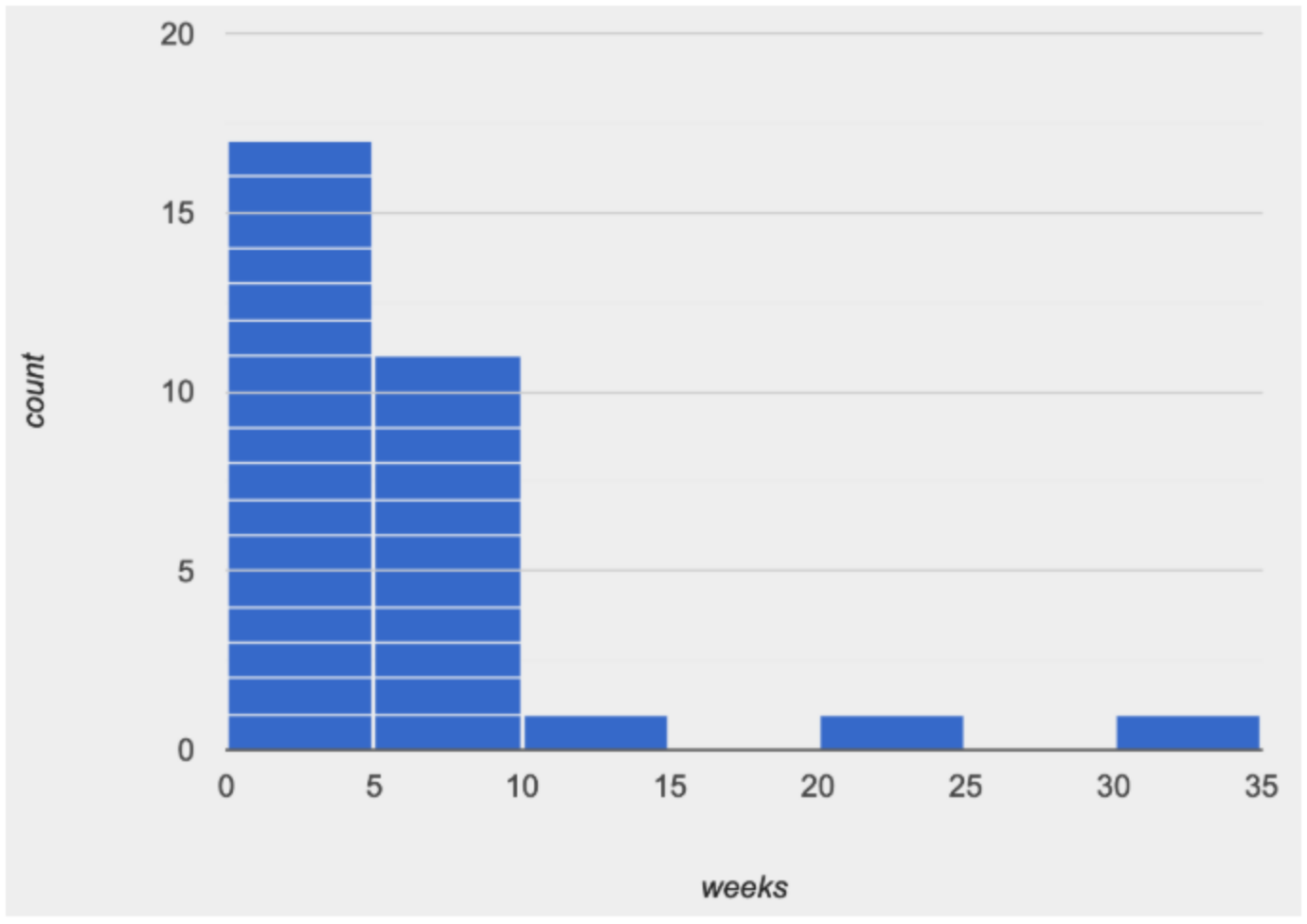
Shape is one way to summarize information in a dataset, to quickly describe what values are more or less common.
Histograms create fixed-size bins, which contain varying numbers of datapoints.
We can think of the data being "squeezed" into these fixed bins, like globs of pizza dough being pushed into tubes. When there isn’t much data that fits into a bin, the tube is mostly empty. But when lots of datapoints fall within a bin, the dough stacks up in the tube. This is why the height of a histogram bar tells us how much data is "squeezed" into that bin!
Consider the image on the right: most of the data points are clustered on the left side, and it contains a few unusually high values way off to the right. We might describe this histogram by saying that it is “skewed right, or has high outliers.”
Here are the most common shapes that we see for real-world data sets:
Symmetric: values are balanced on either side of the middle.
 🖼Show image
In a symmetric distribution, it’s just as likely for the variable to take a value a certain distance below the middle as it is to take a value that same distance above the middle. Examples:
🖼Show image
In a symmetric distribution, it’s just as likely for the variable to take a value a certain distance below the middle as it is to take a value that same distance above the middle. Examples:
-
Heights of 12-year-olds would have a symmetric shape. It’s just as likely for a 12-year-old to be a certain number of inches below average height as it is to be that number of inches above average height.
-
In a standardized test, most students score fairly close to what’s average. Also, we see just as many students scoring a certain number of points above average as we see scoring that same number of points below average. The shape is symmetric (and bulges in the middle because most students score fairly close to what’s average).
Skewed left, or low outliers.
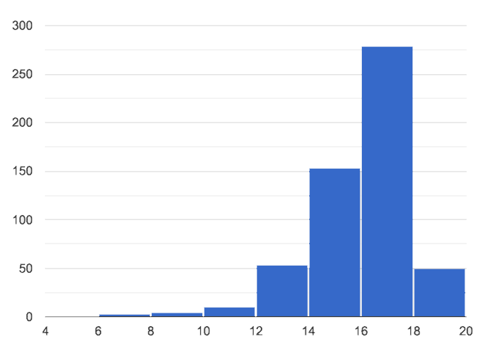
In a distribution that is skewed left, values are clumped around what’s typical, but they trail off to the left with a few unusually low values. Examples:
-
Number of teeth that adults have in their mouths would be skewed left or have low outliers. Most adults will have close to a full set of 32 teeth, but a few of them with serious dental problems would have a very small number of teeth. We won’t get anyone in our data set who has 10 or 20 extra teeth in their mouths!
-
If most students did pretty well on an exam, but a few students performed very badly, then we’d see a shape that has left skewness and/or low outliers.
Skewed right, or high outliers.
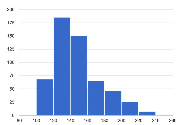
In a distribution that is skewed right, values are clumped around what’s typical, but they trail off to the right with a few unusually high values. We see this shape often in the real world, because there are many variables — like “income” or “time spent on the phone” — for which a few individuals have unusually high values, which aren’t balanced out by unusually low values (things like “income” and “phone time” can’t be less than zero). Examples:
-
Age when a woman in the U.S. gives birth would be skewed right or have high outliers. A few women would be unusually old (40+ years), above the average age of 26 (check the tabloids!), but none of them could be even close to 40 years below average to balance things out!
-
A data set of earnings almost always shows right skewness or high outliers, because there are usually a few values that are so far above average, they can’t be balanced out by any values that are so far below average. (Earnings can’t be negative.)
Investigate
-
Make a histogram for the pounds column in the animals table, sorting the animals into 20-pound bins:
-
Would you describe the shape of your histogram as being skewed left, skewed right, or symmetric?
-
Which one of these statements is justified by the histogram’s shape?
-
A few of the animals were unusually light.
-
A few of the animals were unusually heavy.
-
It was just as likely for an animal to be a certain amount below or above average weight.
-
-
Try bins of 1-pound intervals, then 100-pound intervals. Which of these three histograms best satisfies our rule of thumb?
-
On Identifying Shape - Histograms (Page 63), describe the shape of the histograms you see there.
-
On The Shape of the Animals Dataset (Page 64), describe the pounds histogram and another one you make yourself. When writing down what you notice, try to use the language Data Scientists use, discussing both skew and outliers.
Challenge Questions:
- Compare histograms for the pounds column of both cats and dogs in the dataset. Are their shapes different? How much overlap is there?
- Compare histograms for the age column of both cats and dogs in the dataset. Are their shapes different? How much overlap is there?
- Can you explain why the amount of overlap between these two distributions is different?
Synthesize
Discuss as a class, making sure students agree on the description of the shape.
Your Analysis flexible
Overview
Students repeat the previous activity, this time applying it to their own dataset and interpreting their own results. Note: this activity can be done briefly as a homework assignment, but we recommend giving students an additional class period to work on this.
Launch
Now it’s time to try looking at the shape of your own dataset! Pick one quantitative column in your dataset, and hypothesize whether you think it will be skewed right, skewed left, or symmetric. What do you think?
Investigate
-
How is your dataset distributed? Choose two quantitative variables and display them with histograms. Explain what you learn by looking at these displays. If you’re looking at a particular subset of the data, make sure you write that up in your findings on The Spread of My Dataset (Page 65).
-
Students should fill in the Quantitative Visualizations portion of their Research Paper, using histograms they’ve constructed for their dataset and explaining what they show.
Synthesize
Have students share their findings.
Histograms are a powerful way to display a data set and see its shape. But shape is just one of three key aspects that tell us what’s going on with a quantitative data set. In the next unit, we’ll explore the other two: center and spread.
These materials were developed partly through support of the National Science Foundation,
(awards 1042210, 1535276, 1648684, and 1738598).
Bootstrap:Data Science by the Bootstrap Community is licensed under a Creative Commons 4.0 Unported License. This license does not grant permission to run training or professional development. Offering training or professional development with materials substantially derived from Bootstrap must be approved in writing by a Bootstrap Director. Permissions beyond the scope of this license, such as to run training, may be available by contacting contact@BootstrapWorld.org.
Measures of Center
Measures of Center
Students learn different ways to report the center of a quantitative data set: mean, median and mode(s). After applying these concepts to a contrived dataset, they apply them to their own datasets and interpret the results.
Prerequisites |
||||||||||||||||
Relevant Standards |
Select one or more standards from the menu on the left (⌘-click on Mac, Ctrl-click elsewhere). Common Core Math Standards
K-12CS Standards
Next-Gen Science Standards
Oklahoma Standards
|
|||||||||||||||
Lesson Goals |
Students will be able to…
|
|||||||||||||||
Student-facing Lesson Goals |
|
|||||||||||||||
Materials |
||||||||||||||||
Preparation |
|
|||||||||||||||
Supplemental Resources |
||||||||||||||||
Language Table |
|
- mean
-
average, calculated as the sum of values divided by the number of values
- median
-
the middle element of a quantitative data set
- mode
-
the most commonly appearing categorical or quantitative value or values in a data set
- outlier
-
a data point that is unusually far above or below most of the others
- skew
-
lack of balance in a dataset’s shape, arising from more values that are unusually low or high. Such values tend to trail off, rather than be separated by a gap (as with outliers).
Mean 15 minutes
Overview
Students learn about mean (or "average"), and how it is one way (among others!) to summarize a quantitative column.
Launch
According to the Animal Shelter Bureau, the average pet weighs almost 41 pounds.
Some medicines are dosed by weight: heavier animals need a larger dose. If someone from the shelter needs to give a dose of medicine to the animals, is the “average” the best estimate we can use?
“The average pet weighs 41 pounds” is a statement about the entire dataset, which summarizes a whole column of values with a single number. Summarizing a big dataset means that some information gets lost, so it’s important to pick an appropriate summary. Picking the wrong summary can have serious implications! Here are just a few examples of summary data being used for important things. Do you think these summaries are appropriate or not?
-
Students are sometimes summarized by two numbers — their GPA and SAT scores — which can impact where they go to college or how much financial aid they get.
-
Schools are sometimes summarized by a few numbers — student pass rates and attendance, for example — which can determine whether or not a school gets shut down.
-
Adults are often summarized by a single number — like their credit score — which determines their ability to get a job or a home loan.
-
When buying uniforms for a sports team, a coach might look for the most common size that the players wear.
Can you think of other examples where someone uses a number or two to summarize something complex?
Every kind of summary has situations in which it does a good job of reporting what’s typical, and others where it doesn’t really do justice to the data. In fact, the shape of the data can play a huge role in whether or not one kind of summary is appropriate!
One of the ways that Data Scientists summarize quantitative data is by talking about its center - literally asking "what is a typical value in this sample?", in the hopes of inferring something about a larger population. But there are many different ways to define "center", and each method has strengths and weaknesses. Let’s check the “41 pounds” claim and see if it’s an appropriate measure of center. Later on, you’ll have a chance to apply what you’ve learned to your own dataset, to find the best way to provide an overall summary of the data.
Investigate
Open your “Animals Starter File”. (If you do not have this file, or if something has happened to it, you can always make a new copy.)
If we plotted all the pounds values as points on a number line, what could we say about the average of those values? Is there a midpoint? Is there a point that shows up most often? Each of these are different ways of “measuring center”.
The Animal Shelter Bureau used one method of summary, called the mean, or "average". In general, the mean of a data set is the sum of values divided by the number of values. To take the average of a column, we add all the numbers in that column and divide by the number of rows.
Pyret has a way for us to compute the mean of any quantitative column in a Table. It consumes a Table and the name of the column you want to measure, and produces the mean — or average — of the numbers in that column.
What is its name? Domain? Range?
Notice that calculating the mean requires being able to add and divide, so the mean only makes sense for quantitative data. For example, the mean of a list of Presidents doesn’t make sense. Same thing for a list of zip codes: even though we can divide a sum of zip codes, the output doesn’t correspond to some “center” zip code.
Type mean(animals-table, "pounds"). What does this give us?
Does this support the Bureau’s claims?
Open your workbooks to Summarizing Columns in the Animals Dataset (Page 69). Under the “measures of center” section, fill in the computed mean.
Median 15 minutes
Overview
Students learn a second measure of center: the median. They learn the algorithm and the code to find the median, as well as situations where taking the median is more appropriate than the mean.
Launch
You computed the mean of that column to be almost exactly 41 pounds. That IS the average, but if we scan the dataset we’ll quickly see that most of the animals weigh less than 41 pounds! In fact, more than half of the animals weigh less than just 15 pounds. What is throwing off the average so much?
Kujo and Mr. Peanutbutter!
In this case, the mean is being thrown off by a few extreme data points. These extreme points are called outliers, because they fall far outside of the rest of the dataset. Calculating the mean is great when all the points are fairly balanced on either side of the middle, but it distorts things for datasets with extreme outliers. The mean may also be thrown off by the presence of skewness: a lopsided shape due to values trailing off left or right of center.
Make a histogram of the pounds column, and try different bin sizes. Can you see the skew towards the right, with a huge number of animals clumped to the left?
A different way to measure center is to line up all of the data points — in order — and find a point in the center where half of the values are smaller and the other half are larger. This is the median, or “middle” value of a list.
As an example, consider this list of ACT scores:
25, 26, 28, 28, 28, 29, 29, 30, 30, 31, 32
Here 29 is the median, because it separates the "bottom half” (5 values below it) from the top half” (5 values above it).
The algorithm for finding the median of a quantitative column is:
-
Sort the numbers (we did this for you in the above example).
-
Cross out the highest number.
-
Cross out the lowest number.
-
Repeat until there is only one number left. If there are two numbers left at the end, take the mean of those numbers.
Investigate
-
Pyret has a function to compute the median of a list as well. Find the contract in your contracts page.
-
Compute the median for the
poundscolumn in the Animals Dataset, and add this to Summarizing Columns in the Animals Dataset (Page 69). -
Is it different than the mean?
-
What can we conclude when the mean is so much greater than the median?
-
For practice, compute the mean and median for the weeks and age columns.
Synthesize
By looking at the histogram, we can develop an intuition for whether it’s probably better to use the mean or median. Pronounced left skewness and/or low outliers can pull the mean down below the median, while right skewness and/or high outliers can pull it up. Either way, such shapes distort the mean as a measure of what’s typical for the data set. Data scientists generally prefer to use the mean as their measure of center, because it contains information from every single data value. However, if a data set has substantial skewness or outliers, they use median to report the center .
Modes 25 minutes
Overview
Students learn about the mode(s) of a dataset, how to compute the mode, and when it is appropriate to use this as a measure of center.
Launch
The third measure of center is called the mode of a dataset. The mode of a data set is the value that appears most often. Median and Mean always produce one number, but if two or more values are equally common, there can be more than one mode. If all values are equally common, then there is no mode at all! Often there will be just one mode in the list of most common values: many data sets are what we call “unimodal”. But sometimes there are exceptions! Consider the following three datasets:
1, 2, 3, 4
1, 2, 2, 3, 4
1, 1, 2, 3, 4, 4
-
The first dataset has no mode at all!
-
The mode of the second data set is 2, since 2 appears more than any other number.
-
The modes (plural!) of the last data set are 1 and 4, because 1 and 4 both appear more often than any other element, and because they appear equally often.
Mode is rarely used to summarize quantitative data. It is very common as a summary of categorical data, telling us which category occurs most often.
In Pyret, the mode(s) are calculated by the modes function, which consumes a Table and the name of the column you want to measure, and produces a List of Numbers.
Investigate
Compute the modes of the pounds column, and add it to Summarizing Columns in the Animals Dataset (Page 69). What did you get?
Synthesize
The most common number of pounds an animal weighs is 6.5! That’s well below our mean and even our median, which is further evidence of outliers or skewness.
At this point, we have a lot of evidence that suggests the Bureau’s use of “mean” to summarize animal weights isn’t ideal. Our mean weight agrees with their findings, but we have three reasons to suspect that mean isn’t the best value to use:
-
The median is only 13.4 pounds.
-
The mode of our dataset is only 6.5 pounds, which suggests a cluster of animals that weigh less than one-sixth the mean.
-
When viewed as a histogram, we can see the right skewness and high outliers in the dataset. Mean is sensitive to datasets with skewness and/or outliers.
“In 2003, the average American family earned $43,000 a year — well above the poverty line! Therefore very few Americans were living in poverty."
Do you trust this statement? Why or why not? Consider how many policies or laws are informed by statistics like this! Knowing about measures of center helps us see through misleading statements.
You now have three different ways to measure center in a dataset. But how do you know which one to use? Depending on the shape of the dataset, a measure could be really useful or totally misleading! Here are some guidelines for when to use one measurement over the other:
-
If the data is doesn’t show much skewness or have outliers, mean is the best summary because it incorporates information from every value.
-
If the data has noticeable outliers or skewness, median gives a better summary of center than the mean.
-
If there are very few possible values, such as AP Scores (1–5), the mode could be a useful way to summarize the data set.
Additional Exercises
These materials were developed partly through support of the National Science Foundation,
(awards 1042210, 1535276, 1648684, and 1738598).
Bootstrap:Data Science by the Bootstrap Community is licensed under a Creative Commons 4.0 Unported License. This license does not grant permission to run training or professional development. Offering training or professional development with materials substantially derived from Bootstrap must be approved in writing by a Bootstrap Director. Permissions beyond the scope of this license, such as to run training, may be available by contacting contact@BootstrapWorld.org.
Spread of a Data Set
Spread of a Data Set
Students learn how to evaluate the spread of a quantitative column using box plots, and explore how this offers a different perspective on shape from what can be achieved with a histogram. After applying these concepts to a contrived dataset, they apply them to their own datasets and interpret the results.
Prerequisites |
||||||||||||||||
Relevant Standards |
Select one or more standards from the menu on the left (⌘-click on Mac, Ctrl-click elsewhere). Common Core Math Standards
CSTA Standards
K-12CS Standards
Next-Gen Science Standards
|
|||||||||||||||
Lesson Goals |
Students will be able to…
|
|||||||||||||||
Student-facing Lesson Goals |
|
|||||||||||||||
Materials |
||||||||||||||||
Preparation |
|
|||||||||||||||
Supplemental Resources |
Summative Assessments / Capstone: Stress Project (You will also need the Personality True Colors assessment) |
|||||||||||||||
Language Table |
|
- box plot
-
the box plot (a.k.a. box-and whisker-plot) is a way of displaying a distribution of data based on the five-number summary: minimum, first quartile, median, third quartile, and maximum
- histogram
-
a display of quantitative data that uses vertical bars positioned over bins (sub-intervals); each bar’s height reflects the count or percentage of data values in that bin.
- interquartile range
-
(IQR) is one possible measure of spread, based on dividing a data set into four parts. The values that divide each part are called the first quartile (Q1), the median, and third quartile (Q3). IQR is calculated as Q3 minus Q1.
- median
-
the middle element of a quantitative data set
- quartiles
-
three values that divide a data set into four equal-sized groups
- range of a data set
-
the distance between minimum and maximum values
- sample
-
a set of individuals or objects collected or selected from a statistical population by a defined procedure
- shape
-
The aspect of a dataset that tells which values are more or less common
- spread
-
the extent to which values in a data set vary, either from one another or from the center
Measures of Spread 30 minutes
Overview
Students are introduced to the notion of spread in a dataset. They learn about quartiles, box plots, and how to use them to talk about spread.
Launch
A teacher may report that her students averaged a 75 on a test, but it’s important to know how those scores were spread out: did all of them get exactly 75, or did half score 100 and the other half 50? When Data Scientists use the mean of a sample to estimate the mean of a whole population, it’s important to know the spread in order to report how good or bad a job that estimate does.
Suppose we lined up all of the values in the pounds column of the animals data set from smallest to largest, and then split the line up into two equal groups by taking the median. We can learn something about the spread of the data set by taking things further: The middle of the lighter half of animals is called the first quartile - or "Q1" - and the middle of the heavier half of animals is the third quartile (also called "Q3"). Once we find these numbers, we can say that the middle half of the animals’ weights are spread between Q1 and Q3.
The first quartile (Q1) is the value for which 25% of the animals weighed that amount or less. What does the third quartile represent?
Besides looking at the median as center, and the spread between Q1 and Q3, we also gain valuable information from the spread of the entire data set—that is, the distance between minimum and maximum. This is called the range of a data set. (Note: the term “Range” means something different in statistics than it does in algebra and programming!)
We can use box plots to visualize all of this information. These plots are constructed using just five numbers, which makes them convenient ways to display both center and spread of a data set in a clear and simple way. Below is the contract for box-plot, along with an example that will make a box plot for the pounds column in the animals-table.
Box plots divide our sample into equally-sized groups, and show where those groups are spread thin or clumped together.
Type in this expression in the Interactions Area, and see the resulting plot.
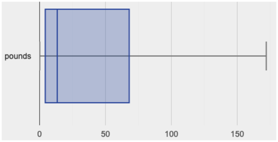
This plot shows us the center and spread in our dataset according to those five numbers.
-
The minimum value in the dataset (at the left of “whisker”). In our dataset, that’s just 0.1 pounds.
-
The First Quartile (Q1) (the left edge of the box), is computed by taking the median of the lower half of the values. In the pounds column, that’s 3.9 pounds.
-
The Median value (the line in the middle), which is the middle Quartile of the whole dataset. We already computed this to be 11.3 pounds.
-
The Third Quartile (Q3) (the right edge of the box), which is computed by taking the median of the upper half of the values. That’s 60.4 pounds in our dataset.
-
The maximum value in the dataset (at the right of the “whisker”). In our dataset, that’s 172 pounds.
Investigate
-
Turn to Summarizing Columns in the Animals Dataset (Page 69)
-
Fill in the five-number summary for the
poundscolumn, and sketch the box plot. -
What conclusions can you draw about the distribution of values in this column?
Data Scientists subtract the 1st quartile from the 3rd quartile to compute the range of the “middle half” of the dataset, also called the interquartile range.
Kinesthetic Activity Divide the class into groups, and give each group a ruler and a ball of playdough. Have them draw a number line from 0-6 with the ruler, marking off the points at 0, 3, 4, 4.5 and 6 inches. Have the groups roll the dough into a thick cylinder, divide that cylinder in half, and then split each half to form four equally-sized cylinders. The playdough represents a sample, with values divided into four quartiles. Box plots stretch and squeeze these equal quartiles across a number line, so that each quartile fills up an interval in that quartile. On their number line, students have intervals from 0-3, 3-4, 4-4.5, and 4.5-6. Have students roll their cylinders so that they fill each of these intervals, retaining a uniform thickness. They should notice that shorter intervals have thicker cylinders, and longer ones have skinny ones. Even though a box plot doesn’t show us the thickness of the datapoints, we can tell that a small intervals has the same amount of data "squeezed" into it as a large interval. |
-
Find the interquartile range of this dataset.
-
What percentage of animals fall within the interquartile range?
-
What percentage of animals fall below the First Quartile? Above the Third Quartile? What percentage fall anywhere between the minimum and the maximum?
Now that you’re comfortable creating box plots and looking at measures of spread on the computer, it’s time to put your skills to the test!
Turn to Interpreting Spread (Page 70) and complete the questions you see there.
Just as pie and bar charts are ways of visualizing categorical data, box plots and histograms are both ways of visualizing the shape of quantitative data. Box plots make it easy to see the 5-number summary, and compare the Range and Interquartile Range. Histograms make it easier to see skewness and more details of the shape, and offer more granularity when using smaller bins.
Left-skewness is seen as a long tail in a histogram. In a box plot, it’s seen as a longer left "whisker" or more spread in the left part of the box. Likewise, right skewness is shown as a longer right "whisker" or more spread in the right part of the box.
Box plots and Histograms can both tell us a lot about the shape of a dataset, but they do so by grouping data quite differently. A box plot is always divided into four parts, which may fall on differently-sized intervals but all contain the same number of points. A histogram, on the other hand, has identically-sized intervals which can contain very different numbers of points.
Turn to Identifying Shape - Box Plots (Page 71) and see if you can describe box plots using what you know about skewness.
Challenge Questions:
- Compare the histograms for the pounds column of both cats and dogs in the dataset. Are their shapes different? How much overlap is there?
- Compare the histograms for the age column of both cats and dogs in the dataset. Are their shapes different? How much overlap is there?
- Can you explain why the amount of overlap between these two distributions is different?
Common Misconceptions
It is extremely common for students to forget that every quartile always includes 25% of the dataset. This will need to be heavily reinforced.
Synthesize
Histograms, box plots, and measures of center and spread are all different ways to get at the shape of our data. It’s important to get comfortable using every tool in the toolbox when discussing shape!
Modified Box Plots More Statistics- or Math-oriented classes will also be familiar with modified box plots (video explanation), which remove outliers from the box-and-whisker and draw them as asterisks outside of the plot. Modified box plots are also available in Bootstrap:Data Science, using the following contract: # modified-box-plot :: Table, (unquote String) -> Image
|
Comparing Box Plots 15 minutes
Overview
Students assess the degree of visual overlap of two numerical distributions.
Launch
"Do dogs take longer to get adopted than cats?"
This is asking us about the interaction between a categorical variable (species) and a quantitative one (weeks). Instead of creating a whole new display, all we have to do is make separate box plots for the distribution of weeks for both cats and dogs. Note: this works fine as long as we’re sure to use a common scale! Both box plots (see below) share the same axis for adoption times, which ranges from about 1 to 10 weeks.
Box plots make it easy to decide if values of a quantitative variable seem to be mostly similar or mostly different, depending on which group an individual is in. The trick is to train your eyes to look for whether there’s a lot of overlap in the two box plots, or if one is noticeably higher than the other.
Investigate
Have students break into groups of 3-4, and compare the box plot of weeks-to-adoption for cats with the one for dogs. Note: they can generate the pair of box plots themselves, but we recommend simply giving them this image: cats v. dogs
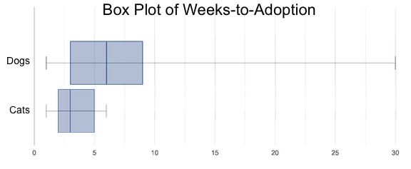 🖼Show image
-
Do the two box plots mostly overlap, or does one have a noticeably different range than the other?
-
How do the medians compare?
Next, each group examines the pair of box plots that compare weeks to adoption for fixed versus unfixed animals: fixed v. unfixed
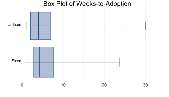 🖼Show image. Once again, consider how similar or different the two plots seem.
-
Do the two box plots mostly overlap, or does one have a noticeably different range than the other?
-
How do the medians compare?
Students should confirm that the box plots for adoption times of unfixed versus fixed animals have more overlap than the box plots for adoption times of cats versus dogs.
Box plots create varying-size bins, which contain a fixed number of datapoints.
This is in contrast to histograms, which have fixed-size bins with varying numbers of datapoints. We can imagine the data as being a pile of pizza dough, divided into four equally-sized quartiles. When the data is tightly packed, the bin is narrow. When it’s spread out, the bin is wide. Histograms show data clusters as tall bars, whereas box plots show clusters as narrow quartiles.
Box plots and histograms give us two different views on the concept of shape.
Histograms: fixed intervals (“bins”) with variable numbers of data points in each one. Points “pile up in bins”, so we can see how many are in each. Larger bars show where the clusters are.
Box plots: variable intervals (“quartiles”) with a fixed number of data points in each one. Treats data more like “pizza dough”, dividing it into four equal quarters showing where the data is tightly clumped or spread thin. Smaller intervals show where the clusters are.
To make connections between histograms and box plots, complete Matching Box-Plots to Histograms (Page 73) and/or (Desmos)
Synthesize
Referring to our Dogs v. Cats box plots, the dogs’ adoption times were much higher than the cats’; the top half of the dogs’ box plot doesn’t overlap at all with the cats’ box plot. Does this suggest that species does or does not play a role in how long it takes for an animal to be adopted?
Referring to our Fixed v. Unfixed box plots, we saw that adoption times for unfixed and fixed animals overlapped a lot, and the medians were pretty close. Does this suggest that being fixed does or does not play a role in how long it takes for an animal to be adopted?
Which variable seems to have more of an effect on adoption time: species (cat or dog) or whether an animal is fixed or not? Have students share back their findings.
Project Option: Stress or Chill? Students can gather data about their own lives, and use what they’ve learned in the class so far to analyze it. This project can be used as a mid-term or formative assessment, or as a capstone for a limited implementation of Bootstrap:Data Science. The project description is available here (You will also need the Personality True Colors assessment) (Based on the What Stresses Us? project from IDS at UCLA) |
Your Analysis flexible
Overview
Students repeat the previous activity, this time applying it to their own dataset and interpreting their own results. Note: this activity can be done briefly as a homework assignment, but we recommend giving students an additional class period to work on this.
Investigate
-
Take 15 minutes to fill out Shape of My Dataset (Page 72) in your Student Workbook. Choose a column to investigate, and write up your findings.
-
Students should fill in Measures of Center and Spread portion of their Research Paper, using the means, medians, modes, box plots and five-number summaries they’ve constructed for their dataset and explaining what they show.
Synthesize
Have students share their findings with one another.
Additional Exercises:
These materials were developed partly through support of the National Science Foundation,
(awards 1042210, 1535276, 1648684, and 1738598).
Bootstrap:Data Science by the Bootstrap Community is licensed under a Creative Commons 4.0 Unported License. This license does not grant permission to run training or professional development. Offering training or professional development with materials substantially derived from Bootstrap must be approved in writing by a Bootstrap Director. Permissions beyond the scope of this license, such as to run training, may be available by contacting contact@BootstrapWorld.org.
Checking Your Work
Checking Your Work
Students consider the concept of trust and testing — how do we know if a particular analysis is trustworthy?
Prerequisites |
||||||||||||||||
Relevant Standards |
Select one or more standards from the menu on the left (⌘-click on Mac, Ctrl-click elsewhere). Common Core Math Standards
CSTA Standards
K-12CS Standards
Next-Gen Science Standards
Oklahoma Standards
|
|||||||||||||||
Lesson Goals |
Students will be able to… - Create a subset of data to verify that a given transformation works as-advertised, using attributes of the transformation and the dataset. |
|||||||||||||||
Student-facing Lesson Goals |
|
|||||||||||||||
Materials |
||||||||||||||||
Preparation |
|
|||||||||||||||
Supplemental Resources |
||||||||||||||||
Language Table |
|
Confirming Analysis 30 minutes
Overview
Students learn how to create a Testing Table, which is small enough to reason about and can be used to test whether code does the right thing.
Launch
Samples are taken in Data Science and Computer Programming for two different reasons. One of the main purposes of Data Science is to take a representative sample from a larger population, and use information from the sample to infer what’s true about the whole population. In programming, we often extract a smaller Table from a larger one, for the purpose of testing that our code seems to do what it’s supposed to. In this lesson, we focus on the tasks of programmers, and consider best practices for setting up a Testing Table that helps us check our code.
-
Uber and Google are making self-driving cars, which use artificial intelligence to interpret sensor data and make decisions about whether a car should speed up, slow down, or slam on the brakes. This AI is trained on a lot of sample data, which it learns from. What might be the problem if the sample data only included roads in California?
-
Law enforcement in many towns has started using facial-recognition software to automatically detect whether someone has a warrant out for their arrest. A lot of facial-recognition software, however, has been trained on sample data containing mostly white faces. As a result, it has gotten really good at telling white people apart, but often can’t tell the difference between people who aren’t white. Why might this be a problem?
-
Why might it be a bad thing to only test medicines only on men (or only on women), before prescribing them to the general public?
Testing Matters!
A good Testing Table should be representative of the population, and relevant to what’s being analyzed. A good Testing Table should have…
-
At least the columns that matter — whether we’ll be ordering or filtering by those columns.
-
Enough rows to include different circumstances that are relevant to the task at hand. For instance, if our code is supposed to extract certain cats from the animals table, our Testing Table should include at least one animal that’s not a cat.
-
Rows that aren’t already sorted, if our analysis is supposed to sort for us.
Data scientists usually think in terms of samples that best serve the purpose of performing inference: Samples should be representative of the entire population, and large enough to get us fairly close to the truth about that population. Computer programmers need to think in terms of Testing Tables that best serve the purpose of verifying that their code does what it’s supposed to: The Tables should be designed to call attention to any imperfections in the code’s instructions.
Investigate
Testing Tables can also be used to verify that a certain analysis is correct. Code that filters a table to show only cats can’t be verified with a Testing Table that already has only cats. (Why not?)
Code that shows only the kittens…sorted in ascending order by weight must be verified by a Table containing cats, non-cats, old and young cats… and rows that aren’t already sorted!
-
Turn to “Trust, but verify …” (Page 75) in your student workbook.
-
You’ve been given a function called
fixed-catsand a description of what it claims to do. -
List the names of the animals that you would use in a Testing Table to verify whether the function works as advertised. When you’ve finished, open the Trust-but-Verify Starter File. There are three versions of
fixed-catshere. Are they all correct? If not, which ones are broken? -
Turn to “Trust, but verify…” (Page 76). Using the same Starter File, construct a Testing Table and figure out which (if any) of the functions are correct!
Synthesize
Complex analysis has more room for mistakes, so it’s critical to think about a Testing Table that allows us to trust that our code really does what it’s supposed to!
How would you check whether or not a facial recognition system was equally accurate for everyone?
These materials were developed partly through support of the National Science Foundation,
(awards 1042210, 1535276, 1648684, and 1738598).
Bootstrap:Data Science by the Bootstrap Community is licensed under a Creative Commons 4.0 Unported License. This license does not grant permission to run training or professional development. Offering training or professional development with materials substantially derived from Bootstrap must be approved in writing by a Bootstrap Director. Permissions beyond the scope of this license, such as to run training, may be available by contacting contact@BootstrapWorld.org.
Scatter Plots
Scatter Plots
Students investigate scatter plots as a method of visualizing the relationship between two quantitative variables.
Prerequisites |
||||||||||||||||
Relevant Standards |
Select one or more standards from the menu on the left (⌘-click on Mac, Ctrl-click elsewhere). Common Core Math Standards
CSTA Standards
K-12CS Standards
Next-Gen Science Standards
Oklahoma Standards
|
|||||||||||||||
Lesson Goals |
Students will be able to…
|
|||||||||||||||
Student-facing Lesson Goals |
|
|||||||||||||||
Materials |
||||||||||||||||
Preparation |
|
|||||||||||||||
Supplemental Resources |
||||||||||||||||
Language Table |
|
- explanatory variable
-
the variable in a relationship that is presumed to impact the other variable
- response variable
-
the variable in a relationship that is presumed to be affected by the other variable
- scatter plot
-
a display of the relationship between two quantitative variables, graphing each explanatory value on the x axis and the accompanying response on the y axis
Relationships Between Columns 15 minutes
Overview
Students are introduced to questions that ask about the relationship between one quantitative column and another.
Launch
Can animals' weights help explain why some are adopted quickly while others take a long time? What other factors explain why one pet gets adopted right away, and others wait months?
Theory 1: Smaller animals get adopted faster because they’re easier to care for.
How could we test that theory? Bar and pie charts are great for showing us frequencies or percentages in a categorical column. Histograms and box plots are great for showing us the shape, center, and spread of a single quantitative column. But none of these displays will help us see connections between two quantitative columns.
Investigate
-
Take a few minutes to look through the whole dataset, and see if you agree with Theory 1.
-
Could any of our visualizations or summaries provide evidence for or against the theory?
-
Write down your hypothesis on (Dis)Proving a Claim (Page 79), as well as a theory about how we could use this dataset to see if you’re right.
Synthesize
We’ve got a lot of tools in our toolkit that help us think about an entire column of a dataset:
-
We have ways to find measures of center and spread for a given quantitative column.
-
We have visualizations that let us see the shape of values in a quantitative column.
-
We have visualizations that let us see frequencies or percentages in a categorical column.
What columns is this question asking about?
Making Scatter Plots 20 minutes
Overview
Students are introduced to scatter plots, which are visualizations that show the relationship between two quantitative variables. They learn how to construct scatter plots by hand, and in Pyret.
Launch
This question is asking about two columns in our dataset. Specifically, it’s asking if there is a relationship between pounds and weeks.
Before we can draw a scatter plot, we have to make an important decision: which variable is explanatory and which is response? In this case, are we suspecting that an animal’s weight can explain how long it takes to be adopted, or that how long it takes to be adopted can explain how much an animal weighs?
The first of these makes sense, and reflects our suspicion that weight plays a role in adoption time. The convention is to use the horizontal axis for our explanatory variable and the vertical axis for the response. Thus, pounds will be x and weeks will be y.
Investigate
We will produce our scatter plot by graphing each animal’s pounds and weeks values as a point on the x and y axes.
Complete Creating a Scatter Plot (Page 80) in your Student Workbook.
Teaching Tip Divide the full table up into sub-lists, and have a few students plot 3-4 animals on the board. This can be done collaboratively, resulting in a whole-class scatterplot! |
-
Open your “Animals Starter File”. (If you do not have this file, or if something has happened to it, you can always make a new copy.)
-
Make a scatter plot that displays the relationship between weight and adoption time.
-
Are there any patterns or trends that you see here?
-
Try making a few other scatter plots, looking for relationships between other columns in the
animals-table.
Synthesize
Have students share their observations. What trends do they see? Are there any points that seem unusual? Why?
Looking for Trends 20 minutes
Overview
Students are asked to identify patterns in their scatter plots. This activity builds towards the idea of linear associations, but does not go into depth (as the following lesson does).
Launch
Shown below is a scatter plot of the relationships between the animals' age and the number of weeks it takes to be adopted.
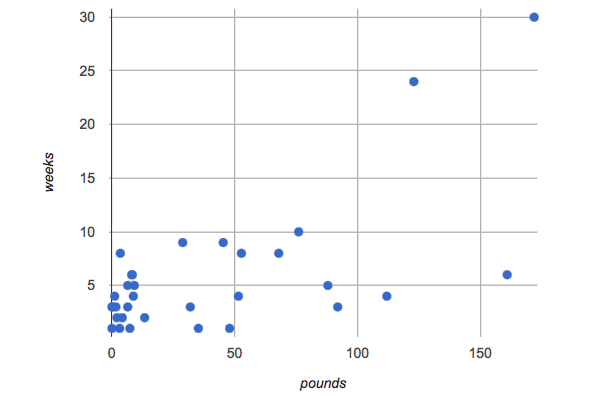
-
Can you see a “cloud” around which the points are clustered?
-
Does the number of weeks to adoption seem to go up or down as the weight increases?
-
Are there any points that “stray from the pack”? Which ones?
Teaching Tip Project the scatter plot at the front of the room, and have students come up to the plot to point out their patterns. |
A straight-line pattern in the cloud of points suggests a linear relationship between two columns. If we can pinpoint a line around which the points cluster (as we’ll do in a future lesson), it would be useful for making predictions. For example, our line might predict how many weeks a new dog would wait to be adopted, if it weighs 68 pounds.
Do any data points seem unusually far away from the main cloud of points? Which animals are those? These points are called unusual observations. Unusual observations in a scatter plot are like outliers in a histogram, but more complicated because it’s the combination of x and y values that makes them stand apart from the rest of the cloud.
Unusual observations are always worth thinking about
-
Sometimes they’re just random. Felix seems to have been adopted quickly, considering how much he weighs. Maybe he just met the right family early, or maybe we find out he lives nearby, got lost and his family came to get him. In that case, we might need to do some deep thinking about whether or not it’s appropriate to remove him from our dataset.
-
Sometimes they can give you a deeper insight into your data. Maybe Felix is a special, popular (and heavy!) breed of cat, and we discover that our dataset is missing an important column for breed!
-
Sometimes unusual observations are the points we are looking for! What if we wanted to know which restaurants are a good value, and which are rip-offs? We could make a scatter plot of restaurant reviews vs. prices, and look for an observation that’s high above the rest of the points. That would be a restaurant whose reviews are unusually good for the price. An observation way below the cloud would be a really bad deal.
Investigate
For practice, consider each of the following relationships, always expressed as "response variable vs explanatory variable". First think about whether you’d expect the variables to be related, then make the scatterplot to see if your hunch seems correct. If you see any unusual observations, try to explain them!
-
The
poundsof an animal vs itsage -
The number of
weeksfor an animal to be adopted vs its number oflegs -
The number of
legsvs theageof an animal. -
Do you see a linear (straight-line) relationship in any of these, evidenced by a cloud of points that’s clearly rising or falling from left to right? Are there any unusual observations?
Synthesize
Debrief, showing the plots on the board. Make sure students see plots for which there is no relationship, like the last one!
Theory 2: Younger animals get adopted faster because they are easier to care for.
It might be tempting to go straight into making a scatter plot to explore how weeks to adoption may be affected by age. But different animals have very different lifespans! A 5-year-old tarantula is still really young, while a 5-year-old rabbit is fully grown. With differences like this, it doesn’t make sense to put them all on the same scatter plot. By mixing them together, we may be hiding a real relationship, or creating the illusion of a relationship that isn’t really there! What should we do to explore this theory?
These materials were developed partly through support of the National Science Foundation,
(awards 1042210, 1535276, 1648684, and 1738598).
Bootstrap:Data Science by the Bootstrap Community is licensed under a Creative Commons 4.0 Unported License. This license does not grant permission to run training or professional development. Offering training or professional development with materials substantially derived from Bootstrap must be approved in writing by a Bootstrap Director. Permissions beyond the scope of this license, such as to run training, may be available by contacting contact@BootstrapWorld.org.
Correlations
Correlations
Students continue to interpret scatter plots, and think about direction and strength of linear relationships.
Prerequisites |
||||||||||||||||
Relevant Standards |
Select one or more standards from the menu on the left (⌘-click on Mac, Ctrl-click elsewhere). Common Core Math Standards
CSTA Standards
K-12CS Standards
Next-Gen Science Standards
Oklahoma Standards
|
|||||||||||||||
Lesson Goals |
Students will be able to…
|
|||||||||||||||
Student-facing Lesson Goals |
|
|||||||||||||||
Materials |
||||||||||||||||
Preparation |
|
|||||||||||||||
Supplemental Resources |
||||||||||||||||
Language Table |
|
- form
-
of a relationship between two quantitative variables: whether the two variables together vary linearly or in some other way
- r
-
a number between −1 and 1 that measures the direction and strength of a linear relationship between two quantitative variables (also known as correlation value)
Correlations have Form 10 minutes
Overview
Students identify and make use of patterns in scatter plots, learning to characterize them as being linear, curved, or showing no clear pattern. This builds intuition for determining if the form is linear, in which case we can proceed to correlation and linear regression.
Launch
By now we have learned ways to summarize a single quantitative variable, like the age of an animal in our dataset: report the center, spread, and shape of the distribution. Together, those numbers tell us what age is typical, how much the ages vary, and what kind of age values are usual or unusual. We could do the same for for animals' weights (or any other quantitative column).
But those individual summaries tell us nothing about the relationship between animals' ages and weights. In order to understand such relationships, we have to expand our view from a single dimension (along one axis) to two dimensions. This goes hand in hand with expanding our display from a one-dimensional histogram to a two-dimensional scatter plot.
Rather than summarizing each distribution in one dimension, we can summarize a linear relationship between two quantitative variables. But this only makes sense if the scatter plot follows a straight-line pattern, as opposed to being curved. So the very first assessment we have to make is to identify the form of the relationship as being linear or not.
Form: whether a relationship is linear or not
Investigate
The relationship between two quantitative variables can take many forms - some patterns are linear, and appear as a straight line sloping up or down. Some patterns are non-linear, and may look like a curve or an arc. And sometimes there is no pattern or relationship at all!
Have students turn to Identifying Form, Direction and Strength (Page 81) in their student workbooks. For each scatter plot, identify whether the relationship is linear, non-linear or if there’s no relationship at all.
Synthesize
Data Scientists use their eyes all the time! It doesn’t make sense to search for correlations when there’s no pattern at all, and only linear relationships make sense if we want to summarize with a correlation.
Going Deeper In an AP Statistics class or full-year Data Science class, it’s appropriate to discuss non-linear relationships here. In a dedicated computer science class, it may also be appropriate to talk about transforming the x- or y-axis (using |
Correlations have Direction & Strength 20 minutes
Overview
Once students have learned to identify a possible linear relationship, they can turn their attention to other qualities of that relationship: its direction and strength. Each of these is expressed in the r-value, which students learn to read.
Launch
Assuming a relationship is linear, data scientists calculate a single number called "correlation" - or r-value - that reports both the direction and strength.
Direction: whether a linear relationship is positive or negative.
A linear relationship between two quantitative variables is positive if, in general, the scatter plot points are sloping up: smaller x values tend to go with smaller y values, and larger x values tend to go with larger y values. The relationship is negative if points slope down: smaller x values tend to go with larger y values, and larger x values tend to go with smaller y values.
-
Positive relationships are by far most common because of natural tendencies for variables to increase in tandem. For example, “the older the animal, the more it tends to weigh”. This is usually true for human animals, too!
-
Negative relationships can also occur. For example, “the older a child gets, the fewer new words he or she learns each day.”
Strength: how closely the two variables are correlated.
How well does knowing the x-value allow us to predict what the y-value will be?
-
A relationship is strong if knowing the x-value of a data point gives us a very good idea of what its y-value will be (knowing a student’s age gives us a very good idea of what grade they’re in). A strong linear relationship means that the points in the scatter plot are all clustered tightly around an invisible line.
-
A relationship is weak if x tells us little about y (a student’s age doesn’t tell us much about their number of siblings). A weak linear relationship means that the cloud of points is scattered very loosely around the line.
Investigate
Have students turn to Identifying Form, Direction and Strength (Page 81) in their student workbooks. For each scatter plot, identify whether the relationship is positive or negative, and whether it is strong or weak.
The correlation r is a number (falling anywhere from -1 to +1) that tells us the direction and strength of a linear relationship between two variables. r is positive or negative depending on whether the correlation is positive or negative. The strength of a correlation is the distance from zero: an r-value of zero means there is no correlation at all, and stronger correlations will be closer to −1 or 1.
An r-value of about ±0.65 or ±0.70 or more is typically considered a strong correlation, and anything between ±0.35 and ±0.65 is “moderately correlated”. Anything less than about ±0.25 or ±0.35 may be considered weak. However, these cutoffs are not an exact science! In some contexts an r-value of ±0.50 might be considered impressively strong!
Calculating r from a data set only tells us the direction and strength of the relationship in that particular sample. If the correlation between adoption time and age for a representative sample of about 30 shelter animals turns out to be +0.44, the correlation for the larger population of animals will probably be close to that, but certainly not the same.
Have students turn to Identifying Form and r-Values (Page 82) in their student workbooks. For each scatter plot, identify whether the relationship is linear, and use r to summarize direction and strength. You could also have them complete a card sort activity on identifying strength (Desmos) and a card sort activity on identifying direction (Desmos).
-
In the Interactions Area, create a scatter plot for the Animals Dataset, using
"pounds"as the xs and"weeks"as the ys. -
Form: Does the point cloud appear linear or non-linear?
-
Direction: If it’s linear, does it appear to go up or down as you move from left to right?
-
Strength: Is the point cloud tightly packed, or loosely dispersed?
-
Would you predict that the r-value is positive or negative? Will it be closer to zero, closer to ±1, or in between?
-
Have Pyret compute the r-value, by typing
r-value(animals-table, "pounds", "weeks"). Does this match your prediction? -
Repeat this process using
"age"as the xs. Is this correlation stronger or weaker than the correlation for"pounds"? What does that mean?
Common Misconceptions
-
Students often conflate strength and direction, thinking that a strong correlation must be positive and a weak one must be negative.
-
Students may also falsely believe that there is ALWAYS a correlation between any two variables in their dataset.
-
Students often believe that strength and sample size are interchangeable, leading to mistaken assumptions like "any correlation found in a million data points must be strong!"
Synthesize
It is useful to ask students probing questions, to help address the misconceptions listed above. Some examples:
-
What is the difference between a weak relationship and a negative relationship?
-
What is the difference between a strong relationship and a positive relationship?
-
If we find a strong relationship in a sample, can we always infer that relationship holds for the whole population?
-
Suppose we have two correlations, one drawn from 10 data points and one drawn from 50. If both correlations are identical in direction and strength, should we trust them equally when making an inference about the larger population?
Correlation does NOT imply causation.
It’s easy to be seduced by large r-values, and believe that we’re really onto something that will help us claim that one variable really impacts another! But Data Scientists know better than that…
Here are some possible correlations that have absolutely no causal relationship; they come about either by chance or because both of them are related to another variable that’s (often) lurking in the background.
-
For a certain psychology test, the amount of time a student studied was negatively correlated with their score! (Struggling students needed to study more; they would have done even worse if they’d studied less!)
-
Weekly data gathered in a city throughout the year showed a positive correlation between ice cream consumption and drowning deaths. (Warmer weather affects both; they have no effect on one another.)
-
A negative correlation was found between how much time students talked on the phone and how much they weighed. (Gender is a confounder: women tend to weigh less and talk more than men.)
Here are a few real correlations, drawn from the Spurious Correlations website. If time allows, have your students explore the site to see more! - “Number of people who drowned after falling out of a fishing boat” v. “Marriage rate in Kentucky” (r = 0.98) - “Average per-person consumption of chicken” v. “U.S. crude oil imports” (r = 0.95) - “Marriage rate in Wyoming” v. “Domestic production of cars” (r = 0.99) - “Number of people who get tangled in their own bedsheets” v. “Amount of cheese consumed that year” (r = 0.95)
Your Analysis flexible
Overview
Students repeat the previous activity, this time applying it to their own dataset and interpreting their own results. Note: this activity can be done as a homework assignment, but we recommend giving students an additional class period to work on this.
Launch
What correlations do you think there are in your dataset? Would you like to investigate a subset of your data to find those correlations?
Investigate
-
Brainstorm a few possible correlations that you might expect to find in your dataset, and make some scatter plots to investigate.
-
Turn to Correlations in My Dataset (Page 83), and list three correlations you’d like to search for.
-
Investigate these correlations. If you need blank Design Recipes, you can find them at the back of your workbook, just before the Contracts.
Synthesize
What correlations did you find? Did you need to filter out certain rows in order to get those correlations?
After looking at the scatter plot for our animal shelter, do you still agree with the claim on (Dis)Proving a Claim (Page 79)? (Perhaps they need more information, or to see the analysis broken down separately by animal!)
Additional Exercises:
These materials were developed partly through support of the National Science Foundation,
(awards 1042210, 1535276, 1648684, and 1738598).
Bootstrap:Data Science by the Bootstrap Community is licensed under a Creative Commons 4.0 Unported License. This license does not grant permission to run training or professional development. Offering training or professional development with materials substantially derived from Bootstrap must be approved in writing by a Bootstrap Director. Permissions beyond the scope of this license, such as to run training, may be available by contacting contact@BootstrapWorld.org.
Linear Regression
Linear Regression
Students compute the “line of best fit” using linear regression, and summarize linear relationships in a dataset.
Prerequisites |
||||||||||||||||
Relevant Standards |
Select one or more standards from the menu on the left (⌘-click on Mac, Ctrl-click elsewhere). Common Core Math Standards
CSTA Standards
K-12CS Standards
Next-Gen Science Standards
Oklahoma Standards
|
|||||||||||||||
Lesson Goals |
Students will be able to…
|
|||||||||||||||
Student-facing Lesson Goals |
|
|||||||||||||||
Materials |
||||||||||||||||
Preparation |
|
|||||||||||||||
Supplemental Resources |
Summative Assessment / Capstone: |
|||||||||||||||
Language Table |
|
- explanatory variable
-
the variable in a relationship that is presumed to impact the other variable
- line of best fit
-
summarizes the relationship (if linear) between two quantitative variables
- linear regression
-
modeling the relationship between two quantitative variables using a straight line
- predictor function
-
a function which, given a value from one data set, makes an educated guess at a related value in a different data set
- response variable
-
the variable in a relationship that is presumed to be affected by the other variable
Intro to Linear Regression 10 minutes
Overview
Students are introduced to the concept of linear regression, and learn how to interpret the slope and intercept. For teachers who have the need and the bandwidth to go deeper, this is a good opportunity to teach the algorithm behind linear regression.
Launch
Make two scatterplots from the animals-table, using age as the explanatory variable in one plot and pounds as the explanatory variable in the other. In both plots, use weeks as your response variable and name for the labels. We will refer to the explanatory column as “xs” and the response column as “ys.”
“Can we predict an animal’s adoption time based on its size? Its age?”
Have students write down what they think on What’s on your mind? (Page 89), then quickly survey the class.
weeks-v-pounds scatterplot
 🖼Show image
We are asking if we can use an animal’s size or age to predict how long it will take to be adopted. A scatter plot of adoption time versus size does suggest that smaller animals get adopted in a shorter period of time and larger animals take longer. Similarly, younger animals tend to be adopted faster than older ones. Can we be more precise about this, and actually predict how long it will take an animal to be adopted, based on these factors? And which one would give us a better prediction?
🖼Show image
We are asking if we can use an animal’s size or age to predict how long it will take to be adopted. A scatter plot of adoption time versus size does suggest that smaller animals get adopted in a shorter period of time and larger animals take longer. Similarly, younger animals tend to be adopted faster than older ones. Can we be more precise about this, and actually predict how long it will take an animal to be adopted, based on these factors? And which one would give us a better prediction?
The mean, median, and mode are three different ways to measure the “center” of a dataset in one dimension. Each represents a different way to collapse a bunch of points on a number line into a single, summary value. If the “center” of points on a one dimensional number line is a single point, what is the “center” of points in a two-dimensional cloud, which cluster around a line?
What we need to do is find a line — called a line of best fit, or a regression line — that is at the center of this cloud. Each point in our scatter plot “pulls” on the line, with points above the line yanking it up and points below the line dragging it down. Points that are really far away — especially influential observations that are far out in the x direction —- pull on the line with more force. This line can be graphed on top of the scatter plot as a function, called the predictor function.
Given a value on the x-axis, this line allows us to predict what the corresponding value on the y-axis might be. This allows us to make predictions based on our data.
Is there only one “best line”? Based on methods of calculus, data scientists know the answer to this question is yes! That justifies us talking about a single “line of best fit.”
Data scientists use a statistical method called linear regression to pinpoint linear relationships in a dataset. When we draw our regression line on a scatter plot, we can imagine a rubber bands stretching vertically between the line itself and each point in the plot — every point pulls the line a little “up” or “down”. Linear regression is the math behind the line of best fit.
Going Deeper If you want to teach students the algorithm for linear regression, now is the time! However, this algorithm is not a required portion of Bootstrap:Data Science. |
Investigate
Have students open this Interactive LR Plot.
-
Try moving the blue point “P”, and see what effect it has on the red line.
-
Find the number called r. In your own words, explain what this number tells us.
-
What’s the largest r-value you can get? What do you think that number means?
-
Where can you move it so that it is most aligned with the other points?
-
Where can you move it so that it is least aligned with the other points?
-
Could the regression line ever be above or below all the points? Why or why not?
Let’s explore scatter plots for weeks-v-pounds and weeks-v-age:
weeks-v-pounds scatterplot
🖼Show image
weeks-v-age scatterplot
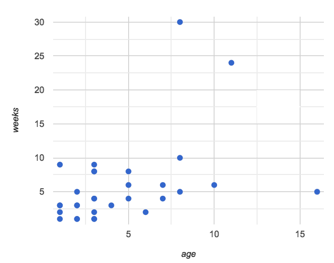 🖼Show image
After looking at the point clouds, we are left with a few questions:
-
Do the relationships appear to be linear for one? Both?
-
If a relationship is linear, what line in particular are the scatter plot points clustering around?
-
What is the r-value for each relationship?
-
Turn to Drawing Predictors (Page 85).
-
In the first column, draw a line of best fit through each of the scatter plots.
-
In the second column, circle whether the slope of the line (which is the same as the direction of the correlation) is positive or negative.
Synthesize
Give students some time to experiment, then share back observations. Can they come up with rules or suggestions for how to minimize error?
-
Would it be possible to have a line that is below all the points? (no)
-
Would it be possible to have a line that is above all the points? (no)
-
Would it be possible to have a line with more points on one side than the other? (yes)
Linear Regression in Pyret 20 minutes
Overview
Students are introduced to the lr-plot function in Pyret, which performs a linear regression and plots the result.
Launch
Pyret includes a powerful display, which (1) draws a scatterplot, (2) draws the line of best fit, and (3) even displays the equation for that line:
# lr-plot :: Table, String, String, String -> Image
# consumes a table, and three column names: labels, x-vals and y-vals
# produces a scatterplot, and draws the line of best fit
lr-plot(animals-table, "name", "age", "weeks")
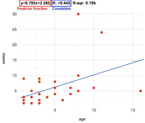 🖼Show image
lr-plot is a function that takes a Table and the names of 3 columns:
-
ls— the name of the column to use for labels (e.g. “names of pets”) -
xs— the name of the column to use for x-coordinates (e.g. “age of each pet”) -
ys— the name of the column to use for y-coordinates (e.g. “weeks for each pet to be adopted”)
Our goal is to use values of the variable on our x-axis to predict values of the variable on our y-axis.
Pedagogical Note We prefer the words “explanatory” and “response” in our curriculum, because in other contexts the words “dependent” and “independent” refer to whether or not the variables are related at all, as opposed to what role each plays in the relationship. |
Have students create an lr-plot for our animals-table, using "names" for the labels, "age" for the x-axis and "weeks" for the y-axis.
The resulting scatterplot looks like those we’ve seen before, but it has a few important additions. First, we can see the line of best fit drawn onto the plot. We can also see the equation for that line (in red), in the form fx = mx + b. In this plot, we can see that the slope of the line is 0.792, which means that on average, each extra year of age results in an extra 0.792 weeks of waiting to be adopted (about 5 or 6 extra days). By plugging in an animal’s age for x, we can make a prediction about how many weeks it will take to be adopted. For example, we predict a 5-year-old animal to be adopted in 0.7925 + 2.285 = 6.245 weeks. That’s the y-value exactly on the line at x=5.
The intercept is 2.285. This is where the best-fitting line crosses the y-axis. We want to be careful not to interpret this too literally, and say that a newborn animal would be adopted in 2.285 weeks, because none of the animals in our data set was that young. Still, the regression line (or line of best fit) suggests that a baby animal, whose age is close to 0, would take only about 3 weeks to be adopted.
We also see the r-value is +0.442. The sign is positive, consistent with the fact that the scatter plot point cloud, along with the line of best fit, slopes upward. The fact that the r-value is close to 0.5 tells us that the strength is moderate. This is consistent with the fact that the scatter plot points are somewhere between being really tightly clustered and really loosely scattered.
Going Deeper Students may notice another value in the lr-plot, called R^2. This value describes the percentage of the variation in the y-variable that is explained by least-squares regression on the x variable. In other words, an R^2 value of 0.20 could mean that “20% of the variation in adoption time is explained by regressing adoption time on the age of the animal”. Discussion of R^2 may be appropriate for older students, or in an AP Statistics class. |
Investigate
-
If an animal is 5 years old, how long would our line of best fit predict they would wait to be adopted? What if they were a newborn, just 0 years old?
-
Make another lr-plot, but this time use the animals' weight as our explanatory variable instead of their age.
-
If an animal weighs 21 pounds, how long would our line of best fit predict they would wait to be adopted? What if they weighed 0.1 pounds?
-
Make another lr-plot, comparing the
agev.weekscolumns for only the cats.
Synthesize
A predictor only makes sense within the range of the data that was used to generate it. For example, a regression line predicting weight from height based only on adults could predict an infant to have a weight less than zero!
Statistical models are just proxies for the real world, drawn from a limited sample of data: they might make a useful prediction in the range of that data, but once we try to extrapolate beyond that data we may quickly get into trouble!
Does the linear regression for our sample of the Animals Dataset allow us to make inferences about the behavior of the larger dataset? Why or why not?
Interpreting LR Plots in Pyret 20 minutes
Overview
Students learn how to write about the results of a linear regression, using proper statistical terminology and thinking through the many ways this language can be misused.
Launch
How well can you interpret the results of a linear regression analysis? Can you write your own?
-
What does it mean when a data point is above the line of best fit?
-
What does it mean when a data point is below the line of best fit?
Investigate
-
Turn to Interpreting Regression Lines & r-Values (Page 86), and match the write-up on the left with the line of best fit and r-value on the right.
-
Turn to Regression Analysis in the Animals Dataset (Page 87) to see how Data Scientists would write up the finding involving cats’ age and adoption time. Write up two other findings from the linear regressions you performed on this dataset.
When looking at a regression for adoption time v. age for just the cats, we saw that the slope of the predictor function was +0.23, meaning that for every year older a cat is, we expect a +0.23-week increase in the time taken to adopt the cat. The r-value was +0.566, confirming that the correlation is positive and indicating moderate strength.
Common Misconceptions
Students often think it doesn’t matter which variable is assigned to be x and which is y in a regression. It’s true that you’ll get the same correlation either way---for example, r=+0.442 whether your scatter plot shows weeks v. pounds or pounds v. weeks. However, the regression line is different, due to the math involved in minimizing vertical distances from the line, not horizontal.
Synthesize
Have students read their text aloud, to get comfortable with the phrasing.
Your Analysis flexible
Overview
Students repeat the previous activity, this time applying it to their own dataset and interpreting their own results. Note: this activity can be done briefly as a homework assignment, but we recommend giving students an additional class period to work on this.
Launch
Now that you’ve gotten some practice performing linear regression on the Animals Dataset, it’s time to apply that knowledge to your own data!
Investigate
-
Write up your findings by filling out Regression Analysis in Your Dataset (Page 88).
-
Students should fill in the Correlations portion of their Research Paper, using the scatter plots and linear regression plots they’ve constructed for their dataset and explaining what they show.
Synthesize
Have students share their findings with the class. Get excited about the connections they are making and the conclusions they are drawing! Encourage students to make suggestions to one another about further analysis.
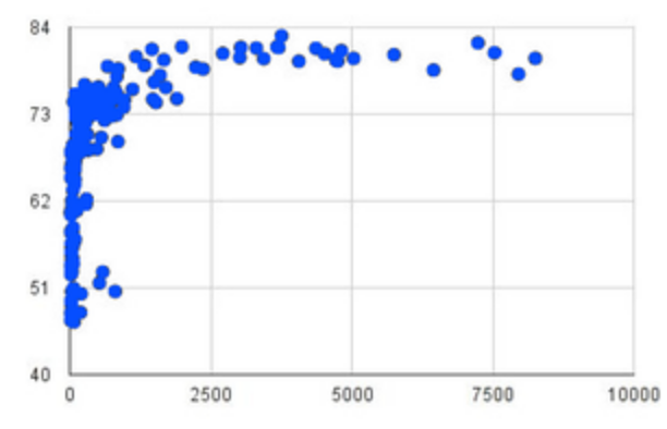
You’ve learned how linear regression can be used to fit a line to a linear cloud, and how to determine the direction and strength of that relationship. The word “linear” is important here. In the image on the right, there’s clearly a pattern, but it doesn’t look like a straight line! There are many other kinds of statistical models out there, but all of them work the same way: use a particular kind of mathematical function (linear or otherwise), to figure out how to get the “best fit” for a cloud of data.
Project Options: Olympic Records In both this project, students gather data about olympic records over time in running, swimming, or speed skating. They use what they’ve learned in the class so far to analyze the change over time, using scatter plots and linear regression. This project can be used as a mid-term or formative assessment, or as a capstone for a limited implementation of Bootstrap:Data Science. See the project description is available here. (Project designed by Joy Straub) |
Additional Exercises:
These materials were developed partly through support of the National Science Foundation,
(awards 1042210, 1535276, 1648684, and 1738598).
Bootstrap:Data Science by the Bootstrap Community is licensed under a Creative Commons 4.0 Unported License. This license does not grant permission to run training or professional development. Offering training or professional development with materials substantially derived from Bootstrap must be approved in writing by a Bootstrap Director. Permissions beyond the scope of this license, such as to run training, may be available by contacting contact@BootstrapWorld.org.
Ethics and Privacy
Ethics and Privacy
Students consider ethical issues and privacy in the context of data science.
Prerequisites |
||||||||||||||||
Relevant Standards |
Select one or more standards from the menu on the left (⌘-click on Mac, Ctrl-click elsewhere). Common Core Math Standards
CSTA Standards
K-12CS Standards
Next-Gen Science Standards
Oklahoma Standards
|
|||||||||||||||
Lesson Goals |
Students will be able to…
|
|||||||||||||||
Student-facing Lesson Goals |
|
|||||||||||||||
Materials |
||||||||||||||||
Preparation |
|
|||||||||||||||
Supplemental Resources |
||||||||||||||||
Language Table |
|
Case Studies 40 minutes
Overview
Students break into groups and read one of three case studies, each dealing with a different issue in Data Science. They discuss the implications of each, then share back.
Launch
“With great power comes great responsibility”
During World War 2, scientists were engaged in a race to develop new weapons, more powerful than anything the world had ever seen. While the immediate goal was "win the war", many of the scientists realized that the weapons they were developing could be used for all sorts of things after the war was over - and not all of them were good.
With tech companies hiring Data Scientists at a staggering rate and collecting massive datasets on users for those scientists to mine, there’s a new arms race happening right now. Search engines tailor their results based on what they know about the customer doing the search, and social media networks want to recommend friends based on what they know about all of us. Both of these goals require building profiles on everyone, figuring out what their preferences are and where they tend to spend their time. They might require figuring out whether each of us is male or female, more likely to go to a movie or a play, or about to buy a dishwasher or a television.
But these datasets and profiles could be used for far more than that. What if the FBI used them to try and figure out who is likely to commit a crime, or a company tries to learn their employees' religion or sexual orientation?
As they build ever-more sophisticated models based on ever-more accurate datasets, Data Scientists need to think about the ethics of what they’re doing as well!
Investigate
Divide the class into groups of 3-4, and assign each group a different case study. Have each group choose one person to share back with the class.
-
How Target Figured Out A Teen Girl Was Pregnant Before Her Father Did (Forbes)
-
Facebook 'likes' can reveal your secrets (CNN)
-
Algorithmic Bias in Criminal Sentencing (Propublica)
(Note: The third article is quite long, but only the first half is needed for students to complete this activity.)
Have students complete Case Study: Ethics, Privacy, and Bias (Page 90).
Synthesize
Give students time to discuss and share back. Encourage students to share back differing views on the articles.
What are some commonalities and differences among the issues raised by these articles?
OPTIONAL: Can the class come up with a list of "Rules for Ethical Data Science"?
Extension 1) For homework, have students write arguments in support of a randomly-chosen side of each case study. Select twelve students (two for each side of all three case studies), and have them debate in front of the class. Each side gets to make "opening" and "closing" arguments, and they take turns so that the closer for each side can respond to what the other side said. Then have the class vote on who was most convincing. 2) For homework, have students find their own articles about ethical issues in data science and write a one-page essay defending one side of it. |
These materials were developed partly through support of the National Science Foundation,
(awards 1042210, 1535276, 1648684, and 1738598).
Bootstrap:Data Science by the Bootstrap Community is licensed under a Creative Commons 4.0 Unported License. This license does not grant permission to run training or professional development. Offering training or professional development with materials substantially derived from Bootstrap must be approved in writing by a Bootstrap Director. Permissions beyond the scope of this license, such as to run training, may be available by contacting contact@BootstrapWorld.org.
Threats to Validity
Threats to Validity
Students consider possible threats to the validity of their analysis.
Prerequisites |
||||||||||||||||
Relevant Standards |
Select one or more standards from the menu on the left (⌘-click on Mac, Ctrl-click elsewhere). Common Core Math Standards
CSTA Standards
K-12CS Standards
Next-Gen Science Standards
Oklahoma Standards
|
|||||||||||||||
Lesson Goals |
Students will be able to…
|
|||||||||||||||
Student-facing Lesson Goals |
|
|||||||||||||||
Materials |
||||||||||||||||
Preparation |
|
|||||||||||||||
Supplemental Resources |
||||||||||||||||
Language Table |
|
- threats to validity
-
factors that can undermine the conclusion of a study
Threats to Validity 20 minutes
Overview
Students are introduced to the concept of validity, and a number of possible threats that might make an analysis invalid.
Launch
Survey says: “People prefer cats to dogs”
As good Data Scientists, the staff at the animal shelter are constantly gathering data about their animals, their volunteers, and the people who come to visit. But just because they have data doesn’t mean the conclusions they draw from it are correct! For example: suppose they surveyed 1,000 cat-owners and found that 95% of them thought cats were the best pet. Could they really claim that people generally prefer cats to dogs?
Have students share back what they think. The issue here is that cat-owners are not a representative sample of the population, so the claim is invalid.
There’s more to data analysis than simply collecting data and crunching numbers. In the example of the cat-owning survey, the claim that “people prefer cats to dogs” is invalid because the data itself wasn’t representative of the whole population (of course cat-owners are partial to cats!). This is just one example of what are called Threats to Validity.
There are several major threats to validity you should be on guard against:
-
Selection bias - Data was gathered from a biased, non-representative sample of the population. This is the problem with surveying cat owners to find out which animal is most loved. Remember that, in general, randomness is the key to obtaining unbiased samples!
-
Bias in the study design - Suppose you survey a random sample of pet owners that includes representative numbers of both cat and dog owners. But you ask them a “loaded” question like “Since annual vet care comes to about $300 for dogs and only about half of that for cats, would you say that owning a cat is less of a burden than owning a dog?” This could easily lead to a misrepresentation of people’s true opinions.
-
Poor choice of summary - Even if the selection is unbiased, sometimes outliers are so extreme that they shift the results of our analysis (such as the mean) in ways that don’t represent the population as a whole. For example, if the shelter happened to house a 100-year-old tortoise, and summarized its animals’ ages with the mean, this would inflate our perception of what age is typical.
-
Confounding variables - The gathered data does not take into account other factors that might influence a relationship. For example, a study might conclude that cat owners are more environmentally conscious: they’re more likely to use public transportation than dog owners. The confounding variable here could be urban versus rural dwelling: people who live in big cities are more likely to use public transportation and also more likely to own cats.
This is just a small list of different threats to validity. There are plenty more!
Investigate
On Identifying Threats to Validity (Page 92) and Identifying Threats to Validity (Page 93), you’ll find four different claims backed by four different datasets. Each one of those claims suffers from a serious threat to validity. Can you figure out what those threats are?
Synthesize
Give students time to discuss and share back.
Life is messy, and there are always threats to validity. Data Science is about doing the best you can to minimize those threats, and to be up front about what they are whenever you publish a finding. When you do your own analysis, make sure you include a discussion of the threats to validity!
Fake News! 20 minutes
Overview
Students are asked to consider the ways in which statistics are misused in popular culture, and become critical consumers of some statistical claims. Finally, they are given the opportunity to misuse their own statistics, to better understand how someone might distort data for their own ends.
Launch
You’ve already seen a number of ways that statistics can be misused:
-
Using the mean instead of the median with heavily-skewed data
-
Using the wrong language when describing a Linear Regression
-
Using a correlation to imply causation
There are other ways to mislead the audience as well: . Intentionally using the wrong chart - suppose the census asks for data from different groups of people, and gets none from one group. That would be very suspicious! That group would show up as an empty space on bar chart, making the absence visible. A pie chart, however, would hide that absence completely - making it less likely that anyone would even notice that group had been "erased"! . Changing the scale of a chart - Changing the y-axis of a scatterplot can make the slope of the regression line seem smaller: "look, that line is basically flat anyway!"
With all the news being shared through newspapers, television, radio, and social media, it’s important to be critical consumers of information!
Investigate
-
On Fake News! (Page 94), you’ll find some deliberately misleading claims made by slimy Data Scientists. Can you figure out why these claims should not be trusted ?
-
Once you’ve finished, consider your own dataset and analysis: what misleading claims could someone make about your work? Turn to Lies, Darned Lies, and Statistics (Page 95), and come up with four misleading claims based on data or displays from your work.
-
Trade papers with another group, and see if you can figure out why each other’s claims are not to be trusted!
Synthesize
Have students share back their "lies". Was anyone able to stump the other group?
Your Analysis flexible
Overview
Students repeat the previous activity, this time applying it to their own dataset and interpreting their own results. Note: this activity can be done briefly as a homework assignment, but we recommend giving students an additional class period to work on this.
Launch
In every analysis, there are always threats to validity. It’s important to always be upfront about what those threats are, so that anyone who reads your analysis can make their own decision.
Investigate
-
Students should fill in the Findings portion of their Research Paper, discussing threats to validity and drawing conclusions from their linear regression results.
Additional Exercises:
These materials were developed partly through support of the National Science Foundation,
(awards 1042210, 1535276, 1648684, and 1738598).
Bootstrap:Data Science by the Bootstrap Community is licensed under a Creative Commons 4.0 Unported License. This license does not grant permission to run training or professional development. Offering training or professional development with materials substantially derived from Bootstrap must be approved in writing by a Bootstrap Director. Permissions beyond the scope of this license, such as to run training, may be available by contacting contact@BootstrapWorld.org.