Students interpret linear regression data for the animals table
Students use linear regression to quantify patterns in their chosen dataset, and write up their findings
Standards and Evidence Statements:
Standards with prefix BS are specific to Bootstrap; others are from the Common Core. Mouse over each standard to see its corresponding evidence statements. Our Standards Document shows which units cover each standard.
Data 3.1.3: Explain the insight and knowledge gained from digitally processed data by using appropriate visualizations, notations, and precise language.
Visualization tools and software can communicate information about data.
Tables, diagrams, and textual displays can be used in communicating insight and knowledge gained from data.
Summaries of data analyzed computationally can be effective in communicating insight and knowledge gained from digitally represented information.
Data 3.2.1: Extract information from data to discover and explain connections, patterns, or trends.
Large data sets provide opportunities and challenges for extracting information and knowledge.
Large data sets provide opportunities for identifying trends, making connections in data, and solving problems.
Computing tools facilitate the discovery of connections in information within large data sets.
Information filtering systems are important tools for finding information and recognizing patterns in the information.
Software tools, including spreadsheets and databases, help to efficiently organize and find trends in information.
HSS.ID.B: Summarize, represent, and interpret data on two categorical and quantitative variables
Summarize categorical data for two categories in two-way frequency tables. Interpret relative frequencies in the context of the data (including joint, marginal, and conditional relative frequencies). Recognize possible associations and trends in the data.
Represent data on two quantitative variables on a scatter plot, and describe how the variables are related.
Fit a function to the data; use functions fitted to data to solve problems in the context of the data. Use given functions or choose a function suggested by the context. Emphasize linear, quadratic, and exponential models.
Fit a linear function for a scatter plot that suggests a linear association.
HSS.ID.C: Interpret linear models
Interpret the slope (rate of change) and the intercept (constant term) of a linear model in the context of the data.
Compute (using technology) and interpret the correlation coefficient of a linear fit.
S-ID.7-9: The student interprets linear models representing data
use of the context of the data to interpret the slope (rate of change) and the intercept (constant term) of a linear model
Length: 90 Minutes
Glossary:
correlation: A number that summarizes the linear relationship between two quantitative variables by reporting its strength and direction
line of best fit: A straight line that best represents the data on a scatter plot, assuming the form is linear. Also called the ’regression line’.
linear regression: The process of modeling the relationship between two quantitative variables with a line that makes the best predictions of responses (y values) given explanatory (x) values.
predictor: a function which, given a value from one data set, tries to predict a related value in a different data set
r: A number between -1 and 1 that measures the strength and direction of a linear relationship between two variables
Materials:
Preparation:
Computer for each student (or pair), with access to the internet
Introduction"Do smaller animals get adopted faster? Do younger animals?" We started the previous Unit with these questions, and looked at scatter plots as a way to visualize possible correlations between two variables in our dataset. What did we find?
Whenever there’s a possible linear relationship, Data Scientists try to draw the line of best fit, which cuts through the data cloud and can be used to make predictions. This line can be graphed on top of the scatter plot as a function, called the predictor. In this Unit, you’ll learn how to compute the line of best fit in Pyret, and how to measure the strength of a relationship by finding the correlation.
Open your "Animals Dataset" starter file. (If you do not have this file, or if something has happened to it, you can always make a new copy.)
Linear Regression
Overview
Learning Objectives
Students learn about linear regression as a tool for quantifying correlations
Students learn how to interpret the results of a linear regression
Evidence Statementes
Product Outcomes
Students interpret linear regression data for the animals table
Materials
Preparation
Linear Regression(Time 30 minutes)
Linear Regression
After our last Unit, we are left with two questions:
Is there a positive or negative relationship between our two variables? In other words, "where do we draw the line of best fit?"
How do we measure the strength of that relationship? In other words, "how well does the line allow us to make predictions?"
Data scientists use a statistical method called linear regression to search for certain kinds of relationships in a dataset. When we draw our regression line on a scatter plot, we can imagine a rubber bands stretching vertically between the line itself and each point in the plot - every point pulls the line a little "up" or "down". Linear regression is the math behind the line of best fit.
You can see this in action, in this interactive simulation. Try moving the blue point "P", and see what effect it has on the red line.
Could the regression line ever be above or below all the points? Why or why not?
What’s the largest r-value you can get? What do you think that number means?
Give students some time to experiment here! Can your students come up with rules or suggestions for how to minimize error?
We can compute our own predictor line in Pyret, plot it on top of a scatterplot, and even get the equation for that line:
lr-plot is a function that takes a Table and the names of 3 columns:
ls - the name of the column to use for labels (e.g. "names of pets")
xs - the name of the column to use for x-coordinates (e.g. "age of each pet")
ys - the name of the column to use for y-coordinates (e.g. "weeks for each pet to be adopted")
If you want to teach students the algorithm for linear regression (calculating ordinary least squares), now is the time. However, this algorithm is not a core portion of Bootstrap:Data Science.
Our goal is to figure out how strongly or weakly the variable on our x-axis explains the change in the variable on our y-axis, the x-variable is sometimes referred to as the explanitory variable and the y-variable is referred to as the response or "outcome" variable.
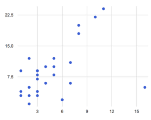
In the Interactions Area, create a lr-plot for our animals-table, using "names" for the labels, "age" for the x-axis and "weeks" for the y-axis.
You can learn more about how a predictor is created by watching this video.
The resulting scatterplot looks like those we’ve seen before, but it has a few important additions. First, we can see the line of best fit drawn on top. We can also see the equation for that line (in red), in the form . In this plot, we can see that the slope of the line is , which means that on average, each extra year of age results in an extra 0.714 weeks of waiting to be adopted. By plugging in an animal’s age for , we can make a prediction about how many weeks it will take to be adopted.
If an animal is 5 years old, how long would this line of best fit predict they would wait to be adopted? What if they were a newborn, just 0 years old?
A predictor only makes sense within the range of the data that was used to generate it. For example, if we extend our line out to where it hits the y-axis, it appears to predict that "unborn animals are adopted instantly"! Statistical models are just proxies for the real world, drawn from a limited sample of data: they might make a useful prediction in the range of that data, but once we try to extrapolate beyond that data we quickly get into trouble!
These charts also include something called an r-value at the top (in blue), which always seems to be between -1 and 1. What do you think this number means?
The correlation r is a number that tells us the direction and strength of a linear relationship between two quantitative variables. In other words, it tells us if the best-fitting line goes up or down, and how tightly clustered or loosely scattered the points are around that line. If the number is positive, it means that the y-values tend to go up as the x-values go up. For example, we would expect a positive r-value between age and pounds, because animals get heavier as they grow up. If it’s negative, it means the y-values go down as the x-values go up. The strength of a correlation is the distance from zero: an r-value of zero means there is no correlation at all, and stronger correlations will be closer to -1 or 1.
What is the r-value for age vs. weeks for our entire shelter population? What about for just the cats? What does this difference mean?
What does it mean when a data point is above the line of best fit?
What does it mean when a data point is below the line of best fit?
If you only have two data points, why will the r-value always be either -1 or +1?
It’s always possible to draw a line between points, so any predictor for a 2-item dataset will be perfect! Of course, that’s why we never trust correlations drawn from such a small sample size!
An r-value of or more is typically considered a strong correlation, and anything between and is "moderately correlated". Anything less than may be considered weak. However, these cutoffs are not an exact science! Different types of data may be "noisier" than others, and in some fields an r-value of might be considered impressively strong!
Turn to Page 48. For each plot, circle the display that has the best predictor. Then, give that predictor a grade between -1 and 1.
You may notice another value, called . This value describes the percentage of the variation in the y-axis that is explained by variation on the x-axis. In other words, an value of 0.42 could mean that "42% of the variation in dog adoption time is explained by the age of the dog."
Discussion of may be appropriate for older students, or in an AP Statistics class.
In the Interactions Area, use linear regression to answer the following questions:
What correlates most strongly with the time it takes an animal to be adopted: the animal’s age, or weight?
Is age more strongly correlated with adoption time for dogs than for cats?
Is age more strongly correlated with weight for dogs than for cats?
When looking at just the cats, we also saw that the slope of the predictor function was +0.23, meaning that for every year older a cats is, we expect a +0.23-week increase in the time taken to adopt that cat. The r-value was 0.566, confirming that the correlation is positive and indicating moderate strength.
Turn to Page 50 to see how Data Scientists would write up the finding involving cats’ age and adoption time. Write up two other findings from the linear regressions you performed on this dataset.
Have students read their text aloud, to get comfortable with the phrasing.
How well can you interpret the results of a linear regression analysis?
Turn to Page 49, and match the write up on the left with the line of best fit and r-value on the right.
Correlation does NOT imply causation.
It’s worth revisiting this point again. It’s easy to be seduced by large r-values, but Data Scientists know that correlation can be accidental! Here are some real-life correlations that have absolutely no causal relationship:
"Number of people who drowned after falling out of a fishing boat" v. "Marriage rate in Kentucky" ()
"Average per-person consumption of chicken" v. "US crude oil imports" ()
"Marriage rate in Wyoming" v. "Domestic production of cars" ()
All of these correlations come from the Spurious Correlations website. If time allows, have your students explore the site to see more!
Your Dataset
Overview
Learning Objectives
Evidence Statementes
Product Outcomes
Students use linear regression to quantify patterns in their chosen dataset, and write up their findings
Materials
Preparation
Your Dataset(Time 40 minutes)
Your Dataset
Turn back to Page 45, where you listed possible correlations. Use Table Plans and the Design Recipe to investigate these correlations. If you need blank Table Plans or Design Recipes, you can find them at the back your workbook, just before the Contracts.
What correlations did you find? Did you need to filter out certain rows in order to get those correlations? Write up your findings by filling out Page 51.
Have several students read their findings aloud.
Closing
Overview
Learning Objectives
Evidence Statementes
Product Outcomes
Materials
Preparation
Closing(Time 10 minutes)
Closing
You’ve learned how linear regression can be used to fit a line to a linear cloud, and how to determine the direction and strength of that relationship. The word "linear" is important here. In the image on the right, there’s clearly a pattern, but it doesn’t look like a straight line! There are many other kinds of statistical models out there, but all of them work the same way: use a particular kind of mathematical function (linear or otherwise), to figure out how to get the "best fit" for a cloud of data.
Bootstrap:Data Science by Emmanuel Schanzer, Nancy Pfenning, Emma Youndtsmith, Jennifer Poole, Shriram Krishnamurthi, Joe Politz and Ben Lerner was developed partly through support of the National Science Foundation, (awards 1535276, 1647486, and 1738598), and is licensed under a Creative Commons 4.0 Unported License. Based on a work at www.BootstrapWorld.org. Permissions beyond the scope of this license may be available by contacting schanzer@BootstrapWorld.org.

 After our last Unit, we are left with two questions:
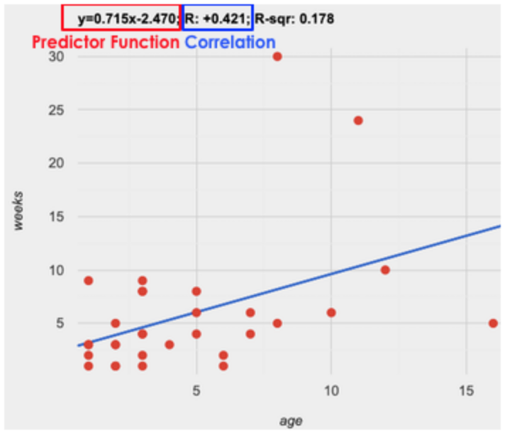 The resulting scatterplot looks like those we’ve seen before, but it has a few important additions. First, we can see the
 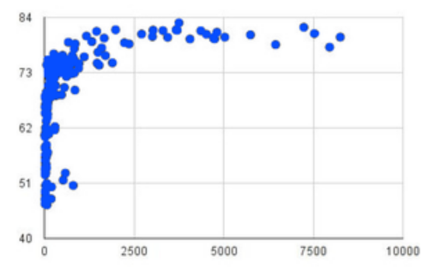 You’ve learned how linear regression can be used to fit a line to a linear cloud, and how to determine the direction and strength of that relationship. The word "linear" is important here. In the image on the right, there’s clearly a pattern, but it doesn’t look like a straight line! There are many other kinds of statistical models out there, but all of them work the same way: use a particular kind of mathematical function (linear or otherwise), to figure out how to get the "best fit" for a cloud of data.