Students investigate scatter plots as a method of visualizing the relationship between two variables, and begin searching for correlations in their dataset.
Students describe correlations in the animals dataset
Students describe correlations in their chosen dataset
Standards and Evidence Statements:
Standards with prefix BS are specific to Bootstrap; others are from the Common Core. Mouse over each standard to see its corresponding evidence statements. Our Standards Document shows which units cover each standard.
Data 3.1.1: Use computers to process information, find patterns, and test hypotheses about digitally processed information to gain insight and knowledge. [P4]
Insight and knowledge can be obtained from translating and transforming digitally represented information.
Patterns can emerge when data is transformed using computational tools.
Data 3.1.2: Collaborate when processing information to gain insight and knowledge.
Collaboration is an important part of solving data-driven problems.
Collaboration facilitates solving computational problems by applying multiple perspectives, experiences, and skill sets.
Communication between participants working on data-driven problems gives rise to enhanced insights and knowledge.
Collaboration in developing hypotheses and questions, and in testing hypotheses and answering questions, about data helps participants gain insight and knowledge.
Collaborating face-to-face and using online collaborative tools can facilitate processing information to gain insight and knowledge.
Data 3.1.3: Explain the insight and knowledge gained from digitally processed data by using appropriate visualizations, notations, and precise language.
Visualization tools and software can communicate information about data.
Tables, diagrams, and textual displays can be used in communicating insight and knowledge gained from data.
Summaries of data analyzed computationally can be effective in communicating insight and knowledge gained from digitally represented information.
Transforming information can be effective in communicating knowledge gained from data.
Interactivity with data is an aspect of communicating.
S-ID.5-6: The student uses data summary techniques to aid interpretation of two categorical and quantitative variables
identification of possible associations and trends in the data
use of a scatter plot to represent data on two quantitative variables and describe how the variables are related
BS-DR.1: The student is able to translate a word problem into a Contract and Purpose Statement
BS-DR.2: The student can derive test cases for a given contract and purpose statement
BS-DR.4: The student can solve word problems that involve data structures
Length: 95 Minutes
Glossary:
correlation: A number that summarizes the linear relationship between two quantitative variables by reporting its strength and direction
line of best fit: A straight line that best represents the data on a scatter plot, assuming the form is linear. Also called the ’regression line’.
outlier: an observation point that is distant from other observations, perhaps due to experimental natural variability or measurement error.
Materials:
Preparation:
Computer for each student (or pair), with access to the internet
IntroductionWhy are some animals adopted quickly, while others take a long time? What factors explain why one pet gets adopted right away, and others wait months?
Ask the class for theories.
Theory 1: smaller animals get adopted faster because they’re easier to care for
How could we test that theory? Bar and pie charts are great for showing us how the frequency of a categorical column. Histograms and box plots are great for showing us the shape and distribution of a quantitative column. But none of these displays will help us see connections between two columns.
Take a few minutes to look through the whole dataset, and see if you agree with the statement. Could any of our visualizations or measures of center help us answer this question? Write down your hypothesis on Page 42, and how we could use this dataset to see if you’re right.
Encourage students to discuss openly before writing.
We’ve got a lot of tools in our toolkit that help us think about an entire column of a dataset:
We have ways to find measures of center and spread for a given column.
We have visualizations that let us see the shape of values in a quantitative column
We have visualizations that let us see the frequencies a categorical column
What column is this question asking about?
Use this as an opportunity to review what these measures and visualizations are. Redirect students back to their contracts page! Point out that this question is asking about both pounds and weeks.
This question is asking about two columns in our dataset. Specifically, it’s asking if there is a relationship between pounds and weeks. Fortunately, there are other tools that let us visualize a relationship between two quantitative columns!
If time allows, ask students how we might visualize this relationship.
Open your "Animals Starter File". (If you do not have this file, or if something has happened to it, you can always make a new copy.)
For each animal in the shelter, there are two data points we care about: how many pounds they weight, and the number of weeks it took to be adopted. We can use these points to plot each animal as a point on the x- and y-axes. Eventually, we’ll have a whole cloud of points, which show us the relationship between the two columns for all the animals at the shelter.
Suggestion: divide the full table up into sub-lists, and have a few student plot 3-4 animals on the board. This can be done collaboratively, resulting in a whole-class scatterplot!
Scatter Plots
Overview
Learning Objectives
Evidence Statementes
Product Outcomes
Materials
Preparation
Scatter Plots(Time 30 minutes)
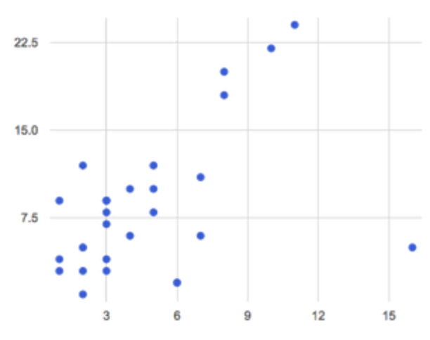
Scatter PlotsHere’s the contract for Pyret’s scatter-plot function, as well as an example of a scatter plot that examines the relationship between weight and adoption time. Notice that the contract is written as a comment - the # symbol means it’s just a note for humans.
Try making a few scatter plots, looking for relationships between columns in the animals-table.
Theory 2: Younger animals get adopted faster because they are cuter
But cats, dogs, rabbits and tarantulas have very different lifespans! A 5 year old tarantula is still really young, while a 5 year old rabbit is fully grown. With differences like this, it doesn’t make sense to put them all on the same scatter plot. To do this analysis, we might have to make several displays, each for a different subset.
Now that we have our scatter plot, what kind of patterns do we see?
Can you see a ’cloud’ around which the points are clustered?
Are there places where the "cloud" is denser than others?
Does the number of weeks to adoption seem to go up or down as the age increases?
Are there any points that "stray from the pack?" Which ones?
Suggestion: project the scatter plot at the front of the room, and have students come up to the plot to point out their patterns.
If we see a straight-line pattern in the cloud of scatter plot points, this suggests the variables could be related in a certain way. Do the two variables’ values tend to increase or decrease together, or does one go down as the other goes up? We’d also like to know if one variables tells us a lot or a little about the other’s values. A single number called a correlation can provide us with both pieces of information.
In this case, we’re looking for a correlation between pounds and weeks. This relationship can be graphed as a line, which tries to cut through the "middle" of the cloud. This line is called the line of best fit, and it turns out to be really useful for making predictions. For example, we can use the line to predict how long a new dog would wait at the shelter, if the dog weighs 68 pounds.
Do you notice any data points that seem unusually far away from the line? Which animals are those? These points are called outliers, meaning that there is something special about them that makes them different from everyone else.
Why might these animals be outliers?
Give students a chance to come up with a few ideas, and share them with the class.
Outliers are always interesting:
Sometimes they’re just random. Maybe Felix just met the right family early, or maybe we find out he lives nearby, got lost and his family came to get him. In that case, we might need to do some deep thinking about whether or not it’s appropriate to remove him from our dataset.
Sometimes they can give you a deeper insight into your data. Maybe Felix is a special, popular breed of cat, and we discover that our dataset is missing an important column for breed!
Sometimes outliers are the points we are looking for! What if we wanted to know which restaurants are a good value, and which are rip-offs? We could make a scatterplot of restaurant prices vs. reviews, an outlier that’s high above the rest of the points would be a restaurant whose reviews are unusually good for the price. An outlier way below the cloud would be a really bad deal.
For practice, try making scatter plots for each of the following relationships. If you see any outliers, try to explain them!
The age of an animal vs the pounds of the animal
The legs of an animal vs the number of weeks to be adopted
The age vs the number of legs it has.
Debrief, showing the plots on the board. Make sure students see plots for which there is no relationship, like the last one!
Of course, it might not make sense to group different animals together in one plot! What if we wanted to see the relationship between age and weeks for just the dogs in our database?
Try making scatter plots for that relate age to weeks, for each of the subsets you’ve defined from the animals table. Does the relationship appear stronger in some of the subsets than others? Why?
Correlations and Predictions
Overview
Learning Objectives
Students learn how to interpret scatterplots, and talk about strength and direction of correlation
Evidence Statementes
Product Outcomes
Students describe correlations in the animals dataset
Students describe correlations in their chosen dataset
Materials
Preparation
Correlations and Predictions(Time 40 minutes)
Correlations and Predictions
Correlations have direction.
A positive correlation means that the variable on the y-axis increases as the variable on the x-axis goes up. For example, "the older the animal, the more weeks it generally takes to get adopted".
A negative correlation means that the variable on the y-axis decreases as the variable on the x-axis goes down. For example, "the longer an animal is at the shelter, the less they generally weigh."
Do you see a correlation in the pounds-vs-weeks scatter plot? If so, is it positive or negative? What correlations, if any, did you see in the other scatterplots you created?
You’ve already learned three ways to find the "center" of a dataset in one dimension: the mean, the median and the mode all represent a way to collapse a bunch of points on a number line into a single, summary number. If the "center" of points on a number line is a single point, what is the "center" of points in a two-dimensional cloud, which cluster around a line?
What we need to do is find a line - called a line of best fit, or a "regression line" - that is at the center of this cloud. Each point exerts a little bit of "pull" on the line, with points above the line yanking it up and points below the line dragging it down. Points that are really far away - our outliers and our influential observations - pull the line harder than those that are close to the line. The slope of the line will be positive or negative depending on whether or not the correlation is positive or negative. Given a value on the x-axis, this line allows us to "predict" what the corresponding value on the y-axis might be. This allows us to make inferences about a population, based on a sample of that population.
Turn to Page 44, and do your best to draw a line of best fit through each of the scatter plots on the left.
Correlations have strength.
If the cloud is tightly packed, there is a strong correlation.
If the cloud is loosely scattered, there is a weak correlation.
If the points are all over the place, with no tendency to rise or fall from left to right, there may be no correlation.
For each line you drew on Page 44, determine the direction and strength of the correlation by circling the words that describe it.
Correlation does NOT imply causation.
If two quantities are correlated, it doesn’t mean that one causes the other! For example, a study found that there is a strong correlation between the number of people who become tangled in their own bedsheets each year is correlated with the amount of cheese consumed that year. It happens that both of those values have been increasing over the past decade, but there is no causal relationship between them!
What correlations do you think there are in your dataset? Would you like to investigate a subset of your data to find those correlations?
Brainstorm a few possible correlations that you might expect to find in your dataset, and make some scatter plots to investigate.
Have students share back their correlations, and why they expect to find them.
Turn to Page 45, and list three correlations you’d like to search for.
Closing
Overview
Learning Objectives
Evidence Statementes
Product Outcomes
Materials
Preparation
Closing(Time 10 minutes)
ClosingAfter looking at the scatter plot for our animal shelter, do you still agree with the claim on Page 42? Perhaps you need more information, or to see the analysis broken down separately by animal.
You’ve started to look for correlations in your dataset, and now you know how to create scatter plots to visualize them. But how do we know if a correlation is strong enough to be useful? Eyeballing charts isn’t good enough! In the next Unit, you’ll learn how to calculate a correlation, and get a feel for strength of a relationship based on a single number. You’ll investigate the correlations in your research that you mapped out here.
Bootstrap:Data Science by Emmanuel Schanzer, Nancy Pfenning, Emma Youndtsmith, Jennifer Poole, Shriram Krishnamurthi, Joe Politz and Ben Lerner was developed partly through support of the National Science Foundation, (awards 1535276, 1647486, and 1738598), and is licensed under a Creative Commons 4.0 Unported License. Based on a work at www.BootstrapWorld.org. Permissions beyond the scope of this license may be available by contacting schanzer@BootstrapWorld.org.

 Now that we have our scatter plot, what kind of patterns do we see?