Students learn how to evaluate two key aspects of a quantitative data set: its center and spread. They measure central tendency (using mean, median, and mode), as well as spread (visualizing quartiles with box plots). After applying these concepts to a contrived dataset, they apply them to their own datasets and interpret the results.
Students learn about shape, and how outliers or skewness prevent a data set from being balanced or on either side of its center
Students learn the extent to which outliers and skewness may affect measures of center.
Students find the mean, median and mode of various columns in the animals table
Students describe the centers and spread in their chosen dataset
Standards and Evidence Statements:
Standards with prefix BS are specific to Bootstrap; others are from the Common Core. Mouse over each standard to see its corresponding evidence statements. Our Standards Document shows which units cover each standard.
6.SP.4-5: The student summarizes and describes distributions
Summarize numerical data sets in relation to their context, such as by: Reporting the number of observations, Describing the nature of the attribute under investigation, including how it was measured and its units of measurement, Giving quantitative measures of center (median and/or mean) and variability (interquartile range and/or mean absolute deviation), as well as describing any overall pattern and any striking deviations from the overall pattern with reference to the context in which the data were gathered, or Relating the choice of measures of center and variability to the shape of the data distribution and the context in which the data were gathered.
Data 3.2.1: Extract information from data to discover and explain connections, patterns, or trends.
Large data sets provide opportunities and challenges for extracting information and knowledge.
Large data sets provide opportunities for identifying trends, making connections in data, and solving problems.
Computing tools facilitate the discovery of connections in information within large data sets.
HSS.ID.A: Summarize, represent, and interpret data on a single count or measurement variable
Represent data with plots on the real number line (dot plots, histograms, and box plots).
Use statistics appropriate to the shape of the data distribution to compare center (median, mean) and spread (interquartile range, standard deviation) of two or more different data sets.
S-ID.1-4: The student uses data summary techniques to aid interpretation of a single count or measurement variable
plots on the real number line (dot plots, histograms, and box plots) to represent data
comparison of two or more different data sets by measure of center (median, mean) and spread (interquartile range) appropriate to the shape of the data distribution
Length: 75 Minutes
Glossary:
box plot: The box plot (a.k.a. box-and-whisker pot) is a way of displaying the distribution of data based on the five-number summary: minimum, first quartile, median, third quartile, and maximum
interquartile range: The interquartile range (IQR) is a measure of spread, and is calculated by subtracting the first quartile (Q1) from the third quartile (Q3)
mean: reports the center of a quantitative data set by dividing the sum of all the values by the number of values
median: the middle of a quantitative data set: half the values are above it, and half are below
mode: the most commonly appearing value in a (quantitative or categorical) data set
outlier: an observation point that is distant from other observations, perhaps due to experimental natural variability or measurement error.
quartile: Numbers that divide a a data set into four, equally-sized groups. The lowest quartile (Q1) is the middle of the bottom half of the data. Q2 (the median) is the middle of the entire sample. Q3 is the middle of the top half of of the data.
skew: lack of balance in a dataset’s shape, arising from more values that are unusually low or high. Such values tend to trail off, rather than separated by a gap (as with outliers)
spread
Materials:
Preparation:
Computer for each student (or pair), with access to the internet
Open your "Animals Starter File". (If you do not have this file, or if something has happened to it, you can always make a new copy.)
In the last Unit, you learned how to talk about shape by looking at histograms. In this Unit, you’ll learn about two more key features of a quantitative data set - center and spread - and how to connect those back to a visual representation.
According to the Animal Shelter Bureau, the average pet weighs almost 41 pounds.
Some medicines are dosed by weight: larger animals need a larger dose. If someone at the shelter needs to give a dose of medicine to an animal, is 41 pounds the best estimate for how much it weighs?
Invite an open discussion for a few minutes.
"The average pet weighs 41 pounds" is a statement about the entire dataset, which summarizes a whole column of values with a single number. Summarizing a big dataset means that some information gets lost, so it’s important to pick an appropriate summary. Picking the wrong summary can have serious implications! Here are just a few examples of summary data being used for important things. Do you think these summaries are appropriate or not?
Students are sometimes summarized by two numbers - their GPA and SAT scores - which can impact where they go to college or how much financial aid they get.
Schools are sometimes summarized by a few numbers - student pass rates and attendance, for example - which can determine whether or not a school gets shut down.
Adults are often summarized by a single number - like their credit score - which determines their ability to get a job or a home loan.
When buying uniforms for a sports team, a coach might look for the most-common size that the players wear.
Can you think of other examples where a number or two are used to summarize something complex?
Every kind of summary has situations in which it does a good job of reporting what’s typical, and others where it doesn’t really do justice to the data. In fact, the shape of the data can play a huge role in whether or not one kind of summary is appropriate!
Data Scientists summarize quantitative data by reporting two key features: what’s the typical value (center) and how much do the values typically vary (spread). Let’s check the "41 pounds" claim and see if it’s an appropriate measure of center. Later on, you’ll have a chance to apply what you’ve learned to your own dataset, to find the best way to provide an overall summary of the data.
Measures of Center
Overview
Learning Objectives
Students learn different notions of "center", including mean, median and mode
Students explore how to properly talk about measures of center
Evidence Statementes
Product Outcomes
Students find the mean, median and mode of various columns in the animals table
Materials
Preparation
Measures of Center(Time 20 minutes)
Measures of Center
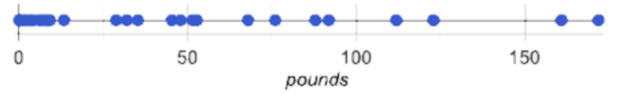
If we plotted all the pounds values as points on a number line, what could we say about the average of those values? Is there a midpoint? Is there a point that shows up most often? Each of these are different ways of "measuring center".
Draw some sample points on a number line, and have students volunteer different ways to summarize the distribution.
The Animal Shelter Bureau used one method of summary, called the mean, or average. In general, the mean of a data set is the sum of values divided by the number of values. To take the average of a column, we add all the numbers in that column and divide by the number of rows.
This lesson does not teach the algorithm for computing averages, but this would be an appropriate time to do so.
Pyret has a way for us to compute the mean of any column in a Table. It consumes a Table and the name of the column you want to measure, and produces the mean - or average - of the numbers in that column.
What is its name? Domain? Range?
Notice that calculating the mean requires being able to add and divide, so the mean only makes sense for quantitative data. For example, the mean of a list of Presidents doesn’t make sense. Same thing for a list of zip codes: even though we can divide a sum of zip codes, the output doesn’t correspond to some "center" zip code.
Type mean(animals-table, "pounds"). What does this give us? Does this support the Bureau’s claims?
Open your workbooks to Page 30. We’ve already decided on the answer to Question 1 (pounds). Under the "measures of center" section, fill in the computed mean.
You computed the mean of that column to be almost exactly 41 pounds. That IS the average, but if we look at the dots on our number line, we can see most of the animals weigh less than 41 pounds! that more than half of the animals weigh less than just 15 pounds. What is throwing off the average so much?
Point students to Kujo and Mr. Peanutbutter.
In this case, the mean is being thrown off by a few extreme data points. These extreme points are called outliers, because they fall far outside of the rest of the dataset. Calculating the mean is great when all the points are fairly balanced on either side of the middle, but it breaks down for datasets with extreme outliers. The mean may also be thrown off by the presence of skew: a lopsided shape due to values trailing off left or right of center, but not separated by the visible gap typical of outliers.
Make a histogram of the pounds column, and try different bin sizes. Can you see the skew towards the right, with a huge number of animals clumped to the left?
A different way to measure center is to line up all of the data points - in order - and find a point in the center where half of the values are smaller and the other half are larger. This is the median, or "middle" value of a list.
As an example, consider this list:
Here 2 is the median, because it separates the "top half" (all values greater than 2, which is just 3), and the "bottom half" (all values less than or equal to 2).
We recommend the following "pencil and paper algorithm" for median finding:
Sort the list.
Cross out the highest number.
Cross out the lowest number.
Repeat until there is only one number left - the median. If there are two numbers, take the mean of those numbers.
Pyret has a function to compute the median of a list as well, with the contract:
# median :: (t :: Table, col :: String) -> Number
Compute the median for the pounds column in our dataset, and add this to Page 30. Is it different than the mean? What can we conclude when the median is so much lower than the mean? For practice, compute the mean and median for the weeks and age columns.
The third and last measure of center is the mode of a dataset. The mode of a data set is the value that appears most often. Median and Mean always produce one number, but if two or more values are equally common, there can be more than one mode. If all values are equally common, then there is no mode at all!
Often there will be just one number in the list: many data sets are what we call "unimodal". But sometimes there are exceptions! Consider the following three datasets:
The first dataset has no mode at all!.
The mode of the second data set is 2, since 2 appears more than any other number.
The mode of the last data set is both 1 and 4, because 1 and 4 both appear more often than any other element, and because they appear equally often.
In Pyret, the modes are calculated by the modes function, which consumes a Table and the name of the column you want to measure, and produces a List of Numbers.
Compute the modes of the pounds column, and add it to Page 30. What did you get? The most common number of pounds an animal weighs is 6.5! That’s well below our mean and even our median, which is further evidence of outliers or skewness.
At this point, we have a lot of evidence that suggests the Bureau’s use of "mean" to summarize data isn’t ideal. Our mean weight agrees with their findings, but we have three reasons to suspect that mean isn’t the best value to use:
The median is only 13.4 pounds.
The mode of our dataset is only 6.5 pounds, which suggests a cluster of animals that weigh less than one-sixth the mean.
When viewed as a histogram, we can see the rightward skew in the dataset. Mean is sensitive to highly-skewed datasets
The Animal Shelter Bureau started with a fact: the mean weight is about 41 pounds. But then they reported a conclusion without checking to see if that was the best summary statistic to look at. As Data Scientists, we had to look deeper into the data to find out whether or not to settle for the Bureau’s summary. This is why using tools like histograms can be so important when deciding on a summary tool.
"In 2003, the average American family earned $43,000 a year - well above the poverty line! Therefore very few Americans were living in poverty." Do you trust this statement? Why or why not?
Consider how many policies or laws are informed by statistics like this! Knowing about measures of center helps us see through misleading statements.
Shape Matters
You now have three different ways to measure center in a dataset. But how do you know which one to use? Depending on the shape of the dataset, a measure could be really useful or totally misleading! Here are some guidelines for when to use one measurement over the other:
If the data is doesn’t show much skewness or have outliers, mean is the best summary because it incorporates information from every value.
If the data clearly has a lot of outliers or skewness, median gives a better summary of center than the mean.
If there are very few possible values, such as AP Scores (1-5), the mode could be a useful way to summarize the data set.
Measures of Spread
Overview
Learning Objectives
Students learn different measures of spread, including range, and interquartile range
Students practice describing spread using these concepts
Evidence Statementes
Product Outcomes
Materials
Preparation
Measures of Spread(Time 20 minutes)
Measures of SpreadMeasuring the "center" of a dataset is helpful, and we’ve seen that shape should be taken into account. But we should also pay attention to the spread in a data set. A teacher may report that her students averaged a 75 on a test, but it’s important to know how those scores were spread out: did all of them get exactly 75, or did half score 100 and the other half 50? When Data Scientists use the mean of a sample to estimate the mean of a whole population, it’s important to know the spread in order to report how good or bad a job that estimate does.
Suppose we lined up all of the values in the pounds column from smallest to largest, and then split the line up into two equal groups by taking the median. We can learn something about the spread of the data set by taking things further: The middle of the lighter half of animals is called the first quartile, Q1, and the middle of the heavier half of animals is the third quartile, Q3. Once we find these numbers, we can say that the middle half of the animals’ weights are spread between Q1 and Q3.
The first quartile (Q1) is the value for which 25% of the animals weighed that amount or less. What does the third quartile represent?
Point out the five numbers that create these quartiles: the three medians, the minimum and the maximum.
We can use box plots to visualize these quartiles. These plots can easily be represented using just five numbers, which makes them convenient ways to display data. Below is the contract for box-plot, along with an example that will make a box plot for the pounds column in the animals-table.
Type in this expression in the Interactions Area, and see the resulting plot.
This plot shows us the spread in our dataset according to five numbers.
The minimum value in the dataset (at the left of "whisker"). In our dataset, that’s just 0.1 pounds.
The First Quartile (Q1) (the left edge of the box), is computed by taking the median of the smaller half of the values. In the pounds column, that’s 4.3 pounds.
The Median (Q2) value (the line in the middle), which is the second Quartile of the whole dataset. We already computed this to be 13.4 pounds.
The Third Quartile (Q3) (the right edge of the box), which is computed by taking the median of the larger half of the values. That’s 68 pounds in our dataset.
The maximum value in the dataset (at the right of the "whisker"). In our dataset, that’s 172 pounds.
One way to summarize the spread in the dataset is to measure the distance between the largest value and the smallest value. When we talk about functions having many possible outputs, we use the term "Range" to describe them. (Note: the term "Range" means something different in statistics than it does in algebra and programming!) When we look at the distance between the smallest and largest values in our dataset, we use the same term.
Turn to Page 30, and fill in the five-number summary for the pounds column, and sketch the box-plot. What conclusions can you draw about the distribution of values in this column?
Data Scientists subtract the 1st quartile from the 3rd quartile to compute the range of the "middle half" of the dataset, also called the interquartile range.
Find the interquartile range of this dataset.
What percentage of animals fall within the interquartile range?
What percentage of animals fall within any of the quartiles?
pounds
Now that you’re comfortable creating box plots and looking at measures of spread on the computer, it’s time to put your skills to the test!
Turn to Page 31 and complete the questions you see there.
Review students’ answers, especially to the question five.
Just as pie and bar charts are ways of visualizing categorical data, box plots and histograms are both ways of visualizing the shape of quantitative data. Box plots make it easy to see the 5-number summary, and compare the Range and Interquartile Range. Histograms make it easier to see outliers, and offer more granularity when using smaller bins.
Box-plots and Histograms can both tell us a lot about the shape of a dataset, but they do so by grouping data quite differently. A box-plot always has four quartiles, which may fall on differently-sized intervals but all contain the same number of points. A histogram, on the other hand, has identically-sized intervals which can contain very different numbers of points.
Turn to Page 32 and see if you can identify which box-plot matches which histogram.
Your Dataset
Overview
Learning Objectives
Evidence Statementes
Product Outcomes
Students describe the centers and spread in their chosen dataset
Materials
Preparation
Your Dataset(Time 20 minutes)
Your DatasetBy now, you’ve got a good handle on how to report center, shape and spread, and it’s time to apply those skills to your dataset!
Take 10 minutes to fill out Page 33 in your Student Workbook. Choose a column to investigate, and write up your findings.
Closing
Overview
Learning Objectives
Evidence Statementes
Product Outcomes
Materials
Preparation
Closing(Time 5 minutes)
ClosingData Scientists are skeptical people: they don’t trust a claim unless they can see the data, or at least get some summary information about the center, shape and spread in the dataset. In the next Unit, you’ll investigate new ways to visualize spread and distribution.
Bootstrap:Data Science by Emmanuel Schanzer, Nancy Pfenning, Emma Youndtsmith, Jennifer Poole, Shriram Krishnamurthi, Joe Politz and Ben Lerner was developed partly through support of the National Science Foundation, (awards 1535276, 1647486, and 1738598), and is licensed under a Creative Commons 4.0 Unported License. Based on a work at www.BootstrapWorld.org. Permissions beyond the scope of this license may be available by contacting schanzer@BootstrapWorld.org.

 If we plotted all the pounds values as points on a number line, what could we say about the average of those values? Is there a midpoint? Is there a point that shows up most often? Each of these are different ways of "measuring center".
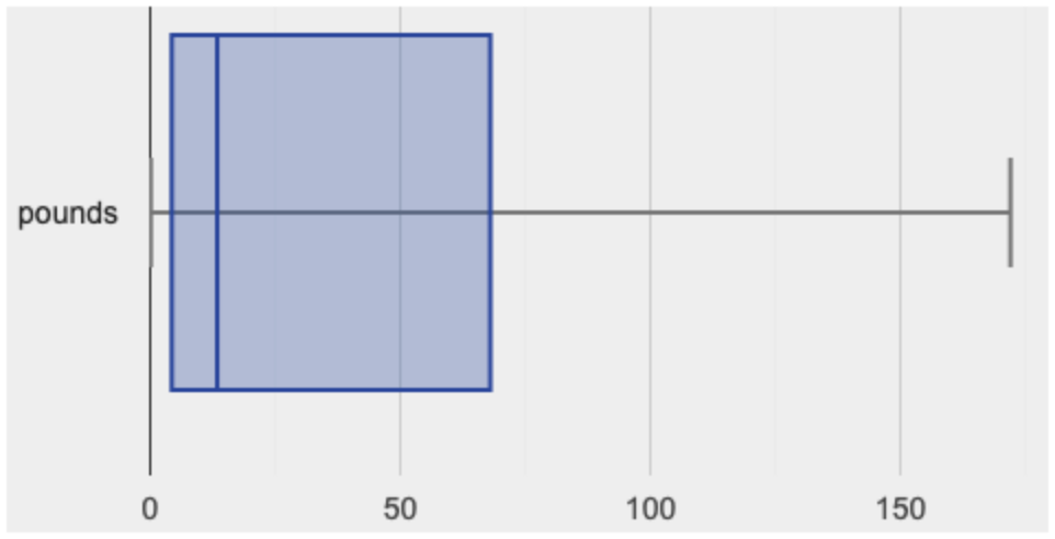 This plot shows us the spread in our dataset according to five numbers.