-
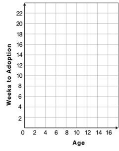
For each row in the Sample Table on the left, add a point to the scatter plot on the right. Use the values from the age column for the x-axis, and values from the weeks column for the y-axis.
-
Do you see a pattern? Do the points seem to go up or down as age increases to the right?
-
Draw a cloud around all the points, and a line around which the cloud appears to be centered
-
-
Does the line slope upwards or downwards?
-
Are the points tightly clustered around the line or loosely scattered?
| name | species | age | weeks |
|---|---|---|---|
|
|
1 |
3 |
|
|
11 |
5 |
|
|
16 |
4 |
|
|
2 |
24 |
|
|
6 |
9 |
|
|
1 |
2 |
|
|
6 |
12 |
|
|
3 |
2 |
These materials were developed partly through support of the National Science Foundation,
(awards 1042210, 1535276, 1648684, and 1738598).  Bootstrap by the Bootstrap Community is licensed under a Creative Commons 4.0 Unported License. This license does not grant permission to run training or professional development. Offering training or professional development with materials substantially derived from Bootstrap must be approved in writing by a Bootstrap Director. Permissions beyond the scope of this license, such as to run training, may be available by contacting contact@BootstrapWorld.org.
