Suppose a stranger invites you to play a game. You start by guessing a number between 2 and 12. The stranger rolls two dice, and add the numbers together. If that sum is the number you guessed, you win the jackpot, but if your number is wrong, then you lose your money. What are your odds of winning this game? Are they good enough that it’s worth playing?
Turn to page Page 17. Take two minutes to write your answer.
This section has students estimating expected values, so if you are also teaching students probability, you can use this section to introduce probabilistic concepts.
If you are uneasy about using a gambling example in the classroom, we understand: the students will see at the end that they should NOT agree to play this game!
What are the all of the possible numbers we could guess? Is there a "lucky number" that we should use, or are all guesses equally likely? Should we play this game?
Ask the classroom if they have any guesses if there is a best number to guess, and if so why. Ask the class to remember their answers for after they’ve completed this exercise.
We can use Pyret to simulate this game, and analyze the results to answer our question. By writing a computer program to estimate what the most common dice rolls are, we can come up with a good guess for what the dice roll will be.
In this exercise, students will use a nondeterministic function for the first time. As they explore the roll-dice function, stress that roll-dice rarely gives the same answer more than once.
Creating Histograms
Overview
Learning Objectives
Evidence Statements
Product Outcomes
Materials
Preparation
Creating Histograms
(Time 15 minutes)
Open the Unit 5 Starter File, Save a Copy and Run the program. Then evaluate each of the following expressions:
roll-dice(1)
roll-dice(3)
roll-dice(10)
What is the contract for roll-dice? How does the input relate to the output? Try typing in roll-dice(10) multiple times. Does it always return the same thing?
The function roll-dice takes in a number of rolls to perform, and returns a List<Number> containing all of the dice rolls. The roll-dice treats each dice roll separately, and makes different numbers every time.
Use roll-dice to create a list of 10,000 rolls. How can we use this List to come up with our lucky number? Is there a measure of center that could answer this question, and help us win the jackpot?
Guide students to suggest using mean, median, and mode to measure the center of the list of dice rolls.
What are the mean, median, and mode of a list of 10,000 dice rolls? Use the functions you’ve learned in Pyret to compute them. Does roll-dice give you the same list every time? Will you get the same mean every time?
Students should try running these functions on the output of roll-dice multiple times, since roll-dice returns slightly different lists each time.
We can see that the mean and median are both 7, and the mean is very, very close to 7. So 7 is probably our best guess.
Unfortunately, we still don’t know if 7 comes up often enough for this to be a game worth playing! We’ve used our measures of center to figure out the most frequent number, but just how frequent is it? We need some way of asking if 7 appears more than all the other numbers combined.
We can use a different kind of chart for visualizing how frequent values are in a list of quantitative data. This kind of chart is a called histogram, and it is similar to the bar charts you have seen before.
Type the following code into your Definitions Area to create the histogram series and draw the plot.
Use .display() to see what the histogram looks like, then try changing the second argument from 11 to 1. What do you think this argument means?
Here, the histogram function takes two arguments:
The first is a list of numbers, containing the quantitative data.
The second is the number of equal-sized bins that we want to distribute this list into (we’ll talk more about this in a moment).
Show students the histogram before explaining what the second argument (number of bins) means, to give them a point of reference. It may be easier for you to project the live code/image of the histogram. Since students do not yet know what a histogram is, or what this code is doing, they will have a harder time if they make syntax errors.
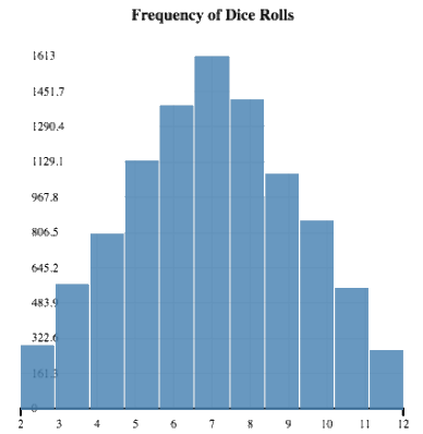
We want to count the number of times each permutation shows up in the dice game. Since there are 11 possible values for each dice roll, we have 11 bars in our chart. Just like the frequency bar charts from last unit, the length of the bar corresponds with how frequent a value is. For example, the longest bar the bar for 7, because 7 is the most frequent. Notice the shape of the histogram: the further away from 7, the less common the number.
For curious students, you can explain this by showing that there are more combinations that add up to 8 than there are for 2 (for example).
By hovering over a particular bar on the histogram, you can see how frequent a value is.
Hover over the middle bar, for the number 7. How many
times was a 7 rolled?
Out of the 10000 rolls, is this more than half? Less than half?
Run the code to make the histogram a few more times. Is the
number of times 7 appears ever more than 5000 times?
The roll 7 is definitely the roll that happens the most often. However, it never
appears more than half of the 10000 rolls. That means, most of the time we
play this game, we will lose!
Bar charts and histograms both count the frequency in which values show up in a dataset. Unlike bar charts, however, histograms provide extra features for quantitative data: the bars are ordered from left to right, and the bins can be resized. Both of these are only made possible because quantitative data can be compared - one bar can be said to be "greater than" than another bar, and a value can be said to be "within" the range of a bin. For categorical data, neither of these is the case, so we use bar charts instead of histograms.
Bins and Spread
Overview
Learning Objectives
Evidence Statements
Product Outcomes
Materials
Preparation
Bins and Spread
(Time 30 minutes)
In the dice roll game, there were 11 possible numbers that the dice roll could produce. Would it be helpful to have 20 bars? 30? What would happen if we only used 1?
Look back at your call to the histogram function for the dice game. In the first example, it made sense to use 11 bins because there were only 11 possible values that the pair of dice could produce.
What would happen if we only used 4 bins for the dice game? What if we used 40?
Try them out with new function calls in the interactions window.
Using only 4 bins gives us a histogram that is less helpful, because 11 bins more accurately covers the range from 2 to 12. However, 40 isn’t any more helpful, because there are so many bins that are empty. Choosing the right bin size helps us make sense of the data, and is a skill that every data scientist should practice.
For another example, let’s look again at our favorite 4th grade class:
First
Last
Height
"John"
"Doe"
52.0
"Jane"
"Smith"
49.1
"Javon"
"Jackson"
57.7
"Angela"
"Enriquez"
52.5
"Jack"
"Thompson"
53.0
"Dominique"
"Rodriguez"
51.1
"Sammy"
"Carter"
56.2
"Andrea"
"Garcia"
50.8
Suppose we had 100 different students in this table. If we want to make a histogram for their height, how many possible values are there? 10? 100? The values of heights have decimals. If we want to have a bar for every possible height value, how many bars do we need?
Guide discussion towards the fact that there are infinitely many values that height could take, so we can’t have a bar for each one.
We can’t have a bar for every possible height, and having a bar for each student in the table isn’t really helpful to us. This is where being able to control the number of bins comes in really handy!
Turn to Page 18 in your workbook and complete the exercise.
In this workbook activity, students will explicitly count the frequency of values appearing within certain ranges, and draw the bar corresponding to a particular bin.
The histogram that you completed only has 5 bars, yet each possible value contributes to the height of a particular bar. This is possible because each of the decimal values is put into a bin. Each bin represents a range of values in our dataset.
Before this discussion, ask students to describe in their own words how histograms can visualize the frequency of an unlimited number of values, using a limited number of bars.
Determining the right number of bins is something that takes trial and error.
Create histograms for each of the following columns of quantitative data.
The calories column in nutrition
The median-life-expectancy column in countries
The gdp column in countries
Play around with the number of bins to try and find the sweet spot.
Make sure the students know that there are many possible right answers to the question of "what is the correct number of bins".
Notice that each of these different data sets, no matter what the bin size is, have different general shapes. The histogram for the dice game had a roughly even spread around one peak. The other data sets may have multiple peaks, and have thin or wide humps.
Interpreting Histograms
Overview
Learning Objectives
Evidence Statements
Product Outcomes
Materials
Preparation
Interpreting Histograms
(Time 20 minutes)
Just like the bar and pie charts, histograms come in many shapes, sizes, colors, and forms.
Turn to Page 19 in your workbook and answer the questions about each of the histograms.
This workbook assignment could also become a homework assignment, or be made into a quiz/jeopardy style game.
A good histogram can help explain complicated data, but a bad one can make things very confusing. Come up with good histograms for the following questions. How will you choose your bin size?
You want to rent a shuttle bus to take people from the airport to an event. You know what time everyone’s flight lands, and they all arrive between 8am and 8pm. What would be a good bin-size to determine how many buses you’ll need?
Look back at your histogram for median-life-expectancy. How many bins make this chart helpful?
How common is it for a country to have more than a billion people? Make a histogram that shows how common different population sizes are.
Closing
Overview
Learning Objectives
Evidence Statements
Product Outcomes
Materials
Preparation
Closing
(Time 20 minutes)
Take 10 minutes to answer question 7 in your Project Report.
Congratulations! You’ve just learned the basics of the Pyret programming language, and how to use that language to answer a data science question. Throughout this course, you’ll learn new and more powerful tools that will allow you answer more complex questions, and in greater detail.
If your students are working in pairs/groups, make sure that each student has access to a version of the program. The student who saved the program to their Google Drive can share their program with anyone by hitting the Publish button in the top left, choosing "Publish a new copy", then clicking the "Share Link" option. This will allow them to copy a link to the program, then send to their partners in an email/message.

 Suppose a stranger invites you to play a game. You start by guessing a number between 2 and 12. The stranger rolls two dice, and add the numbers together. If that sum is the number you guessed, you win the jackpot, but if your number is wrong, then you lose your money. What are your odds of winning this game? Are they good enough that it’s worth playing?
 We want to count the number of times