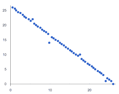
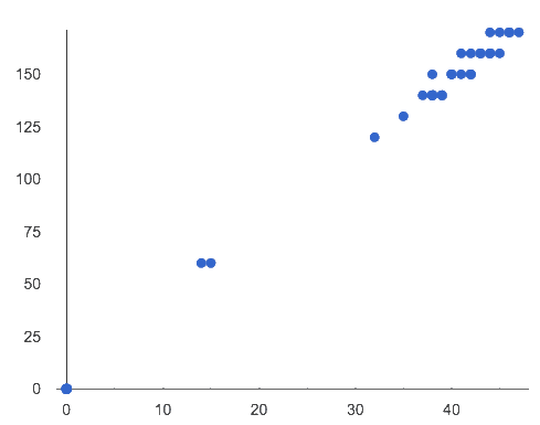
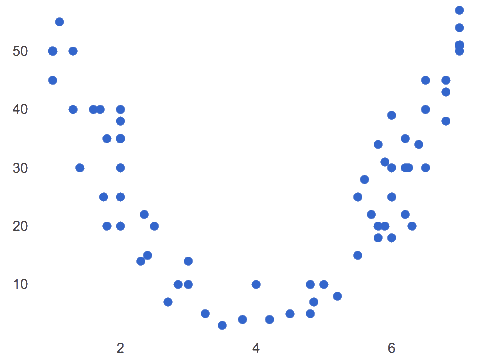
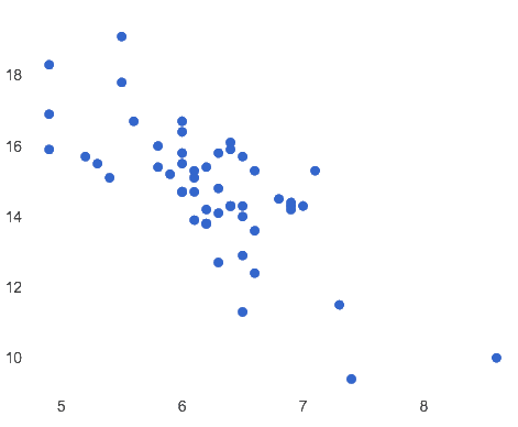
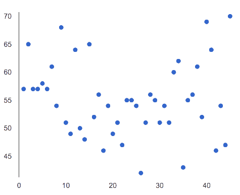
Match the description (left) with the scatter plot (right).
Note: The computer won’t tell us if the relationship we see in a scatter plot is linear, so it’s important to train our eyes to decide this ourselves. For linear relationships, we should train our eyes to assess their direction and get a feel for their strength, so that we have a sense of whether the computed results make sense.
The relationship appears to be linear, negative, and of moderate strength. |
1 |
A |
|
|
This relationship is nonlinear. |
2 |
B |
|
|
The x and y variables in this dataset do not appear to be related. |
3 |
C |
|
|
The relationship appears to be linear, positive, and strong. |
4 |
D |
|
|
The relationship appears to be linear, negative, and strong. |
5 |
E |
|
These materials were developed partly through support of the National Science Foundation, (awards 1042210, 1535276, 1648684, 1738598, 2031479, and 1501927).  Bootstrap by the Bootstrap Community is licensed under a Creative Commons 4.0 Unported License. This license does not grant permission to run training or professional development. Offering training or professional development with materials substantially derived from Bootstrap must be approved in writing by a Bootstrap Director. Permissions beyond the scope of this license, such as to run training, may be available by contacting contact@BootstrapWorld.org.
