Referenced from lesson Displaying Categorical Data (Spring, 2021)
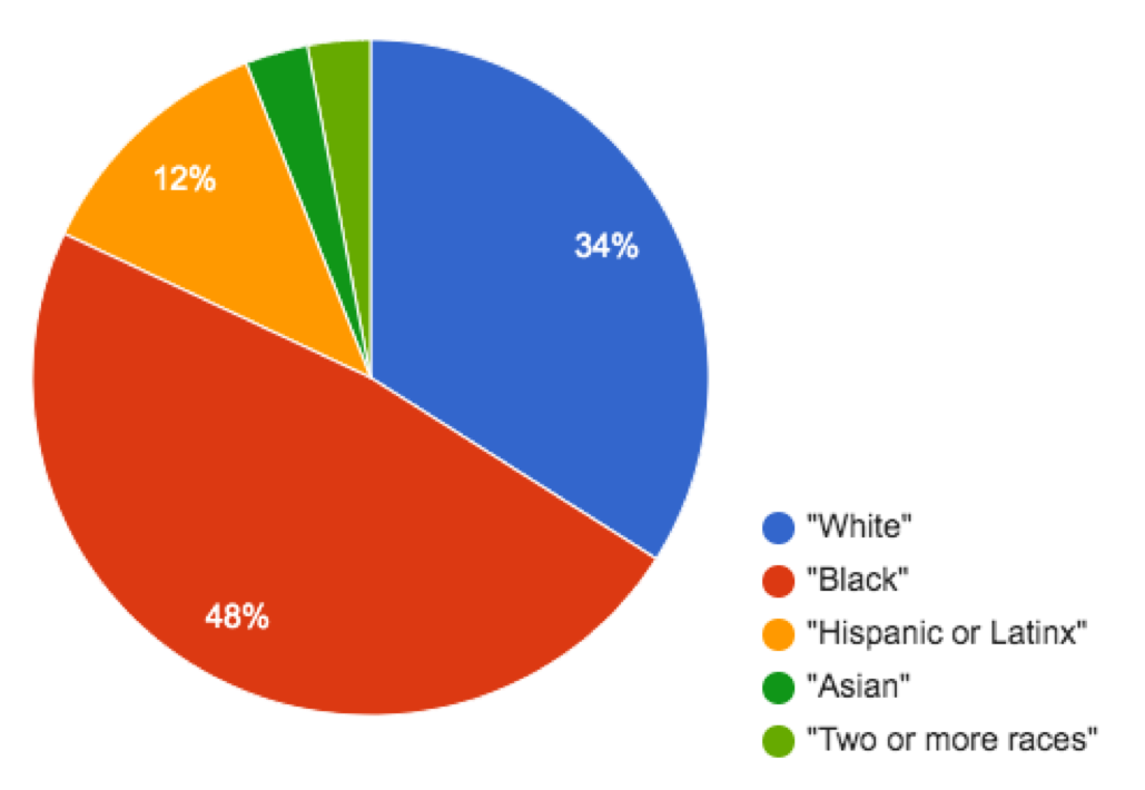
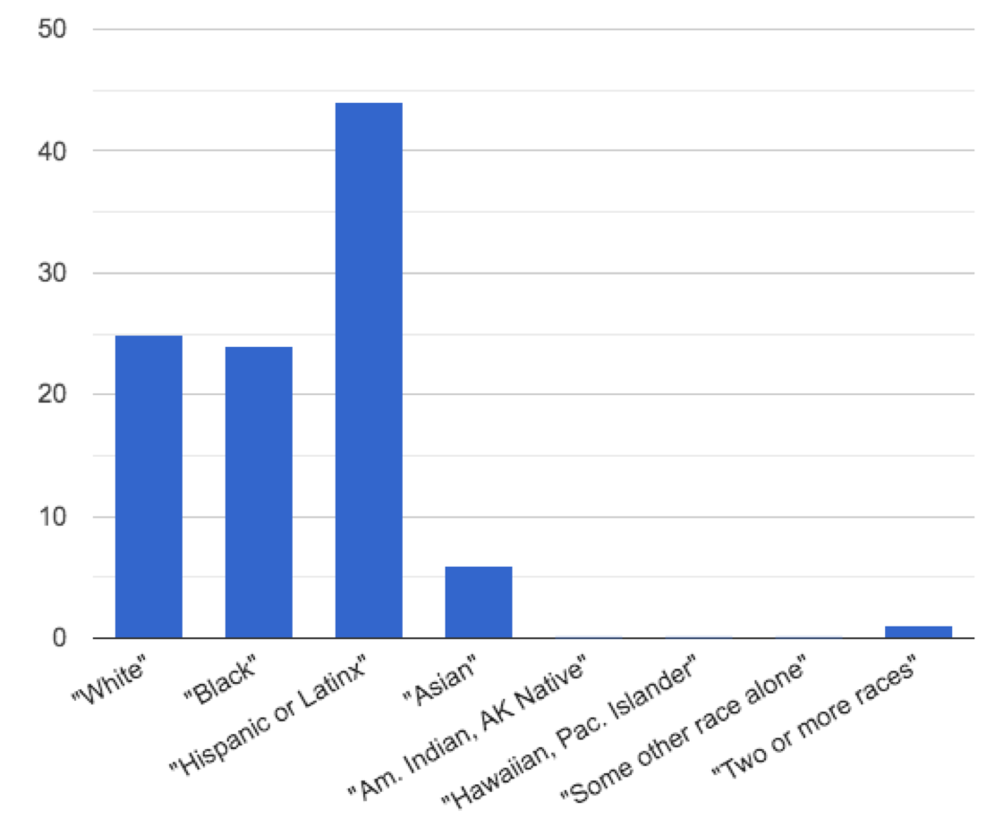
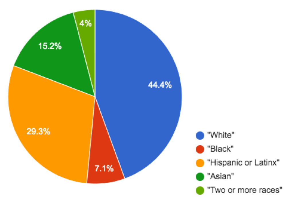
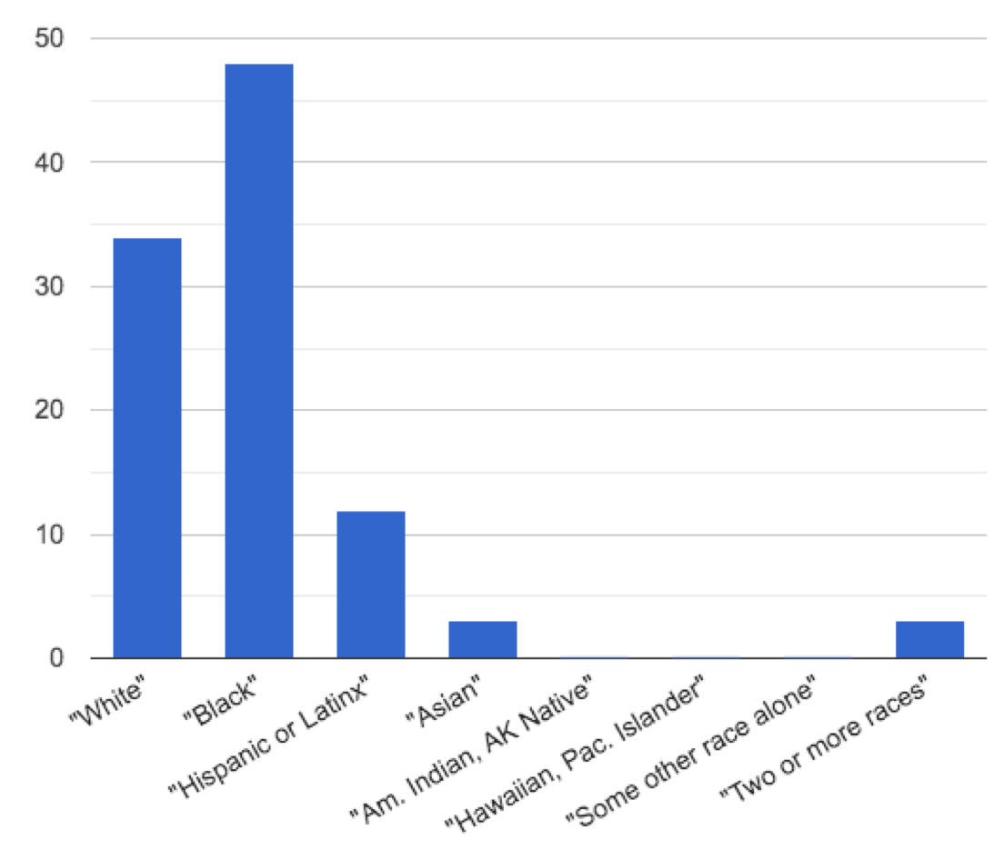
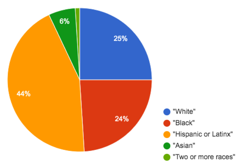
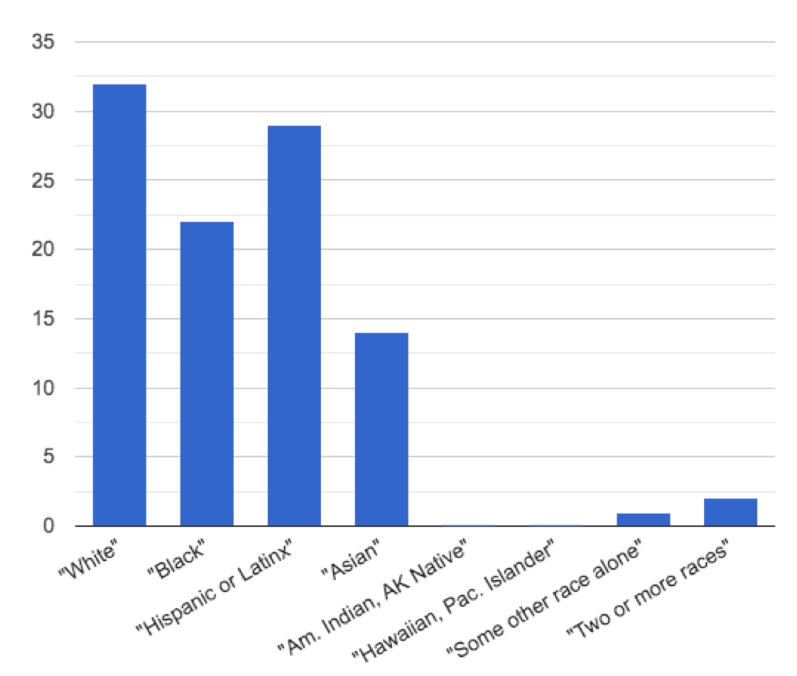
Match each bar chart below to the pie chart that displays the racial demographic data from the same school district.
Cleveland Municipal School District
|
1 |
A |
||
San Diego City Unified School District
|
2 |
B |
||
Houston Independent School District
|
3 |
C |
||
New York City Dept of Education
|
4 |
D |


These materials were developed partly through support of the National Science Foundation,
(awards 1042210, 1535276, 1648684, and 1738598).  Bootstrap:Data Science by the Bootstrap Community is licensed under a Creative Commons 4.0 Unported License. This license does not grant permission to run training or professional development. Offering training or professional development with materials substantially derived from Bootstrap must be approved in writing by a Bootstrap Director. Permissions beyond the scope of this license, such as to run training, may be available by contacting contact@BootstrapWorld.org.