Referenced from lesson Scatter Plots
-
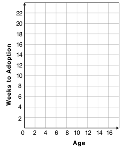
For each row in the Sample Table on the left, add a point to the scatter plot on the right. Use the values from the age column for the x-axis, and values from the weeks column for the y-axis.
-
Do you see a pattern? Do the points seem to go up or down as age increases to the right?
-
Draw a line on the scatter plot to show this pattern.
-
-
Does the line slope upwards or downwards?
-
Are the points tightly clustered around the line or loosely scattered?
| name | species | age | weeks |
|---|---|---|---|
|
|
1 |
3 |
|
|
11 |
5 |
|
|
16 |
4 |
|
|
2 |
24 |
|
|
6 |
9 |
|
|
1 |
2 |
|
|
6 |
12 |
|
|
3 |
2 |
These materials were developed partly through support of the National Science Foundation,
(awards 1042210, 1535276, 1648684, and 1738598).  Bootstrap:Data Science by Emmanuel Schanzer, Nancy Pfenning, Emma Youndtsmith, Jennifer Poole, Shriram Krishnamurthi, Joe Politz, Ben Lerner, Flannery Denny, and Dorai Sitaram with help from Eric Allatta and Joy Straub
is licensed under a
Creative Commons 4.0 Unported License.
Based on a work at www.BootstrapWorld.org.
Permissions beyond the scope of this license may be available by contacting
schanzer@BootstrapWorld.org.
Bootstrap:Data Science by Emmanuel Schanzer, Nancy Pfenning, Emma Youndtsmith, Jennifer Poole, Shriram Krishnamurthi, Joe Politz, Ben Lerner, Flannery Denny, and Dorai Sitaram with help from Eric Allatta and Joy Straub
is licensed under a
Creative Commons 4.0 Unported License.
Based on a work at www.BootstrapWorld.org.
Permissions beyond the scope of this license may be available by contacting
schanzer@BootstrapWorld.org.